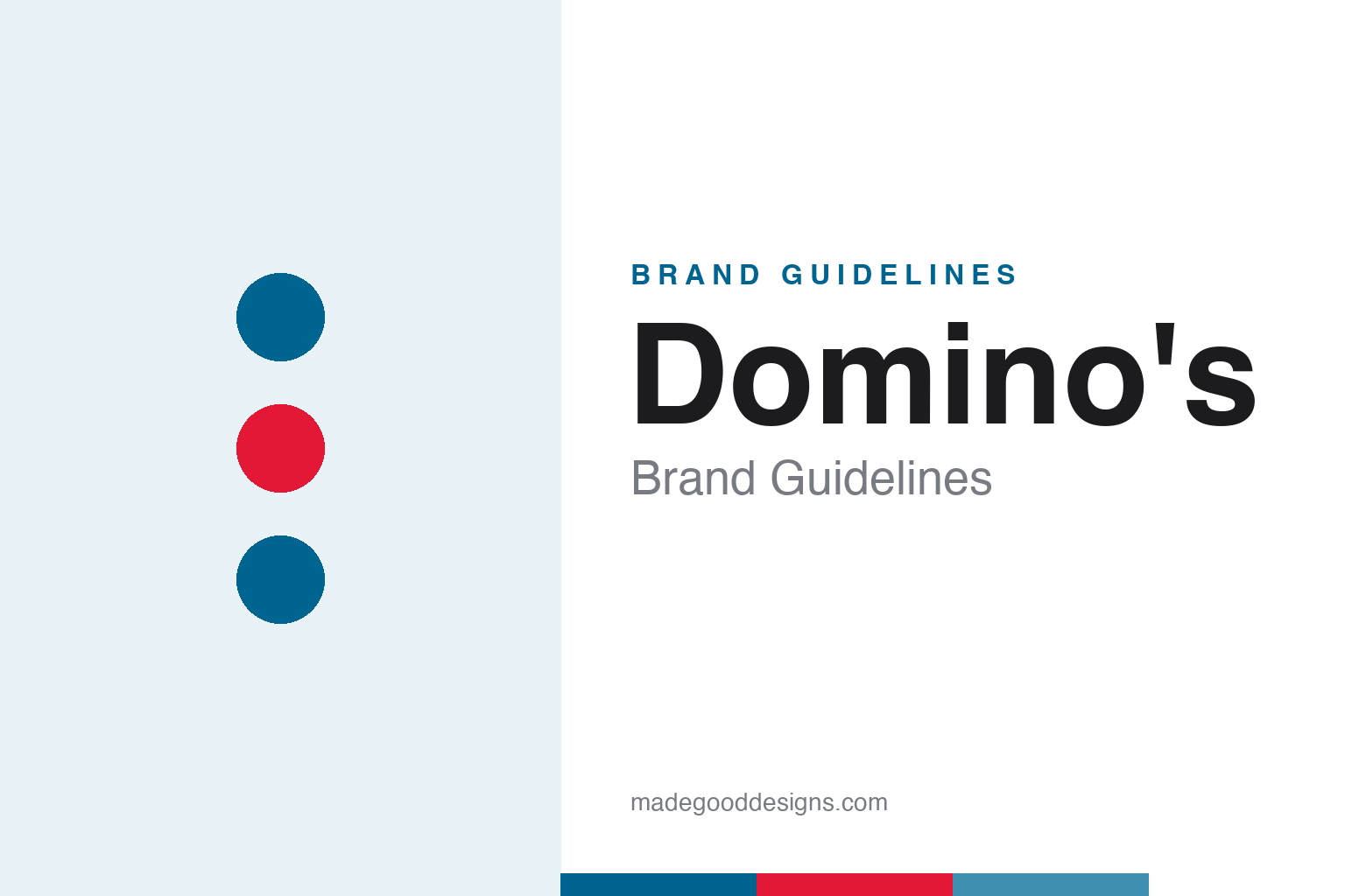
Domino’s Brand Guidelines
A blue-and-red domino with three dots — and a plan to add one per store that the company happily outgrew.
Aa
Two constants: a crisp blue-and-red pairing and a friendly rounded geometric sans. Abstract homage — not the Domino’s tile or wordmark.
Three dots, one abandoned promise
The most charming fact in the Domino’s logo is a plan the company was thrilled to break.
The Domino’s mark is a stylised domino tile, split into two offset squares set on a diagonal: a red square with one dot and a blue square with two, three dots in total. Those three dots have a lovely origin — they represent the brand’s first three stores in 1965, and the founders reportedly planned to add a new dot for every store that opened. The chain grew so fast that the idea was quickly abandoned (imagine a domino with thousands of dots), leaving a small, happy piece of company lore frozen into the logo forever.
The business began in 1960, when brothers Tom and James Monaghan bought a pizzeria called “DomiNick’s” in Ypsilanti, Michigan; it was renamed Domino’s in 1965. The identity’s big modern moment came in 2012, when Crispin Porter + Bogusky led a rebrand that dropped the word “Pizza” from the US logo and tilted the tile — a confident signal that Domino’s had become an icon-first brand and, increasingly, more than just pizza.
Colour
Domino’s runs a tight, high-contrast blue-and-red system. Click a swatch to copy the hex.
The two brand colours are a deep Domino’s Blue near #006491 (Pantone 647 C) and a vivid Domino’s Red near #E31837 (Pantone 199 C), on white. They map straight onto the two halves of the domino tile, which is what makes the icon work so hard: the colours are the logo. (Aggregators list minor variants like #0B648F and #D6202A; the Pantone-anchored values above are the ones to use, treated as approximate outside an official kit.) Blue reads as dependable and calm, red as energetic and appetising — a reassuring split for a brand built on fast delivery.
The strength of this palette is how inseparable it is from the mark. Because blue and red each own one square of the tile, the brand can drop the wordmark entirely and still be unmistakable — a single two-tone domino says “Domino’s” on an app icon, a box or a car-topper. That’s the pay-off of tying colour tightly to a simple shape: the icon becomes portable, and in a digital-ordering world where the brand lives as a tiny app tile, that portability is worth more than any amount of decoration.
Typography
The 2012 reset came with a custom typeface built to be played with.
Domino’s commissioned a bespoke display face, Pizza Press, designed by Terrance Weinzierl at Monotype for Crispin Porter + Bogusky and released in 2014. It’s an all-caps, modular, stackable family — Regular, Inline, Fill, Outline, Shadow, Antique and more, plus ornaments — that lets the brand build characterful, layered headlines like vintage signage. The 2012 wordmark itself tracks a bespoke rounded geometric sans (in the spirit of Pluto Sans), with Trade Gothic used in support. One correction worth making: the sometimes-cited “Neuzeit” is a misattribution — the real custom voice is Pizza Press.
AA 65
All-caps, modular and stackable — built for playful, layered headlines. (Specimen set in Poppins, a rounded geometric sans in the spirit of the Domino’s wordmark.)
A tech company that sells pizza
The icon-first brand was the visible half of a much bigger repositioning.
The 2012 identity didn’t come out of nowhere. In 2010, Domino’s ran the “Pizza Turnaround” — a radically honest campaign (also by CP+B) that publicly admitted its pizza wasn’t good enough and showed the company reformulating it. That confessional reset earned the brand permission to modernise, and the new icon-first logo was the flag planted on the other side. Since then Domino’s has leaned hard into being a digital-first, technology-led business — apps, live order trackers, “AnyWare” ordering — that happens to sell pizza.
For designers, Domino’s is a lesson in making colour and shape do the heavy lifting. By binding blue and red to the two halves of a simple tile, the brand built an icon strong enough to shed its own category name and thrive as an app-sized mark. Add a playful, buildable typeface for warmth and a genuinely brave honesty campaign for permission, and you get one of the cleanest brand turnarounds of the last two decades — proof that a small, well-loved detail like three dots can anchor a very modern identity.
Explore & save
Keep Domino’s’s identity on hand — save it to a board in the Made Good inspiration library.
Domino’s identity set
Pin the blue-and-red palette and the type spirit to your own board.