Fujifilm Brand Guidelines
A red wordmark with a split ‘ii’ — the mark of a film company that reinvented itself to survive.
Aa
Two constants: a corporate red with film-box green heritage, and a bold sans wordmark. Abstract homage — not the Fujifilm wordmark.
The company that outlived film
Fujifilm’s 2006 wordmark isn’t just a redesign — it’s the visual moment the company decided to survive.
Fujifilm’s current identity is a bold, lowercase-styled “Fujifilm” wordmark whose signature quirk is a split, doubled “ii” — the dot-and-stem rendered in two fragments, red on top, black below, with red as the only colour. It’s purely typographic; the old film-box symbol was dropped. Crucially, the mark was introduced on 1 October 2006, alongside the formation of FUJIFILM Holdings, and it was a statement: the company was diversifying beyond film. The prior logo — the classic red-on-green film carton — had run 26 years; retiring it announced a new era.
The heritage is deep. The company was founded on 20 January 1934 as Fuji Photo Film Co., spun off from Dai-Nippon Celluloid. Its most famous survival story is real: as digital killed film, Fujifilm pivoted its core chemistry into healthcare, cosmetics (Astalift) and materials and survived, while Kodak — which clung to film — went bankrupt in 2012 (though Kodak lived on, smaller). The 2006 rebrand is the graphic bookmark on that pivot, and the retro-styled X-series cameras (from 2012) later rebuilt Fujifilm’s photography identity even as the parent company moved on.
Colour
Fujifilm’s colours carry both its present and its heritage. Click a swatch to copy the hex.
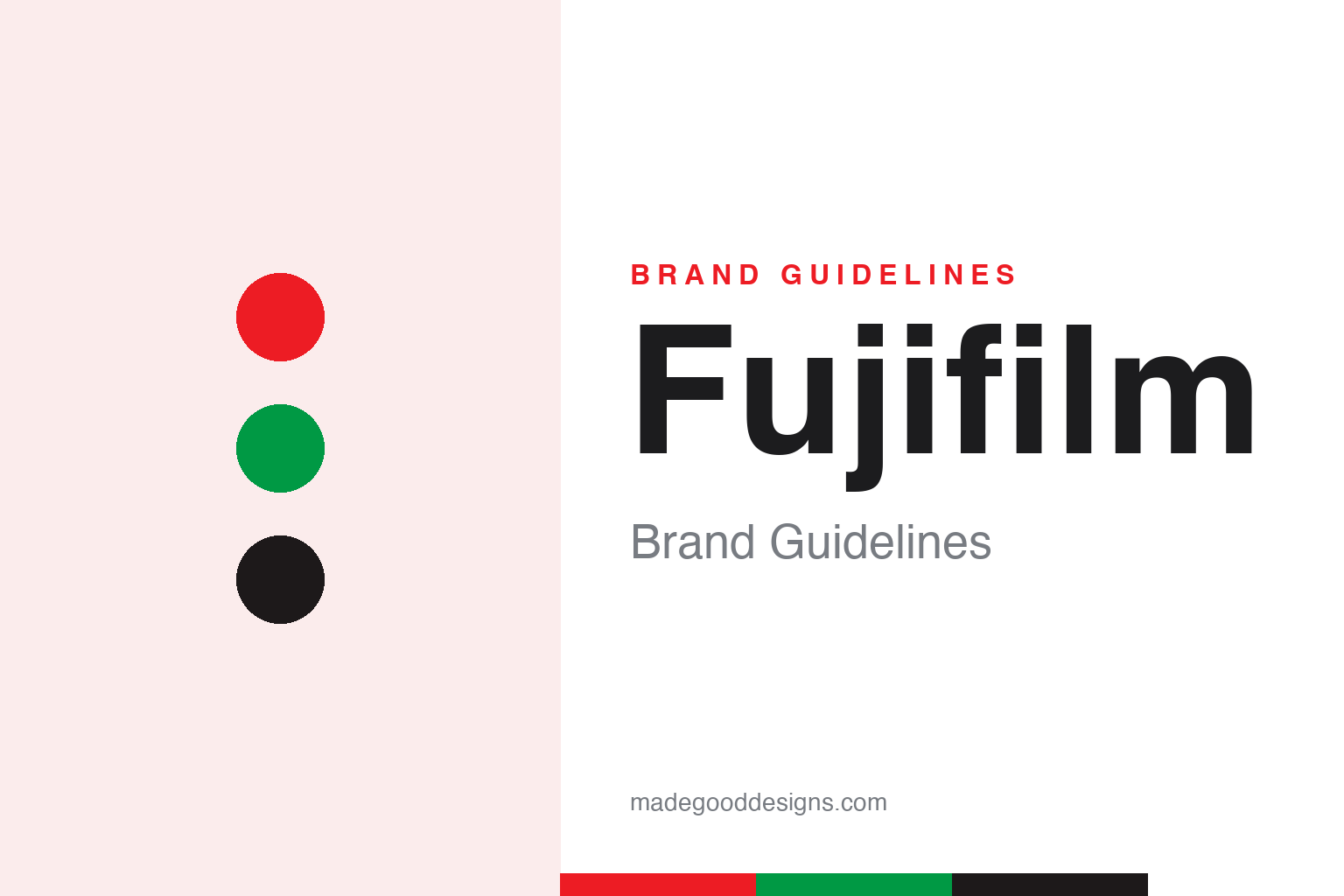
The current mark leans on a corporate red (commonly rendered around #ED1C24) with a near-black wordmark. But the brand’s heritage colour is a green: the classic Fujicolor consumer film carton was green (a deliberate counter to Kodak’s yellow), with the red logo — so the red-and-green pairing is genuine brand history, even if today’s corporate mark is red-and-black. (Fujifilm doesn’t publish an open brand book with codified hex, so all these values are third-party approximations, and the historic green is reconstructed.)
The design lesson is about colour as heritage vs. colour as signal. Fujifilm deliberately shed the red/green film-box look in 2006 to signal it was no longer just a film company — a case of a brand giving up beloved equity to change perception. Yet the green survives in memory and in the X-series’ nostalgia, showing that heritage colour lingers whether or not the logo keeps it. For your own work, it’s a reminder that changing a palette is a powerful way to reposition — and that the old colours don’t fully die; they become the emotional backstory your audience still feels.
Typography
The wordmark is a custom logotype — its personality lives in one small detail.
The “Fujifilm” wordmark is a bespoke bold sans logotype, not an off-the-shelf font, and its whole character sits in that split, two-tone “ii” — a tiny piece of engineering that turns an ordinary name into a recognisable mark. (“Fuji Sans” fonts online are lookalikes, not the official face, and no designer is publicly credited.) It’s a good example of doing a lot with a little: one clever letterform detail, a single red accent, and an otherwise plain bold sans is enough to carry a global corporate identity across film, cameras, healthcare and cosmetics.
ii 34
A plain bold sans made distinctive by one split detail. (Specimen set in Archivo, a strong grotesque in the spirit of the Fujifilm wordmark.)
Reinvention, in a logo
Few marks carry as much strategy as Fujifilm’s quiet 2006 change.
The story behind the wordmark is the whole point. By dropping the film-box symbol and the green in 2006, Fujifilm used design to tell the world it was becoming a diversified technology company — and it backed the claim by pivoting its film chemistry into medicine and cosmetics, outlasting the very product it was named for. One nuance worth keeping honest: the “Fuji” name does honour Mount Fuji (chosen by the first CEO), but the name was already trademarked and had to be bought for ¥8,000, and the plants actually sit near Mount Hakone, not Fuji — a small correction to a tidy origin story.
For designers, Fujifilm is a lesson in using identity to signal transformation. A logo change can’t save a company on its own, but paired with real strategic change it becomes a powerful flag: “we are not what we were.” Retire the equity that ties you to a dying category, keep just enough (the name, a colour, a memory) to stay recognisable, and let one distinctive detail — a split “ii” — carry the new mark. Done alongside genuine reinvention, as Fujifilm managed, a quiet wordmark can mark the difference between a company that survives and one that doesn’t.
Explore & save
Keep Fujifilm’s identity on hand — save it to a board in the Made Good inspiration library.
Fujifilm identity set
Pin the red-and-green palette and the type spirit to your own board.