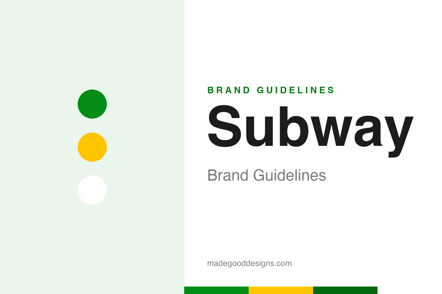
Subway Brand Guidelines
Two little arrows on the outer letters — the whole “way” the brand wants you to move.
Aa
Two constants: a fresh green-and-marigold pairing and a bold rounded sans. Abstract homage — not the Subway arrows or wordmark.
Arrows that tell you which way
Subway hides its whole idea in two small arrows on the ends of its name.
Look at the Subway wordmark and you’ll see an arrow extending from the “S” and another from the “Y” — the two outer letters — pointing in and out. They’re not a metro reference; they signal movement, entering and exiting, the quick “on-the-way” speed of the service and, neatly, the “way” buried in the brand’s own name. It’s a small, smart bit of design that turns a plain wordmark into a story about going somewhere, and it has anchored the identity for over half a century.
The chain was founded on August 28, 1965 by Fred DeLuca and Peter Buck as “Pete’s Super Submarines” in Bridgeport, Connecticut; the name became Subway and the arrowed identity solidified around 1968. Its most recent overhaul came in 2016, when Turner Duckworth refreshed the brand as part of the “Fresh Forward” restaurant program — sharpening the arrows, brightening the palette, and adding a new “Choice Mark” that builds an “S” out of the two arrows and negative space for use where the full wordmark won’t fit.
Colour
Subway’s palette is built to say “fresh” before you read a word. Click a swatch to copy the hex.
The two brand colours are a vivid green near #008C15 (Pantone 2426 C) and a warm marigold yellow #FFC600 (Pantone 7548 C), on white. The green does the strategic work — it reads as fresh, healthy and vegetable-forward, tying directly to the long-running “Eat Fresh” platform — while the yellow adds appetite and energy. (Sources vary on the exact green; older captures like #009444 circulate, but the current Vivid Green is the value to use. The yellow is consistent.) It’s a palette engineered to differentiate Subway from the red-and-yellow burger pack.
Because green carries a health claim, it has to be handled honestly and legibly. Bright green can be a weak text colour on white, so it works best as a fill, a wordmark colour or a strong accent, with the darker green or near-black doing the reading. Pair it with the marigold sparingly — enough to warm the palette without muddying the “fresh” message — and keep plenty of white for that clean, market-stall feel. Used this way, two colours quietly make an argument about the food before the customer has even looked at the menu.
Typography
The 2016 refresh brought custom type built to match the logotype’s forms.
Turner Duckworth’s 2016 system introduced two bespoke typefaces — “Footlong” (bold) and “Six-Inch” (lighter) — drawn by lettering artist Ian Brignell to echo the rounded shapes of the Subway logotype. Footlong handles punchy headlines; Six-Inch carries lighter text. A correction worth making: the face is not called “Subway Sans,” a name that circulates online but isn’t real. The wordmark itself remains its own custom logotype, a nod to the original 1965 signage. Naming type after menu sizes is a small, delightful touch — the sort of detail that makes a system feel authored rather than assembled.
Aa 65
Bold, rounded and friendly — tuned to the shapes of the wordmark. (Specimen set in Baloo 2, a rounded sans in the spirit of Subway’s Footlong.)
Fresh, forward, simplified
The 2016 work was less a reinvention than a sharpening of what already worked.
Rather than throw out its equity, Subway’s “Fresh Forward” rebrand cleaned it up: cleaner geometry in the arrows, a brighter, more ingredient-inspired green and gold, custom type, and the flexible Choice Mark for small spaces and digital touchpoints. It’s a textbook example of evolution over revolution — keep the arrows, keep the colours, keep the story, but modernise the execution so the brand reads well on a phone screen as happily as on a storefront. The core idea (movement, freshness, your way) never changed; only the polish did.
For designers, Subway is a reminder that the smallest details carry the most meaning. Two arrows on two letters encode the entire promise — quick, fresh, made your way — without a single extra graphic. When a brand’s idea is baked that tightly into its wordmark, a refresh’s job isn’t to invent something new; it’s to protect the good idea and let it read clearly in every new place the brand has to live. Get that restraint right, and a fifty-year-old logo can still feel current.
Explore & save
Keep Subway’s identity on hand — save it to a board in the Made Good inspiration library.
Subway identity set
Pin the green-and-marigold palette and the type spirit to your own board.