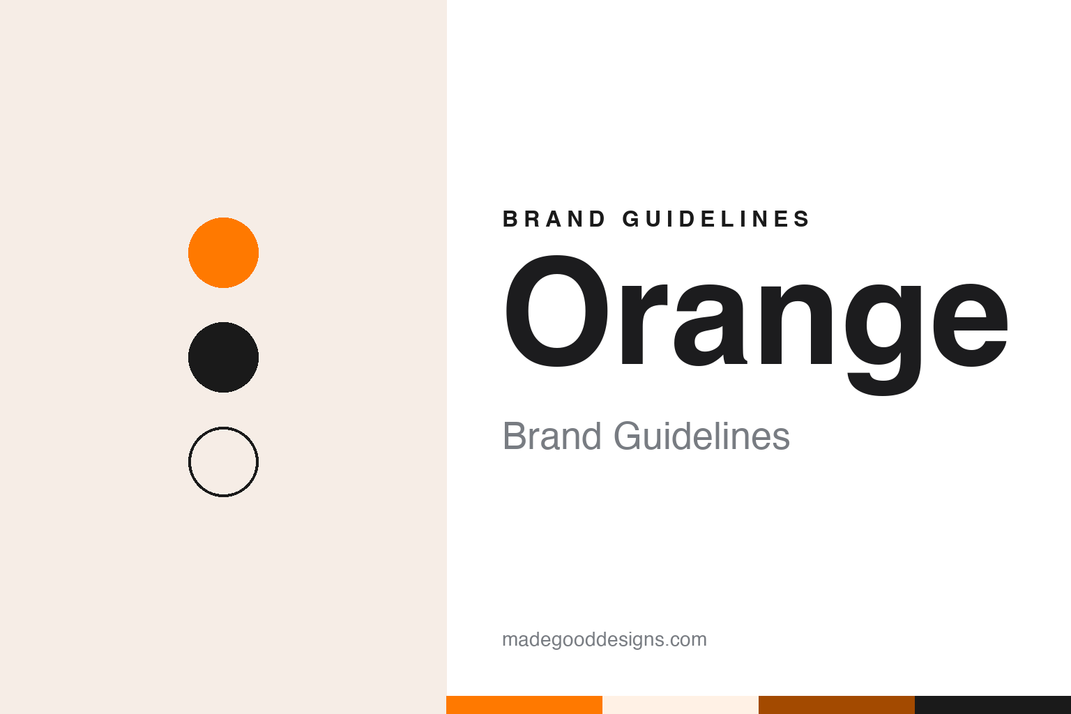
Orange Brand Guidelines
A telecom network named after a colour, and a colour that became a group.
Aa
Two constants: a bright orange, burnt orange and black palette and a Plain bold sans register. Abstract homage — not an Orange asset or mark; no logo, symbol or wordmark is reproduced.
From Microtel to Orange
A British licence, a Hong Kong owner and a launch in April 1994.
Orange started life under a different name. English Wikipedia traces the brand to Microtel Communications, a British consortium that won a licence to build a personal communications network in the United Kingdom. In July 1991 Hutchison Telecom, the UK arm of the Hong Kong conglomerate Hutchison Whampoa, took a controlling stake in Microtel, and the company was later renamed Orange Personal Communications Services.
The network went on sale in spring 1994. The BBC, in a profile published on 8 January 2001, said Orange entered the UK mobile phone market on 28 April 1994, launched by its then owner Hutchison Whampoa, with British Aerospace and Barclays Bank also holding stakes. The same report said Orange grew out of an earlier Hutchison and Barclays venture called Rabbit, a point-to-point phone service launched in 1992 and closed down in 1993, and that Orange was launched four months later with a new management team led by Hans Snook, later chief executive, and Graham Howe.
The BBC profile set out a short line of milestones: the launch of Orange in 1994, a first stock market float in 1996, the Mannesmann acquisition in 1999, the Vodafone acquisition in February 2000, the France Telecom acquisition in August 2000 and a second float in 2001. It described how the company first floated on the London Stock Exchange in April 1996, and how its time as an independent listed company ended in October 1999, when it was bought by the German group Mannesmann.
Ownership then changed twice in a year. On 11 February 2000 the BBC reported that Vodafone had sealed its takeover of Mannesmann, and that Orange, bought by Mannesmann the year before, would have to be sold to satisfy competition regulators in the United Kingdom. On 30 May 2000 the BBC reported that France Telecom had agreed to buy Orange from Vodafone, noting that the company had originally been owned by Hutchison Whampoa of Hong Kong. France Telecom planned to merge Orange with its French mobile network Itinéris and its other mobile activities into a company the report called “New Orange”, to be floated on the London, Paris and New York stock exchanges. English Wikipedia says the purchase was completed in August 2000, and France Télécom has owned the brand since then.
Colour
A slogan, a colour and one name for everything.
The brand was built on a word that had nothing to do with telephones. English Wikipedia describes Orange, at its launch, as an unusual name for a telecommunications firm, created by a team at Microtel led by its marketing director. The line that went with it was just as plain. The BBC’s 2001 profile quoted Orange’s mantra, “the future’s bright … the future’s Orange”, and called its familiarity a sign of the company’s successful branding. The same piece said Hans Snook had played a key role in shaping the company’s vision and promoting its brand, at a time when many people thought mobile phones would be used only by bankers and lawyers.
In France, the colour name replaced older ones. English Wikipedia says that in June 2001 the France Telecom mobile brands Itinéris, OLA and Mobicarte were replaced by the Orange brand. Four years later the internet business followed. On 29 June 2005 the BBC reported that the internet service provider Wanadoo, also owned by France Telecom, would change its name to Orange to create a more unified business identity, with Wanadoo phased out in the United Kingdom and across its other European markets from the following year. The France Telecom name would stay for the core fixed-line operations and as the name of the parent company, and in the United Kingdom the Equant business service would also be renamed Orange. The same report noted that Wanadoo had been known as Freeserve in the UK until 2004.
English Wikipedia dates the switch to 1 June 2006, when France Télécom began selling its internet, television and mobile services under the single Orange brand in most of the countries where it operated, and Orange Business Services replaced the Equant name for business customers worldwide.
The interface has been recognised too. The Institut Français du Design lists Orange among its 2021 Janus winners, with a Janus de l’Expérience Digitale for the My Orange customer app, which the institute describes as an interface giving customers access to Orange internet, mobile, TV and financial services.
Typography
Telecom names and their marks.
Telecom identities tend to carry more history than their logos let on. Many of today’s operators began life as departments of a national post office or a state telecommunications authority, where the name described a function rather than a brand. When those monopolies were corporatised or privatised, the new companies usually needed names that could be registered, trademarked and spoken quickly in advertising, and the renames often shortened a long official title into an acronym, a coined word or a single syllable.
Visual systems in the category lean on a small set of devices. Single letters and short initials are common, partly because they scale down to an app icon or a shopfront fascia without losing legibility. Abstract symbols, such as a globe, a speech mark, a square or a ring, give a company a mark that can sit apart from the word. Colour does a large share of the work: in several markets, telecom companies have sought trademark protection for a specific shade, which makes a palette a legal asset as well as a design choice.
The guides in this round look at how each company’s name and mark were assembled, using dated reporting where it exists, and treat every palette shown here as our own interpretation rather than an official specification.
Aa
A plain bold sans — after a brand that let a single colour word do the talking. (Specimen set in Archivo, a sans STAND-IN; NOT the Orange logo or its typeface.)
Orange
From British cinemas to a French group name.
In Britain the brand was visible on screen as well as in shops. English Wikipedia says that until 2012 Orange advertisements ran at most UK cinemas directly before the feature film, reminding audiences to switch off their phones. Known as Orange Gold Spots, they used a pair of fictional Orange executives trying to work the network into film projects, and featured guest stars over several years, ending with the line asking viewers not to let a mobile phone ruin the film.
The British network was later folded into a joint business. On 8 September 2009 the BBC reported that T-Mobile and Orange planned to merge their UK operations, owned by Deutsche Telekom and France Telecom, with both brands kept separate for the first 18 months while branding options were reviewed. English Wikipedia says the merger was completed on 1 April 2010 and the joint company later traded as EE, which announced in September 2012 that Orange and T-Mobile stores would be rebranded as EE stores. Orange tariffs were withdrawn for new customers in February 2015, and remaining Orange customers in the UK were moved to EE plans in 2019, ending the brand’s life in the country where it had started.
Elsewhere the name kept spreading. English Wikipedia records that in June 2007 Orange and Mid Europa Partners bought the Austrian mobile operator One and rebranded it Orange Austria, a name dropped after the business was sold to Hutchison 3G in 2012. The same article notes that the Orange name was also licensed for some years to operators the French group did not own.
For a design guide, Orange shows how a single common word and a single colour can stand in for a whole telecom group, carrying the same name from mobile into broadband, television and business services. Compare Vodafone, which owned Orange briefly in 2000, and T-Mobile, whose UK network merged with Orange’s to form EE. For this guide we use bright orange, burnt orange and black with a sans, an unofficial interpretation; no product or logo is reproduced.
Explore & save
Keep Orange’s identity on hand — save it to a board in the Made Good inspiration library.
Orange identity set
Pin the Orange bright orange, burnt orange and black palette and the Plain bold sans register to your own board.