T-Mobile Brand Guidelines
VoiceStream’s new name, and a colour it guards.
Aa
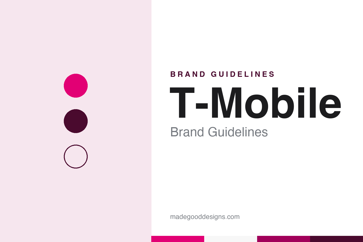
Two constants: a magenta, plum ink and store white palette and a rounded geometric sans register. Abstract homage — not a T-Mobile asset or mark; no logo, “T” or store sign is reproduced.
From VoiceStream
A Seattle-area carrier takes a German name.
T-Mobile in the United States began under another name. English Wikipedia says VoiceStream Wireless PCS was set up in 1994 as a subsidiary of Western Wireless Corporation, the company led by John W. Stanton, to provide digital personal communications services in metropolitan areas of the western and southwestern states using the GSM standard. Western Wireless sold rural analogue service under the Cellular One brand, so VoiceStream was the urban, digital side of the business. It was spun off as VoiceStream Wireless Corporation in May 1999, and in 2000 it bought the regional carriers Omnipoint and Aerial Communications, retiring both names and launching the VoiceStream brand and a “Get More” marketing strategy across its markets, Wikipedia says, citing the company’s own pages from the time.
The German telecommunications group Deutsche Telekom completed its purchase of VoiceStream on 1 June 2001, according to Wikipedia, together with the southern regional operator Powertel. Deutsche Telekom already used the T-Mobile name for its mobile businesses in Europe, and Wikipedia records that VoiceStream adopted the corporate name T-Mobile USA, Inc. in September 2001. The public change came the following summer. The Seattle Post-Intelligencer reported on 18 July 2002 that T-Mobile, “formerly VoiceStream,” had made its debut the day before with television, radio and newspaper advertising in California and Nevada, and that the VoiceStream brand would be phased out in other cities over the following months. The paper described the company as Bellevue-based, and T-Mobile US remains headquartered in Bellevue, Washington.
The same report recorded a change of face. Jamie Lee Curtis, VoiceStream’s longtime spokeswoman, was being replaced by the actress Catherine Zeta-Jones, and the new tag line was simply “Get more.” The company told the paper that the shared name would let customers use their phones under one brand in the United States and in Europe. Wikipedia says the line “T-Mobile. Get More.” was also adopted by T-Mobile companies elsewhere, including those in Germany and the United Kingdom.
Colour
Deutsche Telekom, the Un-carrier and Sprint.
Deutsche Telekom has controlled the American business since 2001. The Wall Street Journal described T-Mobile USA as a unit of the German group in a report of 26 September 2006, which said the company planned to drop Zeta-Jones from its advertising in favour of a more “man-on-street” approach to marketing, letting her appear in some ads until her contract ran out. Wikipedia adds that the rapper Snoop Dogg appeared in 2004 commercials for the T-Mobile Sidekick, and that Zeta-Jones returned in 2009 for a campaign called “Mobile Makeovers,” according to a company press release.
The present corporate shape dates from 2013. Wikipedia says T-Mobile USA combined with MetroPCS in a reverse takeover; the merged company kept the T-Mobile brand and became T-Mobile US, Inc. on 1 May 2013, and MetroPCS continues as the prepaid brand Metro by T-Mobile. Weeks earlier the company had begun calling itself the “Un-carrier.” The New York Times reported on 26 March 2013 that the carrier, led by its chief executive John Legere, was “undergoing a rebranding” into what it called an uncarrier. The paper described Legere at a news conference in New York in a blazer, T-shirt, jeans and sneakers with hot-pink shoelaces, mocking rivals’ two-year contracts as the company replaced its old phone plans with contract-free ones. The Verge reported in July 2013 on a follow-up phone-upgrade plan called Jump, and later announcements were presented as further Un-carrier moves.
A further change to the brand map came with Sprint. Bloomberg reported on 11 February 2020 that a federal district judge in Manhattan had approved T-Mobile’s takeover of Sprint, defeating a lawsuit brought by a group of states, and that the combined company would operate under the T-Mobile name; Bloomberg named Deutsche Telekom as T-Mobile’s owner and SoftBank as Sprint’s parent. Wikipedia dates the completed merger to 1 April 2020. On 2 August 2020, Fox Business reported, Sprint stores began operating under the T-Mobile brand, and the company said most of them had been updated with T-Mobile branding “and a fresh coat of magenta paint.” Wikipedia also lists the purchases of Mint Mobile and Ultra Mobile in 2024, which remain separate brands, and of the wireless operations of UScellular in 2025.
Typography
Design and documentation.
The brands in this group are all wireless carriers, and a carrier’s identity reaches people through a handful of familiar places: the shop front on a high street or in a strip mall, the small card that holds a SIM, the screen of a phone during setup, and the advertising that runs on television, billboards and social feeds. Unlike a packaged product, a carrier sells a service that cannot be seen, so the name, the logo and the colour do much of the work of making it recognisable.
Colour is often the first thing a carrier tries to own. A single strong hue can be repeated across signage, uniforms, packaging and digital screens until it reads as the brand on its own. Typography plays a supporting part, setting the tone of headlines and offers in advertising and keeping store signage legible from a distance.
Carrier brands also change hands. A name can pass between owners, be kept as a separate label after a merger or be retired altogether, so each guide sets out who started the brand, who owns it now and how its look has changed along the way.
Aa
A rounded geometric sans — the register of a store fascia and a magenta billboard. (Specimen set in Manrope, a sans-serif STAND-IN; NOT the T-Mobile logo or brand typeface.)
T-Mobile
A name and a colour inherited from Germany.
The T-Mobile identity in the United States arrived ready-made. When VoiceStream became T-Mobile in 2002, it took on the name, the letter T and the magenta of its German parent, and the Seattle Post-Intelligencer framed the switch as a matter of using a single brand on both sides of the Atlantic. What changed over the following years was the tone of the advertising around that colour, from celebrity spokeswomen to a chief executive in pink shoelaces.
The colour is also a legal asset. Gizmodo reported on 7 November 2007 that T-Mobile held a trademark covering the use of magenta in promoting telecommunications, and Wikipedia records that the company has a colour trademark for magenta and markets itself in its corporate colours. Wikipedia notes that the model Carly Foulkes, who from 2010 fronted commercials for the myTouch 4G that parodied Apple’s “Get a Mac” campaign, was often identified with pink, while the company’s colour is magenta. In 2011 the company held a holiday sale it called “Magenta Saturday,” Wikipedia says, citing MarketWatch and the fan site TmoNews.
The wordmark has been redrawn as the company has changed. Wikipedia dates one version of the T-Mobile logo to 2001–2013 and another to 2013–2020. Throughout, magenta stayed, and in 2020 it was the colour, applied as paint, that turned Sprint shops into T-Mobile shops.
For a design guide, T-Mobile shows how a colour carried over from a parent company, and defended as a trademark, can hold a brand together through a change of name, a reverse takeover and the absorption of a rival’s stores. Compare it with AT&T, whose globe was drawn by Saul Bass, and Verizon and its checkmark. For this guide we use magenta, plum ink and store white with a sans, an unofficial interpretation; no product or logo is reproduced.
Explore & save
Keep T-Mobile’s identity on hand — save it to a board in the Made Good inspiration library.
T-Mobile identity set
Pin the T-Mobile magenta, plum ink and store white palette and the rounded geometric sans register to your own board.