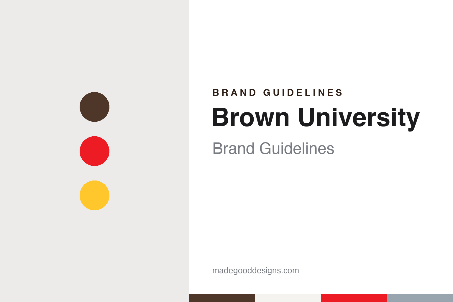
Brown University Brand Guidelines
A Baptist college in Warren, a name bought by a gift and a cross between four books.
Aa
Two constants: a brown, red and gold palette and a humanist book serif register. Abstract homage — not a Brown University mark; no seal, shield, bear or logo is reproduced.
Rhode Island College
A Newport petition, a Warren meeting house and a college on a hill.
Brown University began in 1764 as the College in the English Colony of Rhode Island and Providence Plantations, the long formal name English Wikipedia gives for the institution chartered by the colony’s General Assembly. The idea came from Newport, where in 1761 three residents drafted a petition to the Assembly proposing a “literary institution”, and from the Philadelphia Association of Baptist churches, which wanted a college in Rhode Island under Baptist direction. Wikipedia says the association chose James Manning, a 1762 graduate of the College of New Jersey, to lead it; he arrived at Newport in July 1763, and the minister Ezra Stiles, who later became president of Yale College, agreed to draft the charter.
The college opened not in Providence but in Warren, Rhode Island, on the site of the town’s First Baptist Church, and Manning was sworn in as president in 1765, a post he held until 1791. In 1766 the corporation sent Morgan Edwards to Britain to raise funds. In 1770 the college moved to Providence, where the merchants John and Moses Brown bought a lot on the crest of College Hill for the school; the building now called University Hall went up there, and Wikipedia reproduces a 1792 engraving showing it beside the President’s House. For its first four decades it was known simply as Rhode Island College.
The present name dates from 1804. A year earlier, on 8 September 1803, the corporation voted that a donation of a set sum made within a year would entitle the donor to name the college. The college treasurer Nicholas Brown Jr., a graduate of the class of 1786, answered in a letter dated 6 September 1804, pledging a gift to endow a professorship of oratory and belles lettres, and the corporation voted the same day that the college “be called and known in all future time by the Name of Brown University”, Wikipedia records. The Latin form of the name, Universitas Brunensis, appears on the corporation’s seal. The motto is In Deo Speramus, “In God we hope”, and the fight song is “Ever True to Brown”.
Colour
Three seals, four open books and a sun through the clouds.
The heraldry of Brown has been redrawn with each change of political circumstance. English Wikipedia’s article on the university’s coat of arms says the college’s original seal was procured in 1765 by the Reverend Samuel Stillman after the corporation’s second meeting in Newport; it was made in Boston and showed the profiles of George III and Queen Charlotte, with a Latin legend naming the college in the colony of Rhode Island and Providence Plantations. That colonial design can still be seen carved on campus, on the facade of Marston Hall and on a pendentive of the Sharpe Refectory.
Independence made the royal portraits awkward. In September 1782 the corporation resolved to bring its charter into line with “our present state of national independence” and named a committee of Jabez Bowen, James Manning and Henry Ward to break the old seal and produce a new one. The second seal, adopted on 3 September 1784, replaced the monarchs with a domed temple “sacred to knowledge”, its columns inscribed with the names of the seven liberal arts, beneath a scroll reading Virtus magis colenda and a base inscribed Patet Omnibus. The word for colony gave way to “Republica”. Wikipedia says Solomon Drowne may have had a hand in the design.
The renaming of 1804 was not reflected in the seal for three decades. President Francis Wayland raised the point in his September 1833 report, a committee was formed, and the third seal, the one still in use, was adopted on 3 September 1834. Its centre is the coat of arms, blazoned as a silver field with a red cross between four open books, the books silver and bound in red, with a crest of a demi-sun issuing from clouds in gold and silver. The university’s visual identity policy of 2016 reads the crest as the sun’s golden rays of learning piercing the clouds of ignorance, the books as learning, and the cross as thought to be the cross of St George. The ring around the arms reads Sigillum Universitatis Brunensis. The same arms appear in stone above the Van Wickle Gates of 1901 and on the pediment of Wayland Arch.
Typography
Seals, colours, mascots and wordmarks.
A university’s visual identity is usually built in layers that arrived at different times. The earliest layer is often a seal, a circular device made to authenticate documents, typically carrying a Latin legend, a founding date and emblems such as books, a sun, a lamp or a tree. Seals were made to be pressed into wax or printed small, so their detail rewards close reading rather than quick recognition.
A second layer is the school colour. Many colleges settled on a colour in the nineteenth century for rowing crews, baseball teams and student banners, and only later wrote the shade down as a specification for print and screen. Once a colour is tied to a team, it tends to stay, because students and supporters carry it on clothing and flags.
A third layer is the mascot, an animal or figure adopted for athletics, which often gets its own set of drawings that change with each generation of designers. The newest layer is the wordmark: a name set in a chosen typeface, sometimes paired with a simplified shield, written up in an identity manual so that departments, publications and websites use one consistent signature beside the older emblems.
Aa
A humanist book serif — the register of a diploma and a library spine. (Specimen set in Crimson Pro, a serif STAND-IN; NOT Minion Pro and NOT the Brown University logo.)
Brown University
A shield beside a name, Minion Pro and a B from the letter sweaters.
The modern identity dates from 2003. The university’s Visual Identity Policy and Strategy, in the edition dated July 2016 and launched for the 2016–17 academic year, says Brown adopted its current visual identity after study in 2003, updating the coat of arms and adding the Brown name beside it. The result is a logo that pairs the arms with the word “Brown” in horizontal and stacked compositions; the informal use of the arms on their own was discontinued in 2003, and the shield may now stand alone only where the Brown name appears prominently close by. The clear space around the logo equals the width of the shield, and the cross in the arms is always red unless the logo is printed in a single colour.
The policy separates the ceremonial marks from the everyday one. A Presidential Coat of Arms, which adds a scroll carrying the motto, is reserved for the Office of the President, Commencement, Convocation and meetings of the Corporation. The Corporation seal is kept for authenticating diplomas and official documents and is used decoratively only on the cover of the Commencement programme, printed in black, in brown PMS 476 or in a brown metallic. A plain “Brown” wordmark set in Minion Pro is reserved for licensed merchandise. Minion Pro is the primary serif, used in the logo and for body text, with Freight Sans and Gotham Narrow as sans-serif companions. The primary palette is red PMS 2347 (hex #ED1C24) and brown PMS 476 (#4E3629), with gold PMS 123 (#FFC72C) and gray PMS 7543 (#98A4AE) as accents.
Athletics has its own vocabulary. The teams are the Bears; English Wikipedia, citing the Encyclopedia Brunoniana, says a burro appeared at a game against Harvard in 1902, that a bear’s head was placed over an archway of the student union in 1904, that a live bear named Helen appeared at a 1905 game against Dartmouth, and that Bruno was introduced in 1921, represented by a person in costume by the late 1960s. In 2022 the division of athletics and recreation unveiled a new mark set, which SportsLogos.Net reported on 4 July 2022: a stylised “B” based on the letter worn on varsity sweaters since the 1890s, simplified in brown and red; a secondary standing bear drawn from statues on campus, including the bronze Indomitable on the Ittleson Quadrangle; and a custom typeface to be phased onto uniforms over several seasons.
For a design guide, Brown University shows how a seal that changed with each political era can settle into one set of arms and then be paired with a plain name; compare Columbia University and Yale University for other colonial colleges whose arms carry books. For this guide we use brown, red and gold with a serif, an unofficial interpretation; no product or logo is reproduced.
Explore & save
Keep Brown University’s identity on hand — save it to a board in the Made Good inspiration library.
Brown University identity set
Pin the Brown University brown, red and gold palette and the humanist book serif register to your own board.