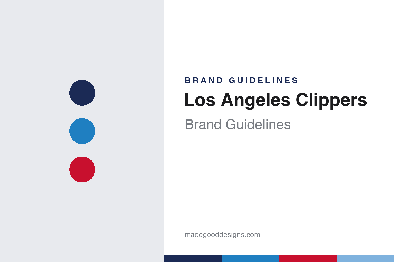
Los Angeles Clippers Brand Guidelines
A name from a naming contest, a ship that sailed twice.
Aa
Two constants: a navy, Pacific blue and red palette and a condensed athletic sans register. Abstract homage — not a Los Angeles Clippers mark; no logo, jersey or wordmark is reproduced.
From Buffalo to the bay
A basketball team named after the sailing ships of San Diego.
The Los Angeles Clippers started on the other side of the continent. English Wikipedia says the franchise was founded in 1970 as the Buffalo Braves, one of three NBA expansion teams that began play that season, alongside the Portland Trail Blazers and the Cleveland Cavaliers. The Braves shared the Buffalo Memorial Auditorium with the NHL’s Buffalo Sabres. In Buffalo the team wore a baby blue base with black trim.
The move west came through an unusual deal. Wikipedia says that in 1978 the Braves’ owner, John Y. Brown Jr., traded franchises with Irv Levin, owner of the Boston Celtics, and that Levin, a Southern California resident, then moved the Braves to San Diego. Scott Cacciola of The New York Times summarised the same history on 3 March 2024: the team was founded in 1970 as the Buffalo Braves, relocated to Southern California in 1978 and was rebranded there as the San Diego Clippers.
The new name came from a contest. Wikipedia says San Diego team officials did not think “Braves” suited the club in its new city, and a local naming contest chose “Clippers”, after the sailing ships for which the city and San Diego Bay were known. The nautical idea has run through the team’s marks ever since.
The San Diego look set out that theme. Wikipedia says the team kept the baby blue base but swapped black trim for orange, and placed a series of nautical signal flags spelling “Clippers” down each side of the shorts. The original logo was a large baby blue circle around a smaller orange circle, standing for the region’s sunshine, with three white sails for the ship. The Times described it as a trio of triangles that evoked sailing masts on the water. During the 1982–83 season the club redesigned again, replacing baby blue and orange with royal blue and red and enlarging the “C” of the wordmark. Wikipedia says the new logo, a moving white basketball with red lines over the team name, lasted with tweaks until 2015.
Colour
A move to Los Angeles, a script wordmark and a change of owner.
The royal blue and red set travelled north. Wikipedia says the businessman Donald Sterling bought the team in 1981 and moved it to Los Angeles in 1984; the Times noted that he did so without the NBA’s approval. The league dropped its lawsuit over the move in September 1987. The 1982–83 uniforms came with the team, and the Times described the main logo of the following decades as the team name inside a streaking basketball.
A longer-lived uniform followed in 1987. Wikipedia says red became the base colour and blue was moved to the trim, with the team name written in script lettering on the white home uniform and the city name in script on the red road uniform. That script set stayed largely intact until 2010. Before the 2000–01 season the club added an interlocking “LAC” monogram at the neckline, with thicker stripes and bolder numerals. In 2010 the uniforms were adjusted again, and Wikipedia says modified logos were presented on the night of that year’s NBA draft.
Ownership changed in 2014. The Times reported that the NBA forced Sterling to sell the team that year after he was recorded making racist comments. Wikipedia says Steve Ballmer took control on 12 August 2014, after a California court confirmed the sale to him from Shelly Sterling, and that the deal included a commitment to keep the team in Los Angeles. Ballmer has owned the Clippers since 2014.
A new identity followed within a year. Wikipedia says the club unveiled it on 18 June 2015: a primary logo of a basketball shaped like a compass, with the “LAC” monogram in the middle, above a black wordmark with two curved lines that, according to the club, suggest the ocean horizon and its nautical roots. The Times later described that logo as a basketball with a big blue “C” and “LA” inside. A black alternate uniform celebrating downtown Los Angeles followed on 6 November 2015, and new Nike uniforms were shown on 11 August 2017.
Typography
Design and documentation.
Professional clubs carry names that can outlast the cities, owners and ballparks attached to them. When a club changes its name, the new identity usually arrives as a complete set rather than a single swap: a wordmark, a cap or helmet insignia, a primary logo, home and road uniforms and a colour palette, all launched together so that signage, merchandise and broadcast graphics can switch on the same date. Leagues often supply design support, and clubs commonly test options with supporters before an announcement.
Relocation works differently. A club that moves may keep its nickname, colours and lettering while the city name on the road jersey changes, so the visual system becomes the thread that links one home to the next. Some clubs play for a period in an interim home, such as a smaller ballpark or a shared stadium, before a permanent building is ready, and their identity then has to read clearly in surroundings designed for another team.
Many clubs also keep a single element through every change: a script wordmark, a letter monogram or an animal mascot. Such elements are often redrawn rather than replaced, with thicker strokes, revised serifs or a simplified outline, so that supporters can recognise them on a cap, a sleeve patch or a scoreboard across several decades.
Aa
A condensed athletic sans — the register of a jersey number and an arena sign. (Specimen set in Barlow Condensed, a condensed sans STAND-IN; NOT the Los Angeles Clippers logo or wordmark.)
Los Angeles Clippers
Back to the ship for a new arena in Inglewood.
The current identity looks backward on purpose. Cacciola reported in The New York Times on 3 March 2024 that the Clippers had announced a new logo the previous week, to be used from the 2024–25 season, when the team would move into its own arena, Intuit Dome, in Inglewood, California. Until then, the Times noted, the Clippers and the Lakers had shared the same downtown arena since 1999. The new logo shows the silhouette of an oncoming ship, which the club described as “a nod to the team’s origins” in San Diego. The hull carries the seams of a basketball, and the ship is framed by a compass. The Times reported that the compass-ball logo of the Ballmer era would be retired after the 2023–24 season.
Wikipedia fills in the parts. The mark is a stylised clipper ship wrapped around a navy “C” in a white circle with a Pacific blue outline, with pointed marks taken from a compass and a basketball silhouette on the hull. The uniforms bring back a modern version of the 1987–2015 script: navy “Clippers” script with red numbers on the white Association uniform, red script on the navy Icon uniform, and a stacked “Los Angeles” script on the red Statement uniform, with nautical flags spelling “LAC” on its navy stripe.
The Nike City uniforms keep returning to the archive. Wikipedia says the 2017–18 City uniform revived the San Diego baby blue and orange, with signal flags spelling “LAC”; the 2019–20 edition used “Los Angeles” in an Old English script as a tribute to the city’s street culture; the 2022–23 version honoured the Drew League with a mosaic inspired by the Watts Towers; and the mostly navy 2023–24 uniform, reading “Clips” in a font based on the 1978–1983 logo, was designed by the Los Angeles artist Jonas Wood. The three-sails logo itself went back to San Diego in 2024, Wikipedia says, when the club’s G League affiliate moved there from Ontario, California, and took the San Diego Clippers name. The team’s website has a page for its mascot, Chuck the Condor.
For a design guide, the Los Angeles Clippers show how a nautical name chosen in one city can be carried, dropped and then reclaimed through ships, sails, signal flags and a compass. Compare the Los Angeles Lakers, the New Orleans Pelicans and the NBA. For this guide we use navy, Pacific blue and red with a condensed sans, an unofficial interpretation; no product or logo is reproduced.
Explore & save
Keep Los Angeles Clippers’s identity on hand — save it to a board in the Made Good inspiration library.
Los Angeles Clippers identity set
Pin the Los Angeles Clippers navy, Pacific blue and red palette and the condensed athletic sans register to your own board.