Paralympic Games Brand Guidelines
An archery contest on a hospital lawn that grew into Games held beside the Olympics.
Aa
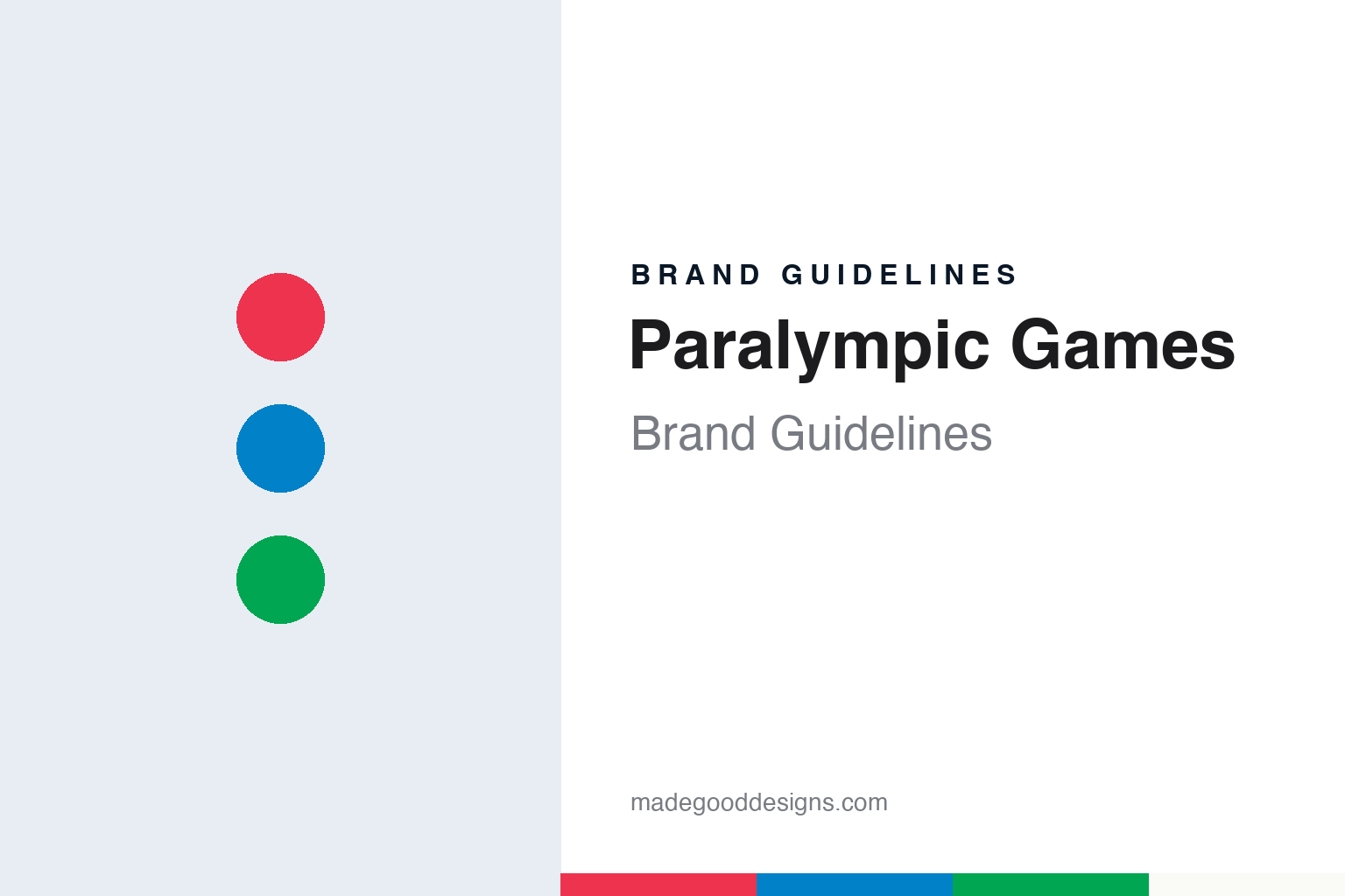
Two constants: a red, blue and green palette on white and a rounded geometric sans register. Abstract homage — not the Agitos, the Paralympic emblem or any protected mark; no logo is reproduced.
Stoke Mandeville
A spinal unit, a bow and arrow, and a date chosen to match London.
The Paralympic story starts in a hospital. The National Archives in Kew, in a story published in September 2024, says the neurologist Ludwig Guttmann was born in Germany, grew up in Königshütte, today Chorzów in Poland, and studied medicine at the University of Breslau. As a German Jew he faced persecution after the Nazis came to power, and in 1939 he and his family left Germany for Britain, where he worked in Oxford.
The British government then asked him to build a specialist service. The National Archives says the National Spinal Injuries Centre at the Emergency Medical Services Hospital at Stoke Mandeville, Buckinghamshire, opened in 1944, with Guttmann in charge. Guttmann made physical movement central to rehabilitation and encouraged his patients to take up sport. A Ministry of Labour visit in October 1948 recorded demonstrations of basketball and badminton in the gymnasium and noted that he had introduced archery.
The games themselves began the same year. According to the National Archives, Guttmann organised the opening Stoke Mandeville games in 1948, an archery competition between his patients and veterans from the Star and Garter home for ex-servicemen in Richmond, timed to coincide with the opening of the London Olympics on 29 July 1948. English Wikipedia says the event was called the International Wheelchair Games. The National Archives adds that the competition grew to include more sports, became international in the 1950s and was held every year at the hospital until 1960.
That year the games moved to Italy. The National Archives says they were staged at the Olympic venue in Rome, following the Olympics, with Guttmann attending. Wikipedia says these were the ninth annual games, championed by the Italian doctor Antonio Maglio, and that they were later designated as the 1960 Paralympic Games, the edition from which the series is now counted.
Recognition followed for Guttmann himself. The National Archives lists an OBE in 1950, a knighthood in 1966 and election as a Fellow of the Royal Society in 1976. When London hosted the Games again in 2012, one of its mascots was named Mandeville after the hospital.
Colour
Paraplegic, then parallel; and an organisation founded in 1989.
The name has been explained in two ways. Wikipedia says “Paralympic” began as a blend of paraplegic and Olympic, reflecting the spinal-injury origins of the games. As other disability groups joined, that reading no longer fitted, and the present formal explanation is that the name comes from the Greek preposition para, meaning “beside” or “alongside,” so that it describes a competition held in parallel with the Olympic Games. Wikipedia says the term came into official use at the 1988 Summer Games in Seoul.
Seoul also set the calendar. Wikipedia says the Paralympic Summer Games were held directly after the Olympics there, in the same host city and largely in the same venues, a pattern later formalised in an agreement between the International Paralympic Committee and the International Olympic Committee in 2001 and extended in March 2018 through 2032. The IPC itself was created in 1989 and is based in Bonn, Germany; Wikipedia says it has a cooperative relationship with the IOC while the two bodies remain distinct and run separate Games.
The symbol has changed three times. The IPC’s own history of the emblem says the 1988 Seoul Games used five Tae-Geuks, a traditional Korean decorative motif, arranged and coloured much like the Olympic rings in blue, black, red, yellow and green. That design lasted until the 1994 Winter Games in Lillehammer. To set the mark further apart from the Olympic symbol, a version with three Tae-Geuks was launched in 1994 alongside the motto “Mind, Body, Spirit,” and stayed in use until the closing ceremony of the Athens 2004 Games.
The IPC says that in 2003, after a strategic review, it commissioned the agency Scholz & Friends to modernise the emblem. The result was the Agitos, from the Latin for “I move,” three crescent-like elements in red, blue and green encircling a central point. It was launched with a new motto, “Spirit in Motion,” at the closing ceremony of Athens 2004, and a flag carrying it was used for the handover to Beijing. The IPC says the Agitos was fully integrated into a Games at Turin in 2006. It says the three colours were chosen for how often they appear in national flags.
Typography
Tae-Geuks, Agitos and a flag beside the rings.
A multi-sport event or federation identity has to hold together a programme of very different competitions under one sign. The mark may appear on a start banner, a finish arch, a bib number, a medal ribbon, a television graphic and a souvenir cap, often in the same week and in different host cities. That pushes designers toward a compact symbol that can be stamped in one colour, and a wordmark that stays legible when it is shrunk onto a lanyard or stretched across a gantry.
Single letters and short monograms are a common answer. A letter can be cut from tape, stencilled onto a ramp or embroidered on a sleeve, and it reads at speed. Finish-line imagery is another resource: the arch, the tape and the clock give an event a stage that photographers return to every year, and the identity is often designed to sit on that stage.
Federations carry a second layer. A governing body may hold the rights to a competition name while host cities create their own edition emblems, so the parent mark has to sit comfortably beside a changing local design. Organisers often keep the core symbol stable and let colour, city name and year do the changing.
Aa
A rounded geometric sans — the register of wayfinding signs and accreditation passes. (Specimen set in Rubik, a sans-serif STAND-IN; NOT the Agitos, the IPC typeface or any Games emblem.)
Paralympic Games
Three identical shapes, Olympic colours and a new typeface.
The Agitos was redrawn in 2019. In a news release dated 20 October 2019, the IPC said the symbol, unchanged since its 2004 launch, had been redrawn and recoloured, with a new font and a wider colour palette, and that a new brand narrative, “Change Starts with Sport,” had been written to describe the movement’s aims. The launch was timed to the IPC Conference and General Assembly in Bonn. The IPC said two London agencies were involved: North for the visual identity and adam&eveDDB for the narrative and campaigns.
Creative Bloq looked at the result in February 2020. Rosie Hilder wrote that the IPC had previously had a symbol but no broader visual identity, and that North had been brought in to build a system that unified its output. In the old Agitos, she explained, the three shapes were all different, which caused inconsistencies in use; the mark had apparently sometimes been applied backwards. In the redesign all three shapes are the same and built on strict geometry. The colours were shifted to match the blue, red and green of the Olympic rings, and North’s Josef Clinch told the magazine that seeing the two symbols side by side “helps to imply equal standing and a unified goal.”
The IPC’s own description of the 2019 mark adds that the three elements now rotate around a shared central point, and that the Olympic colours were adopted partly for sustainability, to reduce ink in printing. Creative Bloq reported that North also drew a set of patterns from the symbol, as an alternative to photography on documents such as anti-doping guidelines, and paired the identity with a typeface called New Hero. The identity was announced in October 2019 and rolled out over the following year.
Other elements of the brand sit around the symbol. Wikipedia says the Paralympic anthem, “Hymne de l’Avenir” by Thierry Darnis, was adopted in March 1996, and that since 2012 the Paralympic flame has included a heritage flame lit at Stoke Mandeville, with torch relays officially beginning there from 2024.
For a design guide, the Paralympic Games show how a symbol can be tightened rather than replaced: same three elements, same three colours, redrawn as one repeated shape. Compare the Olympic Games, whose ring colours the Agitos now shares, and Special Olympics, another movement built around the Olympic model. For this guide we use Agito red, blue and green on white with a rounded geometric sans, an unofficial interpretation; no product or logo is reproduced.
Explore & save
Keep Paralympic Games’s identity on hand — save it to a board in the Made Good inspiration library.
Paralympic Games identity set
Pin the Paralympic-inspired red, blue and green palette and the rounded geometric sans register to your own board.