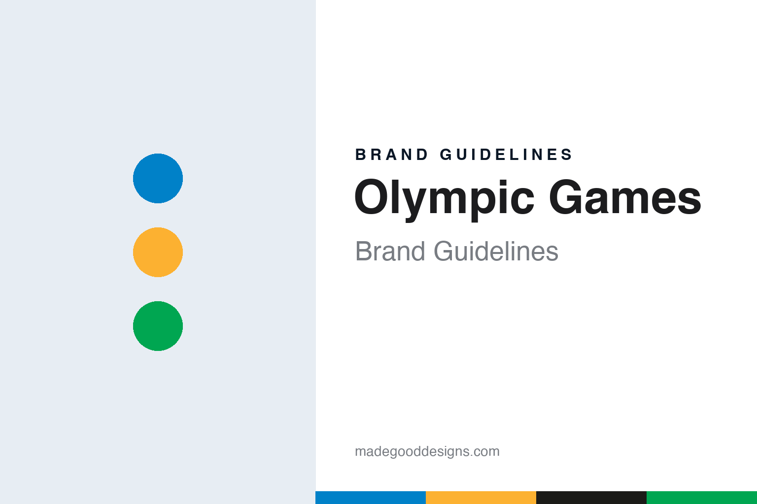
Olympic Games Brand Guidelines
Five rings drawn on a letterhead in 1913 that became the mark of the Games.
Aa
Two constants: a blue, yellow, black, green and red palette on white and a grotesque sans register. Abstract homage — not the Olympic rings, emblem or any protected mark; no logo is reproduced.
Antwerp
A letterhead in 1913, a flag in 1920.
The Olympic rings began as stationery. English Wikipedia says the symbol was created in 1913 by Pierre de Coubertin, the French educator who co-founded the International Olympic Committee and became its second president. Coubertin set out the idea in the August 1913 issue of the IOC’s magazine, Olympique, describing an emblem chosen for the 1914 World Congress: five rings linked at regular intervals, coloured blue, yellow, black, green and red, standing out against the white of the paper.
His own explanation was about flags rather than continents. In the 1913 text, quoted by Wikipedia, Coubertin wrote that the five rings represented “the five parts of the world now won over to Olympism,” and that the six colours, counting the white ground, reproduced the colours of every country’s flag. He listed the blue and yellow of Sweden, the blue and white of Greece, the tricolours of France, Britain, the United States, Germany, Belgium, Italy and Hungary, and the yellow and red of Spain, and he wrote that the emblem had been made to be turned into a flag.
The likely source of the device is an older badge. Creative Bloq, looking back at the design in July 2024, said Coubertin was probably inspired by the logo of the USFSA, the French sports union he had helped to found, which used two rings in the French red and blue. Wikipedia attributes the same link to the American historian Robert Barney, writing in the IOC’s Olympic Review in November 1992.
The war delayed the launch. Wikipedia says the 1914 Congress was suspended when the First World War broke out, so the symbol and flag made their Olympic debut at the 1920 Summer Olympics in Antwerp, Belgium. A flag bearing the rings had already been hoisted in Alexandria, Egypt, at the Pan-Egyptian Games of 1914. Creative Bloq gives the same sequence: drawn in 1913, used at Antwerp in 1920 after the planned Games were cancelled.
The colours were later given meanings Coubertin had not stated. Wikipedia says the IOC’s “Green Booklet” of 1949–50 matched each colour to a continent, blue for Europe, yellow for Asia, black for Africa, green for Australia and red for the Americas, and that the assertion was withdrawn in 1951 for lack of evidence that Coubertin had intended it. The present IOC view, as set out in the Olympic Charter and summarised by Wikipedia, is that the rings stand for the union of the five continents and the meeting of athletes at the Games, with no ring tied to any one continent.
Colour
Thinner lines, a lighter blue, and the interlace restored.
The mark has been redrawn twice. Creative Bloq reported in July 2024 that the original version used starker shades of blue and yellow and thicker rings than the version known today. The International Olympic Committee standardised the design in 1981, with thinner lines, a lighter blue and a darker yellow, and small spaces were opened where the rings cross. In 2010 the spaces were removed, bringing the rings back towards Coubertin’s interlaced original.
The flag has its own lineage. Wikipedia says the flag raised in Antwerp in 1920 could not be found at the end of those Games, and a replacement was made for the handover to Paris for 1924. The IOC still calls that replacement the “Antwerp Flag,” and it was passed from host city to host city at the Summer Games until Seoul in 1988, when Seoul presented a new flag. The Seoul flag served until London in 2012 and was then replaced by a flag from Rio de Janeiro. Wikipedia notes that the large flags flown over each stadium are made separately for every edition, and that they vary slightly in shade and in whether the rings carry white outlines.
The rings are also a legal asset. Wikipedia says the Olympic movement holds exclusive trademark rights to interlocking arrangements of five rings and to the word “Olympic” in many jurisdictions, and that the IOC asks host countries to pass laws giving the symbols special protection. In 1981 the Nairobi Treaty on the Protection of the Olympic Symbol, administered by the World Intellectual Property Organization, obliged its signatories to protect the symbol against commercial use without IOC authorisation. Wikipedia adds that the rings themselves are too old and too simple to qualify for copyright, so their protection rests on trademark law and these treaty obligations.
Each Games builds a second identity around the rings. The host city’s emblem, mascots, pictograms and signage change every edition, while the rings, the motto and the flag stay fixed. Wikipedia says the motto “Citius, Altius, Fortius” was proposed by Coubertin when the IOC was created, borrowed from his friend the Dominican priest Henri Didon, and introduced at the Paris Games of 1924. The kotinos, the olive wreath of the ancient Games, was revived for Athens in 2004 and used as that edition’s emblem.
Typography
Rings, emblems and pictograms.
A league or event identity has to work at sizes a single club badge rarely meets. The same emblem may sit on a sleeve patch, a corner flag, a ticket, a mobile app icon and a screen graphic in the corner of a live broadcast, often within the same afternoon. That pushes designers toward simple silhouettes, a limited set of colours and a wordmark that stays readable when it is shrunk to a few pixels or stretched across a stand.
Title sponsorship adds a second layer. When a company buys naming rights, its name is set beside or inside the competition mark, and the lock-up has to change when the contract ends. Organisers often keep a core symbol stable and treat the sponsor line as a replaceable module, so that kits, signage and graphics can be updated without redrawing the whole system.
Trophy imagery is a third resource. A cup, plate or shield is a recognisable shape, and some identities borrow its outline for the emblem itself. Broadcast graphics then extend the system with score bugs, line-up cards and motion templates, which is where a custom typeface or a strict grid tends to show its value.
Aa
A clear grotesque sans — the register of a stadium sign and a ticket. (Specimen set in Archivo, a sans-serif STAND-IN; NOT the Olympic rings or any Games emblem.)
Olympic Games
A designer from Ulm, a grid and a city in pastels.
Munich’s host identity is well documented. The Cooper Hewitt, Smithsonian Design Museum, wrote in December 2017 that the German designer Otl Aicher was hired in 1966 to design the iconography, language and overall graphic scheme of the 1972 Munich Games. By then Aicher had worked on the identities of Braun, from 1956 to 1966, and Lufthansa, from 1962 to 1964, and had co-founded the Ulm College of Design, a school built on a post-war revival of Bauhaus methods.
Aicher’s brief was partly historical. The museum quotes him as wanting Munich to keep the positive aspects of the earlier Berlin Games while removing their negative connotations, and it describes the result as an inclusive visual language that ran through every printed item, from tickets to winners’ certificates. Its centre was a set of pictograms for the sports and for standard services. The Cooper Hewitt says the figures were drawn on geometric grids, with rules setting the proportions of heads, torsos and limbs, and that a poster in its collection shows them as black and white squares on a silver-grey ground. Aicher, as quoted by the museum, wanted the Games to have “an unforced character” and to be “open, carefree, and relaxed.”
Other host cities built different systems on the same base. The IOC’s rings sit unchanged while each organising committee commissions its own emblem, colour scheme and sport icons, and the Antwerp and Seoul flags carry the rings from one host to the next at each closing ceremony. In design terms the Olympic brand is layered: a permanent mark owned by the IOC, and a temporary identity that belongs to one city for one edition.
The rings have kept their form for more than a century with only two documented redraws. The 1981 standard changed line weight and shade; the 2010 revision restored the interlace. The colours have stayed the same five, and the white ground has remained part of Coubertin’s reasoning about national flags.
For a design guide, the Olympic Games show how a single geometric mark can stay fixed while every host city designs a new identity around it. Compare FIFA, whose World Cup editions also take a new emblem each time, and Formula 1, which rebuilt its own mark in 2017. For this guide we use ring blue, yellow, green and red on white with a grotesque sans, an unofficial interpretation; no product or logo is reproduced.
Explore & save
Keep Olympic Games’s identity on hand — save it to a board in the Made Good inspiration library.
Olympic Games identity set
Pin the Olympic-inspired blue, yellow, green and red palette and the grotesque sans register to your own board.