Toronto Raptors Brand Guidelines
A contest name from a dinosaur film, and a black flag on Cherry Street.
Aa
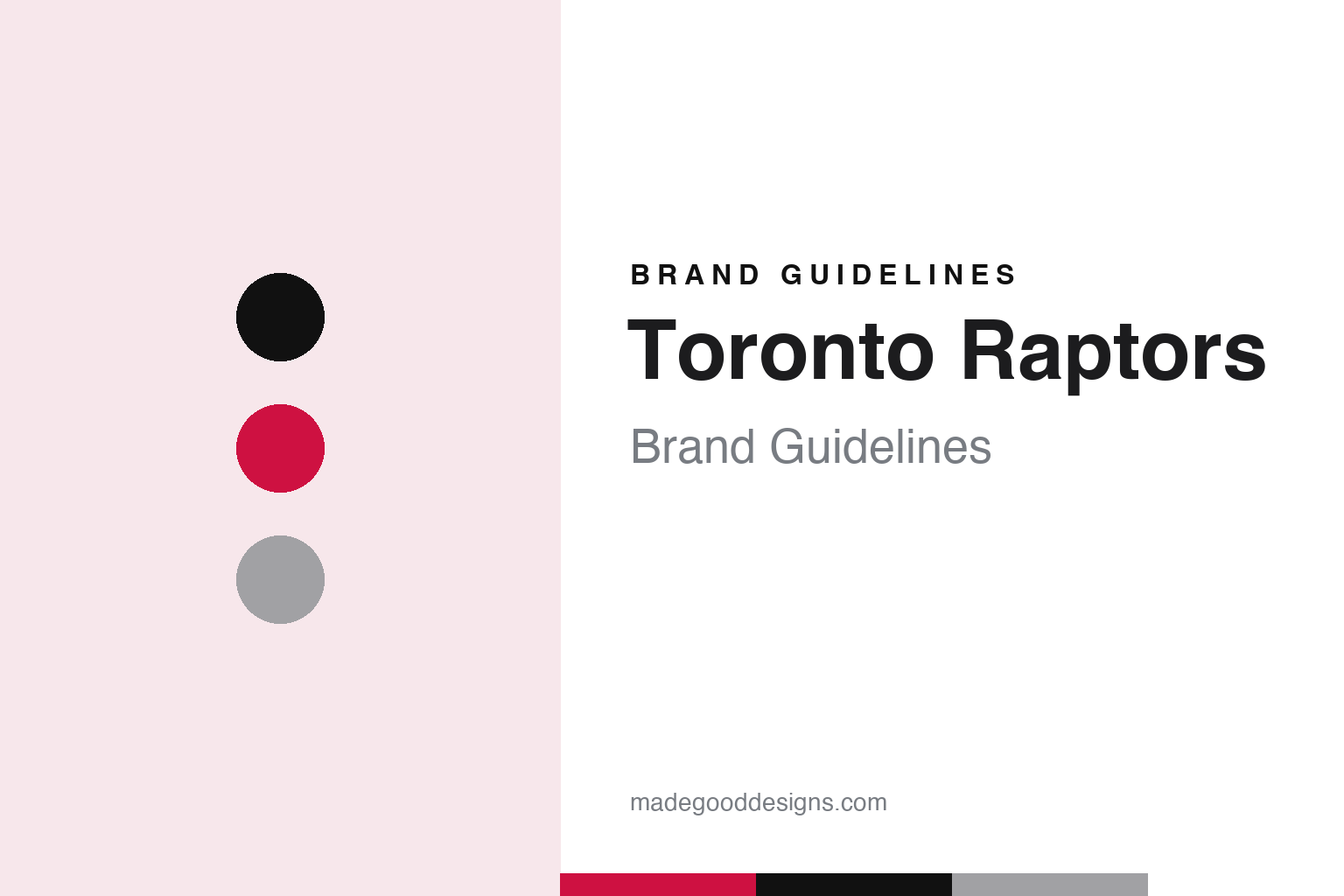
Two constants: a raptor red, north black and Naismith silver palette and a condensed athletic lettering register. Abstract homage — not a Toronto Raptors mark; no clawed ball, dinosaur or wordmark is reproduced.
A name from a contest
John Bitove’s group, a rejected Huskies revival and ten finalists.
The Toronto Raptors were formalised on 4 November 1993, when the NBA Board of Governors endorsed its expansion committee’s decision and awarded a franchise to a group headed by the Toronto businessman John Bitove, English Wikipedia says. His partners included Allan Slaight of Slaight Communications and the Bank of Nova Scotia. The team began play in the 1995–96 season.
The name did not come easily. Wikipedia, citing Michael Leo Donovan’s 1997 book The Name Game, says early sentiment favoured reviving the Huskies, the name of the Toronto club that played in the 1946–47 season of the league that later became the NBA, but that management decided it would be nearly impossible to draw a husky logo that did not resemble the Minnesota Timberwolves’ wolf. The club instead ran a nationwide contest to help choose the name, colours and logo.
Entries were narrowed to ten finalists, which Wikipedia lists as Beavers, Bobcats, Dragons, Grizzlies, Hogs, Raptors, Scorpions, T-Rex, Tarantulas and Terriers. The winner, “Toronto Raptors,” was unveiled on Canadian national television on 15 May 1994. Wikipedia says the choice was influenced by the popularity of the 1993 film of Michael Crichton’s novel Jurassic Park; “raptor” is the informal name for Velociraptor, one of the dinosaurs in the film. The logo and the team’s general manager, Isiah Thomas, were revealed at a press conference on 24 May 1994.
That logo was a cartoon. Wikipedia describes an aggressive-looking, featherless red velociraptor wearing white sneakers with exposed toe-claws, dribbling a silver basketball. The original colours were purple, bright red, black and “Naismith silver,” the last named in honour of the Canadian James Naismith. Wikipedia says purple was dropped for the 2008–09 season, leaving bright red as the dominant colour of the logo and jerseys.
Colour
Maple Leaf Sports & Entertainment and a pitch from Sid Lee.
The founding owners did not keep the team long. Wikipedia says the Raptors were acquired in 1998 by the owner of the Toronto Maple Leafs, which then renamed itself Maple Leaf Sports & Entertainment, and MLSE has owned the Raptors since 1998.
The brand’s next big change came through advertising rather than a logo. Writing in The Globe and Mail on 28 October 2014, Rachel Brady described how the Raptors’ marketing department had invited four local agencies to pitch branding ideas in late 2013, and how the agency Sid Lee won with a concept called “We The North.” Its manifesto cast the team and its supporters as outsiders from the north side. The plan, Brady wrote, was to use the idea as a starting point for a full rebrand with new logos and uniforms, timed to the team’s twentieth-anniversary season in 2015.
The schedule then changed. Brady reported that MLSE decided on 1 April 2014 to launch the campaign at once, about two weeks before the team’s playoff series. Sid Lee shot a 60-second commercial in Toronto in two days, using local basketball players rather than actors, on courts around the city, from Regent Park to Jane and Finch to St. James Town. A husky was brought onto one court as a nod to the 1946–47 Huskies. Tom Koukodimos, Sid Lee’s executive creative director, told the paper the team rewrote the short manifesto many times and wanted an unapologetic Canadian story.
The closing image was an accident of timing. According to the Globe, the shot of a black flag printed with “We The North” was not in the original pitch; a daylight attempt did not work, and it was filmed late on the final night on Cherry Street, against a dark sky. The team released the video on social media in the days before the playoff opener on 19 April, and the paper described black flags and T-shirts carrying the slogan appearing at games and around the city that spring.
Typography
Design and documentation.
A basketball identity is built for a small, bright stage. The jersey carries much of the load: a wordmark across the chest, a number front and back, and trim at the neck and armholes, all of which have to read on a moving body under arena lights and on a television screen at the same time. Designers tend to favour bold, condensed letterforms, a short list of flat colours and outlines clean enough to survive tackle twill, sublimation and screen printing. Numerals are often drawn as a dedicated set so that similar digits stay distinct at a distance.
The court is the other canvas. A centre-circle logo, baseline wordmarks and painted keys turn the floor into a wide graphic seen from directly above, and the colours chosen there have to work with wood grain, glare and broadcast cameras. Alternate uniforms add a further layer: city-themed editions, throwback sets and statement colours let a club test new lettering or reference local history without changing its primary marks. Arena naming then adds a sponsor’s name to the building, so signage systems have to balance the club’s palette with a partner’s logo on scoreboards, concourses and entrances.
Aa
A condensed athletic letter — the register of a jersey wordmark and a slogan on a flag. (Specimen set in Barlow Condensed, a condensed sans STAND-IN; NOT the Toronto Raptors logo or wordmark.)
Toronto Raptors
From a cartoon dinosaur to a torn ball inside a shield.
The logo followed the campaign. On 19 December 2014, Wikipedia says, the Raptors unveiled a new primary logo, which the team described as a circular shield holding a ball torn by the attack of a raptor. The dinosaur itself left the primary mark: what remains is the damage done by its claws, set inside a roundel in red, black and silver.
New uniforms came on 3 August 2015, unveiled with the video game NBA 2K16. Citing the team’s release, Wikipedia says the designs were meant as a tribute to Toronto and to Canada, with the main colours centred on Canada’s national colours of red and white and black and silver kept as trim. The chevrons on the side panels, which had pointed downward since they were introduced in 1999, were turned to point up, which the team linked to the “We The North” slogan. An upside-down tag at the hem carried the slogan so players could read it when tucking in their jerseys, a maple leaf went on the front of the waistband, and a letter “T” on the sides of the shorts, above the claw logo, referred to the city’s “T-Dot” nickname.
The early years have not been discarded. Wikipedia notes that the team has used the Toronto Huskies logo on court art for retro games, and the purple-and-red dinosaur has returned on throwback jerseys. The Huskies, the city’s 1946–47 team, reappear in both the court art and the 2014 commercial, giving a franchise founded in the 1990s a link to the city’s earlier basketball history.
For a design guide, the Toronto Raptors show how a contest name tied to a film could be reworked twenty years later into a sterner system, with an agency campaign setting the tone and a new logo and uniforms following it. Compare it with the Toronto Maple Leafs, the hockey club owned by the same company, and the NBA, whose uniform rules the Raptors’ kit follows. For this guide we use raptor red, north black and Naismith silver with a condensed sans, an unofficial interpretation; no product or logo is reproduced.
Explore & save
Keep Toronto Raptors’s identity on hand — save it to a board in the Made Good inspiration library.
Toronto Raptors identity set
Pin the Toronto Raptors raptor red, north black and Naismith silver palette and the condensed athletic lettering register to your own board.