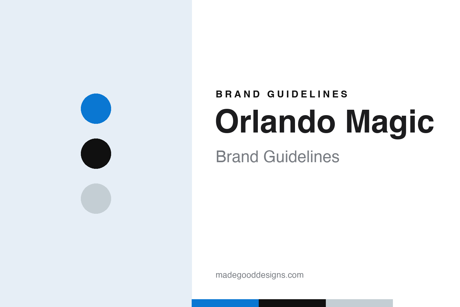
Orlando Magic Brand Guidelines
A tourist town’s theme, written in pinstripes and stars.
Aa
Two constants: an electric blue, pinstripe black and star silver palette and a tall condensed caps register. Abstract homage — not an Orlando Magic mark; no logo, jersey or wordmark is reproduced.
A name from the readers
Four finalists, a committee and a theme-park town.
The Orlando Magic grew out of a conversation in 1985. English Wikipedia says the Orlando businessman Jim L. Hewitt approached Pat Williams, then general manager of the Philadelphia 76ers, with the idea of bringing an NBA team to Orlando. Williams became the public face of the investment group after leaving the 76ers, and on 19 June 1986 the two held a news conference to announce that they would seek a franchise.
The name was settled before the team existed. According to Wikipedia, Hewitt and Williams ran a naming contest in the Orlando Sentinel newspaper, and the entries were narrowed to four finalists: Heat, Tropics, Juice and Magic. On 27 July 1986 it was announced that the committee had chosen “Magic.” Wikipedia says the name alludes to Walt Disney World and its Magic Kingdom, the area’s main tourist attraction, and quotes Hewitt describing Central Florida as “a magical place.”
The NBA then had to decide how many Florida teams to admit. Wikipedia says a franchise committee had recommended a three-team expansion with only one Florida slot, setting Orlando against a Miami bid, but after both groups made successful pitches the league expanded by four, awarding teams in 1987 to Orlando, Miami, Charlotte and Minneapolis–Saint Paul. Hewitt had brought in local investors, among them the real estate developer William duPont, and persuaded city officials to approve an arena project. The Magic began play in the 1989–90 season.
The original identity was the work of a local agency. Wikipedia credits The Advertising Works, an Orlando firm led by its president Doug Minear, with the original uniforms. The logo, a basketball surrounded by stars above a “Magic” wordmark in which a star replaced the A, was created after meetings with Walt Disney World artists and suggestions sent in from around the country. Wikipedia says Williams initially suggested the black and gold of his alma mater, Wake Forest, but the idea was dropped, partly because the local University of Central Florida already used that scheme.
Minear’s palette kept black as its main colour and paired it with silver and an electric blue that, according to Wikipedia, the sporting goods maker MacGregor produced specially for the team.
Colour
Durene pinstripes, sublimated stars and a cleaner decade.
The 1989 pinstripes took some engineering. Wikipedia says the home uniforms were white with black pinstripes, black numbers and blue trim, while the road uniforms reversed the scheme and carried “Orlando” instead of the “Magic” wordmark. Because the standard nylon mesh of the time could not carry pinstripes, the jerseys were made from durene, a fabric with cotton on the inside and polyester bonded to the outside. In 1994–95 the road uniform turned blue with white pinstripes, with the black version kept as an alternate.
Ownership changed early. Wikipedia says the DeVos family, founders of Amway, bought the franchise on 19 September 1991, with Richard DeVos as owner, and that his son-in-law Bob Vander Weide officially took over as owner on 15 November 2007, with ownership still shared among the DeVos children.
For the team’s tenth season, 1998–99, the club turned to fashion. Wikipedia says a new look by the designer Jhane Barnes moved the pinstripes to the sides and filled the background of the jerseys with stars, using a fabric that had been worn in the WNBA. In 2000–01 the logo itself was redesigned around a comet-like “shooting ball with stars,” keeping stars as a primary feature.
The fifteenth anniversary brought a cleaner set. Wikipedia says the 2003–04 uniforms dropped stripes and stars, setting “Magic” in blue block letters with silver and black trim on the white jersey and “Orlando” on the blue road jersey, with a small silver star beneath the collar. The original pinstripes still appeared several times a year as alternates.
They returned in full for the twentieth anniversary. According to Wikipedia, the 2008–09 uniforms brought back silver pinstripes on white and white pinstripes on blue, with a more modern font for the numbers and names. When the team moved to the Amway Center in 2010, it introduced a logo that spelled out “Magic” in full, without the star in place of the A, along with a black pinstriped alternate.
Typography
Design and documentation.
A professional basketball logo has to work at very different sizes: as a centre-court graphic seen from the rafters, as a small patch on a shorts leg and as a square icon on a phone. Clubs often keep a family of marks rather than a single emblem, pairing a primary logo with a wordmark, a monogram and a secondary badge that can stand in where space is tight. Redesigns usually adjust that family together, simplifying outlines, thickening strokes and limiting the colour list so the marks print cleanly on fabric and wood.
Uniform patterns carry much of a team’s personality. Pinstripes, side panels, gradient fills and skyline or landscape motifs give a jersey a recognisable silhouette even when the lettering cannot be read. Throwback or “classic” editions revive an older set for a season, often with its original typeface and trim, and they let a club test how fondly a past look is remembered before deciding whether to bring parts of it back permanently. Mascots add a third layer: a costumed character with its own colours and personality gives the identity a playful voice for younger audiences, community events and arena entertainment.
Aa
Tall condensed caps — the register of a theatre marquee and a pinstriped jersey number. (Specimen set in Bebas Neue, a condensed sans STAND-IN; NOT the Orlando Magic logo or wordmark.)
Orlando Magic
A dragon, a dozen alternates and a return to 1989.
The Magic’s mascot has been part of the identity from the start. Wikipedia says Stuff the Magic Dragon has been the team’s mascot since 1989; he was designed by Wade Harrison and Bonnie Erickson of Acme Mascots, and his name is a pun on the song “Puff the Magic Dragon” and on “stuffing,” a slang term for a slam dunk.
Alternates multiplied in the 2010s. Wikipedia describes a sleeved silver uniform with white pinstripes in 2014 and a carbon-coloured “Stars” alternate without pinstripes in 2016. When Nike took over the league’s uniforms in 2017, the Magic kept their set almost unchanged, and from 2019–20 a black uniform became the Icon set and a new blue one the Statement set, borrowing the silver star and black stripes of the 1989–98 look. A 2022–23 tweak added black pinstripes and subtle star patterns in the stripes.
The current identity looks straight back to the beginning. FOX 35 Orlando reported on 3 June 2025 that the Magic had revealed a new logo and new uniforms at a reveal event at the Kia Center in downtown Orlando. The station said the designs bring back the team’s star imagery, with a cascading star trail in the logo and the same star once more replacing the “A” in both “Orlando” and “Magic.” It described the update as the team’s major brand update to its primary look since the 2008–09 season and a tribute to the original 1989–98 design, and noted that pinstripes modelled on the club’s 1990s warm-up suits were back on the uniforms. FOX 35 quoted Shelly Wilkes, the Magic’s executive vice president of marketing and social responsibility, saying that the logo was developed with fan feedback in mind. Wikipedia adds that the new primary mark is a modernised version of the “streaking ball with stars” logo used from 1989 to 2000.
For a design guide, the Orlando Magic show how a single typographic idea, a star standing in for a letter, can carry a team through several redesigns and come back as the centre of a revival. Compare the Miami Heat, the Florida club admitted alongside the Magic, and the NBA, the league that expanded to Orlando in 1989. For this guide we use electric blue, pinstripe black and star silver with a condensed sans, an unofficial interpretation; no product or logo is reproduced.
Explore & save
Keep Orlando Magic’s identity on hand — save it to a board in the Made Good inspiration library.
Orlando Magic identity set
Pin the Orlando Magic electric blue, black and silver palette and the tall condensed caps register to your own board.