Miami Heat Brand Guidelines
A flaming ball for a new franchise, and a neon pink borrowed from a city’s own past.
Aa
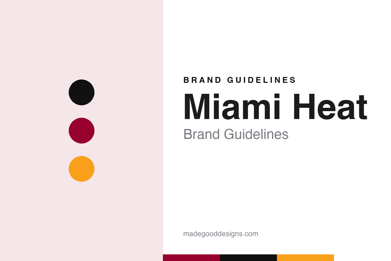
Two constants: a Heat red, court black and flame yellow palette, with a pink and turquoise accent, and a condensed arena lettering register. Abstract homage — not a Miami Heat mark; no flaming ball, wordmark or uniform is reproduced.
An expansion team
Billy Cunningham, Lewis Schaffel and a Carnival founder’s backing.
The Miami Heat were part of the NBA’s late-1980s expansion. English Wikipedia says the league granted Miami one of four new teams in 1987, alongside Orlando, Charlotte and Minnesota, and that the Heat began play in November 1988. The bid was led by former player and coach Billy Cunningham and former sports agent Lewis Schaffel, who ran the club day to day; their financial backer and majority owner was Ted Arison, founder of Carnival Cruise Lines.
Writing in The Washington Post in May 2005, in a profile republished by NBC News, Amy Shipley wrote that the elder Arison helped bring the Heat to Miami but had little involvement in its day-to-day operations. She also recorded that Ted Arison had died in 1999.
Wikipedia’s history of the club says the name Heat had been chosen through a survey in October 1986, before the franchise was awarded, and that once the team had been accepted into the league its logo was created by Mark Henderson, a Miami artist who had studied at the Art Institute of Fort Lauderdale. The mark he drew is a basketball wrapped in flame, usually called the flaming ball, and a modified version of it is still on the uniform.
The first uniforms set the colours. Wikipedia says the 1988 home kit was white with lettering in red, black and orange, and the road kit black with red, white and orange trim. The striping ran down only the right side of the jersey and shorts, and the flaming ball sat on the left leg of the shorts. A red alternate followed in the 1995–96 season.
Colour
From the founding partners to Micky Arison.
Control of the club moved within the Arison family in the mid-1990s. Shipley wrote in the Post that Ted Arison had handed his son Micky Arison partial ownership of the Heat in the early 1990s, and that Micky, deciding he needed full control, bought out Schaffel and Cunningham in early 1995. Wikipedia dates the purchase of the controlling interest to 13 February 1995. Micky Arison, who had run Carnival since 1979 according to the same profile, then hired Pat Riley as head coach and team president later that year, and has controlled the Heat since 1995.
The building and the uniforms changed together at the turn of the century. Wikipedia says the current Heat uniforms date from the 1999–2000 season: striping on both sides, the orange trim changed to yellow, new lettering and block numbers, and a modified flaming ball on the right leg. The logo was updated at the same time, and on New Year’s Day 2000 the team played its first game at a new downtown arena, then called American Airlines Arena and now Kaseya Center. A red alternate with the city name in white was added in 2001–02.
When Nike became the NBA’s uniform supplier for the 2017–18 season, Wikipedia says, the white set became the “Association” uniform, the black set the “Icon” and the red set the “Statement,” all worn regardless of venue. Around that core the club has worn a long run of special sets. Wikipedia lists “El Heat” uniforms for the league’s Noche Latina nights from 2008, throwbacks honouring the ABA’s Miami Floridians, monochrome sets in black, white and red, a tuxedo-inspired design in 2015, and a 2023–24 City uniform built around the phrase “HEAT Culture,” with a number font based on the 1988–99 kit.
The team has said it does not plan to replace the core look. In a December 2018 ESPN feature, Michael McCullough, the Heat’s executive vice president and chief marketing officer, told Zach Lowe that the red, black and white uniforms were not going anywhere because the club had a lot of brand equity in them.
Typography
Design and documentation.
A baseball or basketball team carries its identity in a small number of places, and each one has its own rules. On a baseball cap the mark is usually reduced to a monogram or a single letter, sized to sit on a front panel and to read from the stands. On a jersey the same team may switch to a script wordmark, a looping hand-lettered name stitched across the chest, or to straight block lettering for numbers and player names on the back.
Basketball adds a large printed surface: the court. Centre-circle logos, painted keys, baseline wordmarks and the colour of the wood stain all become part of how a club looks on a broadcast. Arena signage, scoreboards and seat colours follow the same palette.
Mascots turn a logo into a costumed character for families and for merchandise, and they are often redesigned more freely than the crest itself. In recent seasons, city-edition uniforms and alternate sets have given clubs room to borrow local colours, neighbourhood names and period lettering without changing the primary mark. The guides in this series look at how each team handles those layers.
Aa
A tall condensed letter — the register of an arena sign and a block jersey number. (Specimen set in Anton, a condensed sans STAND-IN; NOT the Miami Heat logo, wordmark or Miami Arena lettering.)
Miami Heat
A mood board, an old arena sign and a stripe on one leg.
The Heat’s Vice alternate began as a refusal. Zach Lowe reported for ESPN on 12 December 2018 that when Nike took over the league’s uniforms and pitched ideas for the new “City Edition” sets, the Heat looked at Nike’s proposals, which included a jersey with a palm-tree print, and sent them back because they already had a plan. The result was the “Vice” uniform, worn for the 2017–18 season in white, followed by a black version and a pink “Earned Edition” set the next season.
The colours came from television. Lowe wrote that the uniforms use the pink and turquoise of the wordmark from the 1980s police drama set in the city, and that the club took care never to put the words “Miami” and “Vice” together in a way that could suggest a link to NBCUniversal’s property; McCullough said the team called the company to give it notice. Lowe also noted that Micky Arison had teased the idea of pink-and-turquoise jerseys on Instagram in August 2015.
The design was done in-house. Brett Maurer, the Heat’s graphic designer, told ESPN that he sent his five-person team around Miami for inspiration and built a mood board of images and colours, then tried fronts from busy to bright before settling on the single word “Miami.” A slanted, neon-sign script felt generic. While studying the club’s archive for its 30th anniversary, Maurer found a photograph of the original Miami Arena and its lettering, and used that type instead; he called it the turning point. The shorts carry pink and turquoise trim on the right leg only, as the 1988 uniforms did, and the court for the black set added a double band of pink and turquoise round all four sides, a nod to the double banding on the old Miami Arena floor.
For a design guide, the Miami Heat show how a club can keep one flaming-ball mark and a red, black and white core while letting a city edition borrow colour and lettering from the city itself and from the team’s own first arena. Compare it with the NBA, whose Nike uniform system created the City Edition, and Nike, which proposed the first ideas the Heat turned down. For this guide we use Heat red, court black and flame yellow, with pink and turquoise accents, and a condensed sans, an unofficial interpretation; no product or logo is reproduced.
Explore & save
Keep Miami Heat’s identity on hand — save it to a board in the Made Good inspiration library.
Miami Heat identity set
Pin the Miami Heat Heat red, court black and flame yellow palette and the condensed arena lettering register to your own board.