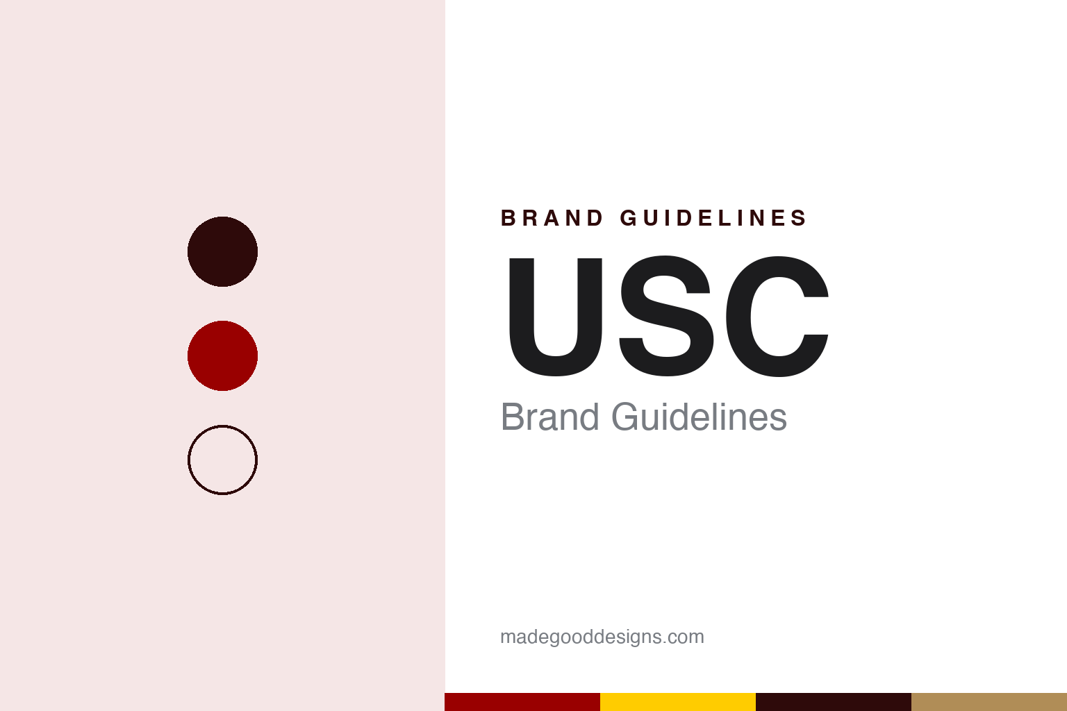
USC Brand Guidelines
Cardinal, gold and a nickname from a sports column.
Aa
Two constants: a cardinal and gold palette and an old-style serif register. Abstract homage — not a USC mark; no shield, seal, monogram or Trojan head is reproduced.
Palmam qui meruit ferat
Methodists, Wesleyans, Cardinals — then Trojans.
The University of Southern California dates its founding to October 6, 1880, in Los Angeles. English Wikipedia credits the effort to Judge Robert Maclay Widney, who secured gifts of land and money from three figures in the young city: the nurseryman Ozro Childs, the former governor John Gately Downey and the banker Isaias Wolf Hellman. The school was originally operated in affiliation with the Methodist Church and, Wikipedia says, severed formal church ties in 1952. Its Latin motto is Palmam qui meruit ferat — let whoever earns the palm bear it.
The name its athletes are known by arrived three decades later, and it arrived in a newspaper. The Daily Trojan, the student paper, marked the centenary in February 2012. The nickname appeared in the Los Angeles Times, the paper wrote, when the sportswriter Owen Bird previewed a track meet between USC and Occidental College in 1912, referring to “Dean Cromwell’s USC Trojans on the Bovard cinder trail.” That year, the Daily Trojan said, USC athletes stopped being called the Methodists, Wesleyans and Cardinals. Asked decades later why he chose the name, Bird said USC athletes faced bigger and better-equipped teams yet had a fighting spirit, and that the name Trojans fitted them.
The name has since organised much of the visual culture. The athletic department launched a “100 Years as Trojans” celebration in 2012 with a dedicated logo for its events, the Daily Trojan reported, and J.K. McKay, a senior associate athletic director, spoke in the same story of the “Fight On!” mindset, a phrase students quoted there used too.
The name also has a three-dimensional form: a statue. The Trojan Shrine, known as Tommy Trojan, is a life-size bronze warrior near the centre of campus. English Wikipedia says it was sculpted by Roger Noble Burnham, who used USC football players as visual references, and unveiled during the university’s 50th Jubilee in 1930. Its base carries five attributes of the ideal Trojan — faithful, scholarly, skilful, courageous and ambitious — and a plaque on the reverse quotes Virgil. Wikipedia notes that the statue is covered during the week of the football game against UCLA, whose blue and gold paint it has received in the past.
Colour
Two colours, specified twice.
USC’s colours are cardinal and gold, and the university specifies them with unusual care for the difference between paper and screen. Its identity site, as archived in February 2021, said USC Cardinal and USC Gold are equal in importance in identifying the university. For printed materials and products it named PMS 201C for cardinal and PMS 123C for gold, and asked that every print job match the coated Pantone chips, whether the stock was coated or uncoated, with drawdowns requested to check accuracy.
The site also warned against shortcuts. For each colour it listed a direct CMYK conversion marked “Do Not Use” alongside a proper bridge conversion for uncoated work, and then an approved screen version: for cardinal, RGB 153, 27, 30 and hex #990000; for gold, RGB 255, 204, 0 and hex #FFCC00. Alternate versions of the two colours, the site said, should be used for anything displayed on a screen rather than printed, including websites, mobile apps, kiosks and presentations.
The colours appear across the athletic marks, but the athletic identity has not always relied on a costume. English Wikipedia says USC’s official mascot is Traveler, a horse. The Daily Trojan reported in March 2024 that a costumed Tommy Trojan character — arched eyebrows, cartoonish muscles and a grin — had made his debut a little over ten years earlier, in 2013, at a basketball game, alongside a cartoon version of Traveler wearing a basketball jersey. Sam Carter, a former creative director of auxiliary services who had previously designed costumes as an art director at Disneyland, told the paper the costumes were created to build school spirit and to sell merchandise to younger fans, from plush toys to a short-lived comic. The cartoon Traveler, the paper wrote, did not connect with fans and was gradually retired.
Neal Pecchenino, who wore the Tommy suit at its debut, told the Daily Trojan that the response at that opening game was split roughly down the middle — half the fans loved it and half did not.
Typography
Design and documentation.
University identities tend to be built from a small, repeatable kit. A torch, a seal or a shield carries the formal voice: it appears on diplomas, official documents, building plaques and the covers of commencement programmes, and it changes rarely because its job is continuity. Alongside it, a simpler wordmark or monogram does the everyday work on websites, signage, letterheads and merchandise, where a detailed seal would blur at small sizes or on a phone screen.
Colour does a surprising amount of the lifting. Many institutions are recognised by a single hue that runs through athletics kit, banners, lanyards and digital templates, and identity manuals usually fix that hue in print and screen values so it reproduces the same way on a sweatshirt as on a slide. A secondary palette of neutrals and accents then gives designers room without diluting the core colour.
Mascots form a third layer. Sports programmes often commission their own marks, with a more playful drawing style and separate usage rules, so a campus may run a formal seal, a clean academic wordmark and an animated athletics character side by side. Reading a university brand well means understanding how those layers divide the work between ceremony, administration and the playing field.
Aa
An old-style serif for a shield and a Latin motto. (Specimen set in Libre Caslon Text, a Google font close in spirit to the Adobe Caslon Pro named in USC’s 2011 identity — a STAND-IN; NOT a USC typeface or logo.)
USC
A shield taken from the seal.
The current academic identity dates to 2011. The Daily Trojan reported in November of that year that the university had launched a new graphic identity, with a redesigned logo and monogram, new typefaces and a shield as a main part of the scheme. The shield, the paper explained, is part of the university seal. The new system replaced logos that had been in place for more than 16 years.
The work was done with the design firm Pentagram, which, the Daily Trojan said, helped produce new identity guidelines, including the selection of primary logotype fonts: Adobe Caslon Pro, National and Frutiger. Each of USC’s academic units was to receive a new logotype. The paper reported that, for consistency, the university adopted a policy prohibiting any additional iconography beyond the new university shield, the seal and the Trojan head, and that the guidelines set strictly enforced requirements for colour combinations, alignment and how logos may be combined.
The Daily Trojan tied the change to the expansion of USC’s schools and other entities and to a push for a more explicit, streamlined logo and set of icons, with the aim of a stronger and more unified image across the campus community. Under the new rules each academic unit was to be identified by its own logotype rather than by separate iconography, and the guidelines, the paper said, would soon appear across campus, in publications and on websites.
For a design guide, USC shows how a nickname coined in a newspaper column can become an entire visual vocabulary — a bronze statue, a helmeted head, a costumed character — while a shield from the seal keeps the academic side formal. Compare Stanford and UC Berkeley. For this guide we use cardinal and gold with a serif, an unofficial interpretation; no product or logo is reproduced.
Explore & save
Keep USC’s identity on hand — save it to a board in the Made Good inspiration library.
USC identity set
Pin the USC cardinal and gold palette and the old-style serif register to your own board.