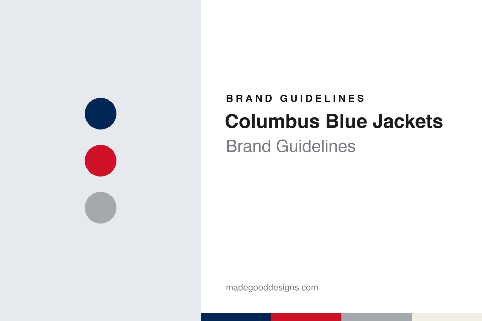
Columbus Blue Jackets Brand Guidelines
A Civil War name, a state flag wrapped around a star and a cannon that fires for every home goal.
Aa
Two constants: a Union navy, flag red and cannon silver palette and a Civil War broadside serif register. Abstract homage — not a Columbus Blue Jackets mark; no flag crest, cannon logo, wordmark or jersey is reproduced.
A name taken from Ohio’s Union regiments
A naming contest, two finalists and a nod to the Civil War.
Columbus came into the National Hockey League through an expansion bid in the late 1990s. English Wikipedia says five investors formed a partnership called Columbus Hockey Limited in November 1996 and applied to the league, and that one of them, the Worthington Industries founder John H. McConnell, privately assured the league that an arena would be built whether or not a public vote passed. When a May 1997 referendum on a publicly financed arena failed, the insurer Nationwide announced on 31 May 1997 that it would pay for the building, and on 25 June 1997 the NHL announced that Columbus would receive a new franchise. The team began play in the 2000–01 season at Nationwide Arena in downtown Columbus, which opened the same year.
The name came out of a public contest. Wikipedia says a “Name the Team” promotion ran across central Ohio in August 1997 with the help of the restaurant chain Wendy’s, and that the entries were narrowed with the league’s help to a shortlist of ten. Using McConnell’s input on the city’s history, the club and the league cut the list to two: Blue Jackets and Justice. The Blue Jackets name was announced in November 1997. Writing in The Hockey News on 28 July 2014, Rory Boylen confirmed that the two finalists were the Columbus Blue Jackets and the Columbus Justice, and that McConnell was the majority owner when the name was picked.
The words refer to soldiers, not insects. Wikipedia says the name was chosen to celebrate “patriotism, pride, and the rich Civil War history in the state of Ohio and city of Columbus,” recalling the volunteer regiments the state raised for the Union Army and the military camps in Columbus, Camp Chase and Camp Thomas, through which Union soldiers and Confederate prisoners passed. Boylen put it plainly in 2014: the team is named for the Union’s blue coats, not for the stinging insect that later became the mascot.
Colour
From a ribbon of stars to a flag wrapped around a star.
The original Blue Jackets logo leaned on patriotic symbols rather than military gear. Quoting the team’s own description, Boylen wrote in The Hockey News in 2014 that the primary logo was a red ribbon studded with stars and unfurled in the shape of the team’s initials, CBJ, with a hockey stick cutting through the centre to form the “J.” The club said the stars on the ribbon stood for the thirteen original colonies and for patriotism, and that an extra star placed on top of the stick marked Columbus as the state capital.
A second mark arrived in 2003. Wikipedia describes it as a stylised version of the flag of Ohio, the state’s swallowtail pennant or burgee, shaped into a “C” wrapped around a single star that again points to Columbus as the capital. It began as an alternate logo and became the primary crest as part of a Reebok-sponsored redesign for the 2007–08 season. Boylen called it a smoother, big-league look and noted that the way the flag sweeps around the star forms a subtle C for Columbus, in red, white and blue.
The uniforms have kept the same base. Wikipedia says the club has worn navy and white jerseys with red pants since it started. The early uniforms carried the CBJ crest on the chest and an alternate logo of the mascot, Stinger, on the shoulders. In 2003 the flag logo replaced Stinger on the shoulders and became the main crest of a navy alternate jersey with black stripes and three stars on the sleeves. When the league moved to Reebok in 2007, the club promoted that alternate to primary status, dropped the black and kept a single star on the sleeve.
The mascot nearly had a bigger role. On 16 March 2010 the uniform blog Icethetics quoted the Columbus Dispatch beat writer Aaron Portzline, who wrote that if not for the club’s former president and general manager Doug MacLean, Stinger would have been the main logo when the team took the ice in 2000. Wikipedia describes Stinger as a yellow jacket who was originally yellow and later changed to green, and says that for half of the 2010–11 season the club also had a second mascot, an anthropomorphic cannon called Boomer.
Typography
Design and documentation.
When a new club needs a name, the choice is sometimes handed partly to the public. A shortlist of candidates is published, supporters vote or submit ideas, and the final pick is announced at an event built for the reveal. Some clubs also play a first season under a placeholder: a city name with a plain word such as “club” or “team” after it, worn on a simple interim crest while the permanent identity is still being drawn. That gap gives designers time to test colours, wordmarks and secondary marks before the full set is fixed.
Military and historical references are another long-running source for sports marks. Flags, stars, period uniforms, cannons and regional history can give a crest a story that points to the place rather than to the game itself, and the details of those references often reappear in alternate jerseys and shoulder patches. Arenas add a further layer. A horn, a siren, a cannon blast or a particular song after a goal can become as recognisable as any logo, and those rituals are often written into how a club presents itself on match nights, in broadcasts and on merchandise.
CBJ
Civil War broadside serif — the register of a recruiting poster, a regimental flag and a crest on navy wool. (Specimen set in Libre Baskerville, a serif STAND-IN; NOT the Columbus Blue Jackets logo or wordmark.)
Columbus Blue Jackets
A cannon on the sweater, a cannon in the arena and a soldier’s pin on the shoulder.
The cannon became the club’s second big symbol. In the same March 2010 report, Portzline wrote that NHL sources had told the Dispatch that the Blue Jackets’ new third sweater, due the following season, would feature a cannon as the central part of the main logo. Wikipedia says the navy alternate arrived in 2010 with the cannon crest and with light blue, silver and vintage white accents in place of red. The cannon replaced the CBJ crest on the primary uniforms in 2015, recoloured in red and navy, and the lettering and numbers were updated in 2017. Apart from a one-season break after the league’s move to Adidas in 2017–18, the navy and vintage white alternate set has stayed in use.
The arena has a real cannon too. Wikipedia says that before the 2007–08 season the club brought a hand-made replica of an 1857 Napoleon cannon into Nationwide Arena. It is fired when the Blue Jackets take the ice, when they score and when they win; after a goal the arena plays the title line of AC/DC’s “For Those About to Rock (We Salute You)” as the cannon goes off, followed by the chorus of “The Whip” by Locksley.
Recent special uniforms have gone back to both the club’s own archive and its military theme. For 2020–21 the team wore an Adidas “Reverse Retro” jersey based on the original Stinger-era white uniform but with a red base, and a second Reverse Retro took the 2003–07 alternate and set it on black with light blue stripes. For the 2025 Stadium Series, Wikipedia says the club wore dark blue uniforms with white, silver and red trim, the cannon crest on the front and a new CBJ shoulder patch with two crossed hockey sticks, a nod to the unit pins worn on the front of a soldier’s slouch cap. An outline of Ohio framed the captaincy patches.
Ownership has stayed with one family. The club’s founder-and-ownership page names John P. McConnell, son of John H. McConnell, as majority owner, and lists Nationwide as a minority owner whose partnership includes the naming rights to the arena.
For a design guide, the Columbus Blue Jackets show how a club can take one historical idea, Ohio’s Union soldiers, and spread it across a state-flag crest, a cannon logo, an arena ritual and even a shoulder patch. Compare the NHL, the Cleveland Guardians, another Ohio club, and the Minnesota Wild, who joined the league in the same 2000–01 season. For this guide we use Union navy, flag red and cannon silver with a serif, an unofficial interpretation; no product or logo is reproduced.
Explore & save
Keep Columbus Blue Jackets’s identity on hand — save it to a board in the Made Good inspiration library.
Columbus Blue Jackets identity set
Pin the Columbus Blue Jackets Union navy, flag red and cannon silver palette and the Civil War broadside serif register to your own board.