Minnesota Wild Brand Guidelines
A forest at dusk that turns out to be an animal’s head.
Aa
Two constants: a forest green, Iron Range red and Minnesota wheat palette and a sturdy northwoods slab serif register. Abstract homage — not a Minnesota Wild mark; no animal-head logo, wordmark or jersey is reproduced.
A wild name for a hockey state
Six finalists, a suburban rink and a rock song on the speakers.
Minnesota lost its first National Hockey League club when the North Stars, based in the state since 1967, moved to Dallas after the 1992–93 season. English Wikipedia says the businessman Bob Naegele Jr., a Minnetonka native, became the lead investor behind an application for an expansion franchise, and on 25 June 1997 the NHL announced that Minnesota had been awarded a team to begin play in the 2000–01 season. CBC Sports reported on 10 January 2008 that Naegele and his group had formed Minnesota Sports and Entertainment in 1997, the year the expansion franchise was awarded, and that the group also owned the arena where the team plays.
The name came out of a public shortlist. Wikipedia says six finalists were announced on 20 November 1997: Blue Ox, Freeze, Northern Lights, Voyageurs, White Bears and Wild. The team was officially named the Wild at an unveiling at Aldrich Arena in suburban Maplewood on 22 January 1998, with Steppenwolf’s “Born to Be Wild” playing over the arena’s speakers. Jac Sperling, named chief executive in the same period, led the new front office alongside the general manager Doug Risebrough.
The thinking behind the name was tied to place rather than to any single creature. Reporting for WCCO and CBS Minnesota on 10 November 2022, Heather Brown wrote that when the logo was introduced in 1998, the club’s chief executive at the time described it as a nod to Minnesota’s “rugged natural wilderness.”
The team played its first game at Anaheim on 6 October 2000, according to Wikipedia, and plays its home games in St Paul. Wikipedia says the building opened as the Xcel Energy Center and is now called Grand Casino Arena.
Colour
A forest, a river and a star that double as an animal’s face.
The Wild’s primary logo is a picture that works two ways. Wikipedia describes it as both a forest landscape and the silhouette of a wild animal: pine trees, a sky and water fill the outline of an animal’s head. The animal’s eye is a north star, which Wikipedia says is a tribute to the departed Minnesota North Stars and to the state motto L’Étoile du Nord, “The Star of the North.” The same entry says the animal’s mouth stands for the Mississippi River, which starts in Minnesota.
Writing in Creative Bloq on 2 June 2023, Joe Foley described the scene as an allusion to the state’s geography and its nickname, the Land of 10,000 Lakes, and noted that the lake forms the animal’s mouth while the North Star becomes its eye. Foley wrote that the club itself has said the logo depicts a non-specific “wild animal,” which has left fans arguing over whether it is a bear or a cat. Since the article first ran, Foley added, a reader pointed out that the river mouth can also be read as a loon, the state bird.
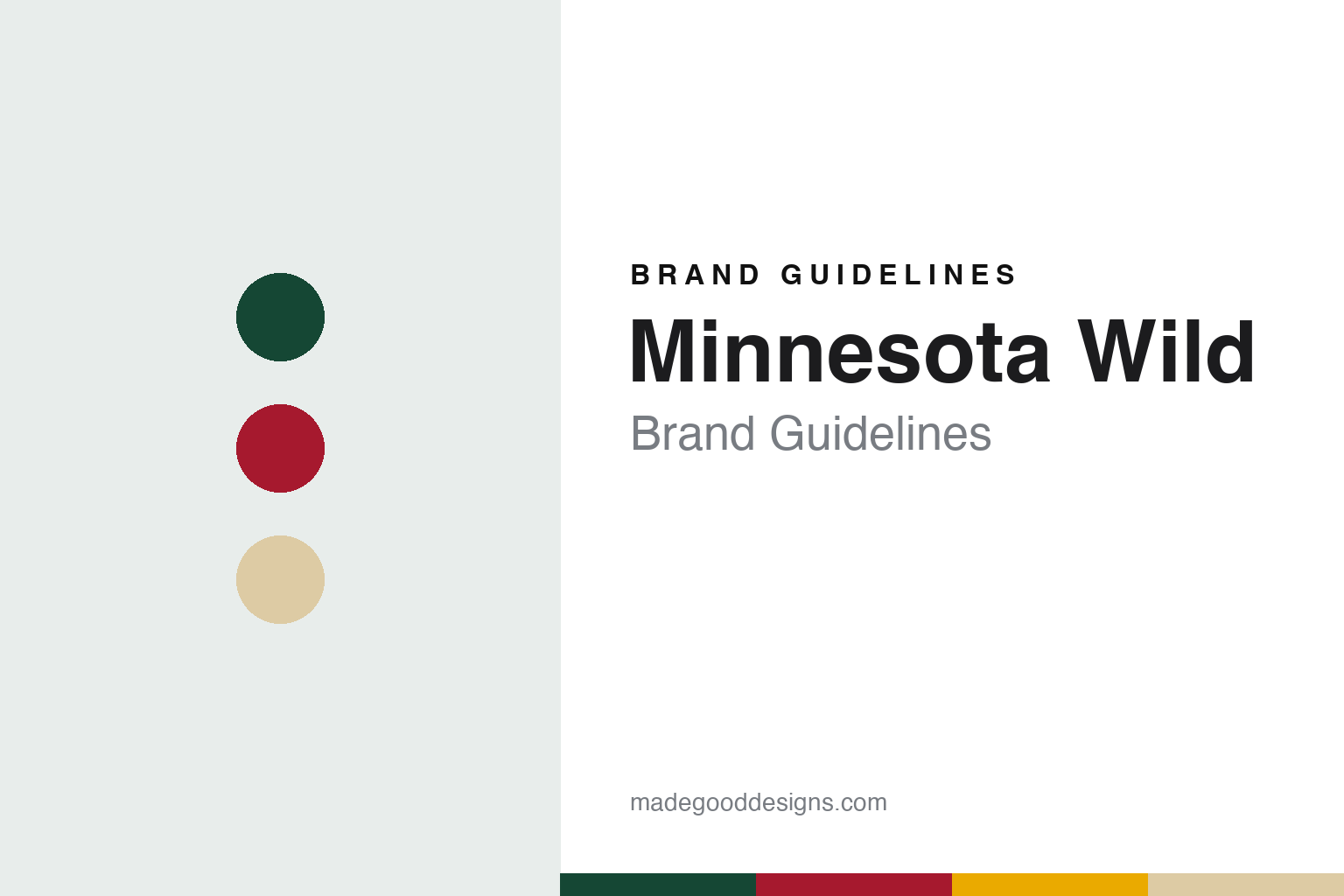
The colours carry place names. Heather Brown reported for WCCO in 2022 that the Wild’s official colours are Iron Range Red, Forest Green, Harvest Gold and Minnesota Wheat.
The early uniforms set that pattern. Wikipedia says that for the club’s first seven seasons the Wild wore green or white jerseys with red and gold stripes and the primary logo on the front, with a circular shoulder patch carrying the words “Minnesota Wild.” On the green jersey the names and numbers were gold with red outlines; on the white jersey they were red with gold outlines. When the league reversed its home and road convention in 2003–04, the green jersey became the home uniform.
The look shifted toward red in 2007–08, when all NHL teams moved to the Reebok Edge system. Wikipedia says the new home jersey was predominantly red, with a small version of the logo set inside a white circle that was itself ringed by the words “Minnesota Wild” on green, and green sleeve panels outlined in wheat. On 30 August 2009 the club added a green third jersey with wheat accents and “Minnesota Wild” written in script across the chest.
Typography
Design and documentation.
Hockey clubs added during expansion periods usually begin with a blank sheet: a new name, a new crest and a set of colours chosen before a single game has been played. Those early decisions tend to lean on place. Designers often reach for local landscape, wildlife, regional history or a civic symbol, so that the mark feels rooted in the city even though the club itself is new. Colour names follow the same instinct, with teams describing their reds, greens, golds and blues through references to local industry, forests, rivers or civic heritage rather than plain swatch labels.
Crests also change over time. A club may introduce a sharper, more illustrative mark in one era, then later return to a simpler letterform or an older emblem drawn from the city’s earlier hockey history. These heritage returns are usually presented as a reconnection with the past and often arrive alongside new jerseys, refreshed wordmarks and updated arena graphics. Arenas carry their own visual traditions too, from goal songs and horns to banners and entrance rituals, and those elements become part of how a hockey brand is experienced as much as any logo printed on a sweater.
MN
Sturdy northwoods slab serif — the register of a cabin sign, a lake-country map and a crest on green wool. (Specimen set in Bitter, a slab serif STAND-IN; NOT the Minnesota Wild logo or wordmark.)
Minnesota Wild
Green at home, North Stars throwbacks and a song for the State of Hockey.
The current home look arrived with the league’s switch to Adidas. Wikipedia says that on 20 June 2017 the Wild introduced a green home jersey with the main logo and a wheat-coloured stripe running through the centre, with wheat and a thinner red stripe on the arms; the away jersey stayed as it was. The 2013 update to the road jersey had already moved the lettering and striping toward a more traditional hockey look.
Several alternate designs have looked back at Minnesota’s earlier hockey history. On 4 April 2017 the team wore North Stars jerseys in warm-ups. Its first “Reverse Retro” jersey, made with Adidas for the 2020–21 season, was a callback to the North Stars’ late-1970s white uniform with the Wild logo recoloured in green and gold; the design returned in 2022–23 with green as the base colour. On 23 September 2023 the club unveiled a green alternate based on that look, with a recoloured “State of Hockey” logo on the right shoulder and captaincy patches shaped like the outline of Minnesota.
The 2022 Winter Classic jersey drew on early Minnesota teams. Wikipedia says it was mainly green with a red shoulder yoke and red and wheat stripes, and its crest set a “MPLS.–ST. PAUL” identifier around a red state silhouette with “MN” inside and two wheat stars referring to Gemini, the twin constellation. Brown gloves and pants recalled early 20th-century equipment. For the 2025–26 season, the club’s 25th in the NHL, the original white jersey came back for four games.
Sound is part of the arena brand as well. Wikipedia says the first goal songs, in 2000–01, were “Born to Be Wild” and “Rock and Roll Part 2.” In 2016 the team held a tribute to the Minneapolis musician Prince at a playoff game and adopted his “Let’s Go Crazy” as a goal song; it later became the win song, followed by the team’s fight song, “The State of Hockey.” The mascot Nordy was introduced in 2008.
Ownership changed the same year. CBC Sports reported on 10 January 2008 that Craig Leipold, who had founded the Nashville Predators, agreed to buy the majority shares held by Naegele and his group; Wikipedia says the league’s Board of Governors approved the purchase of Minnesota Sports & Entertainment on 10 April 2008. Leipold has owned the club since 2008.
For a design guide, the Minnesota Wild shows how a team with no animal in its name can still draw one, by hiding it inside a landscape and giving every colour a place name. Compare the NHL, the Minnesota Twins, who share the Twin Cities market, and the Dallas Stars, the former North Stars. For this guide we use forest green, Iron Range red and Minnesota wheat with a slab serif, an unofficial interpretation; no product or logo is reproduced.
Explore & save
Keep Minnesota Wild’s identity on hand — save it to a board in the Made Good inspiration library.
Minnesota Wild identity set
Pin the Minnesota Wild forest green, Iron Range red and Minnesota wheat palette and the sturdy northwoods slab serif register to your own board.