Ottawa Senators Brand Guidelines
A Roman profile in a gold half-circle, on black and red.
Aa
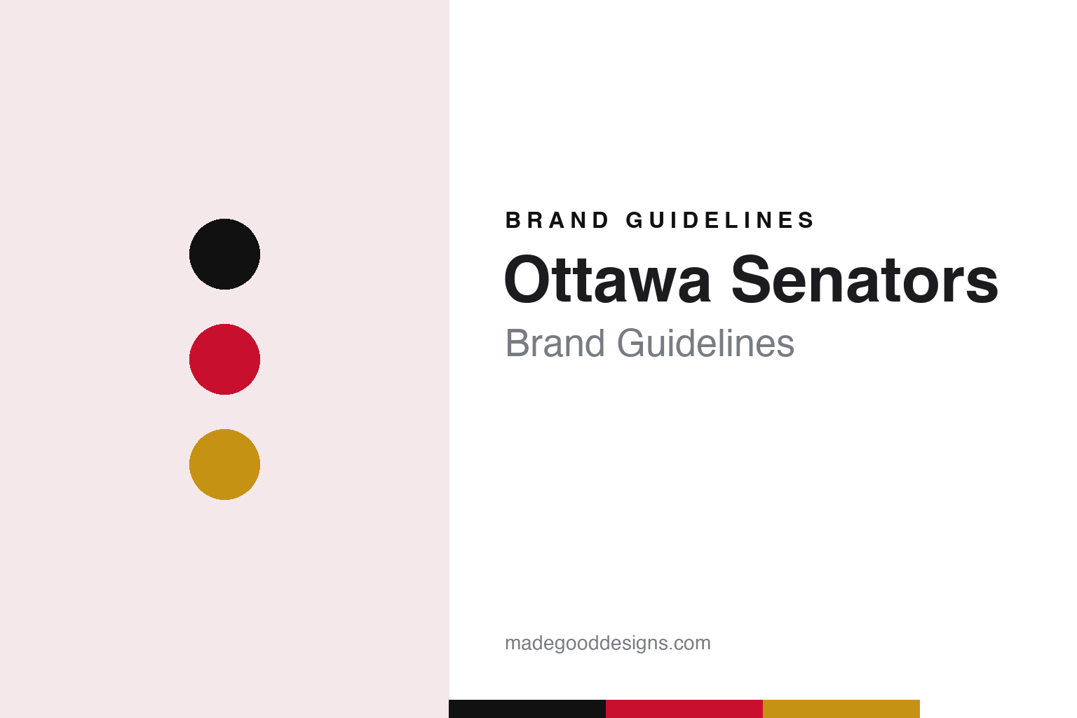
Two constants: a Senate black, Senators red and laurel gold palette and a Roman inscriptional capitals register. Abstract homage — not an Ottawa Senators mark; no centurion logo, O crest or jersey is reproduced.
An old name for a new club
A developer’s campaign, a revived name and a Roman face.
The Ottawa Senators carry a name much older than the club. English Wikipedia says the original Ottawa Senators were founded in 1883, played in the National Hockey League from 1917, and left for St Louis in 1934, where they played as the Eagles. For more than half a century afterwards Ottawa had no NHL team, although the Senators name stayed in use in local amateur hockey.
The modern club was the project of Bruce Firestone, an Ottawa real estate developer. Wikipedia says that after a two-year public campaign led by Firestone, the NHL awarded Ottawa a new franchise on 6 December 1990, and the team began play in the 1992–93 season.
The logo came first. Wikipedia says the original mark was unveiled on 23 May 1991, more than a year before the first game, and that it shows the head of a Roman general, a member of the Senate of the Roman Republic, set inside a gold semicircle. Its designer, Tony Milchard, described the figure as “a centurion figure, strong and prominent.” Wikipedia adds that the logo was criticised by fans at first, and that Milchard hoped people would grow to like it. Over the following three decades the club has redrawn its Roman figure several times and, in 2020, went back to the first version.
The colours also reach back to the old club. Wikipedia says the team colours are black, red and white with gold trim, and that apart from the gold they match the colours of the original Senators.
A shoulder crest made the historical link explicit. Wikipedia says the first jerseys carried a winged “S” with “Est.” and a year in Roman numerals, 1894, which at the time was believed to be the founding year of the original club. That crest was used from 1992–93 through 2006–07 and was brought back in 2020 with slightly different colouring.
Colour
Two-dimensional, then forward-facing, then back to the start.
The first uniforms were simple. Wikipedia says the club’s road jerseys from 1992 to 1995 were black with red stripes, with red numbers in the first season and white afterwards; white stripes were added in 1995. The white jerseys, worn at home until 2003 and on the road until 2007, had black sleeves, tail stripes with red accents and black lettering.
A second Roman face arrived in 1997. Wikipedia says that year the Senators unveiled a red third jersey carrying the first version of a forward-facing centurion logo, designed by Kevin Caradonna, head of the team’s graphic design department, who also designed the mascot. The red jersey became the team’s main dark uniform from 1999. From 2000 to 2007 the club also wore a black alternate with gold, red and white accents.
The league’s move to Reebok’s Edge jerseys brought another redesign. On 22 August 2007 the Senators unveiled a new set that, according to Wikipedia, used the original Senators’ “O” as a shoulder patch, and the club switched its logo usage so that an updated version of its former secondary mark became the primary. Wikipedia quotes the owner at the time, Eugene Melnyk, as saying the new primary logo “represents strength and determination.” A black third jersey with the shortened “SENS” across the front followed before the 2008–09 season.
The heritage theme grew stronger after that. In 2011 the club introduced a black third jersey with horizontal stripes meant to recall the original Senators’ “barber-pole” sweaters, plus shield-shaped shoulder patches like those the early club added after championship seasons; the patches spell the team name in English on one side and French on the other. Wikipedia says the design came out of a collaboration between the club and a fan in Gatineau, Quebec, who had been sharing a version online since 2009, and that it was the basis for the cream jerseys worn at the 2014 Heritage Classic. Before the 2018–19 season the club brought back the red jerseys from the NHL 100 Classic as a third uniform, with a silver “O” on the front.
Then the club went back to its first logo. Josh Wegman reported for theScore on 18 September 2020 that the Senators were returning to their old “2D” logo, and that the only change was gold trimming on the cape instead of red. Melnyk said in the announcement that it was “time to return to our heritage but in a bold, new manner,” and Wegman reported that new home and away uniforms would be shown on 6 October at the NHL draft.
Typography
Design and documentation.
Hockey clubs added during expansion periods usually begin with a blank sheet: a new name, a new crest and a set of colours chosen before a single game has been played. Those early decisions tend to lean on place. Designers often reach for local landscape, wildlife, regional history or a civic symbol, so that the mark feels rooted in the city even though the club itself is new. Colour names follow the same instinct, with teams describing their reds, greens, golds and blues through references to local industry, forests, rivers or civic heritage rather than plain swatch labels.
Crests also change over time. A club may introduce a sharper, more illustrative mark in one era, then later return to a simpler letterform or an older emblem drawn from the city’s earlier hockey history. These heritage returns are usually presented as a reconnection with the past and often arrive alongside new jerseys, refreshed wordmarks and updated arena graphics. Arenas carry their own visual traditions too, from goal songs and horns to banners and entrance rituals, and those elements become part of how a hockey brand is experienced as much as any logo printed on a sweater.
OTT
Roman inscriptional capitals — the register of a senator’s profile, a laurel half-circle and a bilingual shoulder shield. (Specimen set in Cinzel, an inscriptional serif STAND-IN; NOT the Ottawa Senators logo or wordmark.)
Ottawa Senators
Throwbacks in red and black, a lion, bagpipes and a train horn.
Recent alternates have mixed the club’s own past with the older one. Wikipedia says the Senators’ first “Reverse Retro” uniform, in 2020–21, used the original 1992–93 design with red as the base colour, and that the 2022–23 Reverse Retro was based on the 1997–2007 alternates, with the current 2D logo on the front and black as the base. Before the 2025–26 season the club added a red alternate with the primary logo as its crest and gold and black stripes on the waist, shoulders and sleeves. The winged “S” crest returned to the shoulders in 2020.
The arena has its own traditions. The team has played at what is now Canadian Tire Centre since the building opened in 1996. Wikipedia says live music at home games includes the traditional Scottish music of the Sons of Scotland Pipe Band of Ottawa, along with highland dancers. The mascot is Spartacat, an anthropomorphic lion who made his debut on the club’s opening night, 8 October 1992. When the Senators score, the goal horn is a Nathan Airchime taken from a retired VIA Rail train, first used at the old Ottawa Civic Centre, and the goal song is Blur’s “Song 2.” Like other Canadian arenas, the building hears O Canada before the opening faceoff, sung in Ottawa partly in English and partly in French.
Wikipedia says Senators games are broadcast on both the English-language TSN and the French-language RDS networks, under a long-standing agreement with Bell Media.
Ownership has passed through several hands. Wikipedia says Eugene Melnyk bought the club in August 2003. On 13 June 2023 the Senators announced a purchase agreement with a group of investors led by Michael Andlauer, a Toronto businessman. The Associated Press reported, in a story carried by ESPN on 22 September 2023, that the NHL had announced the transfer of the club to Andlauer’s group had been unanimously approved by the league’s board of governors and completed, and that Andlauer would assume control of team operations immediately. Wikipedia says Melnyk’s daughters remain partners in the group. Andlauer’s group has owned the club since 2023.
For a design guide, the Ottawa Senators show how a revived name can drive a whole visual system: a Roman profile, a winged “S” with a Roman-numeral date, barber-pole stripes and bilingual shields all point back to the city’s earlier club. Compare the NHL, the Toronto Maple Leafs, their Ontario rivals, and the Montréal Canadiens. For this guide we use Senate black, Senators red and laurel gold with an inscriptional serif, an unofficial interpretation; no product or logo is reproduced.
Explore & save
Keep Ottawa Senators’s identity on hand — save it to a board in the Made Good inspiration library.
Ottawa Senators identity set
Pin the Ottawa Senators black, red and laurel gold palette and the Roman inscriptional capitals register to your own board.