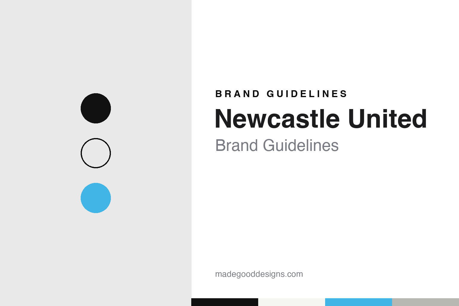
Newcastle United Brand Guidelines
Two Tyneside clubs became one name, and a reserve-team strip became the city’s stripes.
Aa
Two constants: a black, white and Tyne blue palette and a condensed sans register. Abstract homage — not a Newcastle United crest, kit or mark; no logo is reproduced.
St James’ Park
A cricket club’s football side, a rival’s ground, and a name for one city.
Newcastle United grew out of a cricket club in Byker. English Wikipedia says the Stanley Cricket Club formed a football team on 15 November 1881, and that the side was renamed Newcastle East End in October 1882 to avoid confusion with the cricket club in Stanley, County Durham. Across the city, Newcastle West End was formed from West End Cricket Club in August 1882 and moved into St James’ Park in May 1886. The two became rivals in the Northern League.
Only one of them survived. Wikipedia says West End ran into serious financial trouble and approached East End about a takeover. West End was dissolved, several of its players and backroom staff joined East End, and East End took over the lease on St James’ Park in May 1892. The club that moved in was East End in a new home, carrying some of its old rival’s people with it.
The new name was chosen to say so. Wikipedia says East End wanted to draw bigger crowds by recognising the change, and considered 1892 Newcastle, Newcastle Rangers, Newcastle City and City of Newcastle before deciding on Newcastle United on 9 December 1892, to signify the unification of the two teams. The Football Association accepted the change on 22 December, although the company Newcastle United Football Club Co. Ltd. was not legally constituted until 6 September 1895.
The stripes came two years later and were borrowed from the reserves. Wikipedia says the club’s early colours were East End’s home kit of plain red shirts with white shorts and red socks. In 1894 the club adopted the black-and-white striped shirts that had been used as the reserve team’s colours, chosen for the senior team because they were not associated with either of the two clubs it had grown from. The shorts were grey until 1897 and blue from 1897 to 1921, before the black shorts still worn today.
Away kits have moved around far more. Wikipedia lists white shirts with black shorts from 1914 to 1961, a yellow shirt with blue shorts in 1967–68, all red from 1969 to 1974 with an all-blue third kit, a return to yellow, and an all-grey strip from 1983 to 1988. Since 1995 the away kit has changed almost every season.
The ground is part of the brand too. St James’ Park sits in the centre of the city. Wikipedia says the old West Stand was replaced by the Milburn Stand in 1987 and the Leazes End by the Sir John Hall Stand in 1993. The St James Metro station that serves it is decorated in a black-and-white scheme with archive photographs of the club’s players, and the team walks out before home games to “Going Home.”
Colour
A city coat of arms, a magpie by the river, and sea horses on the shirt.
The club’s nickname and its crest come from two different places. The black-and-white stripes give the team its familiar name, the Magpies, while the crest has leaned on the city’s heraldry for much of the past half-century.
The city came first. English Wikipedia says the coat of arms of Newcastle upon Tyne was embroidered on the team’s shirts from 1969 and worn as standard until 1976. It carried a scroll with the city’s Latin motto, fortiter defendit triumphans, which Wikipedia translates as “triumphing by brave defence.”
Then came a badge made for the club. From 1976 to 1983, Wikipedia says, the team wore a circular design that spelled out the club’s full name and showed a magpie standing in front of the River Tyne, with the historic keep of Newcastle behind it. A simpler mark followed in 1983: the initials NUFC, with a small magpie tucked inside the horizontally laid “C.” It was discontinued after 1988.
The current crest dates from the 1988–89 season. Wikipedia says it takes its elements from the city arms: two sea horses, which stand for Tyneside’s connection with the sea, and a castle that represents the city’s keep. The introduction to the same article describes the sea creatures as two grey hippocamps. The magpie that once stood by the river has given way to the heraldry of the place.
Special editions have reached back to the arms again. Wikipedia says the home shirt for 2017–18, revealed on 15 May 2017, carried a gold and silver commemorative crest based on the city coat of arms to mark the club’s 125th football season, and that the shirt numbers were red, as they had last been in 1992–93.
Black and white is the constant underneath all of it. A plain striped shirt, black shorts and black or white socks make the kit recognisable even before the crest is visible, and the city has adopted the pairing in places beyond the ground, from the Metro station to the stands.
Typography
Clubs, crests and colours.
English club crests draw on a small set of visual sources. Some borrow directly from heraldry, with rampant lions, shields, mottoes and stars arranged in the manner of a coat of arms. Others take an animal associated with a club’s nickname, such as a fox, a bird or a hammer-bearing figure, and render it as a simple silhouette. Many lean on the arms of the town or city the club represents, adapting towers, ships, rivers or civic symbols into a badge that can sit on a shirt, a programme cover or a stadium wall.
Crests change over time. Clubs redraw them to work at small sizes, on screens and on merchandise, to simplify fine detail, or to register a mark as a trademark. A redesign can be contentious, because supporters often treat the badge as part of their own identity, and several clubs now run fan consultations, surveys or supporter panels before a new crest is adopted. Some redesigns have been revised or withdrawn after supporters objected.
Shirt sponsorship sits alongside the crest on the kit. Sponsor names, kit-maker logos and sleeve partners appear on the front of the shirt, and they change far more often than the badge itself, which is one reason the crest and club colours carry so much of a club’s visual continuity.
Aa
A condensed sport sans — the register of a shirt number and a stand sign. (Specimen set in Oswald, a sans-serif STAND-IN; NOT the Newcastle United logo.)
Newcastle United
Local families, a flotation, Mike Ashley, and a 2021 consortium.
For much of the twentieth century the club was run by local families. English Wikipedia says Newcastle United was set up as a private company limited by shares in 1895 and was dominated by the McKeag, Westwood and Seymour families. John Hall became chairman in 1992 and floated the club on the stock exchange in April 1997.
Mike Ashley bought the club in 2007. Wikipedia says he acquired the Hall family’s stake through a holding company, St James Holdings, and delisted the club from the London Stock Exchange in July 2007. His era also touched the ground’s name: in November 2009 the stadium was temporarily styled sportsdirect.com @ St. James’ Park, and in November 2011 it became the Sports Direct Arena, before the St James’ Park name was restored in October 2012.
The current owners arrived in 2021. City AM reported on 7 October 2021 that the club had confirmed the completed takeover by an investment group led by Saudi Arabia’s Public Investment Fund, together with PCP Capital Partners and RB Sports & Media. The group said it had acquired Newcastle United Limited and Newcastle United Football Club Limited from St. James Holdings, completing the deal on 7 October 2021 and ending Ashley’s 14 years as owner. The Premier League said it had approved the takeover after receiving legally binding assurances that the state of Saudi Arabia would not control the club.
The shirt has had many makers. Wikipedia lists Bukta and Umbro in the 1970s and 1980s, Asics from 1993, Adidas from 1995 to 2010, Puma from 2010 to 2021 and Castore from 2021 to 2024, with Adidas returning in 2024. Front-of-shirt names have included Newcastle Breweries, McEwan’s Lager and Newcastle Brown Ale, Northern Rock, Virgin Money, Fun88, Sela and, from 2026, Knox Hydrate.
The club has trained at Darsley Park in Benton, north of the city, since July 2003, Wikipedia says, and it plays in the Premier League.
For a design guide, Newcastle United shows how a strip borrowed from a reserve team can become a city’s colours, while the crest moves from city arms to a magpie by the river and back to sea horses and a castle. Compare Manchester United, whose Newton Heath side also took a new name, and Tottenham Hotspur, whose crest is also a single bird. For this guide we use stripe black, stripe white and Tyne blue with a condensed sans, an unofficial interpretation; no product or logo is reproduced.
Explore & save
Keep Newcastle United’s identity on hand — save it to a board in the Made Good inspiration library.
Newcastle United identity set
Pin the Newcastle United black, white and Tyne blue palette and the condensed sans register to your own board.