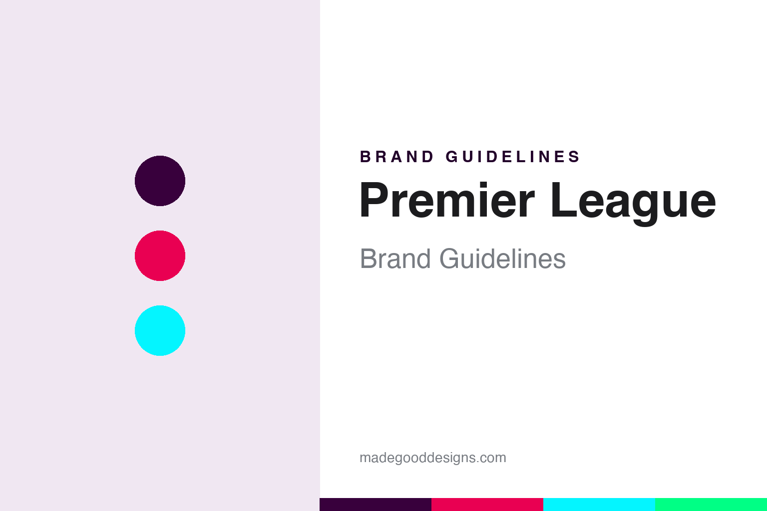
Premier League Brand Guidelines
A crowned lion, deep purple and electric accents — English football’s sponsor-free identity.
Aa
Two constants: a deep purple with electric accents and a modern sans. Abstract homage — not the Premier League lion or wordmark.
A lion, sponsor-free
The Premier League dropped a sponsor’s name and found its own identity.
The Premier League’s logo is a stylised purple lion’s head wearing a crown, set above the “Premier League” wordmark. It came from a 2016 rebrand by the agency DesignStudio (with Robin Brand Consultants), launched for the 2016–17 season — the moment the league ended its title sponsorship with Barclays and became simply the Premier League, with no sponsor name in front of it. A precise point: the lion isn’t new — it dates to the league’s 1992 founding (the old “Barclays Premier League” logo showed a full lion with a football) — DesignStudio redrew and stripped it back to the crowned head, rather than inventing it. (Another nice detail: the palette was designed to be refreshed every three seasons, so “the” purple shifts over time.)
The Premier League was formed as a limited company on 27 May 1992, when the top clubs of the Football League First Division broke away to capture a lucrative TV deal (a then-record Sky/BBC contract), with the first season kicking off in August 1992. It has become the most-watched football league in the world. The lion is a symbol of English football heritage (echoing the “Three Lions” of the England national team). On structure: the Premier League is a corporation whose 20 member clubs are each shareholders, with promotion and relegation to and from the Football League — and, notably, it has been title-sponsor-free since 2016–17 (it dropped Barclays and did not take a new title sponsor, which is exactly what enabled the clean “Premier League” name and identity). Note: it was founded with 22 clubs, reduced to 20 from 1995–96.
Colour
The Premier League runs on purple and electric accents. Click a swatch to copy the hex.
The Premier League’s signature colour is a deep, rich purple (#38003C) — distinctive and ownable in a football world dominated by team reds, blues and whites — paired with a vivid, modern accent palette: a magenta/pink (#E90052), a bright cyan (#04F5FF) and an electric green (#00FF85), on white. (An honest, precise note: #00FF85 is the green, not the cyan — the cyan is #04F5FF, so don’t mislabel them.) The purple gives the league a premium, neutral identity that doesn’t favour any club’s colours, while the electric accents make it feel contemporary, energetic and digital-first — perfect for a global broadcast and social brand. The purple-and-neon system is the ownable core.
The lesson is a neutral signature colour plus vivid accents. The Premier League chose purple precisely because it belongs to no club — a neutral, ownable league colour — then added electric accents for modern energy. For designers, it’s a smart model: a distinctive, category-neutral primary colour gives a governing brand independence, and a bright accent palette keeps it contemporary across digital and broadcast. The takeaways: pick a signature colour that stands apart and stays neutral (purple, when your members all have their own colours); layer in vivid accents for a modern, digital feel; and label your colours precisely (the green is #00FF85, the cyan #04F5FF).
Typography
The wordmark is a modern, bold sans — clean and contemporary.
The Premier League’s modern, bold sans wordmark is clean and contemporary — a deliberate, sponsor-free statement of the league’s own identity. Freed from carrying a sponsor’s name, the 2016 rebrand could make “Premier League” itself the wordmark, set in confident, modern letterforms that read as global, premium and digital-first. Paired with the crowned lion and the purple-and-neon palette, it feels energetic and forward-looking rather than traditional or stuffy — matching a competition that is as much a global media brand as a football league. (Because the exact face is custom, the honest description is “a modern, bold sans,” not a named font.) The typography behaves like the brand: clean, confident and contemporary — the look of a league that finally speaks in its own name.
Aa
A modern, bold sans — clean and contemporary. (Specimen set in Exo 2, a modern sans in the spirit of the Premier League wordmark; the real face is custom.)
Owning your own name
The Premier League’s rebrand was about identity independence.
The Premier League is a lesson in the power of owning your own identity. For years it was the “Barclays Premier League,” its brand shared with a sponsor; the 2016 DesignStudio rebrand was really about independence — dropping the sponsor name entirely and building a distinctive, ownable identity around the crowned lion, the deep purple and the electric accents. That was a confident, unusual move (most leagues chase title sponsors), and it worked: the Premier League now has one of sport’s most distinctive, contemporary and consistent identities, unencumbered by anyone else’s branding. The lion, redrawn and stripped back, became a clean symbol of English football that belongs to the league alone.
For designers and brand-builders, the Premier League offers a clear takeaway: owning your identity — free of a sponsor’s name — can be worth more than the sponsorship. The lessons: a distinctive, ownable identity (a redrawn heritage lion, a neutral purple, electric accents) gives a brand independence and long-term equity; refreshing a heritage element (the lion) rather than inventing a new one preserves recognition while modernising; and a bold, category-neutral colour sets a league apart from its member clubs. It’s also a reminder to keep facts precise — the 2016 rebrand (DesignStudio) dropped Barclays and the lion was redrawn, not created, in 2016; the league was formed in 1992 (with 22 clubs, now 20); and #00FF85 is the green. The Premier League turned dropping a sponsor into a distinctive, independent brand — proof that owning your own name and identity is a powerful move.
Explore & save
Keep Premier League’s identity on hand — save it to a board in the Made Good inspiration library.
Premier League identity set
Pin the purple-and-neon palette and the type spirit to your own board.