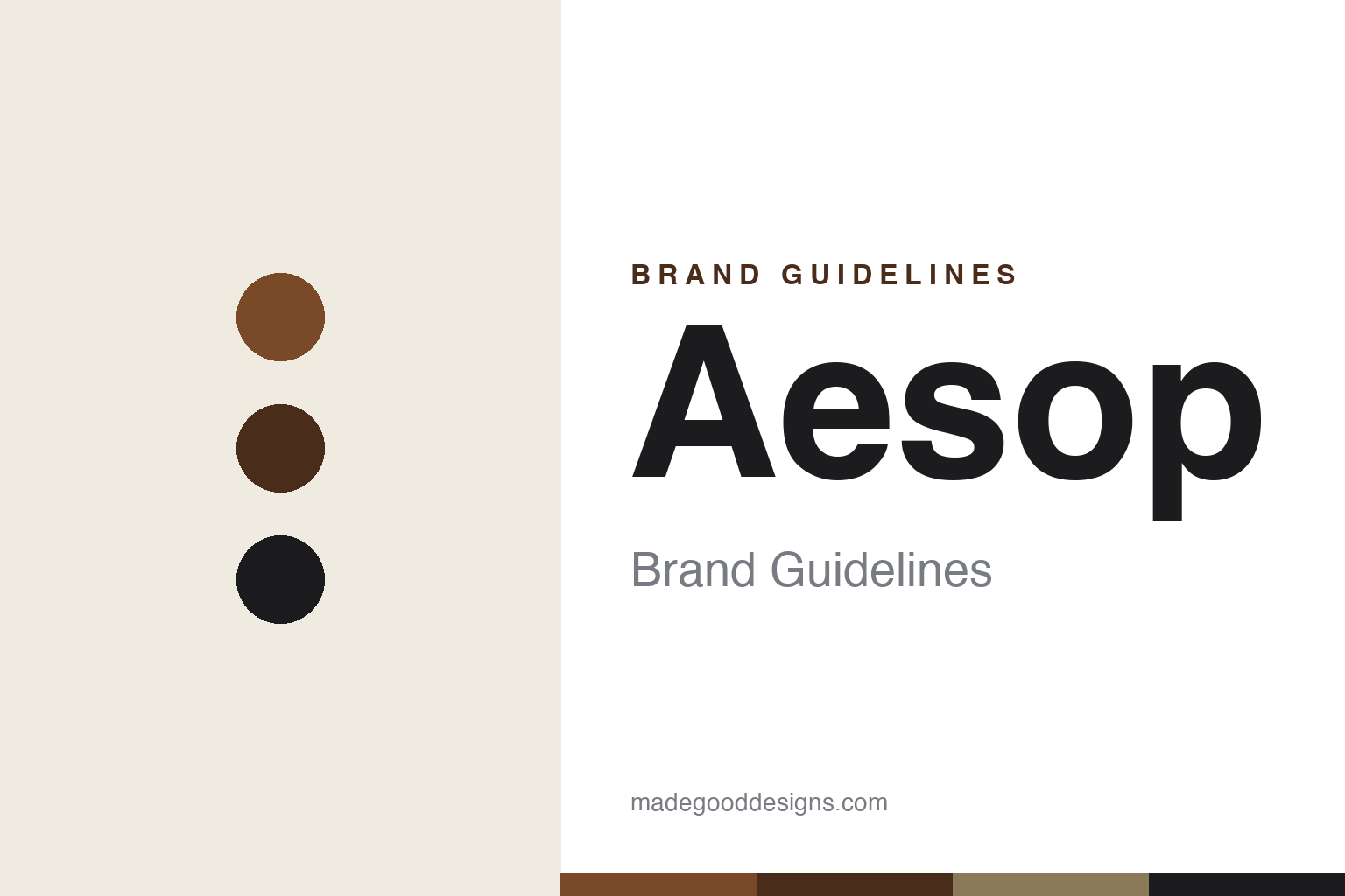
Aesop Brand Guidelines
Amber bottles, chemist-plain labels and a store that’s never the same twice — beauty designed to look like anything but beauty.
Aa
Two constants: an amber-and-ink apothecary palette and a flared humanist sans logotype. Abstract homage — not the Aesop logotype or bottle.
An apothecary, not a beauty brand
Aesop dressed skincare as chemistry — amber glass, dense labels, zero glamour.
Aesop is a masterclass in looking like the opposite of a cosmetics brand. Its products sit in amber-brown apothecary bottles — the light-protecting pharmacy glass you’d expect from a chemist, not a luxury beauty house — wrapped in dense, information-heavy labels set in small, plain type. Founder Dennis Paphitis deliberately rejected the industry’s “fairy-tale” packaging of gloss, gold and glamour; the label reads more like a prescription than a promise, listing ingredients and directions in a clinical, understated way. The effect is intellectual, restrained and unmistakably Aesop — a brand that signals seriousness by refusing to sell a fantasy.
The logotype is a crucial (and widely mis-described) detail. Aesop’s wordmark is not a serif — it is set in Optima, the elegant flared humanist sans-serif designed by Hermann Zapf, whose strokes swell subtly at the terminals without ever becoming true serifs. Body copy on the classic labels is Helvetica Neue. Together, a refined flared sans for the name and a neutral grotesque for the detail create a look that is quiet, literary and precise. (An honest caveat: the Optima and Helvetica Neue attributions are well-documented by type-spotters rather than published in an official Aesop specimen, so treat them as reported, not brand-confirmed; and Aesop publishes no official public hex, so the amber and ink values here are approximate.)
Aesop was founded in 1987 in Melbourne, Australia, by Dennis Paphitis, a hairdresser who began by blending botanical, plant-based formulations for his salon. The name is a deliberate literary joke: it references Aesop, the ancient Greek fabulist, chosen to gently mock the cosmetics industry’s tall tales — a piece of brand wit that underpins Aesop’s bookish, intelligent voice to this day. In 2023, L’Oréal acquired Aesop for US$2.525 billion — its largest-ever brand acquisition — from Brazil’s Natura &Co, which had owned the brand since taking a stake in 2012 and full control by 2016.
Colour
Aesop lives in amber and ink. Click a swatch to copy the hex.
Aesop’s palette is amber-brown, black and cream — the colours of pharmacy glass, printed paper and ink. The amber comes straight from the bottle; the black and off-white come from the label. It’s an earthy, muted, almost monastic scheme with no bright colour anywhere, and that restraint is the point: it reads as natural, serious and apothecary-like, exactly the register a brand mocking cosmetic “fairy tales” wants. The honest caveat: Aesop publishes no official public hex, so the amber (~#7A4A28) and ink here are approximations of the on-shelf reality rather than a confirmed spec.
The lesson is a palette drawn from materials, not fashion. Aesop didn’t pick trendy colours; it let the amber glass and printed label define the scheme, so the identity feels honest and grounded. For designers, it’s a reminder that a restrained, material-led palette can signal authenticity and quality far more convincingly than a loud one. The takeaways: derive colour from your real materials (pharmacy amber, kraft paper, ink); embrace restraint when your positioning is “serious, not showy”; and treat specific hexes as approximate when the brand’s colour lives in a physical object rather than a published value.
Typography
The logotype is a flared humanist sans — Optima, not a serif.
Aesop’s flared humanist sans logotype is the quiet signature of the whole brand. Optima’s letterforms have the proportions and grace of classical Roman capitals, but their strokes flare at the ends instead of resolving into serifs — a subtle swelling that gives the word an air of calm, cultured elegance without any decorative fuss. It’s the perfect match for Aesop’s literary, understated voice: refined but not fancy, intelligent but not cold. On the labels, this flared sans for the name sits above tight Helvetica Neue body copy, so the identity pairs an elegant humanist face with a neutral grotesque — high thought over plain fact. (Because these attributions come from type-spotters rather than an official Aesop specimen, the honest description is “a flared humanist sans in the spirit of Optima,” not a brand-confirmed spec.) The typography behaves like the brand: composed, literate and deliberately unglamorous.
Aa
A flared humanist sans — elegant, not a serif. (Specimen set in Julius Sans One, a flared humanist sans in the spirit of Aesop’s Optima logotype; the real face is Optima, per type-spotters.)
Design as the whole product
Aesop made packaging, stores and language the brand — not the marketing.
Aesop is a lesson in letting design carry the entire brand. It spends famously little on conventional advertising; instead, the amber bottle, the chemist-plain label and — above all — the stores do the talking. Aesop is renowned for making every store unique: each location is individually designed, often with local or emerging architects and local materials, so a Kyoto shop, a New York shop and a Paris shop share a sensibility but never a template — they’re treated as site-specific installations, “stage-sets” rather than retail rollouts. That commitment turns shopping into an architectural experience and makes the physical space, not a logo, the most memorable expression of the brand. Design isn’t decoration on top of the product at Aesop; design is the product experience.
For designers and brand-builders, Aesop offers a rich takeaway: a coherent design world can replace advertising entirely. The lessons: subvert category conventions on purpose (apothecary amber and prescription-plain labels in a category obsessed with gloss); build a consistent sensory and intellectual world (restrained type, earthy palette, literary name and voice) and hold it everywhere; and invest in the physical, site-specific experience (unique, locally-designed stores) as your most powerful brand medium. It’s also a reminder to keep the facts straight — the logotype is Optima, a flared sans, not a serif; Aesop was founded in Melbourne in 1987 by Dennis Paphitis; and L’Oréal bought it in 2023 for US$2.525 billion, its biggest-ever acquisition, from Natura &Co. Aesop turned amber glass, plain labels and singular stores into one of design’s most admired brands — proof that design, done with conviction, can be the marketing.
Explore & save
Keep Aesop’s identity on hand — save it to a board in the Made Good inspiration library.
Aesop identity set
Pin the amber-and-ink palette and the flared-sans spirit to your own board.


