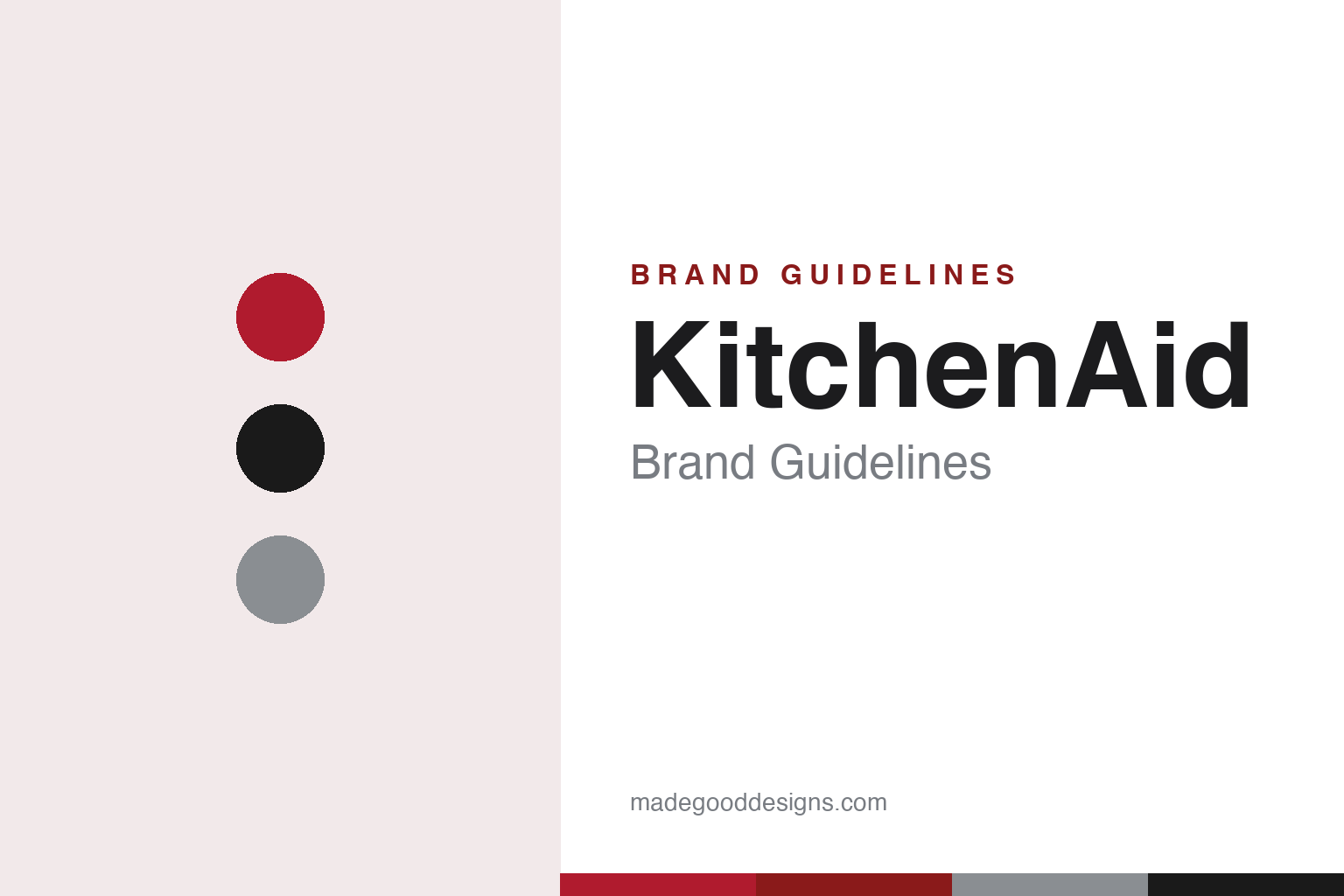
KitchenAid Brand Guidelines
A trademarked mixer silhouette, a wall of colour and Empire Red — an American icon that’s barely changed since 1937.
Aa
Two constants: an Empire-Red-and-ink palette and a bold sans wordmark. Abstract homage — not the KitchenAid wordmark or mixer.
A silhouette worth trademarking
KitchenAid’s stand mixer has looked essentially the same since 1937.
KitchenAid’s brand is its stand mixer — and its most valuable asset is a shape. The streamlined, “bullet-headed,” tilt-back Model K, designed in 1937 by the industrial designer Egmont Arens (1889–1966), was so resolved that its silhouette became a registered U.S. trademark and is still instantly recognisable in today’s machines. That continuity is remarkable: attachments from the Model K era still fit modern mixers, and the profile has barely changed in nearly ninety years. The wordmark — a bold, slightly irregular “KitchenAid” sans, often with the tagline “for the way it’s made” — is a separate mark from the trademarked mixer silhouette. (Honest caveats: KitchenAid publishes no documented logo typeface, so the mark is best described as “a custom bold sans,” and there’s no official brand hex.)
The origin story runs deeper than the mixer, though. KitchenAid began as a product line of the Hobart Manufacturing Company of Troy, Ohio, a maker of commercial foodservice equipment that wanted a home-scale version of its industrial 80-quart bakery mixers — hence the signature planetary mixing action (the beater spins while orbiting a fixed bowl). The brand dates to around 1919, though the exact model years are contested: the first home mixer, the H-5, is dated 1919 in marketing but 1922 by the Smithsonian and Wikipedia, and a 10-quart C-10 (1918) may predate it — so the honest framing is “the stand-mixer story begins around 1919.” The much-loved name story — a tester’s wife saying “I don’t care what you call it, but I know it’s the best kitchen aid I’ve ever had” — is charming company lore (a Smithsonian curator notes there’s “no proof… but it’s a great story”), not documented fact.
On colour and ownership: KitchenAid has no single brand colour — its identity is the wide range of mixer colours (a four-colour range arrived in 1955), with Empire Red as the iconic signature finish (described as “deeper than fire engine red”). Note that Empire Red is a product-finish name, not an official brand hex. The brand passed from Hobart through Dart & Kraft before Whirlpool Corporation acquired KitchenAid in 1986 (for about $150 million, after an antitrust challenge was cleared); Whirlpool owns it still.
Colour
KitchenAid lives in Empire Red. Click a swatch to copy the hex.
KitchenAid’s colour identity is unusual: rather than one corporate hue, the brand is defined by the vast range of mixer colours customers can choose, with Empire Red as the most iconic finish. The mixer became a design object precisely because it comes in dozens of shades — a bright, cheerful wall of colour that turns a countertop appliance into a statement piece and a collectible. Empire Red, a deep, rich red, is the shade most people picture, and it anchors the brand’s energetic, all-American feel. The honest caveat: there is no official brand hex — Empire Red is a product-finish name — so the red here is an approximation of that finish, not an official brand value.
The lesson is choice of colour as the brand. KitchenAid made the range of colours the identity, letting customers express themselves while the trademarked silhouette stays constant. For designers, it’s a reminder that offering a curated spectrum of finishes — on an otherwise unchanging, iconic form — can be a powerful branding and merchandising strategy. The takeaways: keep the iconic form constant and let colour provide variety and personal expression; anchor the range with one signature shade (Empire Red); and treat product-finish names as distinct from an official brand hex.
Typography
The wordmark is a bold, custom sans — sturdy and American.
KitchenAid’s bold, slightly irregular sans wordmark is sturdy and confident — solid, friendly letterforms that read as reliable, all-American and built-to-last, matching the tagline “for the way it’s made.” It’s a workmanlike, approachable mark, never fashionable or fussy, which suits a brand whose appeal is durability, heritage and everyday usefulness. The wordmark deliberately stays out of the way of the real star — the trademarked mixer silhouette — acting as a dependable signature rather than a showpiece. (Because the exact face is custom and undocumented, the honest description is “a custom bold sans,” not a named font; older “Gill Sans” guesses are unverified.) The type behaves like the brand: sturdy, honest and enduring, a match for an appliance passed down through generations.
Aa
A bold, custom sans — sturdy and American. (Specimen set in Rubik, a sturdy sans in the spirit of KitchenAid’s wordmark; the real face is custom and undocumented.)
An icon that never changed
KitchenAid’s power is a shape it never had to update.
KitchenAid is a lesson in the value of an unchanging icon. The stand-mixer silhouette designed by Egmont Arens in 1937 was so perfectly resolved that KitchenAid never needed to redesign it — instead it trademarked the shape and kept it constant for generations, letting colour and attachments provide the variety. That consistency is the brand: a KitchenAid mixer is an heirloom precisely because it looks (and works) the same as the one on a grandparent’s counter, and its silhouette is recognisable enough to be legally protected. The lesson is the opposite of restless rebranding — find a great, functional form and protect it.
For designers and brand-builders, KitchenAid offers a clear takeaway: a great, functional design can become a permanent, protectable icon. The lessons: when a form is genuinely resolved, keep it — decades of consistency turn a product into an heirloom and a recognisable trademark; provide variety through colour and accessories rather than by changing the icon; and let a sturdy, honest identity reflect durability and heritage. It’s also a reminder to keep the facts precise — the iconic silhouette is Egmont Arens’ 1937 Model K (distinct from the ~1919 brand origin and the contested H-5 date); the name anecdote is company lore, not fact; Empire Red is a product finish, not an official hex; and KitchenAid began as a Hobart line and has been owned by Whirlpool since 1986. KitchenAid turned a 1937 silhouette into a timeless icon — proof that a great form, protected and kept, can outlast every trend.
Explore & save
Keep KitchenAid’s identity on hand — save it to a board in the Made Good inspiration library.
KitchenAid identity set
Pin the Empire-Red palette and the bold-sans spirit to your own board.