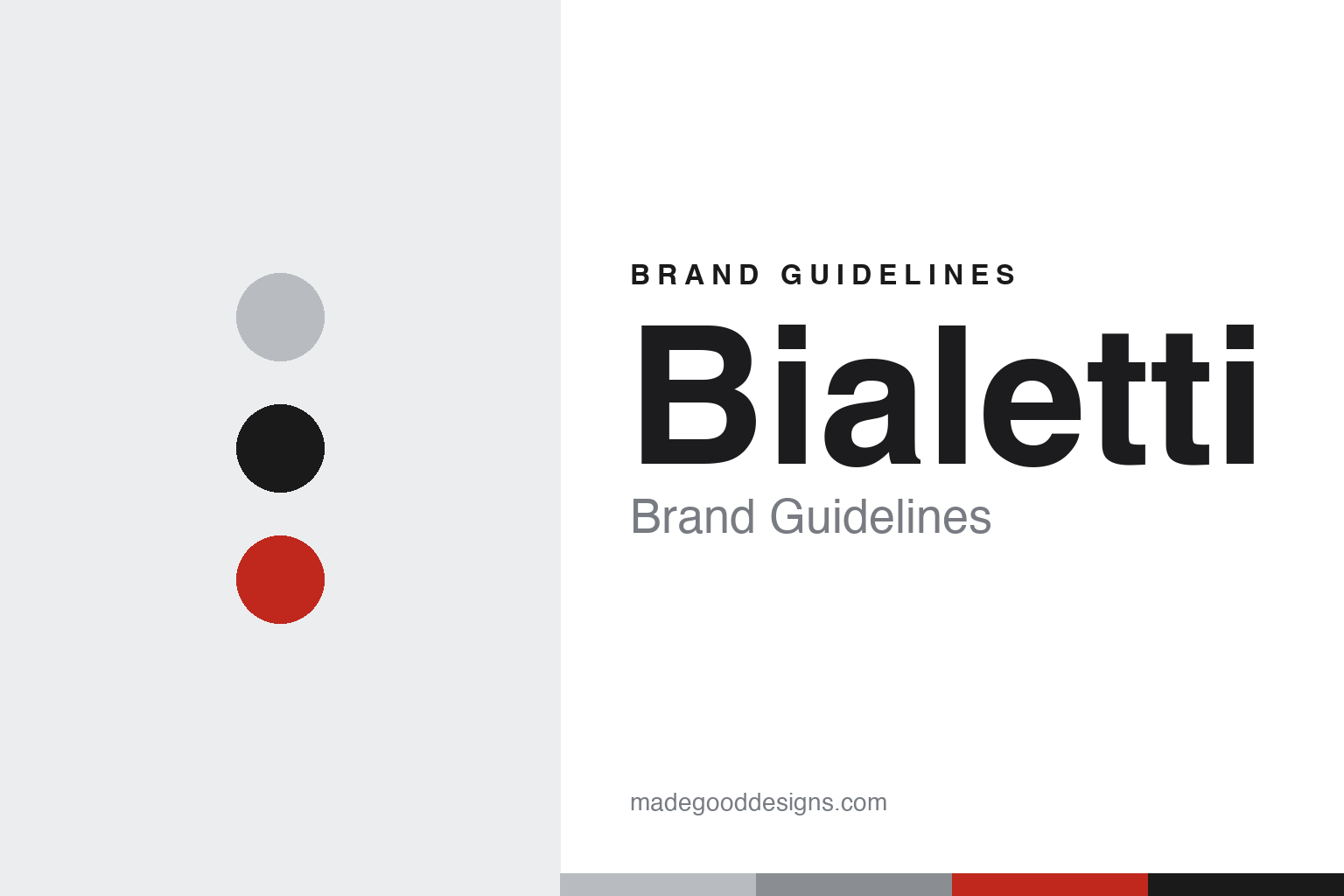
Bialetti Brand Guidelines
An octagonal aluminium pot and a little man with a moustache — the design that put espresso on the world’s stovetops.
Aa
Two constants: an aluminium-and-red palette and a geometric, Deco-flavoured sans. Abstract homage — not the Bialetti mascot or Moka pot.
The little man and the eight-sided pot
Bialetti built a brand on one Art Deco pot and one cartoon man.
Bialetti’s identity rests on two of the most recognisable pieces of design in any kitchen: a pot and a cartoon. The pot is the Moka Express, the octagonal, eight-faceted aluminium stovetop espresso maker — an Art Deco icon (held by MoMA and London’s Science Museum) whose faceted shape and Bakelite handle have barely changed since it launched in 1933. The cartoon is “l’omino coi baffi” — the little man with the moustache, raising a finger as if placing an order — created by illustrator Paul (Paolo) Campani in 1953 for Italy’s Carosello TV advertising, and based on Renato Bialetti. Together, the eight-sided pot and the moustachioed man are the brand: printed on every Moka, they’re instantly Bialetti. (Honest caveats: the wordmark has no documented typeface; no official brand hex is published, so the aluminium/red values here are approximate.)
The family story matters, and it’s easy to muddle. Alfonso Bialetti (1888–1970), an engineer who had spent about a decade in the French aluminium industry, founded the workshop in 1919 — “Alfonso Bialetti & C.” — in Crusinallo, Omegna, in Piedmont, making aluminium goods. It was Alfonso who produced the Moka Express in 1933, choosing aluminium as a light, modern, of-the-moment material (the engineering is commonly credited to Luigi De Ponti, though the exact invention credit is debated, so it’s best hedged). His son Renato Bialetti is the one who turned the Moka into a mass-market icon: taking over in 1946, he built a huge advertising campaign (TV, billboards) and grew production from around a thousand units a year into millions — and he is the man the mascot caricatures. In a fitting coda, when Renato died in 2016, his ashes were interred in a giant Moka pot.
On ownership: Bialetti Industrie S.p.A., long listed on Euronext Milan, faced serious financial difficulties (squeezed by capsule machines and an over-extended retail push) and was acquired by NUO Capital — a Hong Kong-based family office backed by the Agnelli family’s holding company EXOR — in a deal completed in 2025, with an intent to delist. (It’s best described as a Hong Kong-based, EXOR-backed investment group, not a “Chinese state” buyer, and the details are time-sensitive.)
Colour
Bialetti lives in aluminium and red. Click a swatch to copy the hex.
Bialetti’s palette is bare aluminium silver — the raw metal of the Moka pot itself — plus the black of the mascot pictogram and red in packaging and marketing. The aluminium is the product: the faceted, unpainted metal that catches the light on a stovetop and signals the classic Moka. The black mascot and the red accents give the identity warmth and Italian energy. It’s an honest, material-led scheme — the brand’s colour is literally the colour of its most famous object. The honest caveat: Bialetti publishes no official brand hex, so the aluminium and red values here are approximations rather than a confirmed spec.
The lesson is a palette that is the product. Bialetti’s aluminium-and-red identity comes straight from the Moka pot and its advertising, so it feels authentic and inseparable from the object. For designers, it’s a reminder that when a single product is the brand, letting its real material define the palette is the most honest choice. The takeaways: derive colour from your signature object’s material (bare aluminium); add a warm accent for energy (red); and treat specific hexes as approximate when the brand’s colour is really a raw metal finish.
Typography
The type is a geometric, Deco-flavoured sans — like the pot.
Bialetti’s geometric, Deco-flavoured sans echoes the Moka pot’s own aesthetic. The pot is a piece of 1930s Art Deco industrial design — all crisp facets and machine-age geometry — so a clean, geometric sans, with a hint of that period feel, is the natural typographic match. Set against bare aluminium and the little moustache man, the type reads as modern, Italian and quietly nostalgic, matching a brand whose defining object is nearly a century old yet still feels contemporary. The real personality, of course, comes from the mascot and the pot, so the type stays clean and supportive. (Because the exact wordmark face is undocumented, the honest description is “a geometric, Deco-flavoured sans,” not a named font.) The type behaves like the brand: geometric, modern and faintly Deco, in tune with the eight-sided pot.
Aa
A geometric, Deco-flavoured sans. (Specimen set in Jost, a geometric sans in the spirit of the Moka’s Art Deco lines; the real wordmark face is undocumented.)
One object, endlessly loved
Bialetti made a single design synonymous with home espresso.
Bialetti is a lesson in a single product becoming a whole brand — and a cultural icon. The Moka Express is so successful and so unchanged that it is Bialetti: an eight-sided aluminium pot that put espresso on stovetops around the world and became a fixture of Italian domestic life. The brand amplified that one great object with one great character — the little moustache man — turning a piece of engineering into something warm, familiar and beloved. It’s a reminder that you don’t need a huge catalogue to build an iconic brand; you need one exceptional, distinctive design and the storytelling to make people love it.
For designers and brand-builders, Bialetti offers a clear takeaway: one iconic product plus one iconic character can be a brand. The lessons: a distinctive, unchanging design (the octagonal aluminium Moka) can carry a brand for generations; a memorable mascot (the omino coi baffi) adds warmth and recognisability that a logo alone can’t; and letting the product’s real material be the palette keeps the identity honest. It’s also a reminder to keep the history precise — Alfonso Bialetti founded the workshop in 1919 and produced the Moka in 1933 (engineering commonly credited to Luigi De Ponti); Renato Bialetti marketed it into an icon from 1946 and is the mascot, drawn by Paul Campani in 1953; the pot is octagonal aluminium; and the company was acquired by the EXOR-backed NUO Capital in 2025. Bialetti turned one eight-sided pot into the sound and smell of home espresso — proof that a single great design can be an entire brand.
Explore & save
Keep Bialetti’s identity on hand — save it to a board in the Made Good inspiration library.
Bialetti identity set
Pin the aluminium-and-red palette and the Deco-sans spirit to your own board.


