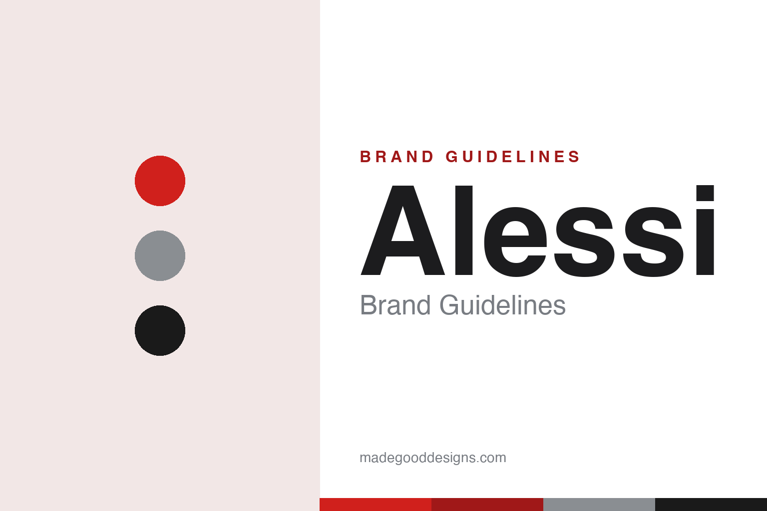
Alessi Brand Guidelines
A red wordmark, polished steel and a catalogue of designers’ dreams — the Italian ‘dream factory’ that makes objects poetic.
Aa
Two constants: a red-and-steel palette and a bold sans wordmark. Abstract homage — not the Alessi wordmark or products.
The dream factory
Alessi doesn’t style products in-house — it commissions the world’s designers.
Alessi calls itself a “Factory of Design” — Alberto Alessi titled his own history The Dream Factory: Alessi since 1921 — and the phrase captures the whole brand. Alessi is a manufacturer that operates like a publisher: rather than impose a single house style, it commissions outside architects and designers to create everyday objects, backed by an in-house engineering team, and keeps the designers’ imaginations “free.” The result is a catalogue full of poetry, wit and provocation — objects meant to trigger emotion and surprise, not just do a job. Its wordmark reflects that confidence: a simple, bold “ALESSI” usually set in red, letting the products carry the personality. (Honest caveats: Alessi publishes no documented logo typeface, so the mark is best described as “a bold sans, usually in red,” and no official brand hex is published — the red and steel values here are approximate. Ignore the many “Alessi rebrand” concepts online; they’re student projects, not the real identity.)
The products are a roll-call of design icons, each by a different star. Philippe Starck’s Juicy Salif citrus squeezer (1990) — the spider-legged aluminium sculpture famously sketched on a napkin — is perhaps the most photographed. Michael Graves’ 9093 kettle with the little bird-shaped whistle (1985) was his first mass-produced design and became Alessi’s best-selling product ever (over 1.5 million sold). Alessandro Mendini’s Anna G. corkscrew (1994), Aldo Rossi’s La Conica (1984) and La Cupola (1988) coffee makers, and Richard Sapper’s 9090 espresso maker (1979) and “singing” 9091 kettle (1983) round out the canon. The playful Girotondo “little man” motif (1989) came from the duo “King-Kong” — Stefano Giovannoni and Guido Venturini (credit both, not Giovannoni alone).
Alessi was founded in 1921 in Omegna, on Lake Orta in Piedmont (its headquarters remain in Omega’s Crusinallo district), by Giovanni Alessi, who set up a workshop for brass and nickel-silver tableware with a foundry. Three generations shaped it: Giovanni (craftsmanship); his son Carlo (chief designer through the 1930s–40s, whose 1945 “Bombé” tea set is a classic); Ettore (engineering, who began working with outside designers); and above all Alberto Alessi, Giovanni’s grandson, who joined in 1970 and turned the firm into a design powerhouse by commissioning the greats. Crucially, Alberto is the entrepreneur and curator, not the designer of the icons. The company is family-controlled (the family holds roughly 60%) and became a certified B Corporation in 2020.
Colour
Alessi lives in red and polished steel. Click a swatch to copy the hex.
Alessi’s visual signature is polished stainless steel plus bright, playful colour, with the wordmark most often in red. The steel comes from the products themselves — mirror-finished kettles, trays and coffee makers — while the pops of colour come from the thermoplastic pieces (think the red of a Sapper kettle handle or the bright figures of Girotondo). It’s a palette that balances seriousness (gleaming metal, precision engineering) with joy (bright, poetic colour), exactly matching a brand that treats everyday objects as art. The honest caveat: Alessi publishes no official public hex, so the red (~#D0201C) and steel here are approximations rather than a confirmed spec.
The lesson is a palette that pairs craft with play. Alessi’s steel-and-colour scheme signals both engineering quality and emotional warmth, reinforcing its identity as a “dream factory.” For designers, it’s a reminder that a palette can carry a dual message — precision and poetry — when your products live at that intersection. The takeaways: let your real materials define the base (polished steel); use bright accent colour to signal playfulness and emotion; and treat specific hexes as approximate when no official value is published.
Typography
The wordmark is a bold sans — confident and quiet, usually in red.
Alessi’s bold sans wordmark, usually in red, is deliberately understated — because the products are the stars. Clean, strong, upright letters spelling “ALESSI” give the brand a confident, modern signature that never competes with the wit of a Starck squeezer or a Graves kettle. That restraint is smart: when your catalogue is a riot of designers’ imaginations, a neutral, assured wordmark is the stable frame that ties it all together. The red gives it warmth and Italian energy without being loud. (Because the exact face is undocumented — and the “rebrands” online are student concepts — the honest description is “a bold sans, usually in red,” not a named font.) The type behaves like the brand: confident and quiet, letting a catalogue of dreams supply the personality.
Aa
A bold sans — confident and quiet. (Specimen set in Archivo, a grotesque in the spirit of Alessi’s bold red wordmark; the real logo typeface is undocumented.)
Objects with poetry
Alessi turned everyday objects into emotional, collectible design.
Alessi is a lesson in treating design as authorship. By operating like a publisher — commissioning the world’s best architects and designers and giving them creative freedom — Alessi built a catalogue where every object has an author and an idea, from Starck’s spidery squeezer to Graves’ whistling bird. That model turned humble kitchen tools into emotional, collectible design, and made “an Alessi” shorthand for a certain playful, intelligent, Italian design sensibility. The brand’s genius isn’t a logo; it’s a philosophy — objects should satisfy a need for “art and poetry,” surprise people, and be a little maverick — held consistently for a century.
For designers and brand-builders, Alessi offers a distinctive takeaway: a brand can be built on curation and authorship rather than a house style. The lessons: act like a publisher — commission great authors (designers) and let their voices shine, unified by engineering quality and a clear philosophy; give products an idea and an emotion, not just a function; and let a confident, quiet identity (a bold red wordmark, steel-and-colour) frame a diverse catalogue. It’s also a reminder to keep the facts precise — Alessi was founded in 1921 in Omegna by Giovanni Alessi; Alberto Alessi (from 1970) is the curator, not the designer; the Juicy Salif is Starck (1990), the bird kettle is Graves (1985, distinct from Sapper’s 9091 “singing” kettle and 9090 espresso maker); and Girotondo is by the King-Kong duo (Giovannoni and Venturini, 1989). Alessi turned everyday objects into poetry — proof that curation and authorship can be a brand’s soul.
Explore & save
Keep Alessi’s identity on hand — save it to a board in the Made Good inspiration library.
Alessi identity set
Pin the red-and-steel palette and the bold-sans spirit to your own board.


