NYU Brand Guidelines
A torch lifted out of a seal and set on a violet square.
Aa
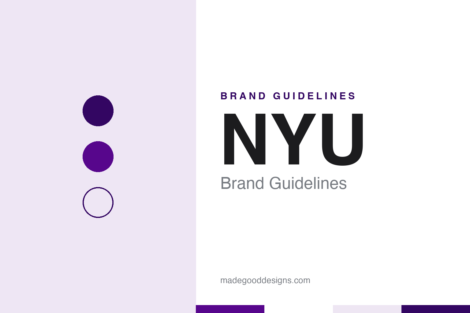
Two constants: a violet, deep violet and white palette and a condensed sans register. Abstract homage — not an NYU mark; no torch, seal or logo is reproduced.
Washington Square
A university of the city, chartered in 1831.
New York University was chartered by the New York State Legislature on 21 April 1831 and incorporated as the University of the City of New-York, English Wikipedia says. A group of the city’s merchants, bankers and traders backed the plan, and Albert Gallatin, who had served as secretary of the treasury under Thomas Jefferson and James Madison, was elected its president. Gallatin spoke of a “system of rational and practical education” for a fast-growing city. Classes began in 1832 in rented rooms in Clinton Hall, near City Hall.
The institution was known informally as New York University from the start, and that name became official in 1896, Wikipedia says. By then the university had built its Old University Building on Washington Square, and in 1894 it moved part of its teaching to a campus at University Heights in the Bronx, a site now home to Bronx Community College. Washington Square, at the edge of Greenwich Village, remains the centre. That city setting runs through the identity: NYU’s buildings sit among the streets of the Village rather than behind a single gate, a point the designer of its torch logo raised when he described the job.
The formal mark is the university seal, which NYU’s brand guidelines date to circa the late nineteenth century and which Washington Square News reported in April 2026 had served as the university’s logo since 1897. It combines five elements: the university name, the founding year in Roman numerals, the Latin motto Perstare et praestare (“To persevere and to excel”), four runners rushing to place a laurel wreath on a pedestal, and the upheld torch of the Statue of Liberty. The guidelines say the runners stand for the continued pursuit of academic excellence and the torch for the university’s commitment of service to New York City. The student paper noted that the origins of the seal itself are unknown, and linked the torch to Gallatin’s idea of a university “in and of the city”.
Colour
A torch, a square and a city of scattered buildings.
The torch that now stands for NYU arrived in 1965. Washington Square News reported in April 2026 that the university, looking to modernise its image, approached the graphic designer Tom Geismar, a founding partner of the New York firm now called Chermayeff & Geismar & Haviv, whose work administrators knew from the Chase Bank logo. The problem was practical. “The idea was to find a way to identify all these buildings,” Geismar told the paper. In a 2014 interview with the student site NYU Local he explained that many buildings around the Village that looked like ordinary brownstones belonged to the university, and that the mark had to be simple enough to be produced in many materials and recognised easily.
Geismar’s answer was to lift a single element out of the seal. “You always had the torch up above in the seal,” he told Washington Square News, and taking that torch, a symbol of knowledge, and making something clear of it “made sense”; the studio tried other torch variations before choosing this one. He told NYU Local that setting the torch on a square did two jobs. It turned the logo into a plaque that could be fixed to building entrances, and it let the torch read as light on a darker ground. He also described how the mark was worked out by hand in sketches and then finished as a carefully drawn ink drawing, long before design software.
The result is the white torch on a violet square that hangs on flags and banners around Washington Square Park. “It’s the banners that tie them all together,” Geismar told Washington Square News, adding that the idea suits city schools. The university describes the contrast of white torch and purple ground as finding light in the darkness, or “enlightenment through education”, the 2026 article reported.
The torch also has a physical counterpart in ceremony. In 1911 Helen Miller Gould, a graduate of the NYU School of Law, gave the university a sterling silver torch modelled on Lady Liberty’s and designed by Tiffany & Co., Washington Square News reported. It was intended for commencement processions, in which a senior faculty member passed it to the youngest undergraduate degree candidate; the tradition later lapsed for a time and was revived.
Typography
Torches, seals, colours and mascots.
University identities tend to be built from a small, repeatable kit. A torch, a seal or a shield carries the formal voice: it appears on diplomas, official documents, building plaques and the covers of commencement programmes, and it changes rarely because its job is continuity. Alongside it, a simpler wordmark or monogram does the everyday work on websites, signage, letterheads and merchandise, where a detailed seal would blur at small sizes or on a phone screen.
Colour does a surprising amount of the lifting. Many institutions are recognised by a single hue that runs through athletics kit, banners, lanyards and digital templates, and identity manuals usually fix that hue in print and screen values so it reproduces the same way on a sweatshirt as on a slide. A secondary palette of neutrals and accents then gives designers room without diluting the core colour.
Mascots form a third layer. Sports programmes often commission their own marks, with a more playful drawing style and separate usage rules, so a campus may run a formal seal, a clean academic wordmark and an animated athletics character side by side. Reading a university brand well means understanding how those layers divide the work between ceremony, administration and the playing field.
Aa
Condensed sans capitals — the register of a banner on a lamppost and a plaque by a door. (Specimen set in Barlow Semi Condensed, a sans-serif STAND-IN; NOT the NYU logo or its typeface.)
NYU
NYU Violet, tiered lockups and a seal kept for diplomas.
Violet is the other constant. Wikipedia and Washington Square News give two explanations for it: that violets grew, or were planted, around Washington Square and the Old University Building, or that the colour was chosen because the violet was the flower associated with ancient Athens as a centre of learning. The 2026 article adds a third account, from a letter in the university archives, linking the colour to the violet and white of King’s College, Cambridge. Today the colour is fixed in the brand guidelines as NYU Violet, specified as PMS 2597 and hex #57068C, the principal brand colour to be used “in every communication and design”. A brighter Ultra Violet (PMS 266 C) is kept for emphasis, black is its partner, and a ladder of deep, medium and light violets and greys completes the palette.
The guidelines divide the marks into tiers. A short NYU logo is the primary mark for central administration; a long version spells out the full name for external audiences, and a stacked version covers very small digital uses or large outdoor flags. Schools, the degree-granting campuses in Abu Dhabi and Shanghai, global academic centres and individual offices each receive lockups built on the same torch, supplied by the university’s in-house Marketing Communications team. The seal is kept apart: the guidelines say it is not the logo, restrict it to official documents such as diplomas and corporate contracts or to goods licensed through the NYU Bookstore, and allow it only in NYU Violet, white on violet or metallic gold (PMS 872 C), with clear space of half a seal width.
Athletics adds a third layer. NYU teams compete as the Violets, a name taken from the colour its athletes have worn for over a century, Washington Square News reported in October 2023, citing the university’s faculty handbook. After a short period in which a student dressed as a violet flower at games, NYU made the bobcat its official mascot on 8 December 1983; the name came from a shortened form of “Bobst Catalog”, the computerised catalogue of Bobst Library. The same report said NYU Athletics rebranded at the start of the 2021–22 academic year with new logos that put the Violets name forward.
For a design guide, NYU shows how one element pulled out of a crowded seal can mark a whole city campus, from building plaques to flags; compare Columbia University and Harvard for systems built on a crown and a shield. For this guide we use NYU Violet, deep violet and white with a sans-serif, an unofficial interpretation; no product or logo is reproduced.
Explore & save
Keep NYU’s identity on hand — save it to a board in the Made Good inspiration library.
NYU identity set
Pin the NYU violet, deep violet and white palette and the condensed sans register to your own board.