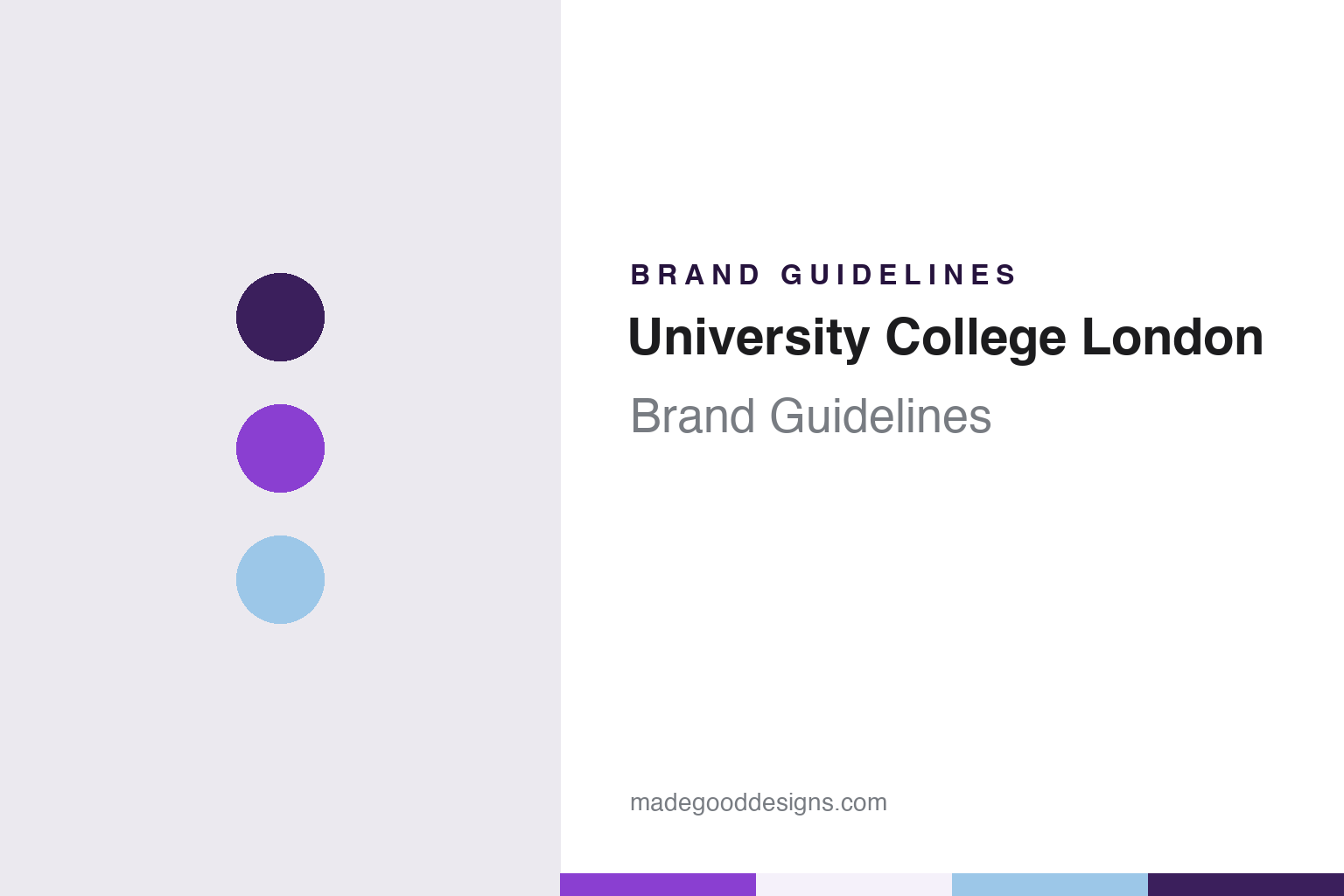
University College London Brand Guidelines
A Greek portico, three capital letters and a purple taken from the gowns.
Aa
Two constants: a dark purple, bright purple and blue celeste palette and an upright sans register. Abstract homage — not a UCL mark; no portico, logo or wordmark is reproduced.
London University, 1826
A college with a portico and no coat of arms.
University College London was established in 1826 as London University, English Wikipedia says, by founders inspired by the radical ideas of the philosopher Jeremy Bentham. It opened without university status or the power to award degrees, and it was set up to admit students regardless of their religion and to be entirely secular. The name changed as the institution’s legal position changed: a new charter in 1976 restored its legal independence, and under that charter the college became formally known as University College London. In 2005 UCL was granted its own taught and research degree-awarding powers, and the same year it adopted a corporate identity under which the full name was replaced by the initialism UCL in all external communications, Wikipedia records.
That choice explains much of what designers see today. Many universities keep a coat of arms for ceremonial and official use and a logo for everyday communications. UCL has no coat of arms at all and uses only a logo, Wikipedia says, and every version of that logo has been built from the same two ingredients: the initials UCL and a stylised drawing of the portico of the Wilkins Building. The building, designed by William Wilkins and now Grade I listed as part of the UCL Main Building and sits on the main campus around Gower Street in Bloomsbury.
The original logo was a monochrome drawing of the Wilkins Building with the letters UCL worked into it. The second, introduced in 2005, separated the two parts: a smaller portico sat to the left and the initialism, twice its height, sat to the right, again in a single colour. The third, introduced in 2026 for the college’s bicentenary, reverses the order, with the letters on the left and the portico on the right, both set at the same height and drawn in dark and bright purple; the university permits variant formats, Wikipedia adds, citing UCL’s brand pages.
The college motto, Cuncti adsint meritaeque expectent praemia palmae, is a quotation from Virgil’s Aeneid. Wikipedia translates it as “Let all come who by merit deserve the most reward”. It has never been tied to an official grant of arms, because there has never been one.
Colour
A 2005 identity and a crest that was never granted.
The 2005 identity was covered in the trade press before it launched. On 22 July 2005 Times Higher Education, in a report by Phil Baty, said UCL’s new corporate identity would be launched on 1 August after months of consultation and planning. The paper described the new logo as featuring the letters “UCL” with the bottom edge of the letters sliced off. Marilyn Gallyer, then UCL’s vice-provost, told the paper the change followed research among a range of stakeholders, who had said the college needed to raise its public profile; the same report recorded objections from staff unions, which planned posters parodying the cropped letters at a time of proposed staffing cuts.
Alongside the official logo runs a second, unofficial tradition. A pseudo-heraldic “UCL crest” circulates widely, Wikipedia says: a purple shield showing a raised, bent arm in armour between two gold laurel branches holding a green, upturned open wreath, with the motto on a blue celeste ribbon beneath. A version of this badge, not on a shield, appears to have been used by the UCL Union from shortly after the union’s foundation in 1893, according to Negley Harte and John North’s history The World of UCL 1828–2004 (2004). The badge has never been the subject of an official grant of arms and breaks several heraldic conventions; it is not an official logo, though modified versions turn up on the kit and pages of some sports clubs and societies.
The official sports mark is simpler. The Team UCL logo, used with variants by many teams, is a shield divided into purple in the lower part and blue celeste in the upper part, and its only picture is the portico; the laurels, wreath, armoured arm and motto of the old badge are absent. Students’ Union UCL asks teams not to modify the logo, Wikipedia notes. Purple and blue celeste are UCL’s traditional sporting and academic colours, and both sit inside a wider palette of 25 colours used in the visual identity, in which the logo can be set in many combinations.
Typography
Portico, initials, purples and type.
Many university marks borrow their imagery from the natural world. A leaf, a flower or a tree stands in for growth and continuity, and a cluster of stars can tie an institution to the sky above its home country. These motifs suit identity work because they reduce well: a single leaf or a handful of points can be drawn as a crisp outline that survives on a lanyard, a web favicon or an embroidered scarf, while the fuller heraldic version stays on degree certificates and ceremonial banners.
Latin mottos play a similar role in text form. A short phrase set in capitals beneath a shield signals continuity with older academic traditions, and designers often keep it on formal documents while dropping it from everyday digital layouts where space is tight.
Buildings and gateways also become symbols. A gate, a tower or a quadrangle that appears in photographs year after year can turn into a shorthand for the whole institution, sometimes appearing in merchandise, alumni publications and social media long before it enters any official logo. Colour completes the system: a named school colour gives teams, gowns and printed matter a shared thread even when the emblem itself changes.
UCL
An upright, compact sans — the register of the three initials. (Specimen set in Archivo, a sans STAND-IN; NOT the UCL logo or its typeface.)
University College London
A bicentenary logo, phased in.
The current logo arrived with the bicentenary. Students’ Union UCL, which is a separate organisation from the university, announced in a news post that UCL had shared a new visual identity, a bold new logo and refreshed look ready for its 200th anniversary in 2026, and said its sabbatical officers had been involved from the start. The union said the project began in summer 2024 with a research phase that asked staff, alumni, students, external partners and supporters around the world what UCL meant to them, and that a theme emerged describing UCL as a “platform for possibility”.
The union also described how the change would reach students. It said there would be no rush to change things, that sustainability was central to the roll-out and that the new identity would be phased in to limit waste, with current and new branded items sold side by side in the union’s shop, the Hanger. That phased approach matters for anyone documenting the identity: for a period the 2005 logo, with its small portico and tall letters, and the 2026 logo, with letters and portico at equal height in purple, will both be seen around Bloomsbury.
The 2026 change moves colour into the mark itself. The 2005 logo was monochrome, and Wikipedia describes the bicentenary logo as drawn in dark and bright purple — the same colour as the lower half of the Team UCL shield. Blue celeste stays in the traditional pairing and in the wider palette. The portico, meanwhile, appears in all three logos, as well as in the Team UCL shield, so the college’s own building runs through every official mark it has used.
For a design guide, University College London shows how an institution without heraldry can build its whole identity from a building and three letters, then add colour two centuries in; compare King’s College London, founded in 1829 in response to the controversy over the secular London University, and the British Museum, its Bloomsbury neighbour with a portico of its own. For this guide we use dark purple, bright purple and blue celeste with a sans, an unofficial interpretation; no product or logo is reproduced.
Explore & save
Keep University College London’s identity on hand — save it to a board in the Made Good inspiration library.
UCL identity set
Pin the dark purple, bright purple and blue celeste palette and the upright sans register to your own board.