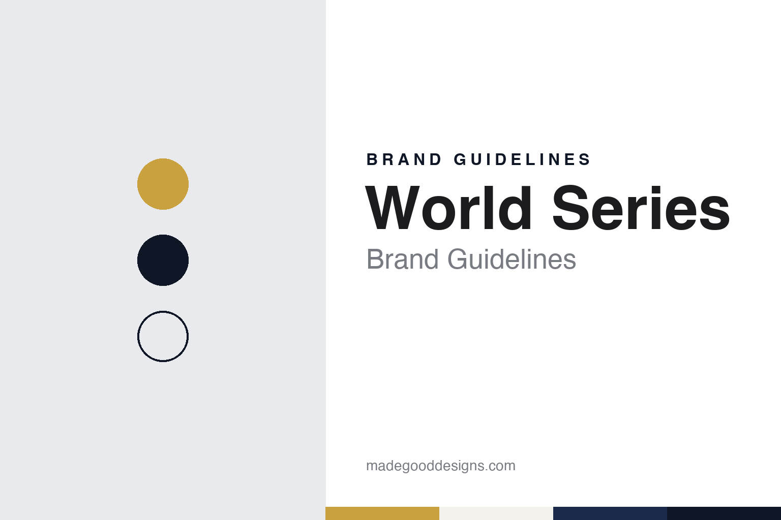
World Series Brand Guidelines
A championship that changes its logo every October.
Aa
Two constants: a pennant gold, navy and silver palette and a slab scoreboard serif register. Abstract homage — not a World Series or MLB product or mark; no logo, patch or trophy is reproduced.
World Series
Two leagues, one autumn series.
The World Series is the annual championship of Major League Baseball, played between the champions of the American League and the National League. English Wikipedia says it was first played in 1903, after the American League had declared itself a second major league alongside the established National League, and that the meeting of the two pennant winners became the way to settle the season.
The event was not fixed from the start. Wikipedia notes that there was no series in 1904: at that point there was no governing body for the World Series and no requirement that one be played, and the New York Giants’ owner, John T. Brush, refused to let his team take part. The format also changed over time. The opening series in 1903 was a best-of-nine, a length used again from 1919 to 1921, before the event settled into the best-of-seven contest it is today.
The name itself was trimmed in use. Wikipedia says the event was first known as the World’s Championship Series, which was gradually shortened in everyday use to the “World’s Series” and, by the 1930s, to “World Series”. The schedule pattern followed a similar path from custom to rule: the 2–3–2 home-game pattern, first used in 1924, was adopted as a permanent rule in 1925 after the Brooklyn owner Charles Ebbets persuaded the other clubs, and a 3–4 pattern was used in 1943 and 1945 to comply with wartime travel restrictions.
The series is traditionally played in October, sometimes running into November as the postseason has grown. Because it is played in the autumn, Wikipedia says, it is often called the Fall Classic, a nickname used alongside the formal name. Since 1969, when both leagues were split into divisions, each league has held a championship series to decide which team advances, so the World Series now sits at the end of a longer run of postseason rounds.
That position matters for the identity. The two finalists arrive with their own crests, colours and uniforms, and the World Series has to frame them without competing with them, through a trophy, a yearly logo and the patch the finalists wear.
Colour
Flags in silver and a patch on every cap.
The central object is the Commissioner’s Trophy. KPRC Click2Houston, in a piece dated 10 November 2017, reported that the trophy was created by Major League Baseball in 1967, with the St. Louis Cardinals receiving it that year, and that a new full-sized trophy is made each year. English Wikipedia adds that the trophy was first awarded in 1967 but was given its name in 1985. The design is a crown of flags, one for each major league club, rising above a base.
The maker is part of the story. KPRC reported that MLB commissioned Tiffany & Co. to create the trophy in 2000, and that the base is engraved with the words “Presented by the Commissioner of Baseball” together with the signature of the commissioner. Because each club has its own flag, the trophy works as a diagram of the whole league: the winner lifts every team’s pennant, not just its own.
There were earlier precedents. Wikipedia records the Dauvray Cup, named after the actress Helen Dauvray, which was awarded to the winner of the series between the National League and the American Association from 1887 to 1890, and the Temple Cup, awarded from 1894 to 1897 for a postseason contest between two National League clubs.
Where the trophy appears has changed as well. KPRC reported that it was originally presented in the clubhouse and that in 1997 the Florida Marlins received it on the field, and Wikipedia says on-field presentations began that year for teams that clinched at home. The move put the flags in front of the cameras rather than in a locker room.
The other constant is the yearly logo. SportsLogos.Net, in a report by Chris Creamer dated 11 May 2022, described that year’s mark as WORLD SERIES in navy blue separated by thin gold horizontal lines, with two pennants, one gold and one silver, in the middle. The report said that the logo of the presenting sponsor, Capital One, had been built into the World Series logo that year. It also explained how the mark is used: the World Series logo is traditionally worn as a patch on the jerseys and caps of both league champions, although in 2021 only the caps carried it because of supply-chain problems.
Typography
Design and documentation.
A sporting event has no factory and no product on a shelf, so its identity lives almost entirely in graphics and objects that return on a calendar. The annual logo is a visible piece: many events keep a permanent mark and add a dated edition lockup each year, so a single season can be identified at a glance on tickets, programmes and merchandise. Posters do similar work in a looser register; some organisers commission a different artist every year, which turns the poster series into a running record of illustration and type styles across decades.
Trophies are the physical centre of the identity. Their silhouette, material and engraving are often fixed for long periods, and photographs of the presentation moment carry that shape far beyond the venue. Venue marks add a third layer: signage, painted grass or tarmac, gates and grandstand lettering that fix the event to a particular place.
Broadcast graphics complete the set. Score bugs, timing towers, lower thirds and title sequences are redesigned every few seasons, and they are where viewers meet the event’s typefaces and colours. Read together, these layers show how an event keeps a stable core while letting each edition look like its own year.
Aa
A slab scoreboard serif — the register of a pennant, a patch and a programme cover. (Specimen set in Roboto Slab, a serif STAND-IN; NOT the World Series logo.)
World Series
A permanent object and a dated mark.
The World Series splits its identity in two. One half is permanent: the Commissioner’s Trophy, whose crown of flags has been made by Tiffany & Co. since 2000 and whose engraved base names the office that presents it. The other half changes every season: a logo drawn for that year, dated, worn on the uniforms of both finalists.
The yearly logo has a hard brief. It has to sit on the sleeve or cap of two clubs with different colours, so it cannot lean too far towards either. The 2022 mark described by SportsLogos.Net, navy lettering with gold rules and pennants in gold and silver, shows one answer: a neutral palette taken from the trophy rather than from any team. The same report shows the pressure from the other side, with a presenting sponsor’s logo built into the mark.
The pennant motif ties the two halves together. The trophy is a cluster of flags; the 2022 logo used two pennants at its centre. A pennant is also what each finalist has already won to get there, which makes the shape a compact way of saying “league champion” without naming either team.
The nickname works as a third layer. “Fall Classic” describes when the series is played rather than who plays it, and it gives broadcasters and writers a way to refer to the event without repeating its formal name. Our palette here follows the trophy and the 2022 mark rather than the season: gold, navy and silver.
For a design guide, the World Series shows how an event can stay recognisable while redrawing its logo every year, by holding the trophy, the pennant shape and a restrained colour range constant. Compare it with MLB, whose batter silhouette sits above every club, and the New York Yankees, a club whose own identity also has a Tiffany & Co. connection, covered in its guide. For this guide we use pennant gold, navy and silver with a serif, an unofficial interpretation; no product or logo is reproduced.
Explore & save
Keep World Series’s identity on hand — save it to a board in the Made Good inspiration library.
World Series identity set
Pin the World Series pennant gold, navy and silver palette and the slab scoreboard serif register to your own board.