Paris Saint-Germain Brand Guidelines
A Paris tower, a Saint-Germain lily and a striped shirt.
Aa
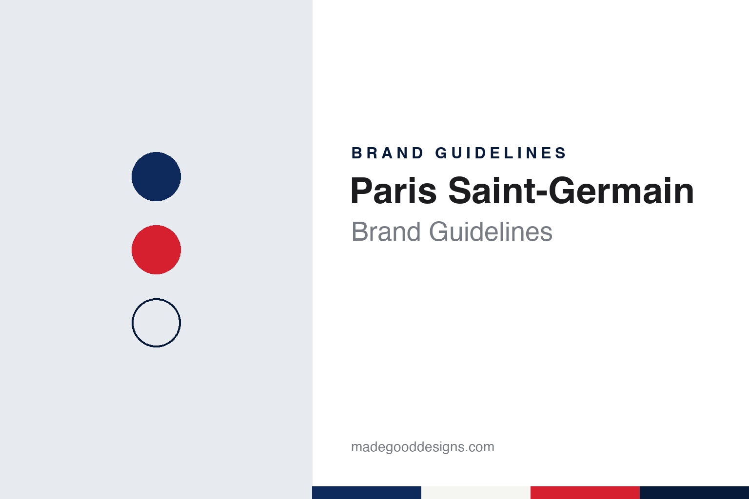
Two constants: a Paris blue, tower red and lily white palette and a condensed kit sans register. Abstract homage — not a Paris Saint-Germain product or mark; no crest, shirt or logo is reproduced.
Paris and Saint-Germain
Two clubs, two towns and three colours.
Paris Saint-Germain was born from a merger. English Wikipedia says the Parisian businessmen Guy Crescent and Pierre-Étienne Guyot founded Paris FC in 1969 and brought in Henri Patrelle, president of Stade Saint-Germain, a club from Saint-Germain-en-Laye, west of the capital. The two clubs merged on 12 August 1970 to form Paris Saint-Germain. The partnership did not last: in 1972 Paris FC and PSG split, and each went its own way under its own name.
The name records both halves of the merger, and so do the colours. Wikipedia says the club’s three colours unite the red and blue of Paris with the white of Saint-Germain-en-Laye, a town associated with French royalty. For its first three seasons the home shirt was red, with blue and white detailing on the sleeves and collar to bring all three colours together. Every later crest and the club’s best-known shirts, Wikipedia notes, have kept those three colours in some combination.
Ownership has changed several times, and each change has shown up in the identity. Wikipedia records that the broadcaster Canal+ took control of the club in 1991, that Colony Capital became majority shareholder in 2008, and that Qatar Sports Investments has owned a majority of the club since 2011, with Arctos Partners taking a minority stake in 2023 and Boardroom in 2025. The club’s president is Nasser Al-Khelaïfi, and its home ground is the Parc des Princes.
The club has also built characters around the colours. Its mascot, Germain the Lynx, was unveiled in 2010 at the Tournoi de Paris to mark the club’s 40th anniversary, Wikipedia says, and wears the traditional red, blue and white.
Colour
A ship, a tower, a cradle and a lily.
The first crest was borrowed. Wikipedia says that after the merger PSG used the original Paris FC logo: a blue football and a red sailing ship, the ship being the historical symbol of Paris that appears on the city’s coat of arms with the motto Fluctuat nec mergitur. When the clubs separated in 1972, PSG needed a mark of its own.
The 1972 crest is the basis of the one used today. It set a red Eiffel Tower on a blue background and, below it, two white symbols of Saint-Germain: a fleur-de-lis and the cradle of Louis XIV, the king born in the town. Wikipedia credits the design to Christian Lentretien, a former PSG director who worked in advertising; a 50th-anniversary history of the crest by the Italian magazine nss says the copyright of the logo belongs to Daniel Hechter, the fashion designer who was a patron of the club at the time.
The tower has been redrawn many times since. Wikipedia says an image of the Parc des Princes was added at the bottom of the crest in 1982 and removed in 1990. In 1992 the Canal+ era brought a radical change: the initials “PSG” in white on a blue, white, red, white and blue ground that echoed the Hechter shirt, with the club name below on black. Following pressure from supporters, the traditional crest returned in 1995 with the club name above the tower and “1970” below the cradle, and in 2002 a darker blue was added.
The current crest dates from 2013. Wikipedia says it was redesigned at the request of the club’s Qatari owners: the word “Paris” now sits in large, bold white letters above the tower, “Saint-Germain” appears in smaller letters beneath the fleur-de-lis, and the cradle and the year 1970 were removed. nss describes the same change as the new management giving “Paris” more prominence than “Saint-Germain”. Wikipedia quotes the deputy general manager Jean-Claude Blanc: “We are called Paris Saint-Germain but, above all, we are called Paris.”
Typography
Design and documentation.
A football club’s identity works across a wide range of surfaces. The crest sits at the centre of it: a compact mark that has to read on a shirt seen from the far side of a stadium, on a television scoreboard graphic, on a phone app icon and on a stitched scarf. Clubs revise their crests from time to time, usually simplifying detail, tightening outlines or redrawing lettering so the mark reproduces cleanly at small sizes and in a single colour.
Kit colours carry the identity as much as any logo. A club’s home colours are often older than its crest, and supporters recognise them at a glance, so designers tend to treat them as fixed while the cut, trim and pattern of the shirt change from season to season. Away and third kits give more room for experiment.
Shirt sponsors add a second brand to a highly visible surface a club owns, which means the crest, the kit maker’s mark and the sponsor’s wordmark have to sit together without crowding. Stadium signage, from gate numbers to the name on the stand roof, extends the same system into architecture, wayfinding and the backdrop of every broadcast.
Aa
A condensed kit sans — the register of a shirt name and a stand sign. (Specimen set in Barlow Condensed, a sans-serif STAND-IN; NOT the Paris Saint-Germain logo.)
Paris Saint-Germain
The shirt that outlasted its designer’s presidency.
If the crest is the club’s signature, the shirt is its uniform. Wikipedia says the fashion designer Daniel Hechter, who became club president in the 1970s, designed the traditional home kit in 1973: a blue shirt with a red vertical stripe flanked by two thinner white stripes, reading blue, white, red, white, blue. It was first worn in the 1973–74 season, making its debut against Red Star in November 1973, the club’s first match at the Parc des Princes, and is still known as the “Hechter shirt”. Hechter himself said he was inspired by the stripes on the bonnet of a Ford Mustang, Wikipedia reports.
The Hechter shirt has not always been the home kit. Wikipedia says a white shirt, promoted by the later president Francis Borelli, served as the home identity from 1981 to 1990 and is now remembered as the “Borelli shirt”. The 1992 crest, with its striped background, shows how far the Hechter pattern had become a mark in its own right: the club used the shirt’s stripes as the crest itself.
The identity now runs along two lines that sometimes pull apart: the heraldic crest, with its tower and lily, and the striped shirt that turns the same three colours into a pattern. The 2013 redesign tightened the first, putting the city’s name and its best-known monument at the centre; the second has stayed close to the shirt Hechter drew in 1973.
For a design guide, Paris Saint-Germain shows how a club formed from two places can carry both in one badge, and how a later owner can rebalance the name without changing the colours. Compare it with Juventus, whose crest was rebuilt around its stripes in 2017, and the Premier League, another football identity redrawn in the 2010s. For this guide we use Paris blue, tower red and lily white with a sans, an unofficial interpretation; no product or logo is reproduced.
Explore & save
Keep Paris Saint-Germain’s identity on hand — save it to a board in the Made Good inspiration library.
Paris Saint-Germain identity set
Pin the Paris Saint-Germain Paris blue, tower red and lily white palette and the condensed kit sans register to your own board.