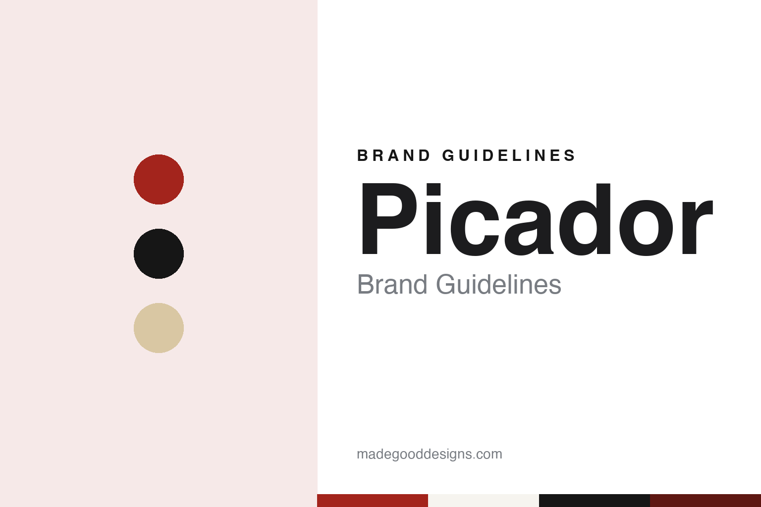
Picador Brand Guidelines
A paperback list with a bullring name.
Aa
Two constants: a red, black and sand palette on white and a Grotesque sans register. Abstract homage — not a Picador asset or mark; no logo, cover or wordmark is reproduced.
A Spanish word on a London paperback
Sonny Mehta’s literary list inside Pan Books.
Picador is a Spanish word for the horseman in a bullfight who carries a lance, and since 1972 it has also been the name of a literary book list in London. English Wikipedia says the imprint was launched in the United Kingdom that year by the publisher Sonny Mehta as a literary series of Pan Books, with the aim of publishing international writing in paperback editions only. It says Picador began publishing its own hardcovers in 1990, and that today it is an imprint of Pan Macmillan in Britain and Australia and of Macmillan in the United States.
Mehta’s route to Pan is set out in the trade press. Shelf Awareness, in an obituary note dated 2 January 2020, said he began his publishing career in London in 1965 at Rupert Hart-Davis, joined Granada Publishing in 1966, where he co-founded Paladin Books, and moved to Pan Books in 1972, where he helped relaunch the Picador imprint. The same note said that in 1987 he moved to the United States as president and editor-in-chief of Knopf, and that he died on 30 December 2019. During his London years, it said, his authors included Douglas Adams, Bruce Chatwin, Germaine Greer, Michael Herr, Ian McEwan, Salman Rushdie and Graham Swift.
The house that gave Picador its home was older. English Wikipedia says Pan Books was set up as an independent publisher in 1944 by Alan Bott, and that its own colophon, the Greek god Pan playing pan-pipes, was drawn by Mervyn Peake, with a later version by Edward Young, the designer of the Penguin logo. It says Pan was later bought by a consortium of publishers that included Macmillan, Collins and Heinemann, and became wholly owned by Macmillan in 1987. English Wikipedia’s article on Macmillan Publishers says Pan Macmillan and Macmillan have been wholly owned by the German Holtzbrinck Publishing Group since 1999.
Picador’s publisher describes the early list in its own words. On its page for the Picador Collection, Pan Macmillan says Mehta launched Picador as an imprint in 1972 with the aim of publishing international writing, and that the Picador paperback originals soon became known for their white spines, which stood on many readers’ shelves. It calls the books challenging, contemporary and eclectic fiction and non-fiction, and quotes a line that sums up the list as a matter of “the author’s voice”, adding that the way a story is told is as important as the story itself.
Colour
White spines, face-out covers and a black-and-white anniversary set.
Picador’s covers were made to be seen front-on. Writing in the Australian magazine Inside Story on 4 April 2012, Richard Johnstone recalled that Picadors were not usually lined up spine-out on standard bookshop shelves. Instead, he wrote, their bright covers faced the customer from wire-and-plastic revolving stands, often placed in a busy part of the shop, and something about the look of a Picador paperback made it seem very much of the moment.
Johnstone’s piece tells the story of one cover in detail. He wrote that the original cover for Don DeLillo’s White Noise, first published in 1985, used video images, computer graphics, photography and typography in a deliberate overload of mixed media. According to notes at the back of the reissue, which he summarised, the illustrator Russell Mills based the final design on monochromes made with car spray paints that had been commissioned from the musician and video artist Brian Eno.
The same article dealt with an anniversary series. To mark forty years since the list’s founding in 1972, Johnstone wrote, Picador reissued a set of fiction titles in 2012, among them DeLillo’s novel, Bret Easton Ellis’s American Psycho, Tim Winton’s Dirt Music and Emma Donoghue’s Room. Every title in the set had a starkly black-and-white cover, with image and type that looked retro and current at once. The new White Noise cover showed a television screen holding a human silhouette broken up by interference. Johnstone named Picador’s chief designer, Neil Lang, and said Lang had explained on the company blog that the cover was made to work online too: it was also produced as a gif animation, in which bands of interference move up and down the screen.
The white spine came back ten years later. On its Picador Collection page, Pan Macmillan says that 2022 marked Picador’s fiftieth year, and that it launched the collection, a list of contemporary classics drawn from its back catalogue, to introduce those books to a new generation of readers. The publisher says the series sees the classic white spines reimagined with a new look. Among the titles it names are Ellis’s American Psycho, Hanya Yanagihara’s A Little Life and Emily St. John Mandel’s Station Eleven.
Typography
A name, a colophon and a series.
For a book publisher, the name has to work in several places at once: on the spine, where a reader scans a shelf, on the title page, where the house is named in full, and on the series that a house builds over decades. Some names describe where a press began. Graywolf Press was named for the Graywolf Ridge and Graywolf River near Port Townsend, Washington, where it started printing poetry chapbooks by letterpress in 1974, and it kept the name after moving to St. Paul in 1985 and to Minneapolis in 2009. Other names describe who a house belongs to. New York Review Books, started in 1999, takes its name from The New York Review of Books, the magazine that publishes it, and shortens it to the initials NYRB for series such as NYRB Classics and NYRB Poets.
Series design often does more of the identifying than the colophon itself. Writing in Eye in the winter of 2007, Rick Poynor described how Penguin’s classics covers of the 1960s, under Germano Facetti, held a series together with a consistent type style and title position, and how Katy Homans’ format for NYRB Classics keeps a title box in a fixed place while changing its colour from book to book, carrying that colour onto the spine and back cover, and leaving the small NYRB logo off the front. When reading a publisher’s identity, look at what stays fixed from title to title, where the house name or mark actually appears, and how far a series format, rather than a logo, tells a reader which list a book belongs to.
Aa
A plain grotesque sans — the register of a paperback list sold face-out. (Specimen set in Libre Franklin, a sans STAND-IN; NOT the Picador logo or any Picador typeface.)
Picador
A second Picador in New York, later a reprint house.
Picador has an American branch with its own history. Publishers Weekly reported on 27 September 1999, in a piece by Jim Milliott, that Picador USA released its first list in January 1995 as an imprint of St. Martin’s Press, and had since grown into an independent publishing member of the Holtzbrinck family devoted to literary fiction and nonfiction. The magazine named George Witte as its publisher. It said that since 1998 Picador had served as the trade paperback publisher for its sister house Farrar, Straus and Giroux, for new titles and backlist, that the arrangement had led to a similar one with Henry Holt, and that Picador also published selected St. Martin’s titles in trade paperback alongside its own originals. Witte told the magazine that Picador was about discovering writers and working with them from the ground up.
That role changed in 2018. Publishers Weekly reported on 20 July 2018, in a piece by John Maher, that the American Picador would stop publishing original titles from April 2019 and return to its primary role as Macmillan’s literary trade paperback reprint house. The magazine quoted a memo from Macmillan president Don Weisberg saying the aim was to keep the trade paperback and hardcover editions of a book consistent and to leave the originating house in charge of both whenever possible. Day-to-day management, it said, would move to FSG under James Meader, newly appointed vice-president and associate publisher, reporting to FSG publisher Mitzi Angel.
The name now covers two kinds of list. In London, Picador is a Pan Macmillan imprint that publishes fiction, nonfiction and poetry in hardcover and paperback; English Wikipedia names authors such as Carol Ann Duffy, Kae Tempest and Douglas Stuart. In New York, it is the paperback home for books first published by other Macmillan houses. Both sit inside the Holtzbrinck group, and both carry the same Spanish word on the spine.
For a design guide, Picador shows how a paperback list can build recognition from the format itself: a white spine on the shelf, a cover that faces out on a revolving stand, and an anniversary set that strips everything back to black and white. Compare Penguin Books, whose colophon came from the same designer as Pan’s later one, or Macmillan Publishers, Picador’s parent on both sides of the Atlantic. For this guide we use arena red, ink black and sand on white with a grotesque sans, an unofficial interpretation; no product or logo is reproduced.
Explore & save
Keep Picador’s identity on hand — save it to a board in the Made Good inspiration library.
Picador identity set
Pin the Picador red, black and sand palette and the Grotesque sans register to your own board.