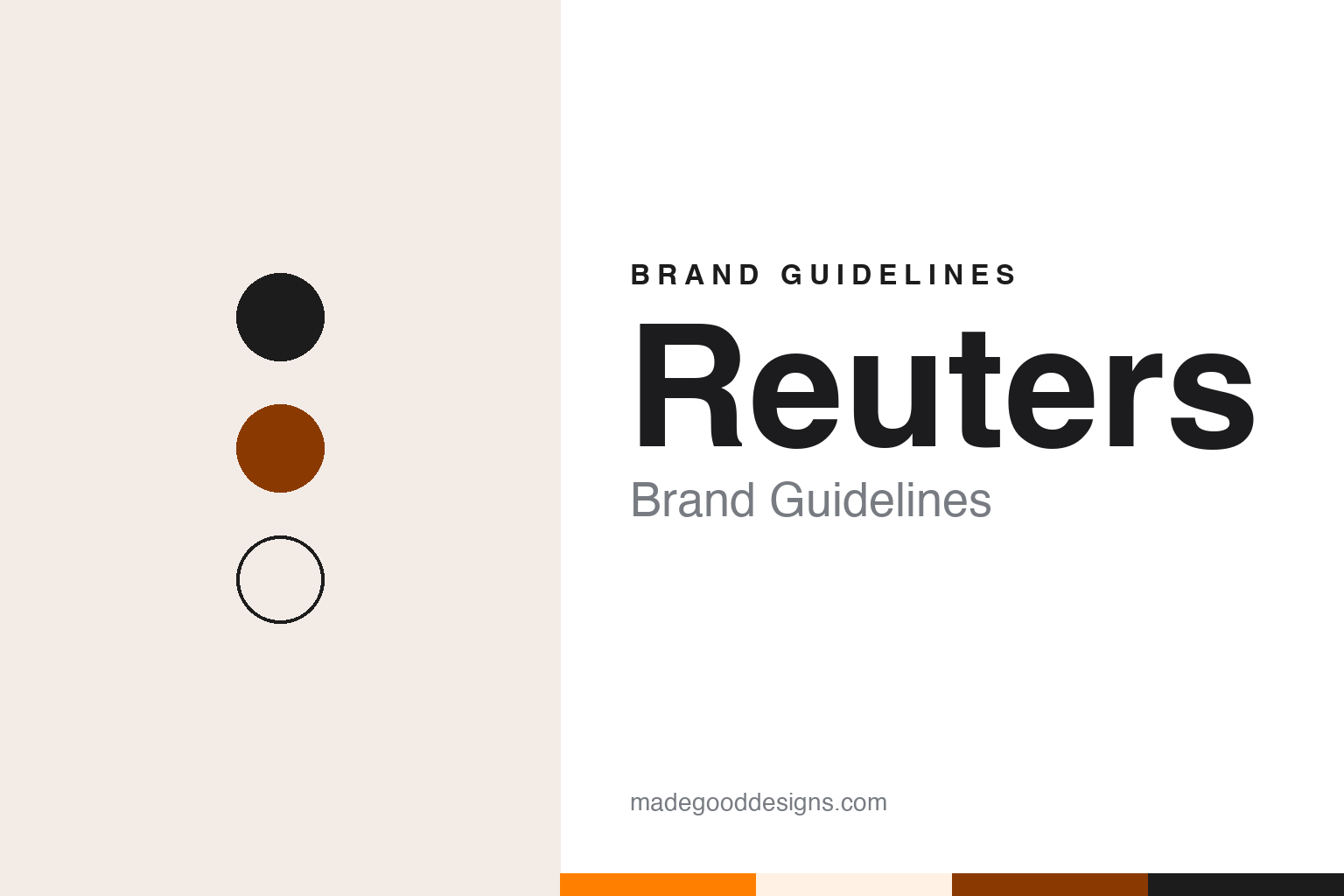
Reuters Brand Guidelines
Pigeons, teleprinter dots and a London news agency.
Aa
Two constants: a Reuters orange, ink and cream palette and a Grid sans register. Abstract homage — not a Reuters asset or mark; no logo, roundel or wordmark is reproduced.
Aachen to London
A pigeon post, a telegraph line and the Royal Exchange.
Reuters is named after its founder, Paul Julius Reuter. Before London there was Aachen. In 1850, Wikipedia says, Reuter ran a prototype news service there, using homing pigeons and the electric telegraph to move messages between Brussels and Aachen. IEEE Spectrum described the arrangement in September 2026: to supplement the telegraph dispatches, Reuter sent pigeons between the two cities, each bird carrying a cylinder holding slips of paper with that day’s stock prices.
In 1851 Reuter moved to London and set up a news agency at the Royal Exchange, according to Wikipedia. Its early customers were banks, brokers and business firms, which wanted commercial news; newspapers followed, beginning with the Morning Advertiser in 1858. In 1865 Reuter incorporated the business as Reuter’s Telegram Company Limited, with himself as managing director, and in 1878 he handed that role to his eldest son, Herbert de Reuter.
The name itself changed shape in the twentieth century. In 1916, Wikipedia says, the shares were bought by Roderick Jones and Mark Napier, who renamed the company Reuters Limited and dropped the apostrophe. That is the spelling the brand still uses: a single word, with no possessive, that reads as a name rather than as one man’s firm.
The agency’s structure kept changing too. The Press Association of Great Britain took a majority interest in 1925, and in 1941 Reuters was restructured, with newspaper associations from Britain, and later Australia and New Zealand, among its owners. Those owners formed the Reuters Trust, and the Trust Principles were written to protect the agency’s independence, Wikipedia says. The agency moved its headquarters to 85 Fleet Street in the 1930s and to Canary Wharf in 2005.
Colour
Alan Fletcher’s dots.
The part of the Reuters identity with the clearest paper trail is its dot logo. The designer was Alan Fletcher. In February 2010 The Baron, the news site for past and present Reuters staff, published a letter that Michael Nelson, a former Reuters general manager, had written to the Financial Times after an article on an exhibition about Fletcher said the lettering evoked the ticker tape of the newswires.
Nelson corrected the record. Ticker tape carried stock-market prices, he wrote; the Reuters lettering evoked the holes in teleprinter tape, the punched paper strip that drove the teleprinters on which news reports moved around the world. Nelson said he attended the Reuters management meeting with Fletcher in the mid-1960s and had doubts about the design, because the technology behind it would be obsolete within twenty years. He was right about the obsolescence, he wrote, but glad the company adopted the design, which in modified form lasted until Thomson acquired Reuters in 2008.
The same 2010 article quoted the account Reuters gave of its own logo before the takeover. The company said there had been several versions of the dot logo, beginning as early as 1965. It said the round element beside the name, the roundel, was developed in 1996 to make Reuters more visible on computer and television screens and to brand its on-screen services in less space, and that it was meant to suggest an abstract globe, with the dots standing for information and the two halves for day and night. In 1999, the company said, the dots in the name were joined, because the dotted letters often broke up on screen, and the typeface was drawn especially for Reuters and named Julius.
Read together, those accounts give the logo a clear line: a lettering idea taken from the agency’s own working equipment, reworked for screens in the 1990s, and kept in some form for more than four decades.
Typography
News agencies and their marks.
A news brand is read before it is understood. The nameplate of a newspaper — the title set across the top of the front page — and the masthead of a magazine do the work a logo does elsewhere, but they sit above a page that changes every day or every issue, so they have to stay recognisable at any size and beside any headline. Many newspaper nameplates keep an engraved or blackletter look that recalls the age of metal type, while magazine mastheads tend to move more freely between redesigns.
Behind the nameplate sits the house typeface: the headline and text families that give every story the same voice. Some publishers commission their own type; others license and adapt existing families. On screens the identity shrinks again, into the app icon and favicon, where a single initial or monogram often has to carry the whole name. Reading these brands means looking at all three layers together — nameplate, type and icon — and noticing which details survive each change of format.
Aa
A grid sans — after a dot logo drawn by Alan Fletcher. (Specimen set in IBM Plex Sans, a sans STAND-IN; NOT the Reuters logo or the Julius typeface.)
Reuters
From Reuters Group to Thomson Reuters.
From 1984 to 2008 Reuters was a listed company. It was floated in 1984, with shares traded in London and on NASDAQ, and until 2008 the news agency formed part of an independent company, Reuters Group plc, according to Wikipedia. Its business grew well beyond newspapers: in the 1960s it began sending financial data by computer, in 1973 it began offering screen displays of foreign-exchange rates to clients, and from 1981 it supported electronic trading on its network.
That changed in 2008, when the Canadian Thomson Corporation acquired Reuters and the combined business became Thomson Reuters, headquartered in Toronto. Thomson Reuters has owned the agency since then. In February 2008, before the deal was completed, Press Gazette reported, citing the Financial Times, that the merged company would keep the Reuters name for its newswire after a long consultation with the branding agency Interbrand, and that a new orange logo for the merged company would be revealed when the deal closed.
That split still shapes the brand. The parent company carries the combined Thomson Reuters name, while the news agency remains simply Reuters, with its editorial leadership in London and New York. The 2010 letter in The Baron dates the end of Fletcher’s dot logo, in its modified form, to the Thomson acquisition. The Trust Principles written in 1941 still appear in the agency’s public statements; in March 2022, Wikipedia records, Reuters cited them when it removed the Russian agency TASS from its content marketplace.
The name’s history is the brand’s spine. The Aachen pigeons, the London office at the Royal Exchange, the apostrophe dropped in 1916 and the teleprinter dots of the 1960s all come back to the same short surname, used for a business that has passed from a founder to a family, to newspaper owners, to shareholders and to Thomson.
For a design guide, Reuters shows how a mark can borrow its form from the tools of the trade it serves. Compare Associated Press, the American agency with its own stencil mark, and Financial Times, another London name in business news. For this guide we use orange, ink and a tape cream with a sans, an unofficial interpretation; no product or logo is reproduced.
Explore & save
Keep Reuters’s identity on hand — save it to a board in the Made Good inspiration library.
Reuters identity set
Pin the Reuters orange, ink and cream palette and the Grid sans register to your own board.