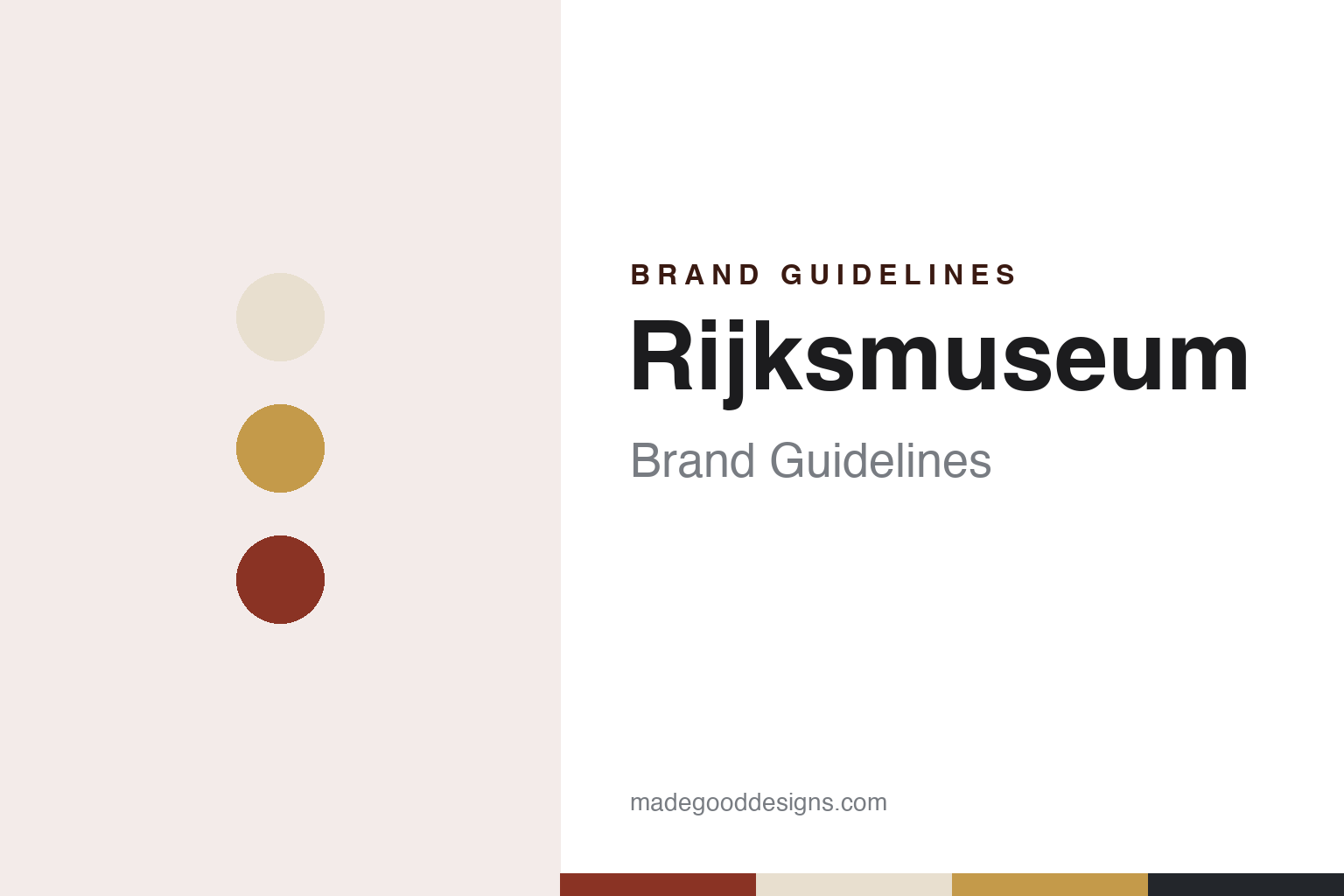
Rijksmuseum Brand Guidelines
A national collection that travelled from The Hague, a brick palace by Cuypers and a name set with an IJ.
Aa
Two constants: a Cuypers brick, atrium stone, hall gold and Museumplein slate palette and a national-museum capitals sans register. Abstract homage — not a Rijksmuseum asset or mark; no logo, artwork, photograph or museum lettering is reproduced.
From The Hague to Amsterdam
A Batavian decision, a gallery in a palace and a move north, 1798–1817.
The Rijksmuseum began as an idea of the Batavian Republic. English Wikipedia says that after the republic was proclaimed in 1795, its finance minister Isaac Gogel argued that a national museum on the French example of the Louvre would serve the national interest, and that the government decided to found the museum on 19 November 1798. Dutch Wikipedia gives the same date and describes the core of the early collection as what remained of the stadtholders’ art collection: Italian pictures, portraits of the House of Orange and patriotic curiosities.
The museum opened on 31 May 1800 in the palace Huis ten Bosch in The Hague. English Wikipedia calls it the National Art Gallery, Nationale Kunst-Galerij, and says it showed around 200 paintings and historic objects from the stadtholders’ collections; Dutch Wikipedia spells the name Nationale Konst-Gallery.
In 1805 the gallery moved within The Hague to the Prince William V Gallery on the Buitenhof. The move north came under the Kingdom of Holland: on the orders of King Louis Bonaparte, the museum moved to Amsterdam in 1808. Paintings owned by the city, including Rembrandt’s The Night Watch, joined the collection, and from 1809 the museum was shown on the upper floor of the Royal Palace on the Dam. Dutch Wikipedia names Cornelis Apostool, director from 1808 to 1844, as the man charged with cataloguing the objects.
In 1817 the collection moved to the seventeenth-century Trippenhuis, and Dutch Wikipedia says that by then, after the accession of King Willem I, it was called the Rijks Museum. The house proved too small. English Wikipedia says the historical objects went to the Mauritshuis in The Hague in 1820, and that in 1838 the paintings by living masters went to Paviljoen Welgelegen in Haarlem, the former summer palace of Louis Bonaparte.
Colour
Two contests, a Gothic-Renaissance palace and ten years of rebuilding.
English Wikipedia says a design contest for a new building was held in 1863 without a winner judged good enough, with Pierre Cuypers placed second. A new contest in 1876 was won by Cuypers with a design combining Gothic and Renaissance elements, and construction began on 1 October 1876. The building was decorated inside and out with references to Dutch art history, and a further contest chose the decorators: B. van Hove and Frantz Vermeylen for sculpture, Georg Sturm for tile panels and painting and W. F. Dixon for stained glass. The museum opened at its new site on 13 July 1885.
Dutch Wikipedia says the building brought the collections back together: alongside the Rijksmuseum’s own holdings it took in the paintings of living masters from Haarlem and the Nederlandsch Museum voor Geschiedenis en Kunst from The Hague. English Wikipedia describes the plan as two squares, each with an atrium at its centre, and a central axis with a passage at ground level and the Gallery of Honour on the floor above. In 1890 a separate building to the south-west was added, made from fragments of demolished buildings so that it offers an overview of Dutch architectural history; it became known as the fragment building and later the Philips Wing.
The twentieth century toned the interior down. English Wikipedia says the hall for The Night Watch was rebuilt in 1906, that most of the multi-coloured wall decoration was painted over between the 1920s and the 1950s, and that floors and exhibition rooms were built into the two courtyards in the 1960s.
The main building then closed for a long renovation. English Wikipedia dates the closure to December 2003, while Dutch Wikipedia gives 18 March 2003 and says the principal seventeenth-century works were on show in the Philips Wing from December 2003. The design was by the Spanish architects Antonio Cruz and Antonio Ortiz; English Wikipedia says many of the old interior decorations were restored and the courtyard floors removed. Queen Beatrix reopened the main building on 13 April 2013, together with an Asian pavilion by Cruz y Ortiz, and the Philips Wing reopened on 1 November 2014.
Typography
A Cuypers façade, a passage through the middle and a gallery of honour.
An art museum’s identity often starts with its building. The façade, the roofline or a single unusual window becomes the shape people remember, and posters, tote bags and membership cards borrow from it long before any logo is drawn. Names do similar work. A long official title is shortened in everyday speech to a surname, a place or a set of initials, and many museums eventually adopt that short form as the word mark, sometimes reduced further to a single letter or monogram that can sit on a banner, a ticket or a phone screen. A collection that spans centuries asks for a mark that stays quiet next to the art, so house identities tend to rely on a restrained typeface, a narrow palette and plenty of empty space.
Exhibitions pull in the other direction. Each major show usually gets its own title treatment, colours and imagery drawn from the works on display, and the house mark steps back to a corner of the poster or the catalogue spine. Inside the building, wayfinding carries the identity in its plainest form: floor numbers, gallery names and directions set in the house typeface on walls, lifts and printed maps. The shop and the ticket desk extend it to bags, labels, admission tickets and membership material, where colour can code a ticket type or a membership level. Online, a digital collection site turns the identity into an interface, with image grids, object records and search filters that have to work for researchers and casual visitors alike.
Aa
National-museum capitals sans — after the clear, typographic register of the museum’s 2012 house style. (Specimen set in Archivo, a sans STAND-IN; NOT the Rijksmuseum logo or the museum’s own typeface.)
Rijksmuseum
From a Studio Dumbar mark to Irma Boom’s IJ and an open image library.
The museum changed its identity ahead of the reopening. Print magazine reported on 22 August 2012 that the Rijksmuseum, nearing the end of its renovation, had unveiled a new logo by the Dutch designer Irma Boom, replacing a mark designed by Studio Dumbar around 1980. It said the logo was part of a new house style, also by Boom, with a colour palette based on highlights of the collection and a typeface called Rijksmuseum by Paul van der Laan of the foundry Bold Monday, and it pointed readers to the Dutch IJ digraph to explain the treatment of those two letters in the logo.
Design Week reported on 28 August 2012 that the Studio Dumbar logo had been in place for 32 years, and quoted Boom: “My starting point was the fact that the Rijksmuseum is a national museum with international appeal. The design is clear and powerful and anchors the museum in the present.” The magazine said the renovation was led by Cruz y Ortiz with the French designer Jean-Michel Wilmotte working on the interiors, and that the Rijksmuseum described its new palette as “the DNA of the Rijksmuseum”, used across its printed and other material. The type designers’ association ATypI later hosted a talk on the identity at its 2013 conference in Amsterdam, describing it as a mainly typographic solution for which Boom invited Bold Monday to draw a series of typefaces.
The museum’s image of itself also moved online. The open-culture network OpenGLAM published a case study on 27 February 2013 saying the Rijksmuseum had begun in 2011 to look at releasing images, prompted by a request from the Dutch Open Cultuur Data initiative, and had by then made 111,000 images of public-domain works available without copyright restrictions, as downloads and through an API. At the end of 2012, it said, this was joined by the launch of Rijksstudio, where people can collect works into their own exhibitions and are encouraged to reuse the images and share the results. English Wikipedia says the platform held 700,000 works by January 2021, under a Creative Commons public-domain dedication.
For a design guide, the Rijksmuseum shows a national museum whose image rests on a Cuypers building, a palette drawn from its own collection and a wordmark built around a letter pair specific to Dutch. Compare the Stedelijk Museum, its neighbour in Amsterdam, and the Bold Monday guide. For this guide we use Cuypers brick, atrium stone, hall gold and Museumplein slate with a sans, an unofficial interpretation; no product or logo is reproduced.
Explore & save
Keep Rijksmuseum’s identity on hand — save it to a board in the Made Good inspiration library.
Rijksmuseum identity set
Pin the Rijksmuseum Cuypers brick, atrium stone, hall gold and Museumplein slate palette and the national-museum capitals sans register to your own board.