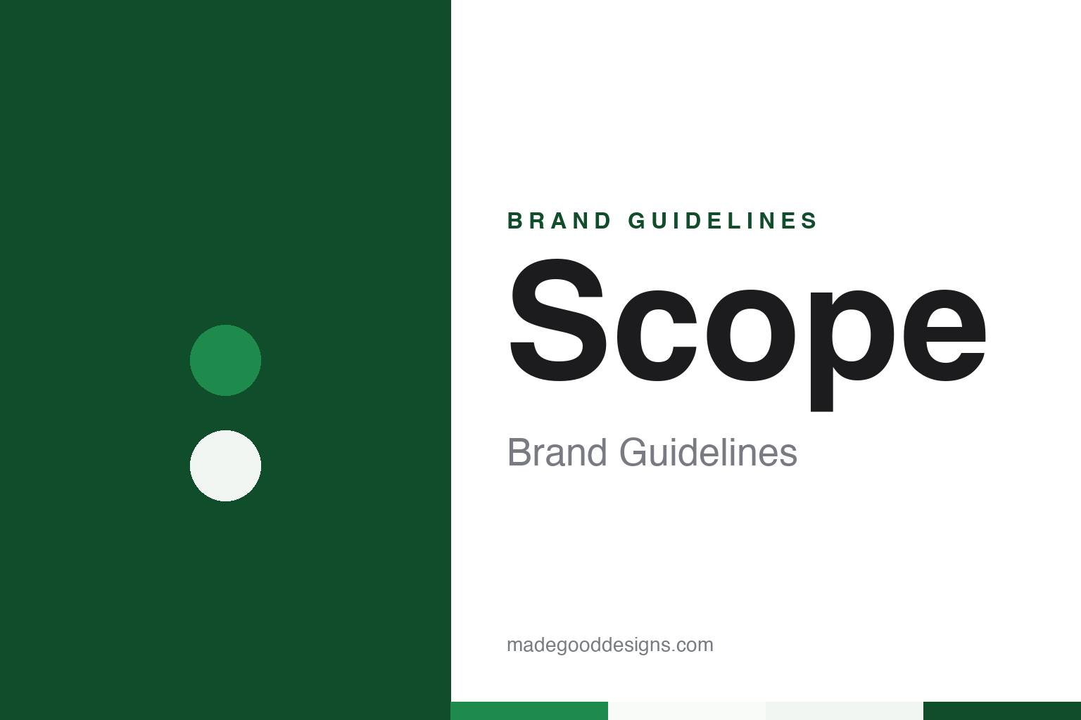
Scope Brand Guidelines
A Procter & Gamble mouthwash with a plain English name and a long-running rival.
Aa
Two constants: a mint, bottle green and pink palette and a rounded humanist sans register. Abstract homage — not a Scope product or mark; no bottle, label or logo is reproduced.
A Cincinnati mouthwash
A soap and candle company, a plain word and a rival.
Scope is a mouthwash brand of Procter & Gamble, the consumer-goods company headquartered in Cincinnati, Ohio. English Wikipedia’s history of the company says it was founded there in 1837 by William Procter, a candlemaker born in England, and James Gamble, a soap maker born in Ireland, who met after marrying two sisters. More than a century later the same company moved into oral care: Wikipedia records that P&G began selling the toothpaste Crest in 1955. Procter & Gamble has owned Scope since it introduced the brand, and the mouthwash has sat inside that oral-care business ever since.
The launch is dated two ways. English Wikipedia’s article on Scope says the mouthwash was introduced in 1965, citing a page of The Indiana Gazette from 10 November 1965, and the article files the brand among products introduced that year. Adweek, in a column by Robert Klara published on 17 January 2013, places Scope’s arrival in 1966, opening its history with the line that before that year, mouthwash meant Listerine.
That older brand is the other half of Scope’s story. Wikipedia describes Scope as a competitor of Listerine for many years, and Adweek’s column sets the two side by side from the start, describing Listerine as Lambert Pharmaceutical’s product and dating its introduction to 1879. In Klara’s account, the newcomer’s real weapon was not an ingredient but a marketing term. Procter & Gamble’s marketers, he writes, built a long run of advertising around a single coined word, “mediciney,” and aimed it squarely at the older rival’s taste.
The name is a plain English word rather than a coined one. The web address scope.com, for example, leads to Keysight, a maker of electronic measurement instruments.
Colour
A Teague bottle, redrawn wordmarks and a place beside Crest.
The bottle has a design pedigree. English Wikipedia’s article on Teague, the industrial-design firm established by Walter Dorwin Teague, says that from the late 1950s the studio expanded its work in product packaging, and that this led to projects for Procter & Gamble brands including Ivory soap, Downy, Comet and Scope. The article describes a lasting relationship between the firm and P&G through the 1960s, and it lists the Scope mouthwash bottle among the package designs Teague produced for clients, alongside the Pringles canister and Ivory soap.
The wordmark has been redrawn several times. The logo files shown on Wikipedia’s Scope page are captioned by period: one used from 1997 to 2009, a new logo introduced in 2009, and a further logo captioned as current from 2012. Two more marks from the same years show the brand working in combination with other names. One is a Scope Outlast logo and the other a Crest Plus Scope Outlast logo, both captioned 2009–2012. The external link Wikipedia gives as the official Scope website pointed to a combined Crest-and-Scope address, crestplusscope.com, which the Internet Archive saved in June 2018.
That pairing with Crest is visible in the way the range is presented today. Crest’s own American website, checked in October 2026, divides its mouthwash listing into two families, Crest Mouthwash and Scope Mouthwash, and lists Scope products including Scope Classic and Scope Outlast. In that listing Scope appears under its own name, as a second family beside Crest’s own rinses, rather than as a sub-line of the toothpaste brand.
The owner, too, has stayed the same. Newspaper reports from 1997 describe Procter & Gamble as Scope’s corporate parent, Dental Products Report named P&G as the brand’s owner in 2012, and Adweek credited the brand’s 2013 advertising to P&G and its agency. Across six decades of logos and campaigns, the company that introduced Scope in the mid-1960s is the company that sells it in 2026.
Typography
Design and documentation.
The brands in this group sit on the same few shelves of a pharmacy or supermarket: mouthwash, toothbrushes, toothpaste and eye drops. They belong to a category in which the pack has to carry a great deal in a small space, and in which many of the names have passed through several owners while staying on the shelf under the same word.
Each format sets its own limits. A mouthwash bottle is a tall, see-through container, so the colour of the liquid inside often becomes part of the look, and the label wraps around a curved surface. A toothbrush is usually sold in a blister pack, a clear plastic shell over a printed card, where the brush itself is on show and the card has to hold the name, the head and the range. Eye drops come in a very small bottle inside a folding carton, so the carton front does most of the work, and the type has to stay legible at a few centimetres across.
Each guide separates what independent sources record from what the company says about itself — who started the name, who has owned it since, and how its packs and advertising have changed — and leaves out anything that cannot be dated.
Aa
A rounded humanist sans — the register of a short, friendly brand name set large on a coloured bottle. (Specimen set in Nunito Sans, a rounded humanist sans STAND-IN; NOT the Scope logo.)
Kissable and courageous
Boxed pink lips, a Valentine’s poll and a bolder identity.
Scope’s advertising has repeatedly turned on romance. Adweek’s 2013 column reproduced a print advertisement from 1977 that Klara called textbook for the brand: a pair of pink lips set inside boxes, with scratch-and-sniff pads attached to the page. A branding consultant quoted in the same piece, Peter Madden of the agency AgileCat, found the advertisement static and medicinal, which is the contrast the column went on to draw.
In 1997 a Scope promotion went wrong in public. The Deseret News (24 March 1997) and the Tampa Bay Times archive (21 March 1997) reported that a Scope poll released just before Valentine’s Day had listed the talk-show host Rosie O’Donnell among the “least kissable” celebrities, alongside Newt Gingrich and Dennis Rodman. O’Donnell answered on her programme on 18 February; Listerine took her side with newspaper advertisements calling her the “queen of kissing”; and a Procter & Gamble spokesman, Jim Schwartz, told reporters the poll “was intended in fun.”
By 2012 the brand had changed its register. Dental Products Report reported on 17 December 2012 that Rishi Dhingra, a marketing director at Procter & Gamble, had described to The New York Times “a new, bold brand identity,” inspired by consumers who “live out loud” and meant to help them “live courageously.” The print work carried lines such as “Become one with everyone” and “Close encounters are the best kind,” while videos on the brand’s YouTube channel followed the comedian David Adhoot on what the trade magazine called his “mission to live spontaneously.”
Adweek described the same shift a month later. Its January 2013 column set the 1977 lips beside a new image of a kiss on a dance floor, credited the work to P&G and its agency Publicis, and wrote that the clinical trappings of the earlier campaigns were gone. In the column’s reading, the new advertising focused on the person using the product rather than on the product itself.
For a design guide, Scope shows how a P&G brand from the mid-1960s has carried a plain English word, a Teague-designed bottle and a run of redrawn wordmarks through campaigns that moved from boxed pink lips to a kiss on a dance floor. Compare it with Crest, the P&G toothpaste it is now listed beside, and Listerine, the rival its early advertising set itself against. For this guide we use mint green, bottle green and lip pink with a rounded humanist sans, an unofficial interpretation; no product or logo is reproduced.
Explore & save
Keep Scope’s identity on hand — save it to a board in the Made Good inspiration library.
Scope identity set
Pin the Scope mint, bottle green and pink palette and the rounded humanist sans register to your own board.