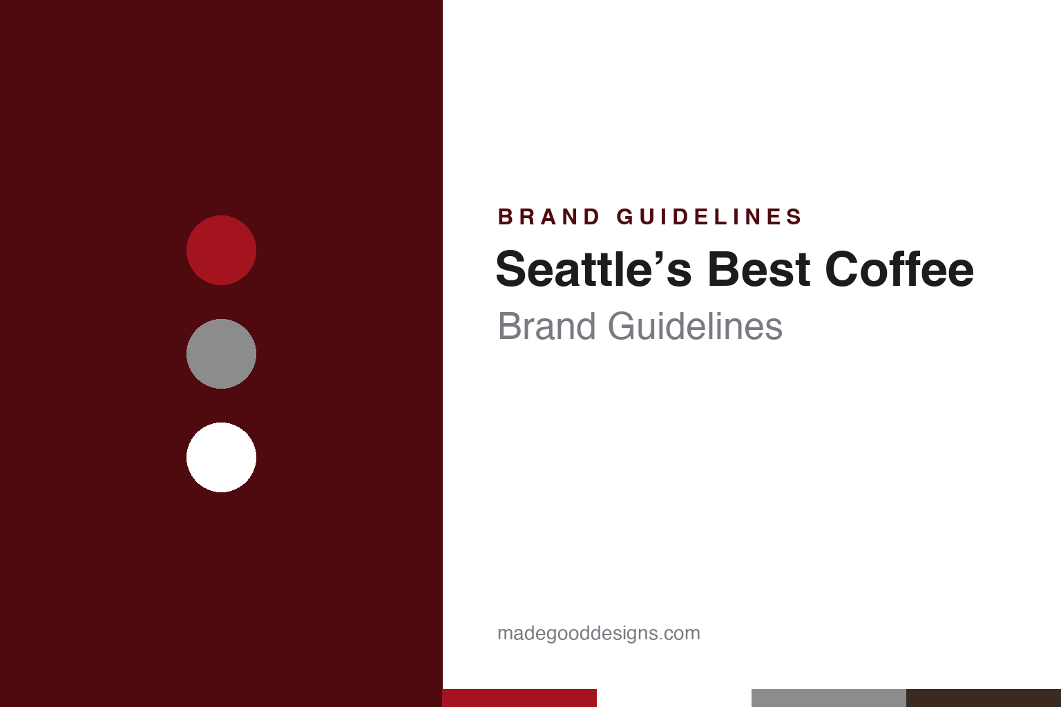
Seattle’s Best Coffee Brand Guidelines
An island roastery, a waterfront pier and a red logo built from a drop and a cup.
Aa
Two constants: a drop red, logo gray and cup white palette and a heavy grotesque sans register. Abstract homage — not a Seattle’s Best Coffee product or mark; no bag, pod or logo is reproduced.
From a waterfront pier to Vashon Island
An ice-cream and coffee shop, two brothers and an old country store.
Seattle’s Best Coffee is an American coffee brand sold as ground and whole-bean coffee and as K-Cup pods. Its trademarks are owned today by Nestlé. The brand dates its start to 1970: the Seattle Post-Intelligencer wrote in April 2003 that Seattle’s Best Coffee was founded in Seattle in 1970, a Starbucks press release of May 2010 said the same, and the brand still used the line “Since 1970” in a statement reported by Beverage Industry in April 2025.
The founder was Jim Stewart. The Seattle Post-Intelligencer named him in August 2002 as the man who had founded Seattle’s Best more than thirty years earlier. English Wikipedia gives the longer origin story. It says the business began in 1969 as a combined ice-cream and coffee shop called the Wet Whisker in Coupeville, on Whidbey Island, north-west of Seattle, where Stewart bought green coffee beans from local roasters to be roasted and sold. Wikipedia says Stewart and his brother Dave then opened another ice-cream and coffee shop, Stewart Brothers Wet Whisker, on Pier 70 on Seattle’s waterfront.
The name changed in stages, according to Wikipedia. The shop became Stewart Brothers Coffee in 1983 and opened further shops in Bellevue and at Seattle’s Pike Place Market. In 1991, Wikipedia says, the company was renamed Seattle’s Best Coffee after winning a local competition.
Roasting moved off the mainland in the 1980s. The Seattle Post-Intelligencer reported on 21 August 2002 that after roasting coffee on Pier 70 for several years, Stewart moved the business to Vashon Island in 1983, and that Seattle’s Best Coffee had begun roasting beans there in an old country store. The paper said Stewart still owned the roasting-plant building, which housed company and coffee memorabilia, and that islanders often used the plant as a meeting place.
The same report explained why the company planned to leave. Green coffee beans were stored at the Port of Seattle, shipped to Vashon for roasting and then sent back across Puget Sound to a distribution centre in Renton. Seattle Coffee Co., which then operated both Seattle’s Best Coffee and Torrefazione Italia, said it was outgrowing the island plant and planned to move roasting to a new plant in Fife, closing the Vashon plant by the end of 2003. “We would have liked to have stayed,” said the company’s president, Steve Schickler.
Colour
Seattle Coffee Co., AFC Enterprises, Starbucks and Nestlé.
Ownership changed several times in the 1990s. English Wikipedia says that around 1995 the company was bought by a group of investors who owned Torrefazione Italia, forming Seattle Coffee Holdings, which changed its name to Seattle Coffee Company in 1997. In 1998, Wikipedia says, AFC Enterprises bought the business and began franchising the Seattle’s Best Coffee brand.
The next owner came from the same city. The Seattle Post-Intelligencer reported on 15 April 2003 that Starbucks would acquire Seattle Coffee Co. from its parent, Atlanta-based AFC Enterprises, including both Seattle’s Best Coffee and Torrefazione Italia; the paper called Starbucks a hometown rival. Starbucks chairman Howard Schultz said the brands would serve consumers with an affinity for the “smooth flavors” of Seattle’s Best coffees. Schickler told employees that one thing that would never change was the quality of the coffee. AFC would continue to operate Seattle’s Best cafés outside North America, chiefly in Asia and the Middle East, said its chairman and chief executive, Frank Belatti.
Under Starbucks the brand was repositioned for wider distribution. A Starbucks release dated 12 May 2010 said Seattle’s Best Coffee, acquired in 2003, was unveiling a new brand direction aimed at making high-quality coffee more accessible. Michelle Gass, then president of Seattle’s Best Coffee, said the company wanted to take its coffee to the places customers went in their everyday lives. The same release announced an agreement to serve the coffee at AMC Theatres and repeated that it would be offered at Burger King restaurants in the United States.
The brand then moved to Starbucks’ partner. On 18 October 2022, Starbucks announced that it planned to sell the Seattle’s Best Coffee brand to Nestlé, with which it had formed the Global Coffee Alliance in 2018. The release said the two companies had agreed to keep the terms confidential and that the transaction was expected to close by the end of 2022. David Rennie, head of Nestlé Coffee Brands, said the brand would let Nestlé offer consumers more choice for their everyday coffee.
Nestlé has owned the brand since that sale. The footer of the Seattle’s Best Coffee website, as archived in May 2024, stated that all trademarks were owned by Société des Produits Nestlé S.A., of Vevey, Switzerland, or used with permission.
Typography
Design and documentation.
The brands in this group sit on a familiar run of grocery shelves: the boxed side dish and meal helper, the bag of flour and the bag or pod of coffee. Each of these packs is bought quickly and often, and each has to say what is inside, how to use it and whose name stands behind it within a few seconds at the shelf.
A boxed mix carries its identity on a printed carton, usually with a photograph of the finished dish and short instructions on the back. A flour bag is mostly plain paper or film, so its name, colour and type of flour do much of the work. A coffee bag, can or pod carries its name alongside the roast and the grind, and the same mark may also appear on a café sign or a brewing machine.
The names behind these packs have often changed hands. Each guide therefore separates what independent, dated sources record from what the company says about itself — its founding story, its owners over time, where its products are made and how its packaging has changed — and marks plainly what rests only on the company’s own word.
Aa
A heavy, plain grotesque sans — the direct, everyday register of a supermarket coffee. (Specimen set in Archivo, a grotesque STAND-IN; NOT the Seattle’s Best Coffee logo.)
A drop, a cup and the colour red
A 2010 logo by Creature, a public backlash and a 2025 packaging refresh.
The brand’s current visual system dates from 2010. The Starbucks release of 12 May 2010 said a new brand identity, including a new logo, would play a key role in Seattle’s Best Coffee’s strategy. It described the logo as keeping the brand’s historic association with its name and the colour red, while assembling familiar coffee symbols, a drop and a cup, in an unexpected way. The logo, the release said, was designed by Creature, an independent brand and advertising agency based in Seattle.
Michelle Gass explained the thinking in the same release. The new identity, she said, was inspired by the history of the Seattle’s Best Coffee culture, “one of optimism and fun,” and the new brand direction would bring a simplified approach to the coffee category. She added that the logo was designed to one day become a universally recognised and reassuring symbol for coffee. The release also used the line “Uncommonly Smooth” to describe the brand’s taste, a claim made by the company itself.
The public reaction was largely critical, according to the local press. The Seattle Times, in a column by deputy business editor Rami Grunbaum published in May 2010, said the logo makeover had been unveiled for the brand’s 40th anniversary and described the new mark as a stylised white-and-gray-on-red design. Many commentators, the paper said, reacted to the utilitarian new look as though they had been splashed in the eye with hot espresso; readers of the food blog Slashfood likened it to a label for generic eye drops. The column printed the old and new logos side by side, along with a parody and a comparison with an oil-company mark.
The idea of smoothness has stayed with the brand. The Seattle’s Best Coffee website, as archived in 2024, described its coffee as “smooth-roasted”. Beverage Industry reported on 11 April 2025 that the brand had unveiled fresh packaging alongside a national campaign starring the actor Joel McHale, titled “May Smoother Coffee Bring Smoother Days” and created by the Los Angeles agency HAYMAKER. The magazine said the new packaging used colour-coded flavour panels, hand-drawn illustrations for each blend and a dedicated panel for the roast level, name and tasting notes, and that the refresh arrived with a new flavoured coffee, Campfire S’mores, sold as ground coffee and as K-Cup pods.
For a design guide, Seattle’s Best Coffee shows how a brand can keep one colour, red, through a change of founder, owner and logo, and how a single word, smooth, can carry a coffee from a 2003 acquisition statement to a 2025 bag. Compare it with Starbucks, its owner from 2003 to 2022, and Nescafé, the coffee brand of its present owner, Nestlé. For this guide we use drop red, roastery maroon, logo gray and cup white with a sans, an unofficial interpretation; no product or logo is reproduced.
Explore & save
Keep Seattle’s Best Coffee’s identity on hand — save it to a board in the Made Good inspiration library.
Seattle’s Best Coffee identity set
Pin the Seattle’s Best Coffee drop red, logo gray and cup white palette and the heavy grotesque sans register to your own board.


