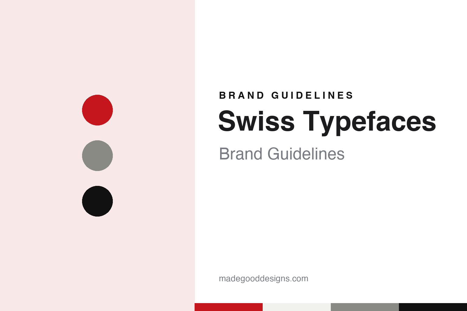
Swiss Typefaces Brand Guidelines
A grotesque that gets updated, not replaced.
Aa
Two constants: a signal red, lake grey and black palette and a neo-grotesque register. Abstract homage — not a Swiss Typefaces asset or mark; no logo, font or wordmark is reproduced.
A foundry named after its own tradition
From BP Foundry to Swiss Typefaces.
Swiss Typefaces is a type design company whose name states its origin plainly. On its own website the foundry says it was founded in 2006 by designers who grew up surrounded by the Swiss, or International, Style, and that those roots are a defining part of the company. It says its headquarters are in Vevey, on Lake Geneva, and that it runs a second design office in Berlin. The copyright line on the site runs from 2006.
The British design site It’s Nice That gave a dated account of the company’s early name in an article published on 13 January 2022. It said the type designer Ian Party studied sign painting and then graphic design at the École cantonale d’art de Lausanne (ECAL), before specialising in typography in the Type and Media programme at the Royal Academy of Art in The Hague. It reported that in 2005 Party founded a design company, BP Foundry, which later became Swiss Typefaces in 2013. The same article said Party taught type design at ECAL from 2005 to 2016 and founded a new studio, Newglyph, in 2019.
The foundry’s current team page names Emmanuel Rey as managing partner and executive creative director and Maxime Plescia-Büchi as founding partner. It also lists a type director, a font technology director, a visual identity and website manager, and external collaborators for Cyrillic, Arabic and Vietnamese, as well as specialists in type metrics and font engineering.
The company frames its identity as a mix of local heritage and outside influence. It says it is embedded in a network of creatives from design, music, street culture, fashion, fine art and technology, and calls that combination of “Helvetian heritage and cosmopolitan connections” the thing that shapes its work. It also says the attitude to innovate covers not only how its letters are drawn but how its fonts are named, packaged, distributed, licensed and priced, and that its typefaces are made by designers, for designers.
Colour
Two designers on speed, streets and grotesques.
A long conversation published by the type journal type.today on 7 February 2017 gives the clearest picture of how the founders talked about their work. In it the designer Ilya Ruderman interviewed Ian Party and Emmanuel Rey of Swiss Typefaces about the state of type design, their influences and their library.
Party said his main inspiration at the time was “everything fast”. He described liking how Formula 1 cars, time-trial bicycles, boats and motorbikes are designed, with organic curves interrupted by sudden straight lines that are calculated for efficiency, and said a typeface should suggest that kind of movement even though it does not move. Rey said he was inspired by street, graffiti and nightclub culture, and by the music industry’s shift from physical formats to MP3 files, which he saw as an example for type design in finding a business model for the digital era. He also said that for the pair there are no fixed rules in type design and that the eye is the referee.
Asked about Swiss design, Party said it was simply how they grew up, surrounded by Swiss graphic design, by every poster in the street and by the design of the Swiss railway company, SBB CFF FFS, which he called a monument of Swiss graphic design. He said it was when he began to travel that he realised design is not always like that.
The interview also set out a view of the library as a small set of families that are revised rather than multiplied. Party described Suisse Int’l as the foundry’s grotesque and said it would not design another grotesque like it; if a better fit was needed, it would update that one. Rey compared the approach to the Porsche 911, which keeps its name while its design is renewed every few years. Party said the same thing was happening with the SangBleu family, which was being redrawn as a new collection, and that a new version of Suisse Works would follow.
Typography
Spines, colophons and specimens as brand surfaces.
A publisher or a type foundry rarely has a shopfront, so its identity lives on the objects it makes. For a book house the first brand surface is the spine: a repeated position for the imprint mark, a consistent run of type for author and title, and sometimes a numbering system, so that a shelf of its books reads as a family from across a room. The colophon at the back of a book does a quieter job, naming the typefaces, the paper, the printer and the designer, and over time that small block of text becomes a signature that collectors look for.
The imprint logo itself is usually small and has to survive embossing, foil, a one-colour print on a cloth cover and a favicon on a website. That pushes many marks towards simple wordmarks or compact monograms. For a foundry the product is the identity: type names, specimen books, specimen websites and trial files carry the house voice. A specimen is both a catalogue and a manifesto, showing how a family behaves at text and display sizes, and the way faces are named, numbered and grouped tells readers how the studio thinks about its own work.
Aa
Neo-grotesque — after a foundry whose Suisse Int’l was described by its designers as “our grotesque” in 2017. (Specimen set in Inter, a sans-serif STAND-IN; NOT the Swiss Typefaces logo or any Swiss Typefaces font.)
Swiss Typefaces
Families, revivals and new scripts.
The type names are a visible part of the foundry’s identity. Its catalogue lists families including Suisse, SangBleu, Euclid, Simplon, Riviera, NewParis and Raskal. The site also has a section for printed publications, which the company says it uses to show what its fonts can do.
In the 2017 type.today interview the founders said two families had begun as revivals. NewParis, in Text, Headline and KingSize versions, started as a revival and was then modified, they said. Party added that a typeface called Romain, which also started as a revival, was due to be taken off the market, redesigned and renamed, because the foundry did not want revivals in its library. Asked which published family represented 2016, Party named SangBleu King.
The same conversation covered scripts beyond Latin. Party said Euclid Flex and Suisse Int’l would arrive in Cyrillic within about a month, and Rey said that more than a thousand ligatures and alternates had been designed for the Cyrillic version of Euclid Flex. Party said the Arabic was being developed with the type designer Pascal Zoghbi, and that the foundry had created typefaces for 29Letters, an Arabic type foundry. He added that variable fonts were key to the foundry’s future development and that it had begun redesigning the collection to fit the format.
The foundry’s current team page reflects that range, with external collaborators credited for Cyrillic, Arabic and Vietnamese and for font engineering and type metrics.
For a design guide, Swiss Typefaces shows how a foundry can turn its own national label into a brand and treat each family as a model line that is redrawn over time. Compare Grilli Type, another Swiss foundry in this collection, and Velvetyne, a French type foundry. For this guide we use signal red, lake grey and black with a sans, an unofficial interpretation; no product or logo is reproduced.
Explore & save
Keep Swiss Typefaces’s identity on hand — save it to a board in the Made Good inspiration library.
Swiss Typefaces identity set
Pin the Swiss Typefaces signal red, lake grey and black palette and the neo-grotesque register to your own board.

