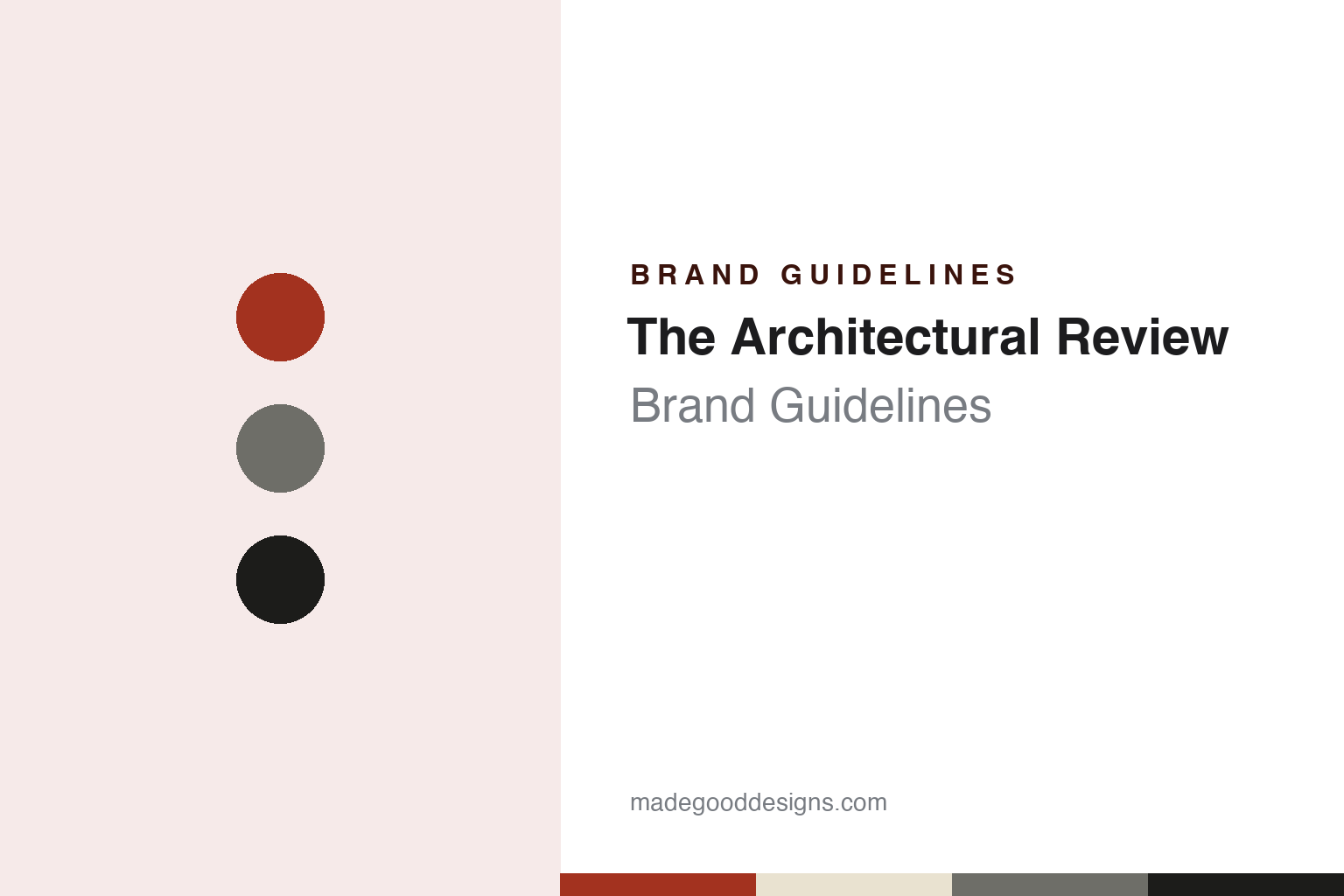
The Architectural Review Brand Guidelines
A Clarendon masthead with a shadow from its own archive.
Aa
Two constants: a plan red, tinted stock and art-paper black palette and a slab-serif capitals register. Abstract homage — not an Architectural Review asset or mark; no logo, cover or masthead is reproduced.
A London monthly for artists and craftsmen
Percy Hastings, the Architectural Press and a family editorship.
The Architectural Review began life with a longer name. English Wikipedia’s article on the magazine says it was founded in London in 1896 as the Architectural Review for the Artist and Craftsman, a monthly, by Percy Hastings, the owner of the Architectural Press. Its first editorial board, according to the same article, was made up of the architects Reginald Blomfield, Mervyn Macartney and Ernest Newton, and Wikipedia lists Henry Wilson as its first editor, from 1896 to 1901. The title is known simply as “the AR”, a shorthand that the designer Simon Esterson noted in an Eye magazine blog post of 8 April 2009, where he described it as the name used by the magazine’s visually aware audience.
The next decisive change came from inside the Hastings family. Wikipedia says that in 1927 Percy Hastings’s third son, Hubert de Cronin Hastings, became joint editor with Christian Barman of both The Architectural Review and its weekly sister, the Architects’ Journal. The two editors widened the magazine’s aims and changed its style, turning it, in the article’s words, into a general arts magazine with an architectural emphasis. Writers from outside architecture were brought in, among them Evelyn Waugh, Cyril Connolly, Robert Byron and Nikolaus Pevsner, and John Betjeman served as an assistant editor from 1930 to 1934.
The same period shaped how the magazine looked. Wikipedia describes the design of the review in those years as making bold use of layout, typefaces and photographs, and says graphic elements were commissioned from Eric Gill and Edward Bawden. From July 1934 it ran articles by P. Morton Shand on European modernist architecture. After the Second World War the magazine took up the idea of “townscape”, the design of urban space, partly through regular articles by its assistant editor and art editor Gordon Cullen.
The editorship has passed through a long line of names since then. Wikipedia lists James Maude Richards as co-editor or editor from 1935 to 1971, apart from the war years, with Nikolaus Pevsner as acting editor from 1943 to 1945 and a member of the editorial board until 1970. Peter Davey edited the magazine from 1980 to 2005. Catherine Slessor, managing editor from 1992, was editor from 2010 to 2015, followed by Christine Murray from 2015 to 2018, and the article now names Manon Mollard as editor. Wikipedia adds that the magazine is published ten times a year in print, while its website is updated daily.
Colour
From the Architectural Press to Ascential and Metropolis International.
The AR has long been published alongside the Architects’ Journal, the weekly that Hubert de Cronin Hastings also co-edited from 1927, and by 2017 both titles belonged to Ascential. On 5 January 2017, according to an Ascential statement reprinted by the magazine-industry body FIPP on 2 June 2017, the group separated a set of what it called “Heritage Brands” into a new operating entity, so that those brands could follow an independent strategy while new owners were sought.
The buyer was announced that June. FIPP’s report says Ascential agreed the sale of its remaining UK Heritage Brands to Metropolis International, and lists the architecture titles among them: the Architects’ Journal, The Architectural Review and the associated World Architecture Festival. English Wikipedia gives the announcement date as 1 June 2017. Metropolis International has owned the AR since 2017, and the magazine continues to be published from London.
The ownership story matters for the identity, because the look of the magazine has often tracked who was running it. In his Eye post of April 2009, Simon Esterson wrote that changes in ownership and a loss of design direction had left the AR looking like an also-ran in the years before that spring, and he welcomed the redesigned April issue as an attempt to revisit some of the magazine’s great days while making it look contemporary. He recalled that his own interest in both architecture and magazine design had been sparked by the AR’s Manplan issues, which he came across in a school art room.
Esterson’s post also sets out who designed the AR in its post-war decades. For more than twenty-five years, until the mid-1980s, he wrote, the look of the magazine was in the hands of one man, Bill Slack, who held the modest title of production editor but would now be called a creative director. Slack controlled the flatplan, designed every page and organised production with the printer. Esterson describes his habits in detail: punning headlines that Slack wrote himself so that they would fit his layouts, set in capitals in condensed grotesque type; Clarendon for text and captions; and Victorian display faces for articles about architectural history. Black-and-white photographs were printed on art paper, text ran on uncoated tinted stock, pictures were turned through ninety degrees when the content demanded it, and, where the budget allowed, a dramatic gatefold was inserted. Eye had already published a longer study of the AR’s design, Richard Hollis’s article “Building a graphic language”, in its issue no. 28.
Typography
A masthead, a section system and a paper stock.
A magazine’s masthead can stay in one plain serif and still change in small steps. Jeremy Leslie of magCulture wrote in September 2015 that the Fantastic Man logo is set in Times Roman, that the earlier covers carried a stacked, centred version of it, and that issue No. 21 broke away from that arrangement before No. 22 returned to it. In No. 22 the magazine also introduced Founders Grotesk, by Kris Sowersby, as a new headline sans. Leslie described pages built on strict typographic rules, with little decoration beyond the fonts, and a look based on an approach rather than a fixed set of devices. It’s Nice That described the same magazine in October 2015 as mostly black and white, with rule lines, two columns and long passages of text.
Other titles put more of the identity into the cover image itself. AnOther says the first cover of AnOther Magazine, in 2001, was a photograph by Nick Knight of two young lovers cast as Adam and Eve, and that Jefferson Hack’s foreword framed it as the magazine’s statement for that season. For its fifteenth anniversary in 2016, It’s Nice That reported, AnOther made a limited edition with a 3D hologram cover of Karl Lagerfeld, made by the holographer Rob Munday, alongside covers of other subjects in the same issue. When reading a magazine’s identity, look at how the masthead is set and how often it moves, which typefaces carry the headlines, and whether the cover photograph or the cover object carries the brand.
Aa
Square-shouldered slab capitals — the Clarendon register of the AR’s archive mastheads. (Specimen set in Zilla Slab, a slab-serif STAND-IN; NOT The Architectural Review masthead, NOT Clarendon and NOT any AR typeface.)
The Architectural Review
The 2009 redesign that went back to Slack.
A defining moment for the AR’s masthead came with the 2009 redesign. Dezeen, in a story by Marcus Fairs dated 24 March 2009, reported that the graphic designers Alexander Boxill had redesigned the magazine, with the new look launching in the April 2009 issue. Dezeen printed a statement from the AR saying this update of its graphic identity, its last having come more than twenty years earlier, had been carried out by the designer Violetta Boxill working with the AR’s art director Cecilia Lindgren, and edited by the new editor-in-chief, Kieran Long.
The masthead was the centre of that work. In a design statement quoted by Dezeen, Violetta Boxill said the team began by looking back through the magazine’s archive, decided that its graphic heyday had come under William Slack, and chose to redraw and reconfigure one of his original mastheads. The new version rendered the letterforms as a merged unit, something Boxill said would have been impossible in Slack’s day because he worked in metal type. Simon Esterson’s Eye post of 8 April 2009 describes the result as a reworking of a Clarendon-based design from the archives, given a projected shadow and foil-blocked on that month’s cover.
The interior system was built in the same spirit. According to the Dezeen statement, the magazine was divided into three main sections, View for news, Buildings for projects and Marginalia for reviews, with occasional recurring sections whose names Kieran Long reclaimed from issues of the Slack era. Each section had a mini-brand based on one font but treated with different patterns and colours. Two typefaces carried the whole magazine: Mercury, the serif by Jonathan Hoefler, used as the body face throughout, and T-Star, a condensed sans serif that Esterson credits to Mika Mischler. Traditional headlines were removed, and buildings were given numbers that ran through an entire year, a cataloguing habit Esterson compared to Factory Records.
For a design guide, The Architectural Review shows how a magazine can renew itself by reading its own back issues: the 2009 team took a masthead, section names and a typographic temperament from the Slack years rather than inventing new ones. Compare it with the London online magazine Dezeen and with the Milanese architecture monthly Domus. For this guide we use plan red, tinted stock and art-paper black with a slab serif, an unofficial interpretation; no product or logo is reproduced.
Explore & save
Keep The Architectural Review’s identity on hand — save it to a board in the Made Good inspiration library.
The Architectural Review identity set
Pin The Architectural Review plan red, tinted stock and art-paper black palette and the slab-serif capitals register to your own board.