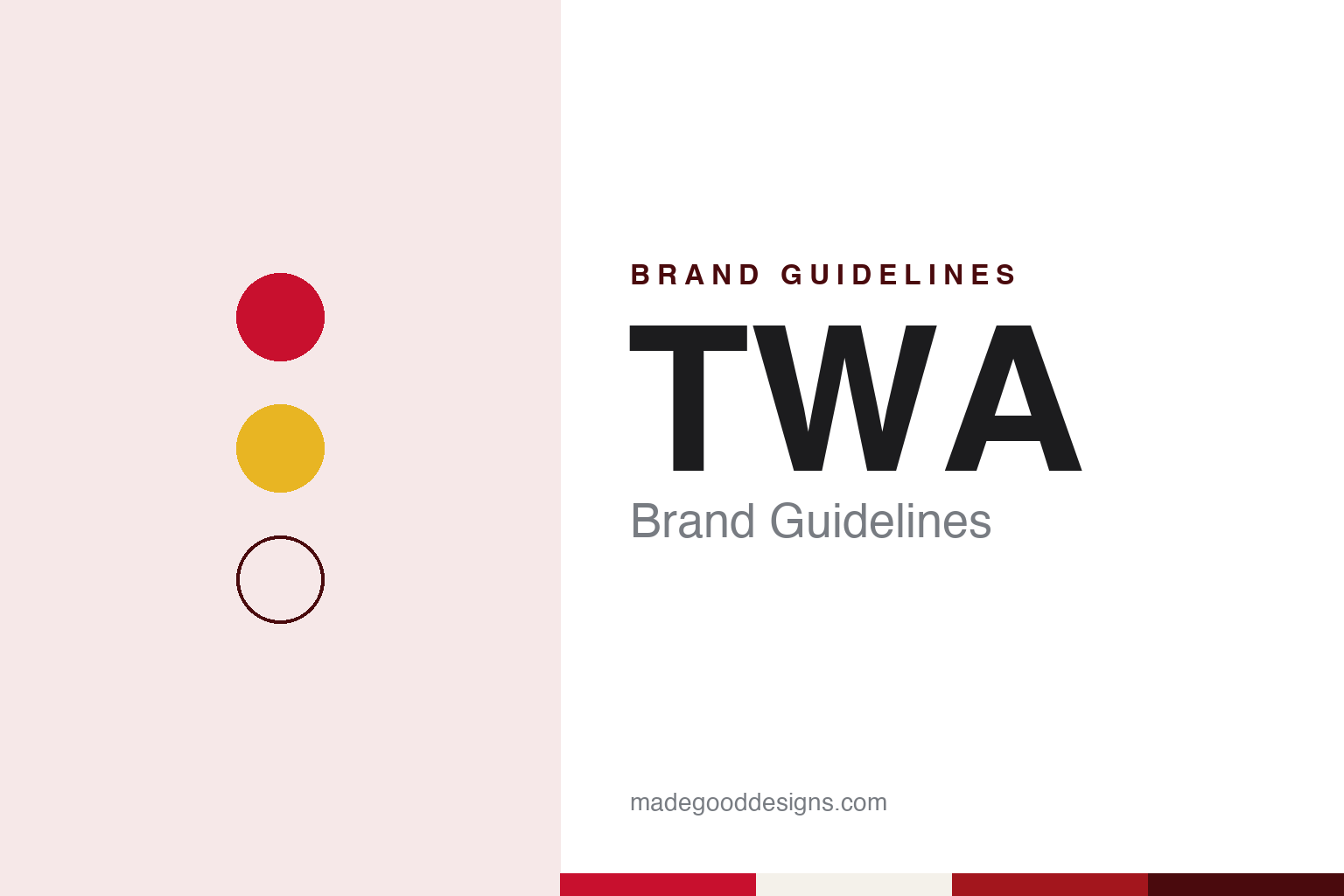
TWA Brand Guidelines
Red italic letters, a yellow double globe and a concrete wing at JFK.
Aa
Two constants: a red, yellow and white palette and a Red italic sans register. Abstract homage — not a TWA or American Airlines asset or mark; no logo, globe or wordmark is reproduced.
A name that outlived its airline
From an airmail merger in 1930 to a final flight in 2001.
TWA no longer flies. The airline stopped operating at the end of 2001, after its assets were bought by AMR, the parent company of American Airlines, and its last flights folded into American’s network. What remains is a name, a set of red letters and a building in New York that has been turned into a hotel. This guide treats TWA as a historical identity and describes what became of it.
The company began as Transcontinental & Western Air. English Wikipedia dates its corporate history to July 1930 and the forced merger of Transcontinental Air Transport, Western Air Express and several smaller operators, which formed the new airline on 1 October 1930. The merger was pushed by Postmaster General Walter Folger Brown, who wanted larger airlines to receive airmail contracts. The new company flew a route between New York and Los Angeles with stops including St. Louis and Kansas City, and in 1931 it moved its headquarters from New York to Kansas City, Missouri.
The initials T&WA, and later TWA, came from that original name. Howard Hughes began buying the airline’s stock in 1939 and, according to English Wikipedia, held a controlling interest by 1944. After the Second World War, under Hughes, the airline expanded to Europe, the Middle East and Asia. On 17 May 1950 it officially changed its name to Trans World Airlines, keeping the same three letters while giving them a new meaning that matched the wider network.
Hughes gave up control in the early 1960s, and later management built a holding company that bought hotels, restaurants and a real estate brokerage. The airline’s main domestic hub moved to St. Louis Lambert International Airport, while English Wikipedia describes its main transatlantic hub as the TWA Flight Center at New York’s John F. Kennedy International Airport, designed by Eero Saarinen and completed in 1962.
The end came in stages. English Wikipedia records that TWA filed for its third and final bankruptcy in January 2001 and that its assets were acquired in April 2001 by AMR, which formed a new company called TWA Airlines LLC. Bookings under the TWA name ended on 30 November 2001. The ceremonial last flight, on 1 December 2001, was Flight 220 from Kansas City to St. Louis, flown by an MD-83 painted in a special scheme called “Wings of Pride.” That night, staff removed TWA signs at airports and replaced them with American Airlines signs, and the LLC itself was dissolved in July 2003.
Colour
Hughes’s red, Loewy’s globe.
Colour sits at the centre of the story. English Wikipedia says the red TWA logo was developed in the 1950s, with a red and white colour scheme developed by Howard Hughes, and that this pairing stayed at the centre of the airline’s identity until the American Airlines acquisition in 2001. The letters themselves were bold, italic and purely typographic: three red capitals leaning forward, with no symbol beside them.
In the 1960s the industrial designer Raymond Loewy worked on the identity. English Wikipedia credits him with a red arrow on white that ran the length of the fuselage and lasted well into the 1970s. In 1962, Loewy updated the corporate logo: he kept the red italic letters but added a double globe in yellow behind them. That combined mark was used for the majority of the airline’s purposes until 1975, when the purely typographic red letters returned on their own.
The airline also used uniforms as part of its look. English Wikipedia lists three designers across the 1970s: Valentino from 1971 to 1974, Stan Herman from 1974 to 1978, and Ralph Lauren from 1978 until 2001. The airline’s Ambassadors Clubs, its airport lounges, closed or passed to American Airlines on 2 December 2001, according to the same source.
During the handover in 2001, English Wikipedia notes, some aircraft carried a hybrid look, with American’s tricolour stripe on the fuselage and TWA titles still on the tail and forward fuselage, before the TWA name was painted out.
Typography
US airlines and their surfaces.
An airline’s identity is read from a long way off before it is read up close. The tail fin is a surface seen from a distance: it stands above the terminal roofline, it appears in every ramp photograph and planespotting shot, and it is usually the one place where a carrier puts its mark at full size. Designers treat the fin as a billboard that must stay legible at a distance, in poor light and at an angle, which is why marks there tend to be bold, simple and high-contrast.
The fuselage carries the second layer. A livery can be a white body with a coloured cheatline, a fully painted body in a single signature colour, or a gradient that runs from nose to tail. Each choice has practical trade-offs in paint weight, maintenance and how the aircraft reads against sky and tarmac. The name on the fuselage is usually set in a wordmark that has to work from a few metres and a few hundred.
On the ground, airport signage, gate areas, check-in counters, uniforms and terminals extend the same system. Wayfinding colour, counter panels and boarding-pass layouts are all brand surfaces, and a terminal building itself can become part of how an airline is remembered.
Aa
A bold italic sans — after three red capitals leaning forward. (Specimen set in Archivo Bold Italic, a sans STAND-IN; NOT the TWA logo or its lettering.)
TWA
A terminal that became the brand.
The building tied to TWA is the TWA Flight Center at John F. Kennedy International Airport. Dezeen, in a report published on 17 February 2019, describes it as a mid-century-modern structure completed by the Finnish-American architect Eero Saarinen in 1962 for Trans World Airlines, with a winged construction, curved concrete rooflines shaped like a beak and glass curtain walls. The terminal closed in 2001 because, as Dezeen puts it, it could not support the size of modern aircraft.
The building has since been given a second life. The TWA Hotel opened in the restored headhouse on 15 May 2019, according to English Wikipedia. Dezeen reports that the New York firms Lubrano Ciavarra Architects and Beyer Blinder Belle worked on the renovation and extension, that INC Architecture & Design designed the event spaces and Stonehill Taylor the guest rooms, and that the hotel owner-operator MCR and the developer Morse were involved alongside the Port Authority of New York and New Jersey, which runs the airport.
Colour carried the identity through the renovation. Dezeen notes that the sunken lounge was restored with carpet in Chili Pepper Red, a hue it describes as the signature colour created for the project by the architect, and that the rooms include vintage TWA posters and Saarinen-designed furniture supplied by Knoll, among them red Womb chairs and white Tulip side tables. The guest rooms sit in two new curved buildings placed behind the original terminal, leaving Saarinen’s structure as the lobby.
The result is an airline identity that now lives mainly on the ground. The red letters appear on the hotel, on its signage and on souvenirs, while the building does the work that a tail fin once did: it is the image people recognise. The airline itself has been part of American Airlines since 2001, and a newer terminal serving JetBlue, opened in 2008, partially encircles the Saarinen landmark, as English Wikipedia describes.
For a design guide, TWA shows how a short set of initials, one saturated red and a single piece of architecture can outlast the company that created them. Compare Pan Am, another defunct US international airline whose globe still circulates, and JetBlue, which now flies from the newer terminal built around the Saarinen building. For this guide we use red, yellow and white with a bold italic sans, an unofficial interpretation; no product or logo is reproduced.
Explore & save
Keep TWA’s identity on hand — save it to a board in the Made Good inspiration library.
TWA identity set
Pin the TWA red, yellow and white palette and the Red italic sans register to your own board.