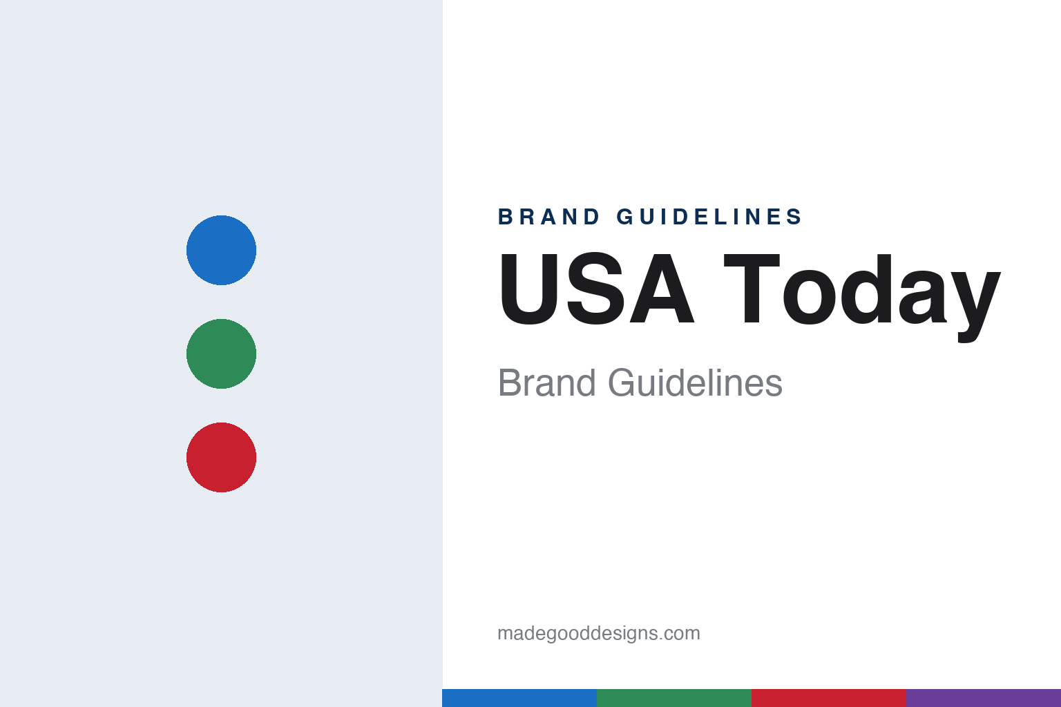
USA Today Brand Guidelines
The national daily that coded its sections in colour.
Aa
Two constants: a section blue, green, red and purple palette and a geometric sans register. Abstract homage — not a USA Today page or mark; no logo, circle or front page is reproduced.
Project NN
A Gannett task force and a national daily.
USA Today was planned inside Gannett. English Wikipedia says the paper was conceived on February 29, 1980, when a company task force known as “Project NN” met the then Gannett chairman, Al Neuharth, in Cocoa Beach, Florida. It lists regional prototypes, among them East Bay Today, an Oakland, California publication of the late 1970s that served as the morning edition of Gannett’s Oakland Tribune.
Gannett announced the launch of the paper on April 20, 1982, Wikipedia says, and USA Today began publishing on Wednesday, September 15, 1982, initially in the Baltimore and Washington, D.C. metropolitan areas. Gannett then expanded national distribution gradually, supported by a network of printing plants that, Wikipedia says, allowed later deadlines for stories and late sports scores.
Colour was built into the paper from the start. Wikipedia says that at launch only the front news-section pages were printed in four-colour, with the rest of the paper in spot colour, and that on July 2, 1984 the paper switched from mostly black-and-white to full-colour photography and graphics in every section. It credits the overall style and heavy use of graphics to Neuharth working with staff graphic designers, among them George Rorick, Sam Ward, Suzy Parker and John Sherlock.
The paper also went abroad and online. Wikipedia records an international edition from July 10, 1984 and a website launched on April 17, 1995, which later added travel information and booking tools.
Colour
Colour boxes, reefers and a weather page.
Its page design is built on colour. English Wikipedia says each section is told apart by a colour in a box at the top left of its front page: blue for News, green for Money, red for Sports and purple for Life. In the paper’s early years, it adds, the Life and Money sections also carried blue nameplates and spot colours because of the limits of the presses at its printing sites. Down the left-hand side of each section front run “reefers,” short paragraphs that point to stories inside, led on the cover by the “Newsline” summary of the day’s headlines. The lead story still runs at the upper right of the front page, and commentary and political cartoons sit at the back of the News section, Wikipedia says.
The weather page has its own documented history. Because a national paper cannot focus on any one city’s weather, Wikipedia says, the entire back page of the News section carries weather maps of the continental United States, Puerto Rico and the U.S. Virgin Islands, along with temperature lists for cities in the U.S. and around the world. It credits the colourised forecast map to the staff designer George Rorick. On September 11, 2012, the news designer Mario García devoted a post on his blog to the weather page, in which Rorick walked through how he created the map and the production routine behind it; García also noted that the weather page was already at the Newseum in Washington.
Typography has changed in steps. Wikipedia says the paper adopted the Gulliver typeface for story headlines in April 2000, and that on January 24, 2011 a tweaked format brought a larger logo at the top of each page, colour adjustments to section fronts, and a new sans-serif, Prelo, for certain main-story headlines, together with a refreshed “Newsline” and more white space.
Typography
Design and documentation.
A printed title carries its identity in a handful of recurring elements. The masthead or nameplate is the title set across the top of a cover or front page, often drawn as custom lettering rather than typed from a stock font, and it is usually protected as a trademark. Around it sit the dateline, issue details and, on a newspaper, the ears on either side of the nameplate.
Magazine covers tend to follow a cover grid: a fixed zone for the masthead, a main image, a lead line and a column of cover lines that tease the stories inside. Some titles let the image overlap the masthead, which only works when the lettering is familiar enough to be read when partly hidden.
Inside, a headline typeface and a text face are paired for contrast, and section furniture — folios, running heads, section labels, rules, bylines and pull quotes — repeats from page to page so readers can find their way. Digital editions reuse these pieces as logos, favicons, app icons and social avatars, so a publisher can keep a compact monogram or short form of the name beside the full nameplate.
Aa
A geometric sans — the register of a colour-coded, graphic front page. (Specimen set in Jost, a geometric sans STAND-IN; NOT the USA Today logo or its custom Futura.)
USA Today
From the globe to the circle.
The paper’s present mark dates from September 14, 2012, the day before its 30th birthday. English Wikipedia says the redesign was developed with the brand design firm Wolff Olins. According to Wikipedia, the “globe” logo used since the paper’s launch was replaced with a new logo built on a large circle, rendered in the colours of each section and serving as an infographic that changes with the news, carrying images for the day’s top stories. The print edition also gained a page for technology stories and more colour pages.
Mario García covered the launch day on his blog on September 14, 2012. He wrote that the square “pill box” treatment of the blue logo had gone, replaced by a circle that kept the familiar blue, and quoted the paper’s press release describing the logo as “a live infographic that can change with the news.” García also identified the new headline type as a custom version of Futura, made by the type foundry Bold Monday. The redesigned website, Wikipedia adds, ran on an in-house content management system called Presto, with a design by Fantasy Interactive.
Gannett launched USA Today in 1982, and on November 4, 2025, Wikipedia says, Gannett announced it would change its own name to USA Today Co. on November 18, 2025, taking the newspaper’s name for the whole group. Gannett, renamed USA Today Co. in November 2025, publishes the paper. Gannett also launched the USA Today Network on December 3, 2015, sharing content between the national paper and the company’s local newspapers, Wikipedia says.
For a design guide, USA Today shows how a newspaper can turn navigation into identity: a colour for each section, a full-page weather map and, since 2012, a circle logo that changes with the news. Compare it with CNN, another American news brand built for a national audience, and with The Washington Post, whose home city, Washington, was one of the areas where USA Today launched. For this guide we use section blue, green, red and purple with a geometric sans, an unofficial interpretation; no product or logo is reproduced.
Explore & save
Keep USA Today’s identity on hand — save it to a board in the Made Good inspiration library.
USA Today identity set
Pin the section blue, green, red and purple palette and the geometric sans register to your own board.