Zendesk Brand Guidelines
A loft in Copenhagen, a Buddha in a headset and a letter made of blocks.
Aa
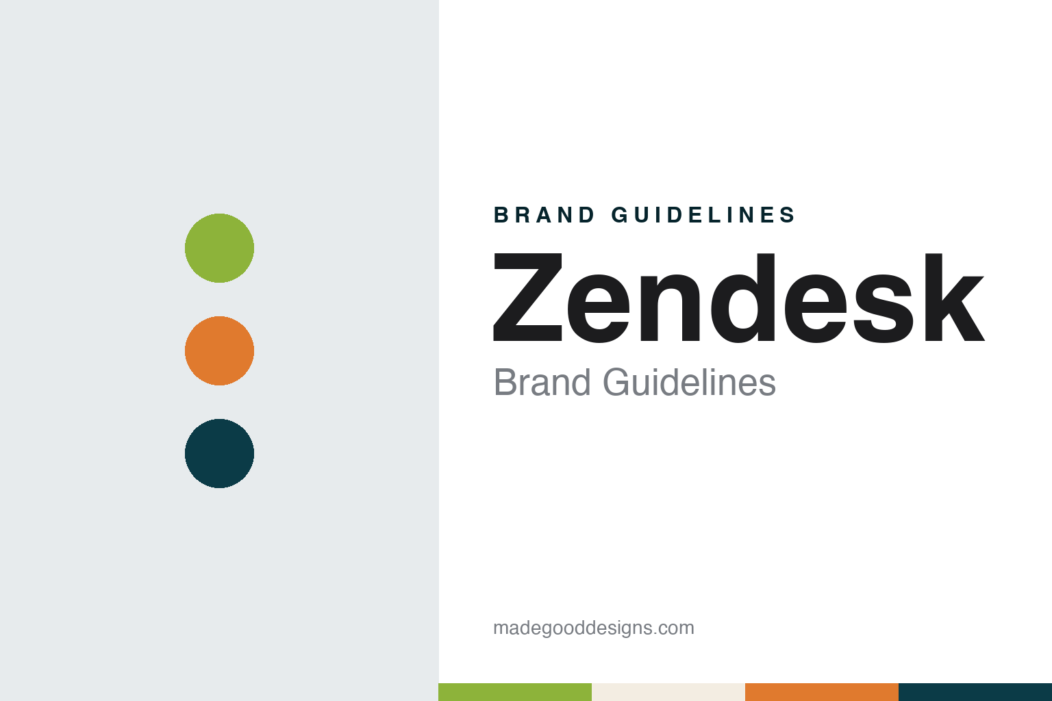
Two constants: a lime, orange and deep kale palette and a Rounded sans register. Abstract homage — not a Zendesk asset or mark; no logo, icon or wordmark is reproduced.
From a Copenhagen loft to San Francisco
Three friends, 2007.
Zendesk started as a small Danish project. Wikipedia says the company was founded in Copenhagen in 2007 by three friends, Morten Primdahl, Alexander Aghassipour and Mikkel Svane, who began building the software in Svane’s loft and paid for the early work out of consulting jobs. Transform magazine, profiling the brand in August 2017, described the same three founders developing a customer-service tracking system on what was then early cloud technology. Wikipedia says the product was released in the autumn of 2007.
The company did not stay in Denmark for long. Wikipedia says investors wanted it based in the United States, and in 2009 Zendesk moved to Boston, then about six months later to San Francisco, where it is still headquartered. Transform placed the move to San Francisco soon after the 2007 launch and noted that the company’s Danish origins stayed part of how it talked about itself. Wikipedia records a public listing on the New York Stock Exchange in 2014.
From the start the founders wanted the brand to look unlike the software it was competing with. Transform reported that the original identity was designed by Toke Nygaard, who later became Zendesk’s chief creative officer. Nygaard told the magazine that at the time the team had no customers and no product, and that the aim was a brand that stood out from what he called dull old software. The result was a cartoon character rather than a wordmark or an abstract symbol.
That character stayed in place for close to a decade. Transform said it formed the visual identity of Zendesk for about ten years, and Nygaard told the magazine that being locked into a single style for nine years had become limiting. He described the original as a product of the mindset of a young start-up, and said the company was now speaking to a different audience. In 2016 Zendesk replaced it.
Colour
A mascot retired, a letter assembled.
The original mascot was a Buddha wearing a customer-service headset. Transform described it in 2017 as a smiling figure in draping orange robes, set on a lime-green background, with a lotus flower holding a heart. Nygaard called it “the little happy guy with the headset”. In November 2016 Web Designer Depot described the old logo as a classic symbol mark of a Buddha in a headset, and reported its replacement.
Wikipedia dates the change of logo to 2016. The new mark, Web Designer Depot said, is a combination mark: a “Z” assembled from separate pieces, with the word Zendesk set beneath it. Nygaard told Transform that the mascot had been hard to carry into the products themselves, because a cartoon character did not suit the experience the company wanted inside the software, and Web Designer Depot quoted him saying the old logo had become limiting for marketing and creative work.
The shapes have their own meanings. Web Designer Depot reported Zendesk’s explanation that a small triangle on top of a larger one stood for its analytics product, Explore, two arrows for its Help Center, and a tall rectangle leaning into a short square for Support. Transform said the company calls these forms “relationshapes”: the main logo is built from four shapes supporting each other, and a family of product logos each combines two shapes in soft colours beside a dark blue Z.
Both publications traced the look back to Denmark. Web Designer Depot listed Kay Bojesen’s wooden monkey, Arne Jacobsen’s textile prints and Poul Kjærholm’s EKC logo among the references, alongside toy blocks. Nygaard told Transform the team looked at clean lines, colours, shapes, wooden toys and Lego. Transform also quoted co-founder Aghassipour, speaking in a Zendesk video, on how replacing the lotus flower and the heart challenged nearly ten years of what the brand had been built on.
Typography
Names, mascots and screens.
Enterprise software sells something nobody can hold, so its identity has to work on surfaces many consumer brands never think about. The name is the starting point. Some companies coin a word with no prior meaning, which clears trademark searches and domain registration but leaves the brand to build every association from scratch. Others borrow an ordinary word or a fragment of a phrase, which lends a ready image but invites confusion with everything else that shares it.
Mascots and illustrated characters appear more often than the sector’s sober reputation suggests. A friendly figure can soften a product built around tickets, workflows or compliance, though many are quietly retired once a company starts courting larger buyers.
The real brand surfaces are often screens. A login page, an empty dashboard, an error message and a notification email are seen far more often than any advertisement, and their colour, spacing and type do much of the identity work day to day. Annual user conferences add a third surface: the stage set, the keynote slides and the lanyard all carry the system in front of a live audience, which is why many enterprise identities are tested at scale in a convention hall.
Aa
A rounded sans — after a soft lowercase wordmark set under a letter made of shapes. (Specimen set in Nunito, a rounded sans STAND-IN; NOT the Zendesk logo or any Zendesk typeface.)
Zendesk
A system built from parts.
The 2016 identity was designed to grow with the company’s product list. Nygaard told Transform that as Zendesk moved from one piece of software to a handful of smaller offerings, it needed a more flexible system that could take in new products, and the two-shape product logos were the answer: each one a variation on the same kit of parts, each able to sit beside the main Z without a separate visual language. The shapes were also made to move. Web Designer Depot reported that each shape had its own animated personality, and Transform described a video in which the pieces bounce around before settling into place.
Ownership changed six years later. Light Reading reported in June 2022 that the private-equity firms Permira and Hellman & Friedman had agreed to acquire Zendesk and that it would no longer be a listed company; it quoted Svane, then chief executive, calling the sale a new chapter. Wikipedia says the purchase was completed in November 2022 and that Tom Eggemeier became chief executive. Zendesk has been privately held since 2022 and remains based in San Francisco, Wikipedia says.
The name has stayed the same throughout, from the loft in Copenhagen to the private company in California, and Nygaard told Transform in 2017 that the brand did not have to be serious and could be fun and quirky. The Buddha carried that tone from 2007 to 2016; the shapes have carried it since, with a dark blue Z at the centre and softer colours around it.
For a design guide, Zendesk shows how a start-up mascot can be retired without losing the warmth it carried, by turning a character into a set of shapes that can be recombined for every product. Compare Twilio, another software company whose brand lives largely on screens, and ServiceNow, a workflow-software name with its own approach to a business audience. For this guide we use lime, orange and deep kale with a sans, an unofficial interpretation; no product or logo is reproduced.
Explore & save
Keep Zendesk’s identity on hand — save it to a board in the Made Good inspiration library.
Zendesk identity set
Pin the Zendesk lime, orange and deep kale palette and the Rounded sans register to your own board.