University of Tokyo Brand Guidelines
Two ginkgo leaves, a light blue won by lot and a gate painted red for a wedding.
Aa
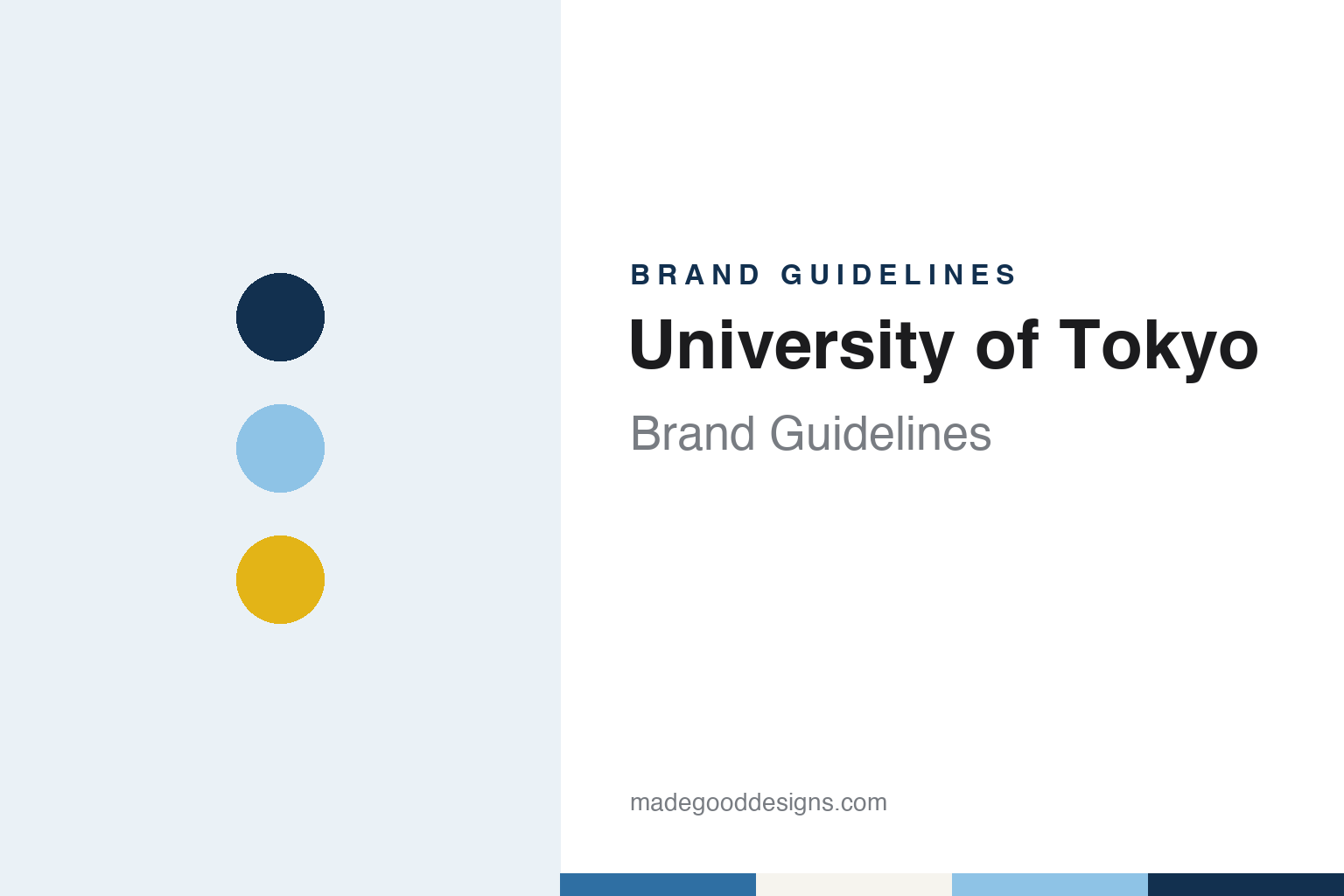
Two constants: an ink, light blue and ginkgo yellow palette and a Mincho serif register. Abstract homage — not a University of Tokyo mark; no ginkgo emblem, gate or logo is reproduced.
Tōdai
A Meiji charter, two imperial names and a return.
The University of Tokyo, known in Japanese as Tōkyō daigaku and shortened to Tōdai (and, in English-language branding, to UTokyo), was chartered by the Meiji government on 12 April 1877, English Wikipedia says. It was formed by merging several older government schools and opened with four faculties: Law, Science, Letters and Medicine. The Imperial College of Engineering was later folded in as the Faculty of Engineering.
The name changed twice in the following decades. In 1886 the institution became the Imperial University, and in 1897, after another imperial university was founded, it became Tokyo Imperial University, Wikipedia records. By 1888 its faculties had moved to Hongō, onto the former Edo residence of the Maeda family, the lords of Kaga Province. In 1947 the word “Imperial” was dropped and the institution returned to the name University of Tokyo, and in 1949, as part of post-war education reforms, it absorbed two higher schools and became a four-year university. One of those schools, the First Higher School at Komaba, still lives on in the identity: the mark of three oak leaves often seen on the Komaba campus was the First Higher School’s emblem and now serves the College of Arts and Sciences, Japanese Wikipedia says.
By its own account, the university never had a formally adopted school crest. The university’s page on its marks puts the question directly — did Tōdai have a crest? — and answers no. What it had instead was a ginkgo leaf. English Wikipedia describes the ginkgo leaf as the symbol of the university, drawn from the trees that line the Hongō campus, and those trees, turning yellow each autumn along the main avenue, became the basis for every version of the mark that followed.
Colour
A badge from 1948, a leaf pair from 2004 and a light blue won by lot.
The older ginkgo mark began life as a badge. According to the university, its council approved a “ginkgo badge” on 8 June 1948, drawn by Hoshino Shōichi, then a professor in the Second Faculty of Engineering. It showed two ginkgo leaves overlaid with the characters for 大學 (“university”), and the council’s record specified gold for the characters and silver for the leaves. The badge came into wide use over the following decades, and the university notes that the versions in circulation drifted: the notches in the leaves, the curve of the stems, the size of the characters and the colours all varied from one use to another. It is now called the former Tōdai mark.
Incorporation as a national university corporation on 1 April 2004 was the occasion for a redraw. The university says a working group on its identity was formed at the instruction of the then president, Sasaki Takeshi, led by vice-president Watanabe Hiroshi, and that the design was produced with the cooperation of Harada Yasushi, then an associate professor at Tama Art University. The new Tōdai mark kept the arrangement of the two leaves from the 1948 badge but refined the notches and replaced the metallic colours: the upper leaf takes the yellow of a ginkgo in autumn, and the lower leaf a blue named after the school colour. Both the current mark and the former mark are registered as trade marks, Japanese Wikipedia says.
That school colour, tansei or light blue, has a sporting origin. Japanese Wikipedia says that when the Tokyo boat club raced Kyoto on 24 September 1920, the crews drew lots for their boats; Tokyo drew light blue and Kyoto dark blue, and the colours stuck. The university’s twice-yearly public-relations magazine is itself titled Tansei. Individual faculties keep colours of their own, from green for Law to red for Medicine and purple for Agriculture.
Typography
Leaves, mottos, gates and colours.
Many university marks borrow their imagery from the natural world. A leaf, a flower or a tree stands in for growth and continuity, and a cluster of stars can tie an institution to the sky above its home country. These motifs suit identity work because they reduce well: a single leaf or a handful of points can be drawn as a crisp outline that survives on a lanyard, a web favicon or an embroidered scarf, while the fuller heraldic version stays on degree certificates and ceremonial banners.
Latin mottos play a similar role in text form. A short phrase set in capitals beneath a shield signals continuity with older academic traditions, and designers often keep it on formal documents while dropping it from everyday digital layouts where space is tight.
Buildings and gateways also become symbols. A gate, a tower or a quadrangle that appears in photographs year after year can turn into a shorthand for the whole institution, sometimes appearing in merchandise, alumni publications and social media long before it enters any official logo. Colour completes the system: a named school colour gives teams, gowns and printed matter a shared thread even when the emblem itself changes.
Aa
Mincho serif — the register of a carved signboard and a printed certificate. (Specimen set in Shippori Mincho, a serif STAND-IN; NOT the University of Tokyo trademark.)
University of Tokyo
A red gate older than the university, and a 2024 logotype.
The campus landmark tied to the university’s image was built half a century before it. The Akamon, or Red Gate, on the Hongō campus was constructed in 1827 to mark the marriage of Maeda Nariyasu, lord of the Kaga domain, to Yōhime, a daughter of the shogun Tokugawa Ienari, the architectural historian William H. Coaldrake wrote in Mirai. Estudios Japoneses in 2017. Coaldrake notes that the familiar name is a later one: in 1827 the gateway was called the Osumai gomon, after the title of the bride’s residence, and from 1855, when Nariyasu was promoted at court, the Goshuden gomon.
His article also complicates the gate’s reputation. Coaldrake argues that red paint was in general use on the gateways of senior daimyō in late Edo, not reserved for shogunal brides, and that the gate came to be called the “red gate” only from the 1880s, after many of the other red gateways in the city had disappeared with the fall of the shogunate. He cites a university document of 1885 in which the gate’s name was corrected from “Nishimon”, the West Gate, to “Akamon”. The structure is a yakuimon, a free-standing gateway type whose roof is set back to dispense with front pillars. Coaldrake describes the gate as today the recognised symbol of the University of Tokyo, though it was built for a very different purpose.
The newest layer of the identity is typographic. Japanese Wikipedia says the university announced through its internal newsletter in February 2024 that from the 2024 academic year the wordmark beside the ginkgo leaves would change from the kanji 東京大学 to the roman UTokyo, and that the lettering would move from black to light blue, which the board member Iwamura Miki described as part of a consistent visual identity. The university says it adopted Visual Identity Guidelines in April 2024 and now uses three versions of the UTokyo Logotype.
For a design guide, the University of Tokyo shows how an informal badge, a borrowed boat-race colour and a gate inherited from a feudal estate can be gathered into one system without a coat of arms; compare the University of Cambridge and ETH Zurich for other university identities that pair a named colour with a simple mark. For this guide we use ink, light blue and ginkgo yellow with a serif, an unofficial interpretation; no product or logo is reproduced.
Explore & save
Keep University of Tokyo’s identity on hand — save it to a board in the Made Good inspiration library.
University of Tokyo identity set
Pin the University of Tokyo ink, light blue and ginkgo yellow palette and the Mincho serif register to your own board.