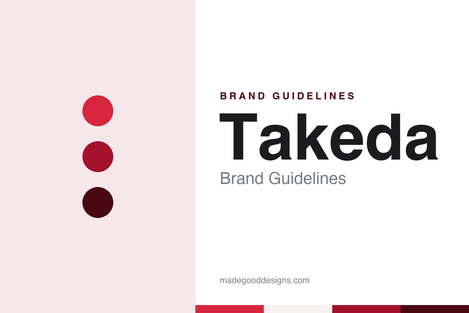
Takeda Brand Guidelines
A merchant street in Osaka, a red scale and a T with a signature.
Aa
Two constants: a scale red, Doshomachi red and lacquer palette and a Mincho-style serif register. Abstract homage — not a Takeda asset or mark; no logo, icon or wordmark is reproduced.
A merchant street
Osaka, 1781.
Takeda begins with a shop on a street of drug merchants. Japanese Wikipedia dates the start of the business to 12 June 1781, when Chobei Takeda I set up as a dealer in medicinal goods in Doshomachi, in what was then Osaka, and began selling traditional Japanese and Chinese medicines. Doshomachi, the same article says, was at that time the centre of the drug trade in Japan, and the name Takeda has stayed tied to the street ever since. English Wikipedia gives the same founder and the same year.
The Takeda name passed down a line of heads of the house, each of whom took the name Chobei. Japanese Wikipedia numbers them, from the founder of 1781 to the sixth Chobei, who became president of the company in 1943. The hereditary name kept the founder’s name and the shop’s name the same across generations.
The trade changed long before the name did. According to Japanese Wikipedia, the house began importing Western medicines in 1871, opened a factory of its own in Osaka in 1895 and moved into manufacturing, and set up a research department in 1914. A separate manufacturing company, Takeda Seiyaku, followed in 1918. On 29 January 1925, the date English Wikipedia gives for the company’s incorporation, Japanese Wikipedia says the trading house and the manufacturing company merged to form Takeda Chobei Shoten, a joint-stock company with its head office in Osaka.
The company built its home on the original street. Japanese Wikipedia says a new head-office building was completed in Doshomachi in June 1928, on the site where the business had started, and that the building survives today as the Takeda Doshomachi Building. The current company still names Doshomachi in Chuo-ku, Osaka, as one of its two registered head offices, the other being in Nihonbashi-honcho in Tokyo. From a single shop of 1781 to a company with a Tokyo tower, the Osaka address has stayed at the start of the story.
Colour
From Chobei’s shop to Takeda.
The present Japanese name dates from the middle of the twentieth century. Japanese Wikipedia says Takeda Chobei Shoten changed its name to Takeda Yakuhin Kogyo on 3 August 1943. The new name dropped the founder’s given name Chobei and the word shoten, a shop or trading house. Before 2004 the company’s English name was Takeda Chemical Industries, Ltd. Japanese Wikipedia says the English name was changed to Takeda Pharmaceutical Company Limited on 1 July 2004, after the company had moved its non-pharmaceutical businesses, from agricultural chemicals to food ingredients and vitamins, into joint ventures with other companies between 2000 and 2007.
The visual identity ran on two tracks for decades. Japanese Wikipedia says the company used different logos at home and abroad until 2019, when it unified them on the overseas design. The domestic mark was the Uroko-jirushi, the scale mark: a white circle with a red triangle set into it, the triangle standing for a fish scale. It was registered as a trademark in 1898, the article says, and became the official corporate emblem in 1943, when the company took its present name.
The mark that replaced it has an older ancestry still. Japanese Wikipedia describes the unified logo as a stylised T whose lower part is cut out in white, with “Takeda” written in script inside it. The design is known as Daki-yama hon, and the article says it is based on the trademark used in the founding era, when the business traded as the shop of Chobei of Omiya. It was adopted in 1961, Japanese Wikipedia says, to raise the company’s recognition around the world, and from 2019 it became the one Takeda logo.
The change in 2019 turned the old pairing around. The scale mark had been the official emblem since 1943; the T and its signature had been the face abroad since 1961. Since 2019 the script wordmark, rooted in the shop’s own early trademark, has carried the company at home as well.
Typography
A street, a shop and its marks.
Corporate identity where the end user rarely looks
Component makers and drug companies share an odd identity problem: the people who use their work most often never see the parent name. A brake module, a sensor or a seat frame arrives inside somebody else’s car, and a medicine reaches a patient under a product name, in packaging shaped by regulators as much as by designers. The corporate mark has to work instead for engineers, buyers, investors, recruits and the towns that host the factories.
That audience shapes the names. Mergers in both sectors often produce a blended word built from the two predecessors, or a coined term with Latin or Greek roots chosen because it carries no prior meaning in any market and can be registered worldwide. Other houses keep a founder’s surname or an old place name long after the business has outgrown it.
The visible identity tends to live in plant and laboratory signage, on gatehouses, lorry livery, safety notices and campus wayfinding. Those settings favour plain wordmarks, a single corporate colour and lettering that stays legible from a distance and in a photocopied procedure sheet. Restraint here is a working requirement rather than a style choice.
Aa
A Mincho-style serif — after a name that began as a shop sign in Osaka. (Specimen set in Shippori Mincho, a serif STAND-IN; NOT the Takeda logo or any Takeda typeface.)
Takeda
Two head offices, one name.
The unified logo arrived in the same season as the company’s change in scale. PharmaTimes reported on 8 January 2019 that Takeda had completed its acquisition of Shire, eight months after the deal was announced in May 2018, with shareholder approval at an extraordinary general meeting in December 2018. Japanese Wikipedia gives the same completion date and describes Shire as a British pharmaceutical company that Takeda now holds as a subsidiary.
A new Tokyo building gave the name a second home. BioPharm International reported on 9 July 2018 that Takeda had announced the opening of its new headquarters in Nihonbashi, Tokyo, on 2 July 2018, and that the building had been completed in March 2018. In its own release about the grand opening, Takeda said the building would serve as the head office for its operations worldwide, and that the interior was designed under the creative direction of Kashiwa Sato of the studio SAMURAI.
Takeda says Sato chose “life force” as the central concept of the building and took eight kanji characters as motifs: those for life, water, light, earth, trees, people, connections and future. The release says the characters were redrawn as modern designs meant to convey wa, a sense of Japanese harmony, and applied as artwork on the walls, so that a visitor moves from the entrance to the working floors through a sequence of written characters.
Japanese Wikipedia says the Global Headquarters took over the functions of the earlier Tokyo head office, while the company keeps Doshomachi in Osaka as its other head office. A shop founded on a merchant street in 1781 now signs its name in script on a tower in Nihonbashi and on a building on the street where it began.
For a design guide, Takeda shows how a company can retire one historic mark in favour of another, choosing the older trademark of its founding shop over the emblem it had used at home since 1943. Compare Astellas, the Tokyo company with a coined name, and Daiichi Sankyo, a Japanese pharmaceutical group formed from two older companies. For this guide we use scale red, Doshomachi red and lacquer with a serif, an unofficial interpretation; no product or logo is reproduced.
Explore & save
Keep Takeda’s identity on hand — save it to a board in the Made Good inspiration library.
Takeda identity set
Pin the Takeda scale red, Doshomachi red and lacquer palette and the Mincho-style serif register to your own board.