Creative Review Brand Guidelines
A square magazine with a cropped-photo past.
Aa
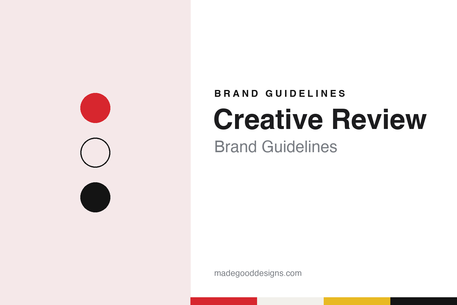
Two constants: a cropper red, spot yellow and matt paper palette and a heavy gothic sans register. Abstract homage — not a Creative Review asset or mark; no logo, cover, typeface or wordmark is reproduced.
An insert that became a magazine
Marketing Week, Bob Bateman and the cover grid.
Creative Review is a London magazine about commercial creativity, covering design, advertising, photography and illustration. Its own account of its origins was written by its art director Paul Pensom for the magazine’s fortieth-birthday coverage, published on 25 June 2020. Creative Review says it began in spring 1980 as a slim quarterly insert for readers of Marketing Week, its sister title at Centaur Media. Wikipedia gives 1981 as the launch year and says the magazine started as a quarterly supplement to Marketing Week before becoming a stand-alone monthly.
Grafik, writing on 31 October 2014, said the design then in use had premiered in 2010 to mark the magazine’s thirtieth birthday.
The early covers followed a fixed system. Pensom wrote that the launch designer, Bob Bateman, created a multi-panel cover grid that showed images from several stories at once, and that the grid was followed strictly for much of the 1980s. Paul Harpin became art director in July 1987, and Creative Review says his cover for March 1988, which promoted a survey of colour use across the creative industries, turned the functional grid towards a more conceptual idea.
The magazine’s name was set in a series of wordmarks. According to Pensom, Harpin introduced a new logo in 1988 that kept the magazine’s “photo cropper” arrangement, gave the wordmark more space and replaced Advertisers Gothic with the heavier Franklin Gothic Heavy. The cover grid lingered in more fragmented form until 1992, and the covers became looser, breaking frames and borrowing graphics from their original contexts.
Later art directors moved further from the grid. Creative Review says Colin McHenry took over as art director in 1990 and was followed by Gary Cook, who redesigned the magazine in the mid-1990s. Cook dropped the multi-panel layout and introduced single-subject covers, including specially commissioned artwork, where earlier covers had largely reused material from inside the issue. Pensom picked a December 1994 cover drawn from a Tennent’s Lager campaign as an example.
Colour
Centaur, a guest edit, and a 2025 sale.
For decades Creative Review was a Centaur Media title, published as a monthly. Its editorial voice in the 2000s and 2010s belonged to Patrick Burgoyne. Press Gazette reported on 26 January 2007 that the advertising agency Mother had paid to guest-edit the February 2007 issue to mark its tenth birthday, around the theme “I Sold My Soul and I Love It”. Burgoyne told Press Gazette that the magazine kept final editorial control, that Mother had been a reader rather than an advertiser, and that the issue raised questions about where advertorial meets editorial.
The magazine’s format changed in the following decade. Wikipedia says Creative Review launched a full website in 2009, after running a blog for two years, and moved from monthly to bimonthly publication in July 2017. It adds that an online subscription, with some articles reserved for paying readers, followed in April 2018.
The ownership change came in September 2025. Press Gazette reported on 25 September 2025 that Haymarket Media Group had bought Creative Review and Marketing Week from Centaur Media, together with the Festival of Marketing event. The titles joined the Haymarket Business Media division, alongside Campaign and PR Week, and stayed under managing director Claire Rance, initially as a separate business unit reporting to Haymarket Business Media’s deputy managing director, Donna Murphy. Press Gazette quoted Centaur’s board calling Haymarket a suitable custodian for the staff and customers of both titles, and Haymarket’s global chief executive, Kevin Costello, on serving specialist audiences.
Haymarket Media Group has owned Creative Review since 2025. The same report said Centaur had also sold The Lawyer that month and would focus on its Econsultancy training business and The Influencer Group. Haymarket is no stranger to design publishing: a Haymarket announcement reprinted by the International Council of Design on 15 April 2008 records that the group had owned the graphic design quarterly Eye until it released the title to its editor that spring.
Typography
Squares, crops and headlines.
A design publication is read as much as it is looked at, and its identity has to work across every surface it touches. The masthead is the anchor: a wordmark that sits at the top of a cover, a website header and a social avatar, and has to stay legible at the width of a phone screen as well as on a newsstand. Around it, covers and grids carry the voice from issue to issue. A cover system might fix the masthead position and leave the image to change, or treat each cover as a commission and let only the type stay constant. Inside, the grid, the body face and the caption style set the pace of reading.
Online, the same identity is stretched across websites and newsletters, where it has to survive templates, thumbnails and inbox previews. Many titles also run events, talks and annuals, and each of these becomes a brand surface in its own right, with its own posters, stage graphics and printed books. Read together, these pieces show how a publication keeps one recognisable voice while its formats keep changing.
Aa
A heavy gothic sans — after the Franklin Gothic Heavy wordmark of 1988. (Specimen set in Libre Franklin, a sans STAND-IN; NOT the Creative Review logo or any Creative Review typeface.)
Creative Review
The 2010 and 2016 redesigns.
The square format arrived with the 2010 redesign. Grafik wrote in October 2014 that the design, launched in April 2010, replaced the old “CR” logo with a broad serif masthead and moved to a smaller format, partly to reduce postal costs. It said the magazine’s square shape had since become its recognisable feature on the newsstand. Writing in 2020, Creative Review says the magazine has kept that square shape through its many changes of look.
The next overhaul came in June 2016. InPublishing reported on 14 June 2016 that the June issue, billed as the “Redesign Issue”, followed a previous makeover in March 2010, and that its new logo was drawn by Robert Holmkvist of the studio Essen International in a bespoke typeface. The trade site added that the logo on the cover was finished with a raised spot UV varnish by Celloglas, with matt lamination elsewhere and a textured spine.
AIGA’s Eye on Design, writing on 13 June 2016, gave more detail. It said art director Paul Pensom led the overhaul of the layout and identity with Stephen Petch and Holmkvist of Essen International, together with Commercial Type and Monotype, and that it was the third redesign of his tenure. Holmkvist drew a custom headline face based on Schmalfette, the condensed grotesque used in Willy Fleckhaus’s German magazine Twen, and it grew into a whole font family. Body text came from serif and sans faces supplied by Monotype and Commercial Type. Eye on Design said the new logo brought back the magazine’s square lock-up and moved away from what Pensom called the “craft aesthetic” of the previous branding.
The redesign went with an editorial change. Burgoyne, by then editor-in-chief, told Eye on Design that the magazine had been widening its coverage across the creative industries since January 2015, with a new focus on creative leadership. The website, the article said, was due to follow later that summer.
For a design guide, Creative Review shows how a magazine can keep one physical signature, its square page, while its wordmark moves from a cropped-photo lock-up to a serif masthead and back to a square mark. Compare Eye, a London graphic design quarterly, and Design Week. For this guide we use cropper red, spot yellow and matt paper with a heavy sans, an unofficial interpretation; no product or logo is reproduced.
Explore & save
Keep Creative Review’s identity on hand — save it to a board in the Made Good inspiration library.
Creative Review identity set
Pin the Creative Review cropper red, spot yellow and matt paper palette and the heavy gothic sans register to your own board.