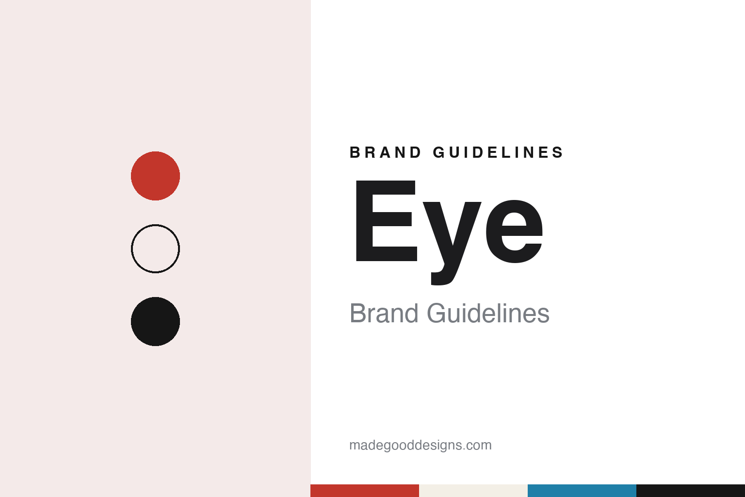
Eye Brand Guidelines
A quarterly that changes its typefaces every issue.
Aa
Two constants: a cover red, litho cyan and proof paper palette and a text serif register. Abstract homage — not an Eye asset or mark; no logo, cover, typeface or wordmark is reproduced.
A London quarterly from 1990
Rick Poynor, Stephen Coates and the early issues.
Eye is a quarterly print magazine about graphic design, published in London. Design Week, writing on 19 November 2024, dates its launch to 1990. Wikipedia names the British writer and graphic designer Rick Poynor as the founder and says he edited issues 1 to 24, from 1990 to 1997. The Dutch critic Max Bruinsma followed as editor for issues 25 to 32, from 1997 to 1999.
The look of the early issues was set by Stephen Coates, whom Design Week calls the magazine’s founding art director. Wikipedia credits him with issues 1 to 26. One of his covers, for Eye 7 in 1992, was a typography special about the arrival of digital type. Design Week says the cover set the word “type” in Trixie, a digital face by the Dutch studio LettError based on a worn typewriter face, and that the issue carried Robin Kinross’s essay on the digital wave in type design.
The team behind the later company was there at the start. A Haymarket announcement reprinted by the International Council of Design on 15 April 2008 says that Simon Esterson and Hannah Tyson of the studio Esterson Associates were both involved in the launch of Eye in 1990.
The current editor arrived in the late 1990s. In an interview republished by magCulture on 18 August 2017, from Jeremy Leslie’s book Independence, John L. Walters said he joined as managing editor after Poynor had left, worked alongside Bruinsma for several issues and became editor with issue 33 in 1999, when Nick Bell was art director. Walters had come from music and from journalism, and told magCulture that he had worked at the Architectural Review before joining Eye.
Walters also gave the magazine’s self-description in that interview. Eye calls itself “The International Review of Graphic Design”, he said, and it looks at advertising, packaging, photography and illustration from a graphic designer’s point of view. Wikipedia lists a long roster of contributors over the years, among them Steven Heller, Robin Kinross, Ellen Lupton, Adrian Shaughnessy and Erik Spiekermann, alongside Poynor himself.
Colour
From Wordsearch to an independent company.
Eye moved through several publishers before it became independent. Wikipedia’s list of issues names Wordsearch as the publisher of the opening numbers, followed by Emap from 1994, Quantum Publishing from 1997 and Haymarket Brand Media from 2005. Walters told magCulture that at Quantum the magazine shared a building with trade titles such as Meat Trades Journal and British Baker, and that Quantum later sold Eye to Haymarket, where its stablemates included What Car?
He described those years as a run of owners who were never quite sure what to make of a graphic design journal. At one point, he said, he had a series of publishers in quick succession, each asking him to explain what Eye was and who read it.
The change that shaped the present title came in April 2008. The Haymarket announcement, as reprinted by the International Council of Design on 15 April 2008, says that Haymarket Media Group released ownership of Eye to its editor, and that both sides agreed the magazine’s niche readers would be better served by a smaller, design-led company. From that day the title was run by Eye Magazine Ltd, a new company set up by Walters with Esterson and Tyson. The announcement lists the new team as Walters, editor since 1999; Esterson, art director since 2005; Tyson as managing director; and Vicky McDougall, promoted to publisher. It quotes Rufus Olins, managing director of Haymarket Brand Media, wishing the team well, and says the spring issue, Eye 67, was published by the new company.
Wikipedia describes the 2008 deal as a management buyout. Eye Magazine Ltd has owned Eye since 2008, and Design Week described Esterson and Walters in November 2024 as the magazine’s owners and publishers. Walters told magCulture in 2017 that the company had gone independent shortly before the financial crash of 2008, and that it had since taken on other work, such as the Pulp project, to support the magazine.
Independence also changed how the magazine looked. Walters said the new owners improved the paper and print quality, which he called a statement of independence, and that the team had been adding articles from older issues to the eyemagazine.com website so that out-of-print pieces stay available to read.
Typography
Covers, type and paper.
A design publication is read as much as it is looked at, and its identity has to work across every surface it touches. The masthead is the anchor: a wordmark that sits at the top of a cover, a website header and a social avatar, and has to stay legible at the width of a phone screen as well as on a newsstand. Around it, covers and grids carry the voice from issue to issue. A cover system might fix the masthead position and leave the image to change, or treat each cover as a commission and let only the type stay constant. Inside, the grid, the body face and the caption style set the pace of reading.
Online, the same identity is stretched across websites and newsletters, where it has to survive templates, thumbnails and inbox previews. Many titles also run events, talks and annuals, and each of these becomes a brand surface in its own right, with its own posters, stage graphics and printed books. Read together, these pieces show how a publication keeps one recognisable voice while its formats keep changing.
Aa
A text serif — after the long-form essays at the heart of the magazine. (Specimen set in Newsreader, a serif STAND-IN; NOT the Eye logo or any typeface used in Eye.)
Eye
A fixed format with changing type.
The magazine’s identity rests on a fixed format and changing type. Design Week reported in November 2024 that Eye has always kept the same dimensions, but that its display type has changed with every edition since Eye 41. Since Eye 72, it said, art director Simon Esterson has chosen fresh typefaces for body text, headlines and captions in each new issue. Walters told magCulture in 2017 that changing the body face every issue is difficult work, and that it gives independent type foundries a chance to show what their typefaces can do.
The covers carry the rest of the brand. Design Week marked an evening in November 2024 when every Eye cover went on show at the London studio SEA, and asked Esterson and Walters to discuss their favourites. They described Eye 48 from 2003, on which Nick Bell filled the cover with everyday design verbs in warm greys that form an image from David King’s book Ordinary Citizens. Eye 87, a 2014 food design special, showed a Tunnock’s tea cake photographed by Lee Funnell. Eye 91, from 2016, enlarged a detail of a green Penguin crime cover by Romek Marber, made with the repro house Dawkins Colour. Eye’s editors also say that, like other print titles, they choose covers with social media in mind, citing a distorted cat by the Swiss digital artist Dirk Koy on Eye 104 in 2023.
One cover drew press coverage of its own: Eye 94, the 2017 typography special. Dezeen reported on 11 September 2017 that the London studio MuirMcNeil, run by Paul McNeil and Hamish Muir, used HP Mosaic software for the HP Indigo digital press to generate a unique, numbered front and back cover for every copy of the issue. Dezeen said the studio drew master “seed” files in which the letters of the word “eye” were repeated in three layers, set in its own TwoPoint and TwoPlus typefaces, and then set rules for the software to scale, position, crop and recolour each one. Design Week adds that the covers were printed by Pureprint, and the editors say the project was documented in a short film by Adie Harrison.
For a design guide, Eye shows how a magazine can hold a steady format and name while letting typefaces and cover images change from issue to issue. Compare Creative Review, another London design title, and Design Week. For this guide we use cover red, litho cyan and proof paper with a serif, an unofficial interpretation; no product or logo is reproduced.
Explore & save
Keep Eye’s identity on hand — save it to a board in the Made Good inspiration library.
Eye identity set
Pin the Eye cover red, litho cyan and proof paper palette and the text serif register to your own board.