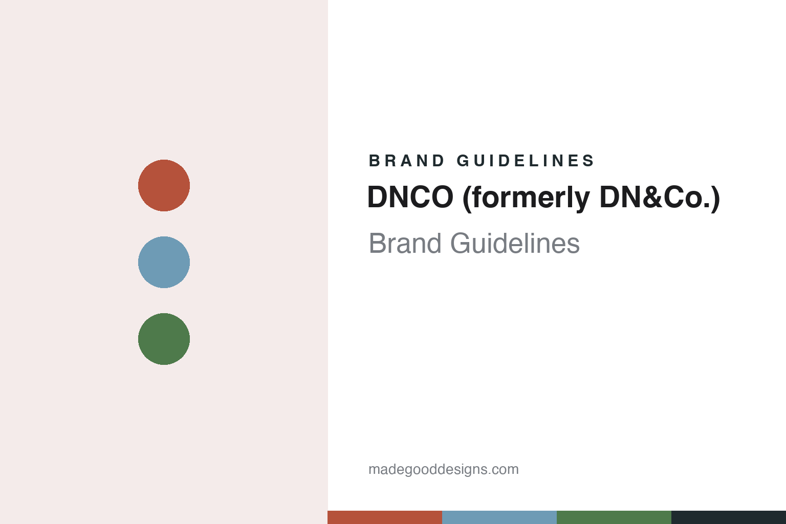
DNCO (formerly DN&Co.) Brand Guidelines
A place-branding studio that dropped its ampersand.
Aa
Two constants: a brick red, sky blue and garden green palette and an uppercase grotesque register. Abstract homage — not a DN&Co. or DNCO asset or mark; no logo, icon or wordmark is reproduced.
A London studio for places
Founding, focus and a change of owner, 2006 to 2019.
DN&Co. is a London branding and design studio whose work centres on culture and place: neighbourhoods, buildings, museums and the districts around them. Creative Boom, reporting on 28 June 2022, said the studio was founded in 2006, and named Joy Nazzari as its founding director. For most of its life the studio wrote its name in lower case, as dn&co, and the trade press used that spelling through the 2010s.
The studio’s focus was set out by Co-op News on 4 November 2019. The paper described dn&co as a London-based design consultancy that specialises in place branding, and said it had created work for cities, neighbourhoods and cultural institutions. It named the V&A; Here East, a technology centre on the site of the London 2012 Olympics; and the central London district of St James’s. Co-op News added that the team’s skills ran to film making, social media and signage, and that the studio also curated exhibitions in its own space.
One of those exhibitions was Hey Neighbour. Co-op News said it would run at the studio’s Ground Floor Space gallery as part of a series of displays on the idea of neighbourliness for the London Design Festival, with proceeds going to the homeless charity The Manna Society. The subject sits close to the studio’s day-to-day work, which deals with how people use and feel about the places where they live.
The same Co-op News report recorded a change in who owns the business. As of November 2019, dn&co had become employee-owned, with an Employee Ownership Trust holding all of the shares on behalf of the people who work there. The paper said the move set the studio up as an independent business. Nazzari, quoted as founder, said that for a creative studio, building a thriving business goes hand in hand with having an outstanding team, and that it was time to give everyone at dn&co a stake in the business and a say in its future. An Employee Ownership Trust has held the studio since 2019.
Creative Boom returned to the point in 2022, describing the decision to become employee-owned in 2019 as one of the fundamental parts of the studio’s story. Nazzari told the magazine that becoming fully employee-owned was a strong endorsement of the studio’s own future and of the people in it.
Colour
A museum renamed, a television site rebranded.
Much of the studio’s published work is for buildings with a past. On 27 November 2019, It’s Nice That reported that the Geffrye Museum in Hoxton, east London, was renaming itself the Museum of the Home, with a new identity by dn&co. The museum was due to reopen in the summer of 2020 after a redevelopment, with a focus on contemporary as well as historical ideas of home.
The magazine said the identity was built around light. At its centre is a custom typeface called Home Sans, developed by the studio with Colophon Foundry. Its letterforms are made from the angular shadows cast by a direct light source, and because it is a variable typeface, the shadows can be set long and dramatic or short and sharp depending on where the type is used. Design director Gabriel Weichert told It’s Nice That that the idea of home has always been defined by light, from the fire in the cave to the flicker of a television, and that the team thought of the museum itself as a source of light that shows how people live.
Weichert said the flexibility allowed different tones of voice: heavier weights when the museum asks challenging questions or announces news, lighter ones when it is one voice among partners. Creative director Patrick Eley told the magazine that light also shaped the illustration and photography, where it is used to draw the eye or bring a subject forward. It’s Nice That said the system rests on diagonal layers and a colour palette taken from the museum itself, with core colours of brick red, sky blue and garden green found in its almshouses and gardens, plus an off-white secondary palette. The studio was then working on the museum’s wayfinding for the reopening.
A second project with a long history was the conversion of the BBC’s former Television Centre in west London into homes, cafés, restaurants, gardens, a cinema, a hotel and restored recording studios. Co-op News said in November 2019 that dn&co’s role was to make sure the new brand carried the building’s cultural heritage, and that the studio wrote the tagline “They called it the home of British Television. You can call it home.”
Typography
Founder, owners and a new name.
British design studios often take their names from the people who started them. Two surnames joined by an ampersand, a single surname with “Studio” in front, or a founder’s name set entirely in lowercase all appear across the field. Each form signals something about the practice behind it: a pairing of surnames puts a partnership at the front, while a lowercase name can read as plain and unforced next to the capitals of corporate clients.
The ampersand itself is a recurring device. It can join two founders, stand in for a word inside a name, or become a small piece of lettering that a studio redraws for its own stationery and website. Because it is a character with many historical shapes, a studio can make it its own without inventing a symbol from scratch.
Beyond the name, studios build their identities through what they make for themselves. Self-initiated projects, printed books about the studio’s work, posters for talks and exhibitions, and short-run publications all act as brand surfaces. Alongside the case studies on a website, these pieces show how a practice thinks when no client is setting the brief.
Aa
An uppercase grotesque — after the studio’s 2022 word mark. (Specimen set in Archivo, a sans STAND-IN; NOT the DN&Co. or DNCO logo, and not Post Grotesk.)
DNCO (formerly DN&Co.)
From dn&co to DNCO, June 2022.
The studio changed its own name and identity in June 2022. Creative Boom reported on 28 June 2022 that dn&co had unveiled a new name, DNCO, and a new brand identity, designed to mark its move to full employee ownership and to give it room to grow. The rebrand dropped the ampersand and switched the name to capital letters. The magazine said this made the name easier to say, which mattered as the studio looked at international expansion, and brought it into line with the studio’s web and social media addresses.
Nazzari explained the new name to Creative Boom. She said DNCO is not an acronym, but that it can be read as an imperfect contraction of Design Community, and that the name signals a company that has moved beyond what the four letters originally stood for. She said the studio had become a different company coming out of the pandemic years, and that its old name and brand no longer represented it.
The studio ran the job as if it were a client project. Creative Boom said DNCO assigned a team of strategists and designers led by a client manager, held stakeholder interviews and workshops, and kept to a timeline with milestone meetings at which the studio was referred to as a client rather than in the first person. Eley, quoted as creative director, said designing a studio’s own identity is one of the most uncomfortable jobs in the business, but that years of conversations about the name showed a full review was due. He described the result as a recessive identity that lets the work for others stand out, with a more confident and playful visual language than before.
Design director Sam Jones called the change “evolution, not revolution”. He told the magazine that the studio chose Post Grotesk from Sharp Type for its mix of robust forms and softer quirks, including rounded dots on the letters, and that the same typeface was used for the new logo: a plain uppercase word mark that breaks with the studio’s previous lowercase identity. Illustration was added to the system for self-initiated projects. Creative Boom listed recent clients including the Design Museum, the V&A and Edinburgh Park.
For a design guide, DN&Co. shows how a studio that names places for a living handled its own name: keeping the letters, dropping the ampersand and moving from lower case to capitals. Compare the Design Museum, a client named in 2022, and johnson banks, another London studio in this collection. For this guide we use brick red, sky blue and garden green with a grotesque sans, an unofficial interpretation; no product or logo is reproduced.
Explore & save
Keep DNCO (formerly DN&Co.)’s identity on hand — save it to a board in the Made Good inspiration library.
DN&Co. identity set
Pin the DN&Co. brick red, sky blue and garden green palette and the uppercase grotesque register to your own board.


