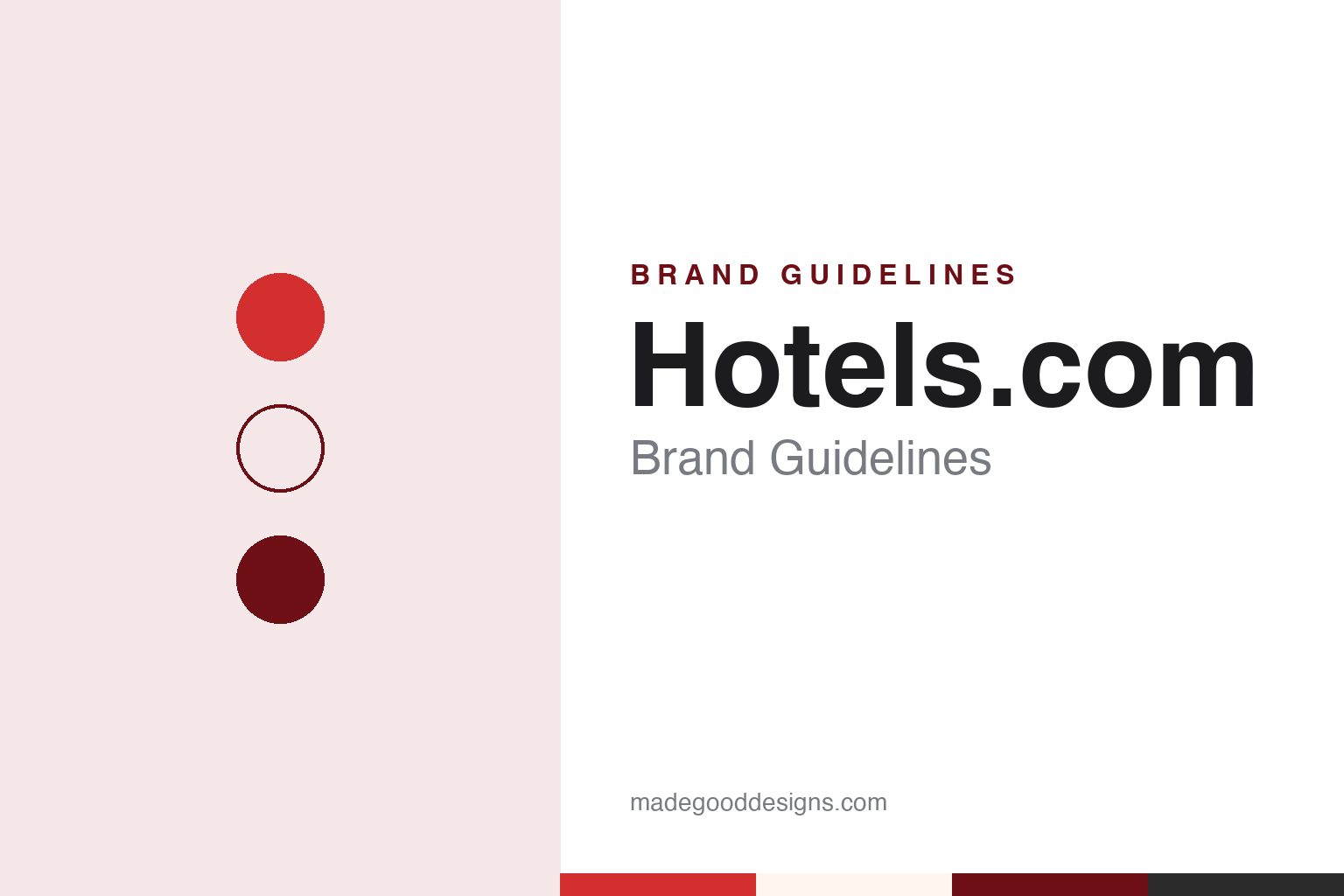
Hotels.com Brand Guidelines
From a phone-booking network to Captain Obvious and a layered H.
Aa
Two constants: a sign red, lobby maroon and pillow cream palette and a friendly geometric sans register. Abstract homage — not a Hotels.com product or mark; no logo, “H” or mascot is reproduced.
Hotels.com
A phone line that took the name of its own web address.
Hotels.com did not start life with that name. English Wikipedia says the business was established in 1991 by David Litman and Robert Diener as Hotel Reservations Network, usually shortened to HRN, and that it began by taking hotel bookings over a toll-free telephone number in the United States. The service was, in other words, a phone line before it was a website, and its original name described exactly what it did: a network for reserving hotel rooms.
The change of name followed a change of owner. Wikipedia records that in 2001 HRN was acquired by USA Networks Inc, the media group that in the same period also took a controlling interest in the online travel company Expedia. In 2002, Wikipedia says, HRN renamed itself Hotels.com after buying that domain name, launched an offline brand called 1-800-2-Hotels and began taking hotel bookings online. A run of international sites followed over the next two years. USA Networks was renamed InterActiveCorp, or IAC, in 2003, and in 2005 IAC separated its travel holdings into a new company, Expedia, Inc., with Hotels.com becoming one of its operating companies. Expedia Group has owned Hotels.com ever since, alongside sister brands such as Expedia and Vrbo.
Inside the group the brand has absorbed and shared things as well as kept its own name. Wikipedia says Hotels.com took over Venere.com, another Expedia-owned hotel site, on 1 December 2016. Its own loyalty scheme, Hotels.com Rewards, was rolled out across several countries between 2008 and 2011, and in 2023 Expedia Group launched One Key, a single loyalty programme spanning Expedia, Hotels.com and Vrbo. The result is a brand whose name is also its address: a plain description, a dot and a top-level domain, carried on a website, an app and a phone line.
Colour
A clay mascot, then a captain who states the obvious.
For much of its history the brand has spoken through characters. English Wikipedia says the actor Ed Helms voiced a character called “Smart” in Hotels.com advertising, and that in 2012 Smart changed from clay animation to computer-generated imagery. The slogan of that era, Wikipedia says, began as “Smart. So Smart” before becoming “Be Smart. Book Smart”.
In 2014 Smart gave way to Captain Obvious. Breaking Travel News reported at the start of March 2014 that Hotels.com was launching a campaign called “The Obvious Choice”, introducing Captain Obvious as a fictional world traveller. The launch spot, the publication said, broke on 23 February during cable programming in the United States and Canada, with social media, email, radio, cinema and online video to follow. It credited the campaign to Crispin Porter + Bogusky in Boulder, Colorado, and the opening spot to director Stacy Wall of Imperial Woodpecker. Neha Parikh, then vice president and general manager of Hotels.com North America, told the publication that the idea was already “in our name”. Wikipedia names the actor as Brandon Moynihan and describes the joke simply: the captain makes self-evident remarks, the self-evident point being that Hotels.com is the obvious place to book.
The character became a long-running platform. Campaign US reported on 15 March 2017 that the captain was back in new films from Crispin Porter & Bogusky, a year after he had “run for president” in an earlier round of ads. The 2017 executions, directed by Ruben Fleischer, carried titles such as Drill Sergeant, Binge and Selfie, and the campaign added radio, social media, an interactive online video, influencer partnerships and interviews with the captain on Radio Row in Phoenix during March Madness. Wikipedia lists later outings as well, including a La La Land-inspired spot, an advert in which the captain meets his future self, an appearance in a 2018 ad-blocking campaign on Channel 4 and a 2019 cameo as a DJ in the television series Four Weddings and a Funeral.
Typography
Design and documentation.
Travel sites live on small screens as much as large ones, so their identities are tested at very different sizes. A wordmark that reads well across the top of a desktop search page has to survive as a home-screen app icon, a favicon in a browser tab and a tiny badge on a booking confirmation email. Many travel brands answer that problem with a compact symbol or a single letter that can stand alone when the full name will not fit, and keep the wordmark for larger placements.
Colour does a lot of work in this category. A consistent brand colour helps a user spot the right app among dozens on a phone and recognise the brand inside a crowded comparison results page. Mascots and characters play a similar role: an animal, a figure or a costumed spokesperson can carry a brand across television, social video and outdoor advertising without relying on the name alone.
Television spokespeople and recurring advertising characters have long been part of the travel-site playbook, giving a web service a face and a voice. When a company refreshes its identity, these elements are often redrawn, retired or brought back, so it is worth checking the date of any logo, icon or campaign before treating it as current.
Hh
A friendly geometric sans — the register of an app header and a booking button. (Specimen set in Figtree, a sans-serif STAND-IN; NOT the Hotels.com logo.)
Hotels.com
A three-layer H and a name taken literally.
The latest reset arrived in March 2026. Writing for DesignRush on 18 March 2026, George Mavridis reported that Hotels.com had launched a global campaign called “It’s All in the Name”, developed with the agency Mischief @ No Fixed Address. The idea turns on wordplay: each spot opens with a familiar phrase and then takes it literally, so that the brand can make the point that its own name, and its features, mean exactly what they say. DesignRush described four 30-second films, titled Headphones, Catfish, Chicken Fingers and Fish Fingers, with Headphones introducing a feature called “Save Your Way”, and said the television spots began airing in the United States on 17 March, supported by digital and social channels.
The campaign ran alongside a broader update to the visual identity, built around a redesigned “H” logo. According to DesignRush, the new mark is made of three layers, which the company links to the way users move through the service, from searching to booking to earning rewards, and it appears across the app, the website and the advertising. The publication quoted Natalie Wills, Expedia Group’s senior vice president of marketing and creative, as saying in a press release that the refreshed identity marked the return of the H logo, and it noted that the brand’s Bellboy mascot remains in place beside the new mark.
Seen together, the pieces of the identity share one habit. The company name is a literal description of its service; Captain Obvious built a decade of advertising on saying the obvious; and the 2026 campaign returns to that idea by making literal sense of misleading phrases. The visual side is comparatively compact, a single letter worked into layers and a uniformed hotel character, so that the name itself carries much of the meaning.
For a design guide, Hotels.com shows how a descriptive domain name can become a brand voice, with characters and a single letterform doing the visual work. Compare Airbnb, another accommodation brand built around a custom symbol, and Google, whose single-letter app icon also has to stand in for a whole name. For this guide we use sign red, lobby maroon and pillow cream with a sans, an unofficial interpretation; no product or logo is reproduced.
Explore & save
Keep Hotels.com’s identity on hand — save it to a board in the Made Good inspiration library.
Hotels.com identity set
Pin the Hotels.com sign red, lobby maroon and pillow cream palette and the friendly geometric sans register to your own board.