Travelocity Brand Guidelines
A Sabre spin-out and a garden gnome in a red hat.
Aa
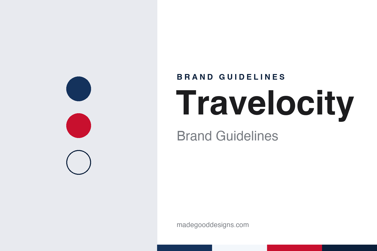
Two constants: a coat navy, hat red and beard white palette and a rounded humanist sans register. Abstract homage — not a Travelocity product or mark; no logo or gnome is reproduced.
Travelocity
An airline reservation system that learned to talk to travellers.
Travelocity grew out of airline technology rather than a start-up garage. English Wikipedia traces its roots to 1978, when American Airlines began giving travel agencies access to its electronic reservation system, Sabre. In the mid-1980s, Wikipedia says, a consumer version called eAAsySabre appeared on the online services CompuServe and GEnie, and in the early 1990s it was offered on services such as Prodigy and America Online.
The Travelocity name arrived in 1995. Wikipedia describes the service as a 50-50 joint venture between Worldview Systems Corporation, which ran an online travel database, and Sabre, which had been distributing that database; the two developed and launched Travelocity across 1995 and 1996. In 1996 Worldview’s investors, Advance Publications and Ameritech, sold their stake to Sabre, and the business was run by the Sabre technology executive Terry Jones. Wikipedia records a merger with Preview Travel in 2000, which produced a Nasdaq-listed company with Sabre as majority holder, and a tender offer in March 2002 through which Sabre took back all of the outstanding shares. Michelle Peluso, who had joined through the acquisition of the last-minute travel site Site59, became president and chief executive in December 2003.
Ownership changed again a decade later. Wikipedia says Sabre sold Travelocity to Expedia, Inc. in January 2015, so Expedia Group has owned the brand since then, alongside sister names such as Expedia and Hotels.com. The Travelocity name has stayed in use through each of those changes of owner, and since 2004 the brand has been fronted in its advertising by a garden gnome.
Colour
A stolen garden gnome, a red hat and a postcard home.
The Roaming Gnome arrived in January 2004. The Fort Worth Star-Telegram reported that month that Travelocity, then based in Southlake, Texas, had launched television, radio and newspaper advertising built around a two-foot, white-bearded gnome wearing a red hat and a blue coat, a gnome that had been taken from its owner’s garden. In the ads he is seen skiing, cliff diving in Mexico and eating cheese in Canada, and each piece carried the line “Book with Travelocity: Don’t Forget your Hat.” Susan McLaughlin, Travelocity’s vice president of marketing, told the paper the company saw the campaign as a way to relaunch the Travelocity brand.
The newspaper credited the idea to Travelocity’s new advertising agency, McKinney + Silver of Raleigh, North Carolina, which had been hired in October 2003 and had proposed the gnome while bidding for the account. McLaughlin said the campaign drew on the European prank of gnome kidnapping, in which garden gnomes are stolen and their owners sent photographs of them travelling around the world. Before the ads ran, the Star-Telegram said, Travelocity spent several weeks building interest online through a website, whereismygnome.com, on which the gnome’s owner, Bill, posted sightings, and through a mock news report shown during the Rose Bowl on 1 January. Wikipedia refers to the effort as the “Where Is My Gnome?” campaign.
The gnome then became the brand’s permanent spokesman. Wikipedia says that in February 2016, after the move to Expedia, Travelocity launched a campaign called “Wander Wisely” featuring the Roaming Gnome, and changed its tagline from “Go and Smell the Roses” to “Wander Wisely”. Travelocity was also a long-running sponsor of the American reality series The Amazing Race, from its opening season until season 34, when Wikipedia says the sponsorship passed to the parent company’s Expedia brand.
Typography
Design and documentation.
Travel sites live on small screens as much as large ones, so their identities are tested at very different sizes. A wordmark that reads well across the top of a desktop search page has to survive as a home-screen app icon, a favicon in a browser tab and a tiny badge on a booking confirmation email. Many travel brands answer that problem with a compact symbol or a single letter that can stand alone when the full name will not fit, and keep the wordmark for larger placements.
Colour does a lot of work in this category. A consistent brand colour helps a user spot the right app among dozens on a phone and recognise the brand inside a crowded comparison results page. Mascots and characters play a similar role: an animal, a figure or a costumed spokesperson can carry a brand across television, social video and outdoor advertising without relying on the name alone.
Television spokespeople and recurring advertising characters have long been part of the travel-site playbook, giving a web service a face and a voice. When a company refreshes its identity, these elements are often redrawn, retired or brought back, so it is worth checking the date of any logo, icon or campaign before treating it as current.
Aa
A rounded humanist sans — the register of a booking screen and a postcard caption. (Specimen set in Nunito Sans, a sans-serif STAND-IN; NOT the Travelocity logo.)
Travelocity
A character who carries the brand.
By 2020 the gnome had moved from supporting player to lead. Writing in MediaPost’s Marketing Daily on 3 March 2020, Tanya Gazdik reported that Travelocity was bringing back the Roaming Gnome in “Wish You Were Here”, its national brand campaign from Proof Advertising of Austin, Texas, which had taken over as agency of record in July 2019. The campaign promoted Travelocity’s free membership programme and kept the existing “Wander Wisely” tagline. MediaPost noted that while the gnome had already been a regular presence in the advertising, this work cast him as the lead, with 30-second and 15-second television spots plus online video and social media. Proof, the publication said, also ran the gnome’s own social media accounts.
The 2020 films kept the original premise of a small figure on a large trip. In “Puttanesca For Two” the gnome waits for a dinner companion who has not arrived; in “Bring A Paddle” he sits strapped into a kayak, needing someone to paddle for him; and in “The Thrill Of Better Travel” he goes zip-lining. Laura Molnar, Travelocity’s senior manager of brand marketing, said in a release quoted by MediaPost that the company wanted the gnome to take on a brand influencer role.
Across two decades, then, a constant in the Travelocity identity has been a character rather than a logo or a typeface: a garden ornament with a red hat, a blue coat and a white beard, whose 2004 backstory, a gnome stolen from a garden and sent around the world, still frames the advertising. The taglines have changed, from “Don’t Forget your Hat” to “Go and Smell the Roses” to “Wander Wisely”, and the owners have changed from Sabre to Expedia, while the gnome has carried the brand through each shift.
For a design guide, Travelocity shows how a mascot with a clear silhouette and a short story can outlast taglines, agencies and owners. Compare Airbnb, a travel brand that leans on a symbol rather than a character, and Google, whose colour-led identity also has to work at app-icon size. For this guide we use coat navy, hat red and beard white with a sans, an unofficial interpretation; no product or logo is reproduced.
Explore & save
Keep Travelocity’s identity on hand — save it to a board in the Made Good inspiration library.
Travelocity identity set
Pin the Travelocity coat navy, hat red and beard white palette and the rounded humanist sans register to your own board.