Boston Celtics Brand Guidelines
A name chosen for a city of Irishmen, and a leprechaun drawn by the coach’s brother.
Aa
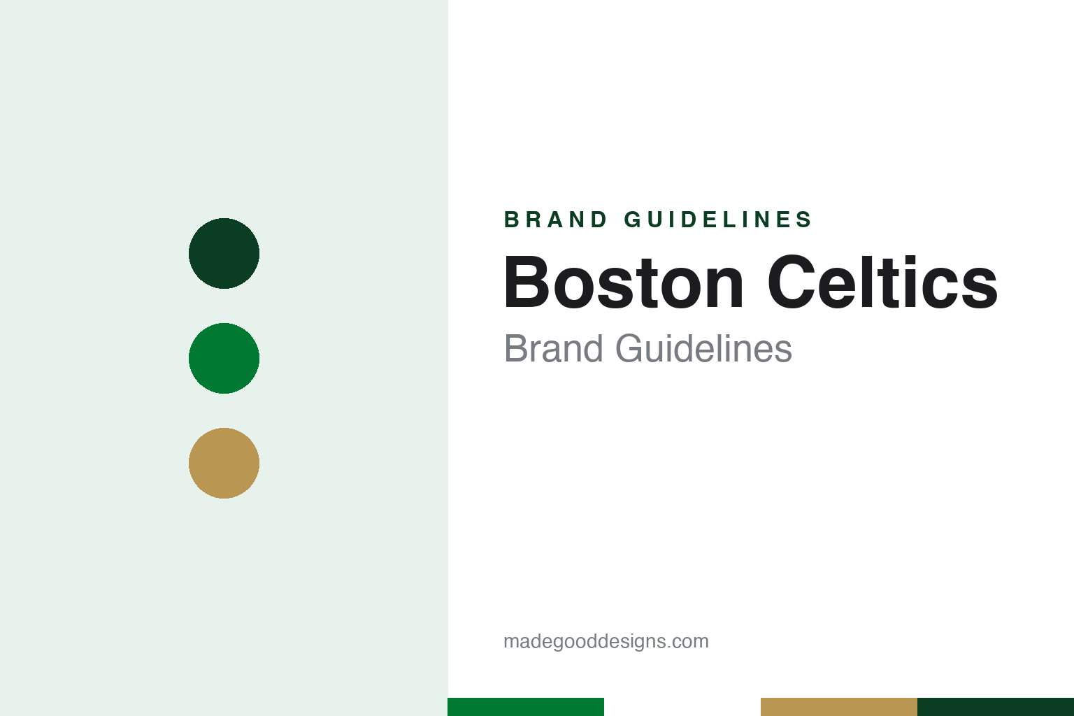
Two constants: a Celtic green, shamrock gold and home white palette and a block jersey lettering register. Abstract homage — not a Boston Celtics mark; no leprechaun, shamrock or wordmark is reproduced.
A Garden team
Walter Brown, an empty arena and a name from New York.
The Boston Celtics were formed on 6 June 1946 by Walter A. Brown, president of the Boston Garden-Arena Corporation, as a member of the new Basketball Association of America, English Wikipedia says. The team joined the National Basketball Association on 3 August 1949, when the BAA merged with the rival National Basketball League.
Brown was a hockey man first. The team’s own history pages, archived on Celtics.com, say he took to basketball as a way to fill the empty winter dates at his Boston Garden, where professional hockey was already established. According to that account, the name grew out of a conversation between Brown and Howie McHugh, a member of the Garden’s publicity staff assigned to the new basketball club. The two men tried several nicknames, including Whirlwinds, Unicorns and Olympics, before Brown settled on Celtics.
The team says Brown gave two reasons: the name had a basketball tradition through the Original Celtics, a barnstorming team from New York, and Boston was full of Irishmen. In the version on the club’s site he went straight on to the colour as well, telling McHugh that the team would be put in green uniforms. The team says McHugh tried and failed to talk him out of the name. Wikipedia describes both the name and the later leprechaun mascot as nods to the city’s Irish population and to the Original Celtics.
Wikipedia lists the Boston Garden as the home arena from 1946 to 1995 and its successor, now TD Garden, from 1995, an arena the Celtics share with the NHL’s Boston Bruins.
Colour
From the Garden’s founder to the Grousbeck family and Bill Chisholm.
The club’s ownership has passed from Brown’s era to new groups. Yahoo Sports, reporting on 15 May 2025, said that Wyc Grousbeck, with the help of an investment group, had bought the team in 2002, and that the Grousbeck family had agreed to sell it to a group led by Bill Chisholm, co-founder and managing partner of Symphony Technology Group. The report said the agreement came nine months after Grousbeck announced he was looking to sell. Wikipedia records that the NBA approved the sale in August 2025, and the Chisholm group has controlled the club since then.
The uniform was set early and changed slowly. Wikipedia says the Celtics wore green on the road and white at home for much of their history, and that the basic template of today’s kit was formalised in the team’s early years. The notable changes it lists are a switch from serifed to sans-serif block lettering in 1968, the addition of player names in 1972, and the addition of the three-leaf shamrock logo in 1998. The white set stayed largely the same, while the green set alternated between the city name, from the 1950s to 1965, and the team name, from 1965 until 2014.
ESPN reported the most recent change to the green road uniform on 21 July 2014: from the 2014–15 season the road jerseys would read “BOSTON” across the front rather than “CELTICS.” When Nike became the NBA’s uniform supplier in 2017, Wikipedia says, the white set became the “Association” uniform and the green set the “Icon,” and both are now worn regardless of venue. Sponsor marks followed: a General Electric logo appeared on the left shoulder from 2017, with Vistaprint taking the jersey patch in 2020 and Amica Mutual Insurance in 2024.
Footwear became part of the look too. Wikipedia says the team wore black sneakers through most of its history, switched to green in the early 1970s, and returned to black by 1985 because the right shade of green was hard to produce; white sneakers came back for home games from the 2003–04 season.
Typography
Design and documentation.
A sports team’s visual identity works across surfaces that rarely sit still. The crest or primary mark has to hold up on a jersey chest, a cap front, a centre-court decal and a phone-sized app icon, so designers tend to favour bold silhouettes, a limited set of flat colours and outlines that survive embroidery, screen printing and paint. Secondary marks and monograms carry the identity where the full crest would be too busy, such as a sleeve, a helmet side or a social-media avatar.
Wordmarks do a different job. A team name set in custom lettering has to read from the upper deck and on a television graphic at once, which is why many wordmarks use condensed or slab-serif letterforms, generous tracking and a consistent arch or baseline. Uniform numbers follow league rules on size and contrast, and teams often commission a dedicated numeral set so that a 6 and an 8 stay distinct at a distance. Arena and stadium signage then repeats the same palette and letterforms on scoreboards, concourse wayfinding and court or field markings, turning the venue itself into part of the brand system.
Aa
A slab-serif jersey letter — the register of a block jersey number and an arena banner. (Specimen set in Roboto Slab, a slab-serif STAND-IN; NOT the Boston Celtics logo or wordmark.)
Boston Celtics
A leprechaun, a shamrock and a full-colour anniversary.
The Celtics’ primary logo is a leprechaun spinning a basketball, known as Lucky. Wikipedia says it was originally drawn by Zang Auerbach, the brother of the team’s head coach Red Auerbach, and first appeared against a large basketball. ESPN, reporting the club’s 2014 announcement, likewise described the leprechaun logo of the 1960s as illustrated by Auerbach’s brother Zang.
For decades the drawing was kept to three colours. Wikipedia says that through the 1995–96 season the logo used only green, white and black, and that for the 1996–97 season, marking the club’s 50th anniversary, it received a full-colour treatment: a tan face and hands, gold on the vest, bow tie and hat, brown on the ball and the shillelagh, and black on the trousers and shoes.
The leprechaun has never been the only mark. The main alternate, Wikipedia says, is a white shamrock with the word “Celtics” above it inside a green circle, used since the 1998–99 season and based on logos the club used before Zang Auerbach’s leprechaun. For much of the club’s history the shamrock was trimmed in gold, as on the old warm-up jackets. On 21 July 2014 the team unveiled a further alternate, a silhouette version of the leprechaun; ESPN reported that it would not be worn on game uniforms and quoted the team’s release, which said the logo was meant to extend the brand while staying versatile enough to work across formats and products.
For a design guide, the Boston Celtics show how a name, a colour and a cartoon can be fixed in a team’s first decades and then worked through new arenas, new suppliers and new owners with small adjustments: a change of lettering, a full-colour anniversary version, a silhouette for merchandise. Compare it with the NBA, whose Nike uniform system the Celtics now wear, and the Chicago Bulls, another NBA team covered in this series. For this guide we use Celtic green, shamrock gold and home white with a serif, an unofficial interpretation; no product or logo is reproduced.
Explore & save
Keep Boston Celtics’s identity on hand — save it to a board in the Made Good inspiration library.
Boston Celtics identity set
Pin the Boston Celtics Celtic green, shamrock gold and home white palette and the block jersey lettering register to your own board.