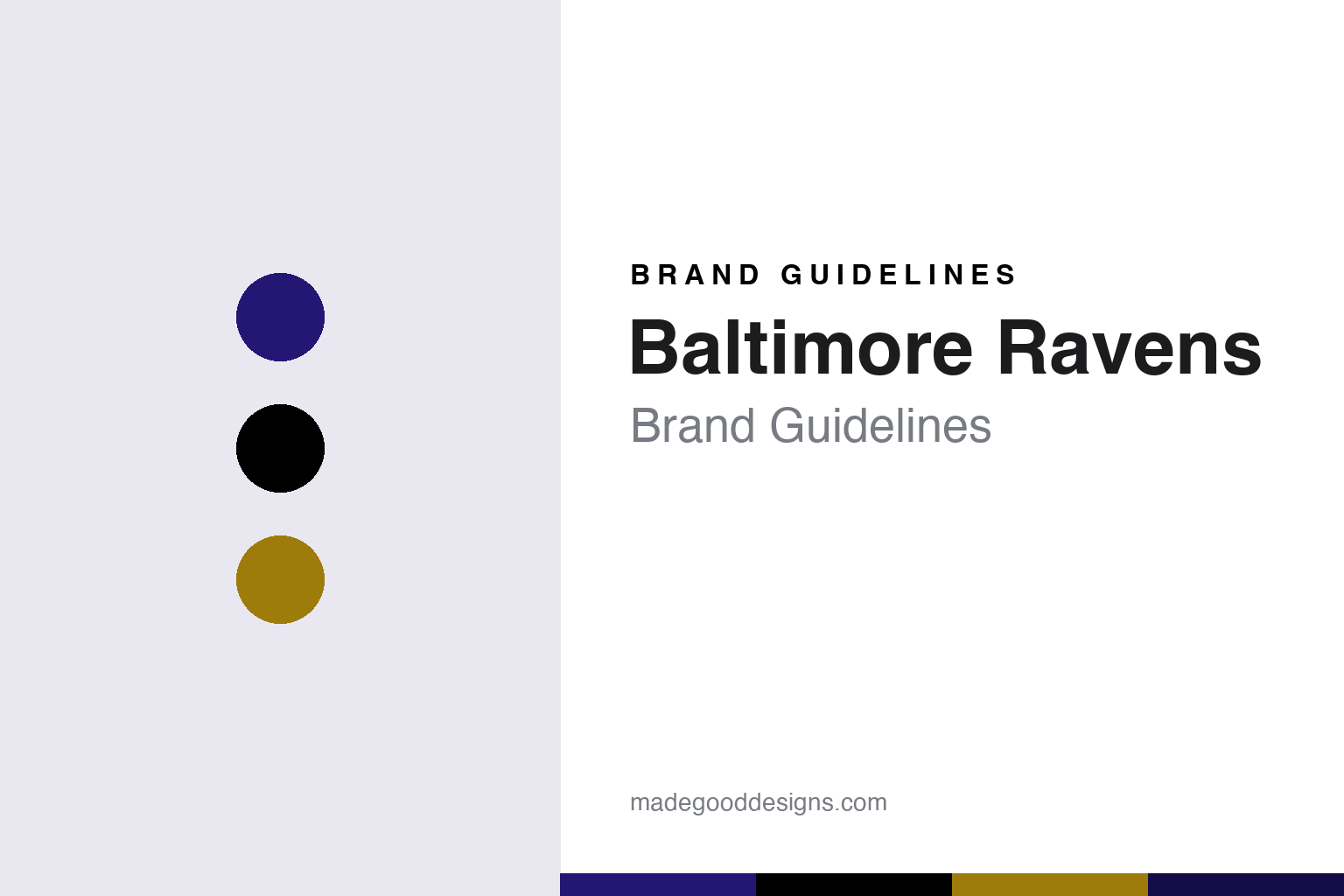
Baltimore Ravens Brand Guidelines
From a Poe poem and a fan vote to purple, black and a raven in profile.
Aa
Two constants: a purple, black and gold palette and a condensed athletic sans register. Abstract homage — not a Baltimore Ravens product or mark; no helmet, uniform or logo is reproduced.
Baltimore
A team from Cleveland, with a new name and colours.
The Baltimore Ravens were created by a relocation that left its history behind. English Wikipedia says Art Modell, then owner of the Cleveland Browns, announced on 6 November 1995 that he intended to move his team to Baltimore the following year. A settlement between the city of Cleveland and the NFL followed on 8 February 1996. Under it the Browns’ name, colours, uniform design and franchise records stayed in Cleveland, for a team that resumed play there in 1999. Modell took his players and staff to Baltimore, where, for the purposes of team history, the club counts as a new franchise starting in 1996.
The new club needed a name with local roots. Wikipedia says “Ravens” was inspired by Edgar Allan Poe’s poem “The Raven” and was chosen in a fan contest; the allusion honours Poe, who spent the early part of his career in Baltimore and is buried in the city. Other names in the poll included Marauders and Americans. Wikipedia quotes The Baltimore Sun as reporting at the time that fans also liked the tie-in with the other birds in town, the Orioles, and found it easy to picture a tough black bird.
The name had an earlier owner. Wikipedia says a wheelchair basketball team called the Baltimore Ravens was founded in the city in 1972 by Ralph Smith, and that in the 1990s the naming rights were sold to the football club, after which the basketball team became the Maryland Ravens.
The colours came from somewhere else. Wikipedia says Modell told ESPN’s Roy Firestone that the Ravens’ colours, introduced in early 1996, were inspired by the Northwestern Wildcats’ 1995 season. The club’s helmets are black with purple “talon” stripes running from the facemask to the crown, and players normally wear purple jerseys at home and white on the road. In 1996 the team wore black pants with a single wide white stripe; in 1997 it switched to white pants striped in purple and black, with a new font for the numbers. The team moved in 1998 into a new stadium beside Camden Yards, opened as PSINet Stadium and now called M&T Bank Stadium, and it is headquartered in Owings Mills, Maryland.
Colour
A shield with wings, then a raven in profile.
The first helmet logo was short-lived. Wikipedia says the mark used from 1996 through the 1999 Pro Bowl showed raven wings spread out from a shield bearing a letter B, with the word “Ravens” above it and a cross bottony below. The US Fourth Circuit Court of Appeals later affirmed a jury verdict that this logo infringed a copyright held by the Maryland amateur artist Frederick E. Bouchat.
The replacement was chosen with the fans. Wikipedia says The Baltimore Sun ran a poll showing three designs for a new helmet logo and that readers preferred a raven’s head in profile. Modell agreed to follow that preference but still wanted a letter B somewhere in the design, and the new logo introduced in 1999 placed a B over the raven’s head. A secondary shield refers to Baltimore’s heraldry: it alternates the Calvert and Crossland emblems seen on the flags of Maryland and Baltimore and interlocks them with stylised letters B and R.
Alternate uniforms gave the palette more room. Wikipedia says the club introduced an all-black alternate in November 2004, first worn for a home game against the Cleveland Browns billed as “Pitch Black” night, and has since used it for selected prime-time games. The club switched from white to black cleats in 2007, wore gold pants for the first time in December 2015, and wore an all-purple Color Rush set in 2016. From 2024 that set was worn with an alternate purple helmet carrying a front-facing raven logo, and it was renamed “Purple Rising”.
Ownership has been settled since 2004. Wikipedia says tech investor Steve Bisciotti bought a minority stake from Modell on 27 March 2000 with an option to buy a further share in 2004, and became majority owner on 9 April 2004.
Typography
Design and documentation.
An American football club’s identity has to work at very different scales. The helmet logo is the mark people see first: a single shape on a curved shell, read from the upper deck and on a phone screen, so it is usually a bold silhouette with a clear outline and few colours. A wordmark then carries the name on jerseys, sidelines and broadcasts, often in a custom or heavily modified typeface with its own numerals for the back and shoulders of the jersey.
Alternate uniforms give clubs room to play. Throwback sets bring back earlier helmets and stripes for a game or a season, and all-over single-colour “colour rush” style sets push one team colour across helmet, jersey and trousers. Each alternate has to stay recognisable on television next to the opposing side, which is why contrast between home and away kits matters so much.
Sideline apparel — coaches’ jackets, caps, hoodies and staff polos — extends the same marks into retail, away from the field. In the stadium, the palette moves onto end-zone paint, the midfield logo, ribbon boards, wayfinding and concourse signs, where large flat areas of colour and simple type need to read from a distance and in floodlight.
Aa
A condensed athletic sans — the register of a stadium wordmark and a sideline banner. (Specimen set in Oswald, a sans STAND-IN; NOT the Baltimore Ravens logo, wordmark or numerals.)
Next Flight
Midnight purple and a raven’s wings.
The Ravens wore broadly the same uniforms for three decades before a refresh in 2026. WJLA 7News reported that the club unveiled its “Next Flight” uniforms on 16 April 2026, at an event for season-ticket seat licence holders at Merriweather Post Pavilion in Columbia, Maryland. The centre of the change is a new midnight purple: WJLA says the colour-shifting material is meant to echo the iridescence of a raven’s feathers, looking purple in the light and darker as the light fades.
The details lean on the bird and the city. According to WJLA, the jersey collar shows a raven’s wings, referring back to feather details in the original design, and the pant stripes are cut diagonally to imitate a raven’s claws and to represent the Calvert crest on the Baltimore and Maryland flags. “Baltimore” now appears on the front of the white road jersey and on the back collar of the purple, black and Purple Rising jerseys. Phrases from the team’s lexicon are stitched inside the collars, among them “Darkness There and Nothing More”, a line from Poe’s poem. A midnight purple stroke was added to the numbers, the drop shadow was removed, the typography was made more consistent across numerals and the gold trim was taken out of the three primary jerseys.
The helmets were reworked too. WJLA says the Purple Rising helmet introduced in 2024, a metallic purple shell with gold talon stripes, now carries the primary Ravens logo so it can be worn with other purple uniforms, while a new black helmet carries black talon stripes and a two-toned front-facing raven. Wikipedia adds that the front-facing raven on the matte black helmet has red eyes, and that the shield patches on the black and Purple Rising sets were recoloured to match.
For a design guide, the Baltimore Ravens show how a new club can build an identity from local culture, a poem, a city’s heraldry and its flags, and then refresh it by adjusting colour and detail rather than redrawing the marks. Compare the league in our NFL brand guidelines, the league’s uniform supplier in our Nike brand guidelines and another bird-named club in our Philadelphia Eagles brand guidelines. For this guide we use raven purple, black and metallic gold with a condensed sans, an unofficial interpretation; no product or logo is reproduced.
Explore & save
Keep Baltimore Ravens’s identity on hand — save it to a board in the Made Good inspiration library.
Baltimore Ravens identity set
Pin the Baltimore Ravens purple, black and metallic gold palette and the condensed athletic sans register to your own board.