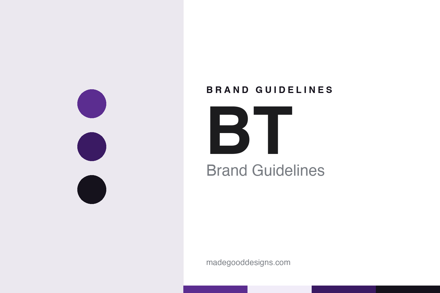
BT Brand Guidelines
Two letters, three marks and a Post Office past.
Aa
Two constants: a violet, deep violet and ink palette and a Rounded geometric sans register. Abstract homage — not a BT asset or mark; no logo, symbol or wordmark is reproduced.
Out of the Post Office
A name that began as a department.
BT’s name started life as a description of a job. For much of the twentieth century Britain’s telephones were run by the state postal service, and the company’s archive still reflects that: according to Wikipedia, the records of the Post Office Telegraph and Telephone Service (1864–1969) and of the telecommunications division of the Post Office Corporation (1969–1981) are public records held by BT Archives. Telephones, telegrams and letters shared one organisation, one set of counters and, for a long time, one visual identity.
The split came at the end of the 1970s. In 1979, Wikipedia says, the government decided that telecommunications should be fully separated from the Post Office, and the British Telecom brand was introduced in 1980. On 1 October 1981 it became the official name of Post Office Telecommunications, which turned into a state-owned corporation independent of the Post Office under the British Telecommunications Act 1981. BT itself, in a 2003 statement, dated its existence as British Telecom from 1980.
The new name kept the national framing of the old service, with the word “British” at the front, and it set out the two initials, B and T, that the company would later trade under on their own.
Competition followed quickly. In 1982, Wikipedia says, British Telecom’s monopoly was broken when a licence was granted to Mercury Communications. The national operator now had a rival. The next move, a sale of shares to the public, would change the legal form of the business and, eventually, its name once more.
Colour
Privatisation, then two letters.
Privatisation was announced in 1982 and carried out in stages. On 19 July 1982, Wikipedia says, the government announced its intention to sell shares in British Telecom. On 1 April 1984 British Telecommunications was incorporated as a public limited company, the Telecommunications Act 1984 received royal assent on 12 April, and the business, property, rights and liabilities of the statutory corporation passed to British Telecommunications plc on 6 August 1984. In November 1984 just over half of the new company was offered to the public and employees, and the shares began trading on 3 December 1984, with listings in London, New York and Toronto.
The state stepped back further over the following decade. The government sold half of its remaining interest in December 1991 and the other half in July 1993, Wikipedia says, and in 1997 it gave up the special “golden share” it had kept at flotation.
The shorter name arrived in the middle of that process. The company changed its trading name to “BT” on 2 April 1991, according to Wikipedia. The change came with a new symbol: the “piper”, a figure blowing a pipe or trumpet that sat beside the letters. In its April 2003 statement, BT described the piper as the mark it had used since 1991 and said the identity introduced then was only its second visual change since becoming British Telecom. Angus Porter, then managing director of BT Retail’s consumer division, said in the same statement that the piper had served the company for twelve years.
When The Register reported the piper’s replacement on 7 April 2003, it described the mark as a trumpet-blowing figure and noted that the change would be phased in over the following three years.
Typography
Telecom names, symbols and colours.
Telecom identities tend to carry more history than their logos let on. Many of today’s operators began life as departments of a national post office or a state telecommunications authority, where the name described a function rather than a brand. When those monopolies were corporatised or privatised, the new companies usually needed names that could be registered, trademarked and spoken quickly in advertising, and the renames often shortened a long official title into an acronym, a coined word or a single syllable.
Visual systems in the category lean on a small set of devices. Single letters and short initials are common, partly because they scale down to an app icon or a shopfront fascia without losing legibility. Abstract symbols, such as a globe, a speech mark, a square or a ring, give a company a mark that can sit apart from the word. Colour does a large share of the work: in several markets, telecom companies have sought trademark protection for a specific shade, which makes a palette a legal asset as well as a design choice.
The guides in this round look at how each company’s name and mark were assembled, using dated reporting where it exists, and treat every palette shown here as our own interpretation rather than an official specification.
Aa
A rounded geometric sans — after two letters set inside a circle. (Specimen set in Manrope, a sans STAND-IN; NOT the BT logo or the BT typeface.)
BT
From the globe to the roundel.
The piper’s successor was borrowed from inside the group. On 7 April 2003 BT announced a new corporate identity, and chief executive Ben Verwaayen said in the company’s statement that the logo represented BT as being in tune with the multimedia age while communicating its international reach. BT said there would be no big advertising launch and that the mark would be introduced over time. The Register reported the same day that the new symbol was the multicoloured “Connected World” globe previously used by BT’s internet business, BT Openworld, and that it would be rolled out over three years.
The globe stayed for sixteen years. In May 2019 BT replaced it with a simpler mark: the letters BT inside a circle. It’s Nice That reported on 26 June 2019 that the logo was the work of the London studio Red&White, three years in the making, and part of a full corporate identity system. Red&White’s creative director Paul Franklin told Design Week that the overhaul was meant to show BT as “a tech brand, not just a telecoms brand”, It’s Nice That reported. The same report said a BT typeface by the type foundry Dalton Maag took a central role alongside a set of roundels for internal and external use. The reaction was muted, the magazine added, and the discount retailer Poundland teased the design on social media.
The roundel arrived on a very public surface. In June 2019, It’s Nice That noted, the new logo began appearing on England football team shirts after BT signed a deal with the Football Association. Wikipedia also records BT’s long sponsorship of Scottish rugby, including the naming rights to BT Murrayfield stadium from 2014. In April 2022, Wikipedia says, BT announced that it would focus on the EE brand, which it acquired in 2016, for consumer products.
For a design guide, BT shows how a long national title can shrink to two letters, and how the symbol beside them can change three times while the letters stay. Compare Royal Mail, the brand that grew from the other half of the old Post Office, and AT&T, another telecom company known by its initials and a globe. For this guide we use violet, a deep violet and ink with a sans, an unofficial interpretation; no product or logo is reproduced.
Explore & save
Keep BT’s identity on hand — save it to a board in the Made Good inspiration library.
BT identity set
Pin the BT violet, deep violet and ink palette and the Rounded geometric sans register to your own board.