Equinor Brand Guidelines
A droplet, a star and a new name, from a Norwegian state company.
Aa
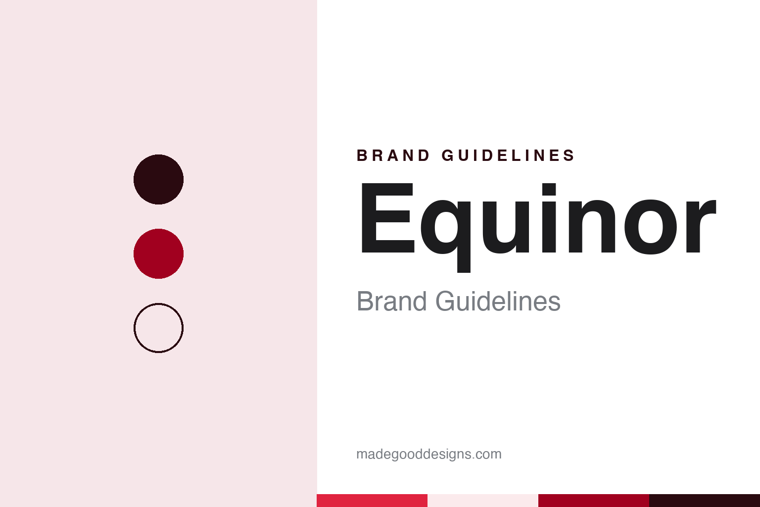
Two constants: a red, deep red and blush palette and a Nordic sans register. Abstract homage — not an Equinor asset or mark; no logo, star symbol or wordmark is reproduced.
State oil to Statoil
An act of parliament in 1972 and a shorter name a year later.
Equinor began life with a long name. English Wikipedia records that Den norske stats oljeselskap A/S, the Norwegian State Oil Company, was founded as a limited company owned by the Norwegian government on 14 July 1972, after a unanimous vote in the Storting, the Norwegian parliament. The aim, the same article says, was Norwegian participation in oil activity on the continental shelf and the building of domestic skills in the petroleum industry.
The long name did not last long in daily use. Industriminne, the history site set up for the company’s fiftieth anniversary, says that in 1973 the original name was amended in practice to Statoil, a word that worked better internationally. It joined two plain parts, “stat” for state and “oil”, and English Wikipedia glosses it simply as “state oil” in Norwegian. For more than four decades it was the name on platforms, reports and petrol pumps.
Those petrol pumps mattered to the brand. English Wikipedia says that in the 1980s Statoil decided to become a fully integrated petroleum company and began building the Statoil fuel station brand, so the name moved from offshore industry into Norwegian streets and, later, into neighbouring countries. In 2001, Industriminne notes, the company was part-privatised, which made the “stat” prefix less exact than it had been in 1972.
The next big change came through a merger. English Wikipedia traces Equinor’s heritage to three Norwegian petroleum companies: Statoil, Norsk Hydro and Saga Petroleum, the last two having merged in 1999. Statoil and the oil and gas division of Norsk Hydro joined in 2007, with the merger approved by the European Union on 3 May 2007 and by the Storting on 8 June 2007. The combined business was called StatoilHydro, a name the article describes as created for temporary use only, out of regard for the smaller partner.
The temporary name was dropped two years later. The annual general meeting approved a return to Statoil ASA in May 2009, and English Wikipedia dates the change to 2 November 2009. The company has its head office in Stavanger, on Norway’s west coast, while much of its international work is led from Fornebu, outside Oslo.
Colour
A turquoise droplet, an orange droplet and a magenta star.
Industriminne gives the clearest account of the company’s marks, and it counts five logos in all. The first, introduced with the shorter Statoil name, was a droplet in turquoise and white, a shape that brought to mind a drop of oil.
In 1986 the droplet changed colour. Industriminne says it became orange on a blue background, with the company name in white, a combination that showed up better on the illuminated neon signs used at Statoil service stations.
The 2007 merger changed the name but not the picture. According to Industriminne, StatoilHydro kept the existing logo, so the temporary double name was set beside the familiar droplet. The real redesign came with the return to Statoil in 2009, when, the site says, the company marked its status as a modern international business with a fresh logo built around a magenta star.
The star and the droplet then lived side by side for a few years. Industriminne notes that the service stations went on using the orange droplet on blue until the retail chain was sold to Canada’s Alimentation Couche-Tard in 2012. English Wikipedia adds that the retail business had been split off in 2010 as a separately listed company, Statoil Fuel & Retail, and that in 2016 Couche-Tard decided to rebrand the stations as Circle K.
The fifth logo arrived with the new name. Industriminne says the star was reconfigured in 2018 and that its magenta became red to coincide with the adoption of Equinor. The result kept the idea of a star from the 2009 mark while moving the colour to a warmer red, so the change of name was not also a complete change of symbol.
Typography
Energy companies and their marks.
Industrial company names tend to start as descriptions of people or processes. Many began with a founder’s surname, a pair of partners’ names joined by an ampersand, or a long legal title that listed what the firm made and where. Over time those titles were shortened in everyday use, and the short form often became the official name: a surname on its own, or a set of initials that customers and staff had been using for decades.
The marks that sit beside those names are usually simple shapes. Squares, ovals, diamonds and plain rules recur because they print cleanly on drums, sacks, vehicles, signage and paperwork, and because they hold their shape at very small and very large sizes. Many identities rely on a single corporate colour, applied across a wordmark and a few supporting elements, rather than a broad palette.
Mergers and spin-offs test these systems. When companies combine, the new group must choose whether to keep one name, join two, or invent a third; when a group later splits, each part needs a name and mark of its own. Those decisions, and the dates on which they took effect, are often the clearest record of how an industrial brand has changed.
Aa
A plain Nordic sans — after a lower-key wordmark beside a red star. (Specimen set in Work Sans, a sans STAND-IN; NOT the Equinor logo or its typeface.)
Equinor
Equal, balanced and Norwegian.
The name Equinor was announced on 15 March 2018, when the board proposed the change subject to approval by the annual general meeting, according to English Wikipedia. The company explained the coinage in two parts: “equi”, the starting point for words such as equal, equality and equilibrium, and “nor”, signalling a company proud of its Norwegian origin. CleanTechnica quoted that explanation on 16 May 2018, when it reported that shareholders had approved the name at the annual general meeting and that Statoil had officially become Equinor.
The same report gave the chief executive’s reasoning. Eldar Sætre, it said, had told Reuters that a name with “oil” as a component would increasingly be a disadvantage, and that the old name had served the company well for decades but was not the name for the decades ahead. Industriminne puts it in brand terms: the prefix “stat” had stopped being wholly accurate after part-privatisation, and “oil” was not something the company wanted to be solely identified with.
Not everyone welcomed the change. Industriminne records that many people inside the company identified strongly with the Statoil name, and that Arve Johnsen, the company’s first chief executive, was critical of the new one and regretted losing the public goodwill built up by the original. Some commentators, the site adds, heard an echo of equus, the Latin word for horse.
The new name also had to work beyond the logo. English Wikipedia notes that the Norwegian state holds a majority of the shares, and that the company runs a sponsorship programme called Morgendagens helter, or Tomorrow’s heroes, for young talent in art, education and sport, with an art prize, Statoils kunstpris, awarded every second year since 2007. The older name survives in that prize.
For a design guide, Equinor shows how a company can drop a name its home market knew well yet keep continuity through its symbol, carrying the 2009 star into 2018 and changing its colour rather than its idea. Compare Shell, built around its pecten shell symbol, and BP, another energy company that rebuilt its identity around a single symbol. For this guide we use red, deep red and blush with a sans, an unofficial interpretation; no product or logo is reproduced.
Explore & save
Keep Equinor’s identity on hand — save it to a board in the Made Good inspiration library.
Equinor identity set
Pin the Equinor red, deep red and blush palette and the Nordic sans register to your own board.