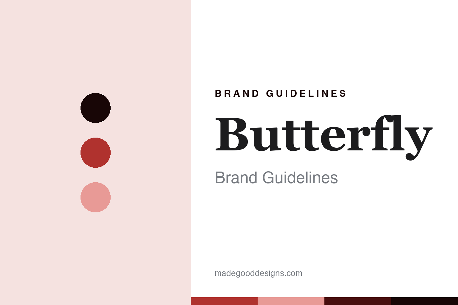
Butterfly Brand Guidelines
The premium name in table tennis.
Aa
Two constants: a Butterfly-red palette and a premium-serif register. Abstract homage — not a Butterfly product or mark.
The premium name in table tennis
Butterfly is the Japanese house of Tenergy rubber and the premium standard of the sport — the company Tamasu Co.
Butterfly brings the round its premium standard — the Japanese company, Tamasu Co., widely regarded as the leading name in table tennis, whose Tenergy rubber is a landmark of the sport and whose blades and rubbers are the equipment of choice for many of the game’s greats. Butterfly makes blades, rubbers, balls, tables, shoes and apparel, and its answer to a round about the equipment houses is depth and quality: the premium name, built on Japanese engineering. A brand, premium.
Its identity is the premium name in table tennis. Butterfly’s Tenergy rubber, its Japanese engineering and its premium standard are the story here. A brand, premium. The premium name in table tennis.
(Honest notes, so the story stays precise. Butterfly — the corporate site butterfly.co.jp, run by Tamasu Co., Ltd.; the site butterflyonline.com is a United States distributor, Bowmar Sports, not the maker — is a full-line table-tennis brand, widely regarded as the premium global leader, making blades, rubbers, balls, tables, shoes, apparel and robots. It was founded in 1950 by Hikosuke Tamasu, himself a table-tennis player, in Yanai, in Yamaguchi, Japan, with its head office now in Suginami, Tokyo, so both the Yanai origin and the Tokyo head office are correct. On where it is made — the theme of this round — Japanese production is central to Butterfly’s premium identity, especially its high-end rubbers and top blades, but we do not claim that everything is made in Japan or name specific factories, since the range is broad and lower tiers are made elsewhere. On ownership, it is the privately held Tamasu Co., Ltd., not publicly listed, and we avoid naming an individual owner. Its Tenergy rubber, a high-tension Spring Sponge product from around 2008, is a well-established landmark we describe as public fact. Its players, such as Jan-Ove Waldner, Timo Boll and Zhang Jike, are public associations we state without inventing endorsements. Its butterfly device and wordmark are IP we describe but do not reproduce; there is no official brand hex; these tones are an unofficial interpretation. This is design commentary.)
Colour
Butterfly lives in a Butterfly red. Click a swatch to copy the hex.
Butterfly’s identity is premium, Japanese and precise — a Butterfly red, an ink, a blush, a deep red, and a paper. The palette leans Butterfly red and blush: a confident, brand-red register that nods to the sport’s premium name and a rubber sheet rather than a quiet palette. It signals the leading maker. The honest caveat: with no published brand hex, these values are an original, unofficial interpretation, not first-party colours.
The lesson is a Butterfly red signals a premium, Japanese identity. Butterfly’s world is a premium, made object. For designers, it is a reminder that a confident red and a soft blush can carry a sports brand — the tone of the premium standard. Because these tones can fail as small text, keep type dark and let the colour live in the accents, palette and band. The takeaways: build a premium standard; own a landmark product; keep genuine home production; and treat any single hex as unofficial.
Typography
The register is a premium serif — Japanese, precise, considered.
Butterfly’s identity carries a Japanese, precise, considered spirit — a premium equipment house, not a fashion. A premium serif captures the mood: refined, classic and confident, the register of the sport’s leading name. Set in a Butterfly-red palette, the premium serif feels Japanese and precise — exactly the personality Butterfly carries. It is engineering rather than a logo, mirroring rubber and veneer. (Butterfly’s real butterfly device is a thing we describe but do not reproduce, and the exact typeface is not ours to use.) Because it is not ours to use, the honest description is “a premium-serif spirit,” shown here in a stand-in. The type behaves like the brand: Japanese, precise and considered.
Aa
A premium-serif spirit — Japanese and precise. (Specimen set in Playfair Display, a premium-serif STAND-IN; NOT the Butterfly logo.)
The equipment houses
Butterfly stands for the premium name in table tennis.
Butterfly brings the round its premium standard. A Butterfly-red palette, a premium serif and a landmark rubber make one thing — the premium name in table tennis — the whole identity: premium, Japanese and precise. Tenergy is the differentiator, and Japanese engineering is the meaning. The point is the company Tamasu Co., widely regarded as the sport’s leading maker, whose rubbers and blades equip many of the game’s greats.
Put to work, the identity is a premium standard told straight, as design. A maker in this spirit would build a premium standard, own a landmark product, and keep genuine home production. A reader in this spirit would keep the facts right: Butterfly was founded in 1950 by Hikosuke Tamasu in Yanai, Yamaguchi, with its head office now in Tokyo; it makes blades, rubbers, balls, tables and more; Japanese production is central to its premium identity, though we do not claim everything is Japan-made; it is the privately held Tamasu Co., not publicly listed; and Tenergy, from around 2008, is its landmark rubber. Butterfly sits among the round’s oldest houses with Stiga, and its where-made thread is genuine premium home production, alongside Nittaku’s Japan-made balls. The honest editorial moves are to date the founding to 1950, to name Tamasu Co. as the maker, to say premium Japanese production not all-Japan, and to state the players as public facts. The lesson Butterfly teaches is that a premium standard can be a whole identity, and honesty about the broad range keeps it credible.
For designers and brand-builders, Butterfly continues the equipment houses: build a premium standard — and own a landmark product. The lessons: earn a premium reputation; make a landmark like Tenergy; keep genuine home production and say so without overclaiming; state a private owner plainly; and never reproduce a logo. It is also a reminder to stay precise: Butterfly is the Japanese house of Tenergy rubber and the premium standard of the sport, by Tamasu Co. — with the palette here an unofficial interpretation. Read that way, Butterfly is less a blade than a standard: the premium name in table tennis. The lesson for a brand is that a premium standard and a landmark product reinforce each other, and naming Tamasu Co. keeps the heritage earned. Butterfly made the-premium-name-in-table-tennis the identity — proof that a standard can define a brand.
Explore & save
Keep Butterfly’s identity on hand — save it to a board in the Made Good inspiration library.
Butterfly identity set
Pin the Butterfly-red palette and the premium-serif register to your own board.