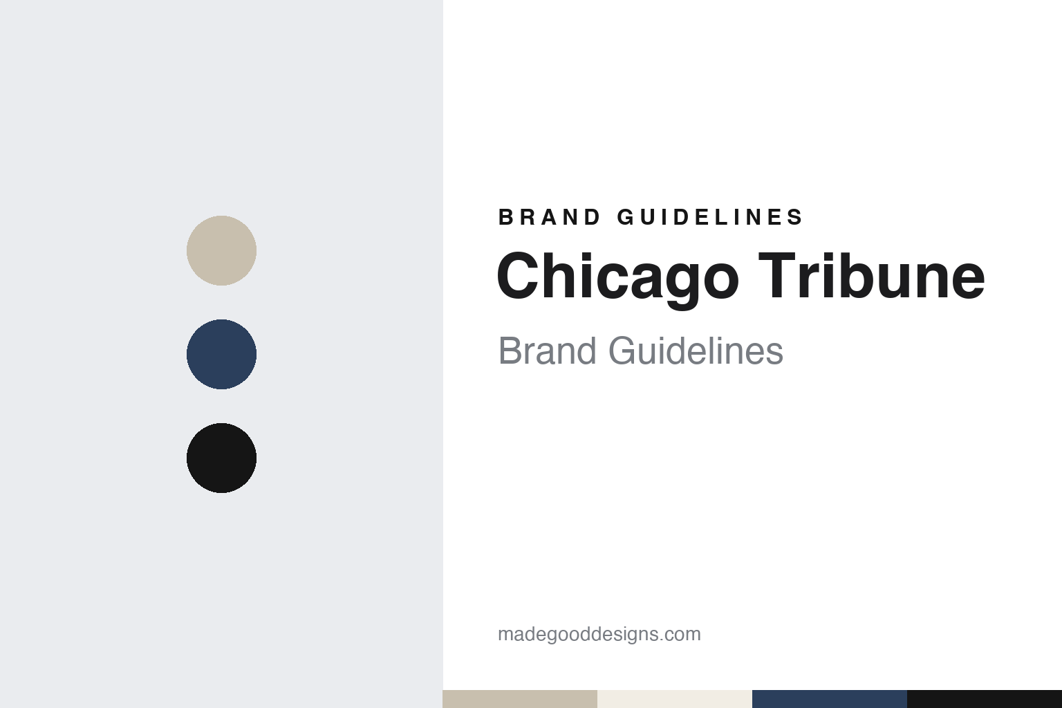
Chicago Tribune Brand Guidelines
A Chicago daily with a Gothic tower.
Aa
Two constants: a limestone, blue and black palette and an old-style serif register. Abstract homage — not a Chicago Tribune asset or mark; no logo, front page or nameplate is reproduced.
A Chicago daily from 1847
Three founders, then Medill, Ray and a run of new names.
The Chicago Tribune was not founded by the man often linked to it. English Wikipedia says the paper was founded by James Kelly, John E. Wheeler and Joseph K. C. Forrest, and that the opening edition appeared on 10 June 1847. Several changes of ownership and editorship followed over the next eight years, the same article says.
Joseph Medill arrived in the mid-1850s. English Wikipedia says Medill came from the Cleveland Leader to become managing editor, while Charles H. Ray became editor-in-chief and Alfred Cowles started as bookkeeper, and that each of the three bought a third of the paper. Under that team, the article says, the Tribune absorbed other Chicago publications, among them the Free West in 1855, the Chicago Democratic Press in 1858 and the Chicago Democrat in 1861.
The name changed with those mergers. English Wikipedia says the paper was called the Chicago Press & Tribune from 1858 to 1860, and that on 25 October 1860 it became the Chicago Daily Tribune. The shorter title, Chicago Tribune, is the one the paper uses today.
The family line continued into the next century. English Wikipedia says Robert R. McCormick, a grandson of Medill, became co-editor with his cousin Joseph Medill Patterson in 1910, and that the two added features such as film reviews, advice columns and comic strips including Little Orphan Annie and Moon Mullins. Patterson left in 1919 to start the New York Daily News in New York City, the article says.
The paper also gave its name to a broadcaster. English Wikipedia says the Tribune bought an early radio station, WDAP, in 1924 and renamed it WGN, the call letters taken from a slogan the paper once used about itself. WGN Television followed on 5 April 1948, according to the same article.
The Chicago Tribune was the founding business of Tribune Company, which English Wikipedia says later included other newspapers and television stations around the country, the Los Angeles Times among them, before the newspapers were separated from the rest of the group in 2014.
Colour
A tower by competition in 1925, a spelling habit and a change of format.
The building came before any modern redesign. English Wikipedia says that in 1922 the Chicago Tribune held an international design competition for its new headquarters, the Tribune Tower, and that the winning entry was a neo-Gothic design by the New York architects John Mead Howells and Raymond Hood. Construction was completed in 1925, and the paper stayed in the tower on North Michigan Avenue from 1925 to 2018, according to the same article.
The paper also had a habit of its own on the page. English Wikipedia says that under McCormick the Tribune championed simplified spelling: beginning in 1934 it compiled lists of common words whose spelling it shortened, and from 1939 it used forms such as “thru”, “tho”, “altho” and “thoro”, which became distinctive features of the paper for decades. The same article says most of these spellings were kept until a 1975 stylebook update adopted Webster’s Third as the paper’s spelling authority, while a few, including “cigaret” and “dialog”, lasted until 1981. English Wikipedia adds that Patterson’s New York Daily News shared the same enthusiasm for simplified spelling.
Printing moved out of the tower in the 1980s. English Wikipedia says the Tribune opened a new printing facility, Freedom Center, by the Chicago River in September 1982.
The format was tested in 2009. English Wikipedia says the paper, originally published only as a broadsheet, announced on 13 January 2009 that it would keep the broadsheet for home delivery but publish in tabloid format for newsstands, news boxes and commuter stations. The change proved unpopular with readers, the article says, and in August 2011 the Tribune dropped the tabloid edition and returned to the broadsheet across all channels.
The tower was left behind in 2018. English Wikipedia says the Tribune ended its stay at Tribune Tower on 9 June 2018 and moved to One Prudential Plaza, overlooking Millennium Park, after Tribune Media sold the tower to developers, and that the tower was later converted to condominiums. In January 2021, the article says, the newsroom and main office moved again, this time to the Freedom Center printing site.
Across these moves, the paper’s title has stayed in the form set in the nineteenth century, and its typographic habits, from simplified spellings to the broadsheet page, have been changed by dated decisions rather than all at once.
Typography
A nameplate, a text face and a fixed order on the page.
A newspaper’s title can stay fixed while the pages beneath it change. English Wikipedia says the Frankfurter Allgemeine Zeitung, first published in Frankfurt on 1 November 1949, altered its traditional layout on 5 October 2007 to carry colour photographs on the front page and replaced blackletter type everywhere except the nameplate. German Wikipedia says the lettering of that title, designed by Regina May, has stayed typographically unchanged, and that in October 2011 the paper’s website gave up its own logo for the printed Fraktur head.
A change of page size works the same way. English Wikipedia says The Sydney Morning Herald, a Sydney title since 1831, moved its weekday paper from broadsheet to compact with effect from March 2013, following The Times in London, and printed its Saturday edition as a broadsheet for the last time on 22 February 2014. The name at the top, fixed since 1842, carried across to the smaller sheet. When reading a newspaper’s identity, look at which parts of the masthead have stayed unchanged, which parts of the page were redrawn, and the dates on which each change was made.
Aa
An old-style serif — the register of a city broadsheet set for long reading. (Specimen set in Old Standard TT, a serif STAND-IN; NOT the Chicago Tribune nameplate or any Chicago Tribune typeface.)
Chicago Tribune
From Tribune Company to Tribune Publishing, and Alden since 2021.
The ownership has changed several times in the twenty-first century. English Wikipedia says the Tribune Company was bought out in December 2007 by the Chicago real estate investor Sam Zell, who became its chairman. In August 2014, the same article says, the newspapers, including the Chicago Tribune and the Los Angeles Times, were spun off as a separate publicly traded company, Tribune Publishing, and the parent was renamed Tribune Media.
The current owner took over in 2021. NPR, in a report dated 21 May 2021, said the New York-based investment fund Alden Global Capital had won shareholder approval that day to acquire the Tribune Publishing newspaper chain, whose titles included the Chicago Tribune, The Baltimore Sun and the New York Daily News. The report named Heath Freeman as Alden’s president. English Wikipedia says the acquisition closed in May 2021 and that Alden operates its media properties through Digital First Media. Alden Global Capital has owned the Chicago Tribune, through Tribune Publishing, since 2021.
The editors form a dated list. English Wikipedia names Ann Marie Lipinski as editor from February 2001 until July 2008, Gerould W. Kern as editor from July 2008, and Mitch Pugh as executive editor from 20 August 2021, after a period in the same role at The Post and Courier in Charleston, South Carolina.
The paper’s design story sits mostly outside the nameplate. The Tribune Tower, won by competition and finished in 1925, gave the paper a physical identity on Michigan Avenue from 1925 to 2018. The simplified spellings gave its text a recognisable look from the 1930s to the 1970s. The 2009 tabloid edition for newsstands showed how a change of format can be tried and withdrawn, and the broadsheet returned in 2011.
For a design guide, Chicago Tribune shows how a newspaper can carry a short title from 1860 onward while its building, its spelling rules and its page format change around it in dated steps. Compare Los Angeles Times, once a sister paper in the same group, or The New York Times. For this guide we use limestone, blue and black with a serif, an unofficial interpretation; no product or logo is reproduced.
Explore & save
Keep Chicago Tribune’s identity on hand — save it to a board in the Made Good inspiration library.
Chicago Tribune identity set
Pin the Chicago Tribune limestone, blue and black palette and the old-style serif register to your own board.