Cincinnati Reds Brand Guidelines
A colour that became a name, a name that was briefly hidden, and a C shaped like a wishbone.
Aa
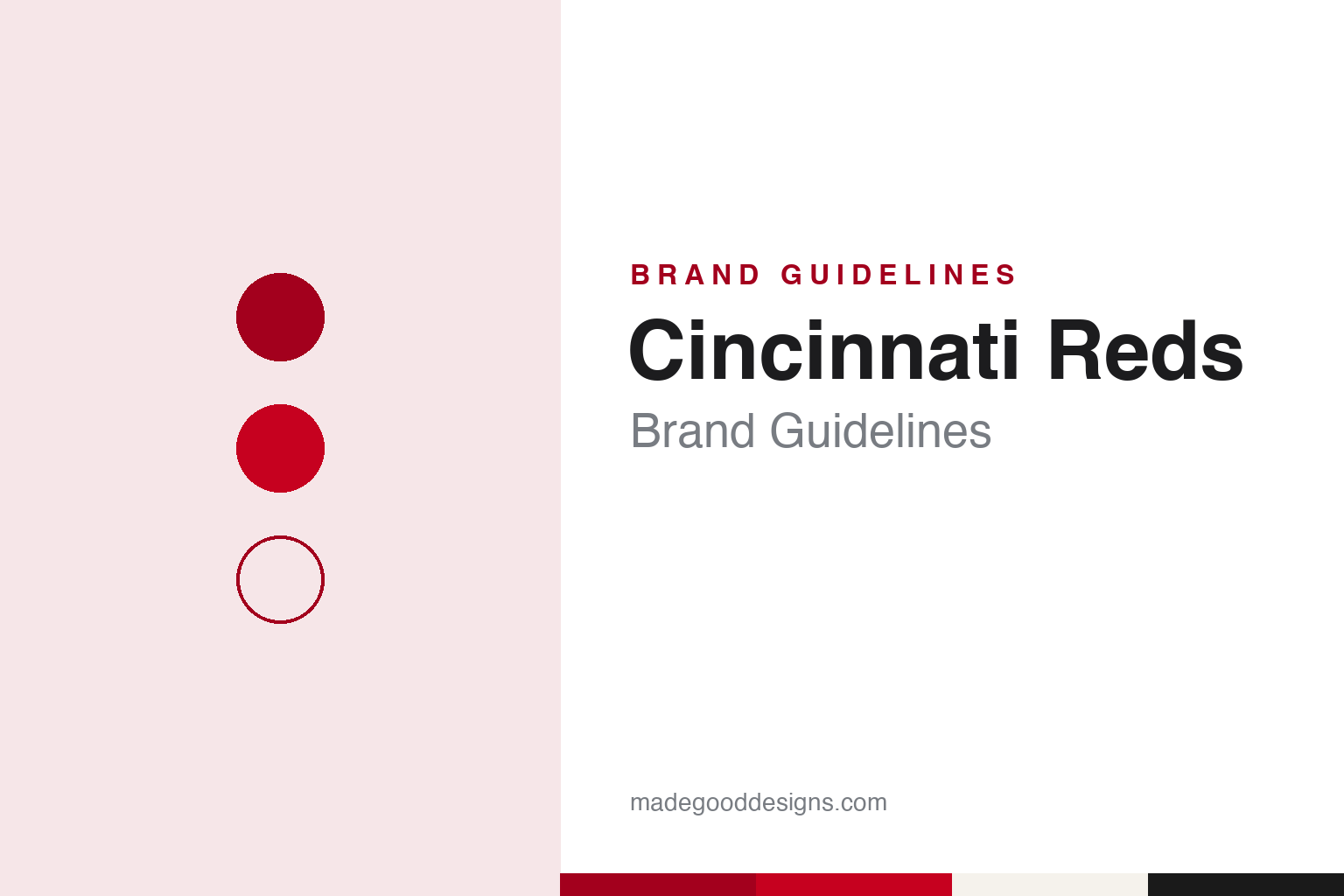
Two constants: a wishbone red, deep stocking red and home white palette and a wishbone initial and old-style numerals register. Abstract homage — not a Cincinnati Reds mark; no cap logo, script or wordmark is reproduced.
A club formed in protest
An expulsion over beer and Sunday games, a new league, and a ballpark called Redland.
The modern Cincinnati Reds grew out of a dispute. English Wikipedia records that Cincinnati had been a charter member of the National League in 1876, but that on 6 October 1880 the league’s other owners adopted a pledge to ban beer sales and Sunday games, and expelled Cincinnati when its president refused to sign. O. P. Caylor, sports editor of the Cincinnati Enquirer, responded by forming a new independent club in the spring of 1881. With former Reds president Justus Thorner and the Pittsburgh baseball figure Denny McKnight, he helped organise a rival league, and the new club played in the American Association as a charter member from 1882. It moved to the National League in 1890.
The name has always been about colour. Wikipedia says the club itself described its name as having been “Red Stockings” and then “Redlegs” before it settled on Reds, and the club’s early logo was a wishbone-shaped “C” with the word “REDS” inside, drawn only in red and white. That letter, with the point at its base that gives it the wishbone shape, has been redrawn many times and remains the core of the identity.
The club’s homes have carried the name too. Wikipedia lists Bank Street Grounds from 1882, two League Parks and the Palace of the Fans before the club moved in 1912 into a steel-and-concrete ballpark on the corner of Findlay Street and Western Avenue, on the city’s west side. In a SABR history dated 19 March 2015, Lon Garber writes that the park spent its first years as Redland Field and was renamed in 1934 for the club’s new owner, Powel Crosley. Garber also credits the groundskeeper Matty Schwab with designing the park’s scoreboard format, and says Schwab went on to design scoreboards for clubs in New York, Boston, Philadelphia and Pittsburgh.
Charles F. Faber, in a SABR biography of Powel Crosley Jr. dated 7 April 2015, writes that after the previous owner’s bankruptcy in 1933 the franchise was sold to Crosley, a radio manufacturer who was a director of the lending bank and who had started the Cincinnati radio station WLW in 1922. Faber says the ballpark’s name changed from Redland Field to Crosley Field in honour of the new owner.
Colour
A name hidden in the 1950s, and owners from Crosley to Castellini.
For several seasons the club played down its own name. Wikipedia records that in April 1953, in a political climate shaped by McCarthyism, the club announced a preference to be called the “Redlegs,” to avoid any link with the political meaning of “red.” According to The New York Times, as Wikipedia quotes it, the political significance of the word was not discussed by management. From 1956 to 1960 the word “REDS” was taken out of the wishbone C, and the club went back to “Reds” for the 1959 season. The colour scheme moved with the name: Wikipedia says navy blue was introduced during the Redlegs years and dropped again in the 1960s and 1970s.
The Redlegs period left a lasting character. Mr. Redlegs, a mustachioed man with a baseball for a head, wearing a pillbox hat, appeared on the road uniform after 1956. In 1972 a new logo put Mr. Redlegs inside the wishbone C in place of the script “REDS.” He returned as a sleeve patch in the December 2006 redesign, with a handlebar moustache that Wikipedia describes as reminiscent of the 1950s and 1960s drawing.
The ballpark moved to the river and stayed there. Wikipedia says the club left Crosley Field for Riverfront Stadium, by the Ohio River, on 30 June 1970. That stadium, later called Cinergy Field, was demolished in 2002, and Great American Ball Park opened in 2003 just to its east, after the city agreed in the late 1990s to build separate stadiums for the Reds and the Cincinnati Bengals.
Ownership has changed hands at long intervals. Wikipedia records that Marge Schott sold a controlling stake in 1999 to a group led by Carl Lindner, keeping a minority interest, and that Robert Castellini took over as controlling owner from Lindner in 2006. Castellini has led the club since.
Typography
Design and documentation.
Baseball identity is built from a small set of parts that recur across the sport. The cap insignia is a compact version of the identity: often a single letter, a monogram or a small emblem, it has to read on a cap front, a sleeve patch, a scorebook and a phone icon alike, which is why club marks are often drawn as heavy, closed shapes rather than fine linework. Behind it usually sits a fuller crest or primary logo, a roundel or shield that carries the club name, a founding date or a piece of local symbolism, and which appears on programmes, tickets and signage rather than on the field.
Mascot heads form a second layer. Many clubs have used a cartoon figure with a baseball for a head or a costumed character, and these drawings change with the illustration fashions of each decade, from the thin pen line of mid-century sports cartoons to the thicker, flatter shapes of later digital work. Ballpark scoreboards and wayfinding then turn the palette into architecture, setting club colours in lights, painted steel and large-format type. Throwback uniforms close the loop: clubs reissue older lettering, cap marks and colour combinations for single games or whole seasons, so a design guide for any team has to treat its past wordmarks as live material rather than archive.
Cc
A Western-style slab display — the register of the early-1900s-style numerals the club adopted in 2006. (Specimen set in Rye, a slab STAND-IN; NOT the Cincinnati Reds logo, script or wordmark.)
Cincinnati Reds
Sleeveless jerseys, an oval C, and a uniform kept for a quarter-century.
The uniform has swung between plain and decorated. After the Redlegs name was dropped in 1956, Wikipedia says, the club adopted sleeveless jerseys over red long-sleeved undershirts, with an all-red cap carrying a white wishbone C. The home uniform was plain white with a red wishbone C on the left chest; on the road the C gave way to Mr. Redlegs. In 1961 the club replaced the wishbone with an oval “C”, kept the sleeveless cut, and added red pinstripes at home and an arched block “CINCINNATI” on the grey road jersey.
The look that settled in 1967 lasted, with small changes, through 1992. Wikipedia says the point returned to the C, making it a wishbone again; the caps were all red at home and away with the C in white; the home jersey carried the wishbone “C-REDS” logo on the left chest and the road jersey the arched “CINCINNATI.” The uniforms were flannel until 1971, then double-knit pullovers with beltless trousers from 1972.
Later decades added and removed details. The 1993 uniforms brought back buttons and pinstripes, made the home jersey sleeveless again, reversed the colours of the C-REDS logo, and introduced a home cap with a white pinstriped crown and red bill. In 1999 the club made black a primary colour, especially on the road. The December 2006 redesign returned the home cap to all red with a white wishbone C lightly outlined in black, gave the road cap a black bill, dropped the sleeveless jersey and switched the names and numbers to an early-1900s-style typeface.
Wikipedia says the City Connect design was meant to look to the future. The 2023 version, made with Nike, used a modified C on the cap and sleeve and spelled “CINCY” across the chest, with an Ohio buckeye and the city motto “Juncta Juvant” on the collar. A second City Connect, released in 2026, turned the same design all red with black numbers.
For a design guide, Cincinnati Reds shows how one letterform can carry a club through a name change, a colour change and many uniform sets, and how a mascot drawing can be retired and brought back as heritage. Compare the bird-on-bat tradition in our St. Louis Cardinals guide, and the league-wide marks in the MLB guide. For this guide we use wishbone red, deep stocking red and home white with a slab serif, an unofficial interpretation; no product or logo is reproduced.
Explore & save
Keep Cincinnati Reds’s identity on hand — save it to a board in the Made Good inspiration library.
Cincinnati Reds identity set
Pin the Cincinnati Reds wishbone red, deep stocking red and home white palette and the wishbone initial and old-style numerals register to your own board.